Disambiguating Data Visualizations
Making Meaning from Data Visualizations and the Data
Data visualizations play a critical role in the communications of research findings and underlying datasets. They appear in a wide range of research for both specialist and generalist audiences. Such visualizations are used during the analytical process as well, prior to public presentations.
About some data visualizations created in NVivo
Within NVivo, there are some basic tips about the data visualizations that this software tool may output.
- In data queries, the parameters of the initial data extraction may reset in each iteration, so it is a good idea to re-check parameters for each new re-crawl and the follow-on data extractions. If the parameters are not clear (and are not documented clearly), then miscommunications may occur with the data visualization.
- Even though data visualizations are eye-catching and possibly aesthetically pleasing, the original dataset (in table format, for example) still has relevance and value. The "real" data resides there, and that data should be brought into the analysis. In other words, there is data in the originating dataset that is unaddressed and uncaptured in data visualizations.
- The geolocation map of Tweets from NCapture and NVivo is highly sparse. Published accounts suggest that only 1-2% of microblogging messages have any information in the location field, and this data is unstructured and noisy data. In other words, people may register their accounts from "Mars," and that is what shows up in the data cell. The only locations that can be mapped are those which may be read in the software, so that sort of data is highly sparse, and the resulting maps have to be understood as such.
As popular as they are, data visualizations are difficult to create and use well. There is often a history of understandings and assumptions used with data visualizations (particularly each type of data visualization), and these require years of formal learning to understand. Many data visualizations are based off of complex statistical methods, graphing methods, and variant layout algorithms. Datasets may be fully accurate, but the layout algorithms used in the depiction of that data may be misleading. Oftentimes, the researchers that create such visualizations are not backed up by statisticians who can help vet the data and evaluate the related imagery. Sometimes, something gets lost in translation between complex quantitative data and visual communications strategies.
Alignment of data with visualization types.
Certain data visualization types have to be set up with certain types of data. Software tools may output data visualizations even if the underlying data does not fit that visualization type, and even if the resulting visualization is data-incoherent or nonsensical. (Sometimes, such visualizations even make it into a publication.) Some data visualizations are created for aesthetic impressions, not the conveyance of data; some contemporary examples of these include social network graphs which may be visually enticing and memorable but maybe too large-scale or broad-grained to be informative. Data visualizations like word clouds may be used to make a political statement and not really convey much about the actual underlying data.
There is an inherent data reduction or summary aspect to data visualizations. As a representation of the underlying data, the visualization masks and encapsulates complexity in a way that may not be perceivable by the audience, who are understood to be approaching the visualization with their own mental models and understandings. (If data is transient...such as in videos and animations, human capacity for understanding is diminished further.)
Typical users may just do a quick scan of the data visualization and not spend the time necessary to understand the visualization or the underlying data. Even if there is a "close read" of some data visualizations, the inherent ambiguity may be misread or misunderstood given the human tendency to close gaps in information by putting in their own narratives. It may help to slow users of a visualization, so they may engage with the information with more critical thinking.
There are a number of ways to disambiguate data visualizations and to head off potential negative learning or misunderstandings. This page will only address a few of them—because it is thought that this information would benefit those creating and using such visualizations in NVivo.
Other Options Outside of NVivo
Typical users may just do a quick scan of the data visualization and not spend the time necessary to understand the visualization or the underlying data. Even if there is a "close read" of some data visualizations, the inherent ambiguity may be misread or misunderstood given the human tendency to close gaps in information by putting in their own narratives. It may help to slow users of a visualization, so they may engage with the information with more critical thinking.
Some Ways to Disambiguate Data Visualizations
There are a number of ways to disambiguate data visualizations and to head off potential negative learning or misunderstandings. This page will only address a few of them—because it is thought that this information would benefit those creating and using such visualizations in NVivo.
Probably one of the most obvious ways to head off misunderstandings from data visualizations is to understand data visualization conventions and their uses. Align the data with the proper acceptable data visualizations. Proper data visualization design would include the strategic uses of labels, “pullouts,” and legends. Textual annotations help clarify meaning, and they often introduce a deeper level of specificity than the visuals. Use sufficient labeling. Make sure that no data is obscured, with one element overlapping another.
In terms of accessibility, do not use color alone to convey information. Chloropleth maps may be problematic in this sense, so some map makers will use patterning to indicate frequency or intensity or density (not color alone).
In the context of a paper, there should be lead-up and lead-away texts to contextualize the visualization. (This is not to say that a visualization shouldn’t be able to stand alone, to some degree.
In a Semantic Web context, every visual may be disaggregated and used in wholly different contexts--so each visualization should be able to stand alone and be somewhat complete in and of itself. Using an in-depth caption may enhance the accessibility of the data visualization--in addition to the embedded alternative text or "alt text" description.)
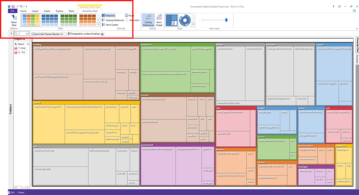
Hierarchy Chart Tools (tab) -> Color (area) ->
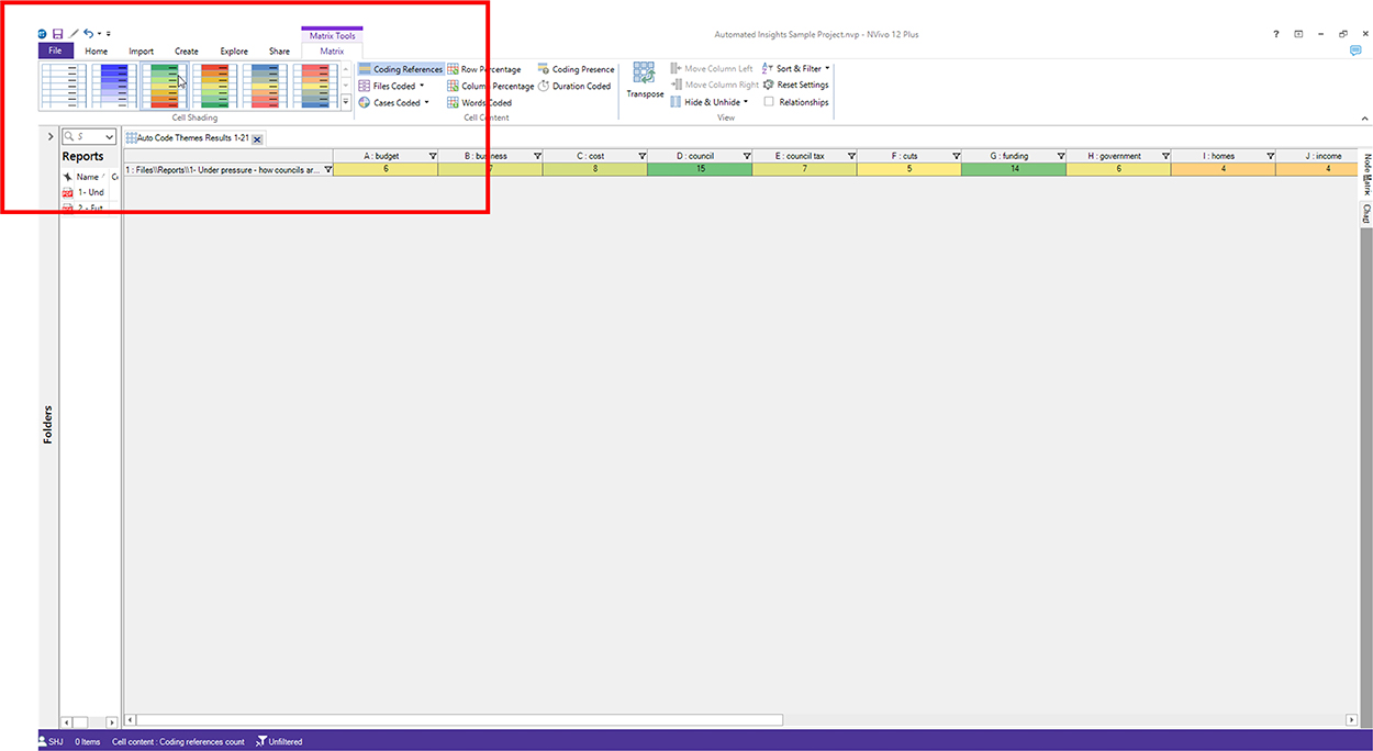
Matrix Tools (tab) -> Cell Shading (area) ->
Other Options Outside of NVivo
- Editing colors in an image file. It is possible to output the data visualization as an image file and then change the respective colors--hue and saturation, and others--in the areas using Adobe Photoshop using the eyedropper tool.
- Outputting a node matrix and outputting a different data visualization with a different tool (with different color palettes). Another option is to output the data table, sometimes called the "Node Matrix," and use that data to output visualizations in MS Excel or some other visualization tool (with different color choices).
- Mixes of approaches. It is possible to use the output data to create data visualizations from another tool...and then change the color on that image file, etc.
It may help to let readers know of the data provenance and how that data was cleaned and handled before the visualization was created. It may help to enable online user interactivity with the data visualization, for deeper understanding. Enabling users to access more information—like datasets—may also be helpful, so they may see what informed the data visualization.
Make sure that if the visualizations may result in potential misunderstandings that those issues are brought up and addressed. Whoever originates data has some responsibility to ensure its accurate conveyance.
(One other challenge is that even if a data visualization is embedded and contextualized within a web page or a slideshow or an application, it can become disaggregated...and people may view the data visualization as a stand-alone individual object. Ideally, each data visualization should be fairly clear even in a stand-alone context...without the benefit of surrounding information.)
Dynamic (Motion-Based) Data Visualizations
The data visualizations described here are static ones. They are consumed in a non-changing format. For many other tools, dynamic data visualizations are available which show "streams" of data as in dynamic stream graphs (which show changes over time). Gapminder is a well-known and free tool that shows a dynamic visualization.
When people consume "transient" data, they tend to understand less. They tend to need more supports (cognitive scaffolding). They benefit from having controls over the speed of presentation. They benefit from having cues to know what to focus on. They benefit from the ability to review the transient visualization. They tend to have lower long-term recall of the contents. So when using transient data visualizations, design accordingly.
(The tags visual at the top of this page is one example of a pseudo-dynamic data visual. It is also somewhat interactive. There are other exploratory types of visuals that may be explored on this page on this Scalar platform.)
Some Online Galleries of Various Data Visualizations
It helps to immerse in a topic to learn it to some depth. Here is a listing of a few online data visualization galleries.
| Previous page on path | Some Types of Data Visualizations in NVivo, page 2 of 2 | Path end, return home |
Discussion of "Disambiguating Data Visualizations"
Add your voice to this discussion.
Checking your signed in status ...