Thanks for your patience during our recent outage at scalar.usc.edu. While Scalar content is loading normally now, saving is still slow, and Scalar's 'additional metadata' features have been disabled, which may interfere with features like timelines and maps that depend on metadata. This also means that saving a page or media item will remove its additional metadata. If this occurs, you can use the 'All versions' link at the bottom of the page to restore the earlier version. We are continuing to troubleshoot, and will provide further updates as needed. Note that this only affects Scalar projects at scalar.usc.edu, and not those hosted elsewhere.
Exploding Tongues: Language, Art, and the Russian Avant-garde
Main Menu
Back to Futurism: Russian Artist Books
Introductory Page by Chris Gilman
BookENDS: A Working Theory of Textuality as Cultural Dominant, 1912-
An Introduction and Conclusion to a Semester's Investigation into the Book Arts as an Avant-garde Practice
Book Case Studies
Collaborative Research by Case Studies
Big Bang: Timeline of Russian Avant-Garde Book Arts and Their Cultural Impacts
A Timeline of Russian Avant-Garde Book Arts and Their Cultural Impacts
CoaRse CaLIBration
ARTS 227 "Introduction to Letterpress Printing" (Pedersen) and CSLC134/RUSN334 "Exploding Tongues" (Gilman)
NthOlogy
A limited edition collaborative book arts project by students of ARTS 227 (Pedersen) and CSLC 134/RUSN 334 (Gilman), Spring, '17
MANIFESTERS (AB & Kelly): A portfolio of process and products
Appendix: A Path Through Russian Avant-Garde Books
Christopher Gilman
1985b99a2acd541caa12a10c3ebf6896565283ab
Dexter Blackwell
92e005ca94195f836c6089cf147faff4c74fa79e
Zoe Foster-La Du
c1c8954189fb3ee4ab6e36bfb90fae86777eab97
Stephen Heim
7069d17c035042745c96bc6c7619096cd7b33da4
Kelly Kirkland
e1805e502570d093d70f00df18f145c99290d0a3
Ian Lehine
b028c384a69e4b92166e7791b002fa3f2cee5818
Timothy Lewis
13880d3d99b4b71ce85be63e69a6d44e38853d68
Jmedina2
9ac3fc10003fb639ac412984b59b01a5b826e161
Taylor Robinson
aa08dd3939f1f1c6162c5518ae531385e51659af
Evan Sarafian
042e10782d9a6d3f0001a4b35abb02f58ad84684
Craig Dietrich
2d66800a3e5a1eaee3a9ca2f91f391c8a6893490
ILiADS (Institute for Liberal Arts Digital Scholarship)
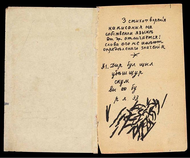
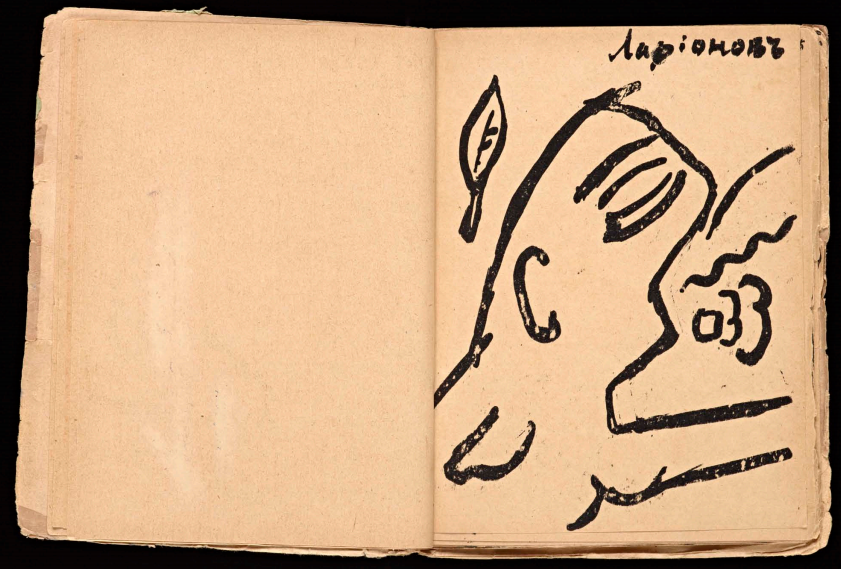
Kruchenykh, A. "Dyr bul shchyl," from Pomada (1913)
1 2017-02-23T10:50:44-08:00 Dexter Blackwell 92e005ca94195f836c6089cf147faff4c74fa79e 12041 14 First instance of non-referential language later called zaum, or "transrational" poetry, collaboratively designed with Mikhail Larionov, as simultaneous innovations in oral culture, visual abstraction, and book design plain 2017-05-24T12:53:44-07:00 Taylor Robinson aa08dd3939f1f1c6162c5518ae531385e51659afThis page has annotations:
- 1 2017-10-05T07:00:37-07:00 Christopher Gilman 1985b99a2acd541caa12a10c3ebf6896565283ab "Dyr bul shchyl..." Christopher Gilman 5 plain 2017-10-06T06:46:32-07:00 Christopher Gilman 1985b99a2acd541caa12a10c3ebf6896565283ab
- 1 2017-05-07T18:53:45-07:00 Taylor Robinson aa08dd3939f1f1c6162c5518ae531385e51659af Lines, abstracted from form Taylor Robinson 4 plain 2017-05-07T18:55:09-07:00 Taylor Robinson aa08dd3939f1f1c6162c5518ae531385e51659af
- 1 2017-02-23T11:21:14-08:00 Dexter Blackwell 92e005ca94195f836c6089cf147faff4c74fa79e This poem is the first of three in a series by Kruchenyk. Christopher Gilman 2 plain 2017-10-06T06:46:36-07:00 Christopher Gilman 1985b99a2acd541caa12a10c3ebf6896565283ab
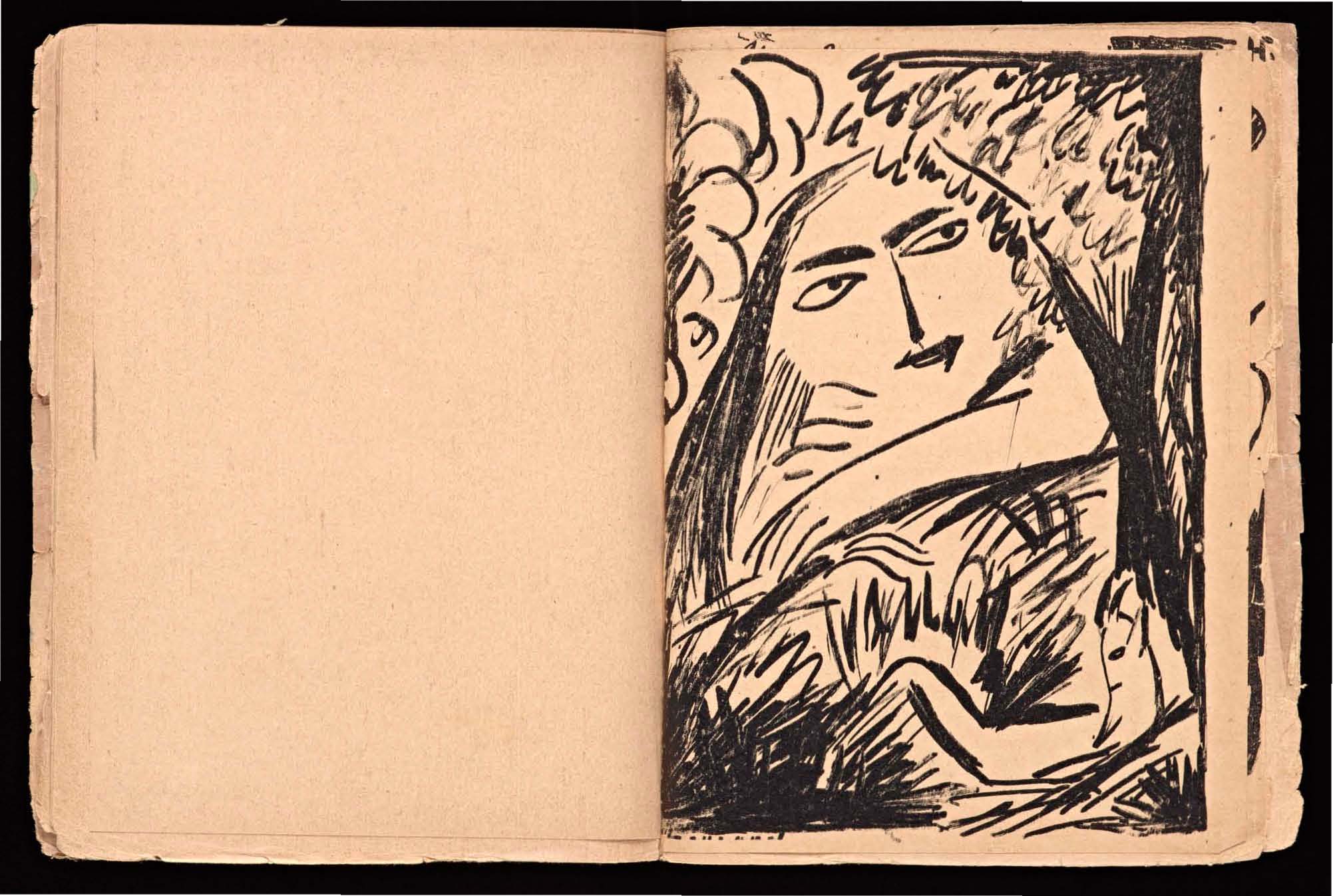
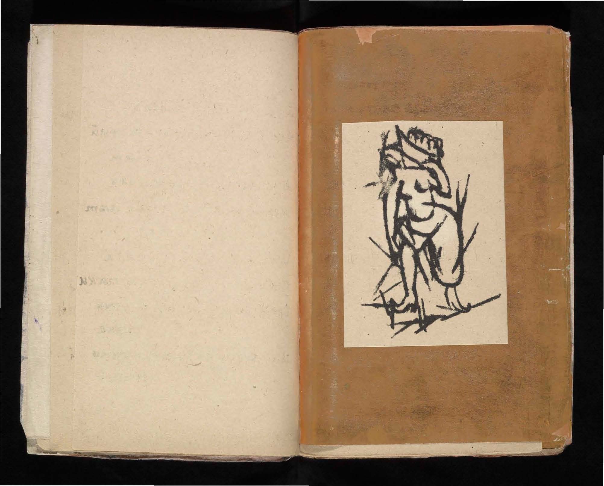
- 1 2017-02-23T11:20:38-08:00 Dexter Blackwell 92e005ca94195f836c6089cf147faff4c74fa79e Larionov's depiction of a female figure. Dexter Blackwell 1 plain 2017-02-23T11:20:38-08:00 Dexter Blackwell 92e005ca94195f836c6089cf147faff4c74fa79e
- 1 2017-02-23T11:12:00-08:00 Dexter Blackwell 92e005ca94195f836c6089cf147faff4c74fa79e In Russian, the vowel "ы" should not be used after certain consonants. Kruchenyk violates this rule with his Zaum language. Dexter Blackwell 1 plain 2017-02-23T11:12:01-08:00 Dexter Blackwell 92e005ca94195f836c6089cf147faff4c74fa79e
- 1 2017-02-23T11:15:07-08:00 Dexter Blackwell 92e005ca94195f836c6089cf147faff4c74fa79e The final line seemingly begins with individual letters. Or are they supposed to be words themselves? Dexter Blackwell 1 plain 2017-02-23T11:15:07-08:00 Dexter Blackwell 92e005ca94195f836c6089cf147faff4c74fa79e
- 1 2017-02-23T11:19:54-08:00 Dexter Blackwell 92e005ca94195f836c6089cf147faff4c74fa79e The whole poem goes back and forth between following the conventions of the Russian language, and then breaking it. Dexter Blackwell 1 plain 2017-02-23T11:19:54-08:00 Dexter Blackwell 92e005ca94195f836c6089cf147faff4c74fa79e
This page has tags:
- 1 2017-04-23T12:54:46-07:00 Christopher Gilman 1985b99a2acd541caa12a10c3ebf6896565283ab Big Bang: Timeline of Russian Avant-Garde Book Arts and Their Cultural Impacts Christopher Gilman 54 A Timeline of Russian Avant-Garde Book Arts and Their Cultural Impacts timeline 2017-05-03T07:19:11-07:00 Christopher Gilman 1985b99a2acd541caa12a10c3ebf6896565283ab
- 1 2017-03-01T14:14:13-08:00 Craig Dietrich 2d66800a3e5a1eaee3a9ca2f91f391c8a6893490 Timeline Craig Dietrich 2 timeline 2017-03-01T14:16:58-08:00 Craig Dietrich 2d66800a3e5a1eaee3a9ca2f91f391c8a6893490
This page is referenced by:
-
1
2017-04-13T11:07:32-07:00
The Tool and the Hand: Linearity in Non-Art
112
by R. Taylor Robinson
plain
2025-03-15T09:33:21-07:00
The Russian avant-garde of the early twentieth century developed out of the explosive period preceding and immediately following the Russian Bolshevik revolution. Emanating from the Russian Futurists of the 1910s and culminating in the Soviet realism of the 1930s, this movement spawned many influential figures. Among these artists was El Lissitzky, a constructivist whose career was characterized by an unmistakable venture from the world of art without social purpose into the world of design, marked by social efficacy. Lissitzky’s mentor and founder of the Suprematist art movement, Kazimir Malevich, remarkably opposed the postrevolutionary constructivist ideology of rendering social utility from art, despite his place at the origin of Constructivism itself. Distancing his art from its traditional place as merely a service to the state and church, he created art that existed by itself for itself, originating in a place of subjective feeling rather than objective utility, as with Constructivism. Additionally, Aleksandr Kruchenykh, a Russian Futurist and co-author of a series of art books, concerned himself primarily with laying bare the device, a term, representative of the movement to which he belonged, often used to describe the Futurists’ attempts to re-sensitize the reader through the defamiliarization of artistic and literary conventions. The bridge between these artists can be found through the examination of the line by itself, whether it be a line on a page or a line of text. The following text will explore this line as it appears throughout these early art movements of the Russian avant-garde, and how, through re-contextualization, the line becomes an artistic device to direct the viewer’s gaze. In the spirit of laying bare the device the artists of this time stripped away its facade and revealed to their audience the line as it is, the line as such. In the investigation of these lines a particular binary opposition emerges, concerning the way in which these lines were drawn, synthesis by hand or by intermediary mechanical tool.
The Gutenberg design is the well established convention of orienting lines of text on a page from left to right, top to bottom. When a custom becomes so ingrained in the social consciousness, expectations tend to overwrite minute discrepancies. In regards to the Gutenberg standard, all books and printed materials generally subscribe to this form, therefore the custom becomes the expectation. When this happens, convention takes over and any unique features are overlooked. This is extremely limiting to artists exploring the full expressive potential of their medium. As Janecek describes in Kruchenykh Contra Gutenberg, the Russian Futurists placed these conventions on display by de-standardizing these customs, namely the organization of lines of text on a page. A. Kruchenykh, a Russian Futurist, co-authored a series of art-books between 1912 and 1916 to do just that. In order to understand the methods they utilized in laying bare the device, the significance of the lines of text themselves must be understood. The Gutenberg design works because the lines of text direct the reader’s gaze; they guide the viewer’s eyes in order to create a linear narrative. So what happens when these lines of text are fragmented and distorted, when the reader is no longer able to rely purely on expectation for where to look next? The reader becomes aware of the device in use.
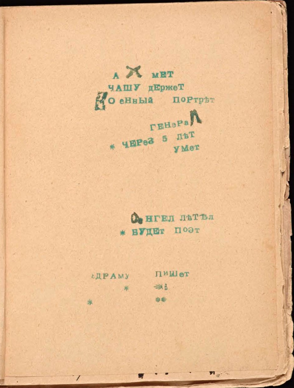
Roman Jakobson, in The Dominant, describes the concept of a Dominant within systems of values, arguing that any given system of values is defined by it. He explains this using the example of verse. “[Verse] possesses its own hierarchy of superior and inferior values and one leading value, the dominant, without which verse cannot be conceived and evaluated as verse.” (Jakobson, The Dominant, p42). The Dominant, he posits, is that which is the defining characteristic of a given system of values. What makes verse, verse? Many of the poems presented in the Futurist Art Books, poems such as “Axmet” by A. Kruchenykh, challenge Gutenbergian notions of page structure, revealing the Dominant. When the structures that organize lines of text on a page are put on exhibition, the question of what makes a book, a book, is raised. It is possible to look at these lines of text as examples of lines as such, lines which direct the reader's gaze around the page. In deviating from expectation by being written sporadically around the page, the lines in this poem call attention to the Gutenbergian organization of the page and lay bare the device; they force the reader to read the text in a new way, allowing them to see the page as a whole, rather than just an instance of a page in a standardized book.
The tool vs hand paradigm shows itself most clear in the lines which comprise the very letters on the page. The first salient feature one is drawn to when looking at “Akhmet,” is the series of out of place and irregular letters. Although they may seem to deviate from the line as defined above, It is still possible to investigate them as lines as such, for they still direct the reader’s gaze around the page. The gaze of the reader is guided from letter to letter. Making up the very structure of these handwritten capital letters, the line as such calls into question the standardization of each letter within a poem. Here the line as such is handwritten and imprecise. Juxtaposed to these handwritten capital letters, letters handprinted by a stamp are scattered throughout as well. These stamped letters call back to the Gutenberg standardization of letter type, but due to both their individual placement and the placement of the lines of text themselves, still manage to lay bare the device and call attention to the regularized Dominant of verse. The seemingly random positioning of the handwritten letters among the printed ones, guides the reader to an awareness of the standardization of letter type in the Gutenberg tradition.
In Mirskontsa, literally The World from the End, A. Kruchenykh's short story, generally referred to by its first line “i travelled for a long time” (Russian: я долго путешествовал, ya dolgo putyeshestvoval), presents a similar phenomenon, but on a different scale. Here, in what is likely Kruchenykh's handwriting, the mixed usage of handwritten letters in print, i.e., multiple individual lines creating a cohesive whole letter; and handwritten letters in script, i.e., one continuous line, the shape of which creates the letter. Although the piece as a whole takes on more Gutenbergian style, lines of text, left to right, top to bottom, what is specifically of note here is rather the text itself. There is no consistency throughout in terms of letter type. There are intermingled script letters and print letters, as well as capital letters and lowercase letters. Balancing this line between Gutenberg and non-traditional page structure is how Kruchenykh lays bare the device and in doing so, for the sake of examination, shines a light on the Dominant, the boundaries of what makes a book, a book, in these art books of early twentieth century Russia.
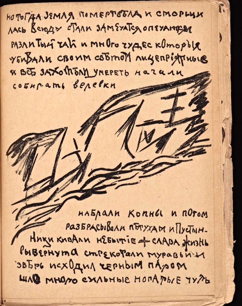
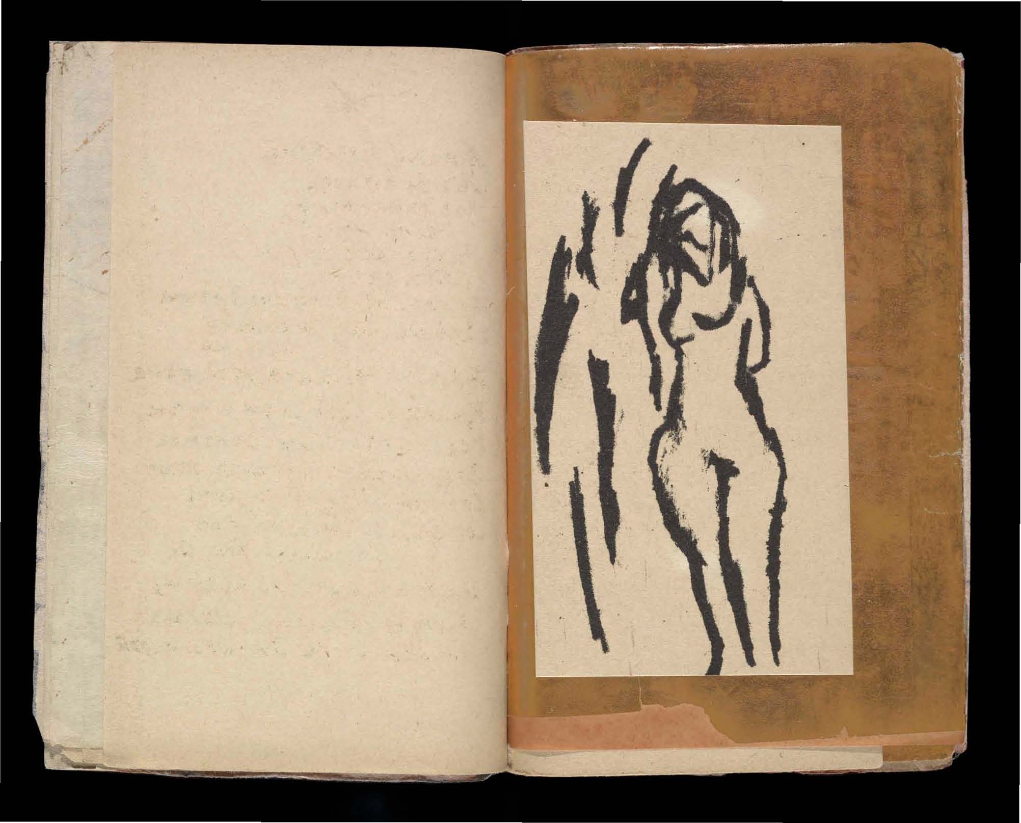
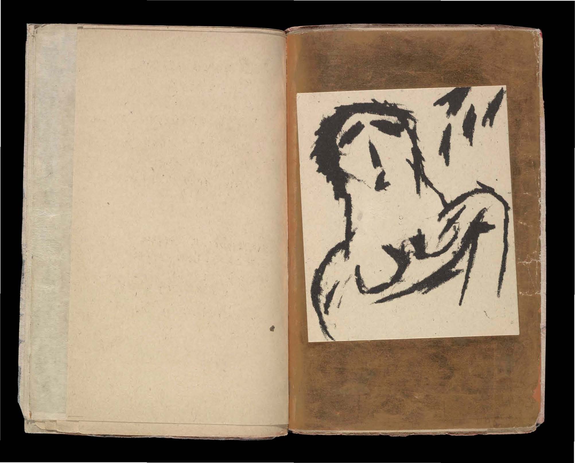
In addition to Kruchenykh’s non-Gutenbergian lines of text, included in the 1912-1916 art books are the lines of ayism was a style of art created by Mikhail Larionov, in which an image as a whole is constructed from lines, or "rays of light." These imprecise lines are not simply the outlines, or the components of some greater form, but rather from the imprecise messy tangle of these lines, a shape precipitates. Take Larionov's rayism drawing for Kruchenykh's "dyr bul shchyl." The lines at the bottom of the page are said to be a picture of a naked woman. Even knowing this, it is hard to see, but what is clear is Larionov’s attempt to elucidate the Dominant; figures are usually drawn by combining lines to create an outline or define the figure. Here, however, the lines are not part of the figure at all, but rather they are rays of light, that present the figure without representing it. Where previously convention dictated the use of lines as only to precisely outline a given form, Larionov centralizes imprecise lines, abstracted from the form. In his “dyr bul shchyl” illustration, Larionov also reimagines the function of illustrations which accompany text. As Janecek argues in Kruchenykh Contra Gutenberg, in refero;s illustrations within the Futurist art books, “The illustrations are not merely tied to the text—they develop and complete the poetic images or contrast with them.” (Janacek, Kruchenykh Contra Gutenberg, p45). This is another way that the art books lay bare the device. Previously, illustrations in books merely precisely and clearly reiterated the content of the text. However, in Larionov’s case this is not so. The imprecision of his Rayist illustrations and the ambiguity of what they depict causes the viewer to question the function of illustrations.
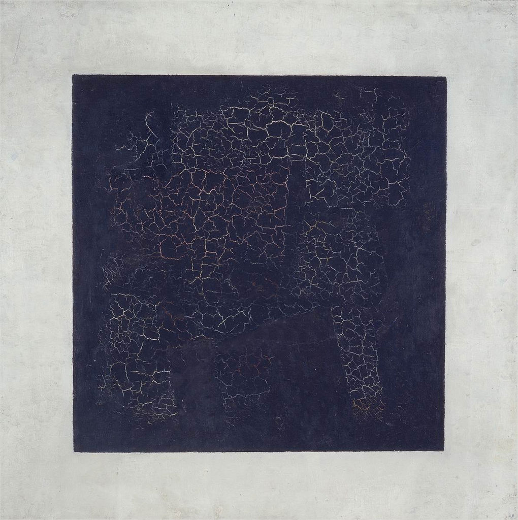
Kazimir Malevich reshaped the avant-garde art world by creating art from his own subjective experience, rather than the previous tradition of objective realism. Beginning with his most famous work, The Black Square, Malevich created the Suprematist art movement. He mentored many young artists who would go on to become Constructivists, a style which visually mimicked Suprematism and yet could not be more ideologically different. Suprematism took much from the art books of the Russian Futurists in that it made plain the utilities of regularity and reproducibility in a given medium. Instead of questioning Gutenberg's conventions, as the Futurists did, the Suprematist movement attempted to redefine the conventions of formal art. As Malevich himself described it in his Suprematist manifesto, The Non-Objective World: The Manifesto of Suprematism, “Art no longer cares to serve the state and religion, it no longer wishes to illustrate the history of manners, it wants to have nothing further to do with the object, as such, and believes that it can exist, in and for itself, without ‘things’ (that is, the ‘time-tested well-spring of life’).” (Malevich, The Non-Objective World: The Manifesto of Suprematism). Suprematist works were almost always a collection of basic abstract shapes; it was art by itself, for itself, and, departing from the more traditional artistic tenets of the time, it was intended to explore and abstract pure artistic feeling into the paintings themselves.
The Constructivist movement spawned out of Malevich’s exploration of subjectivity in art, and opposed it. Although within his corpus of work there is a notable lack of examples of lines as such, Malevich is worth mentioning because of his immense influence on the art world and more specifically on the progression of the Russian avant-garde. Many of Malevich's students went on to start the Constructivist movement, coinciding with the rise of Stalin and concerning itself with the creation of "non-art." Art, to them, had no social utility or value and therefore must be replaced by something that did. Therefore they developed utilitarian strategies of creating art that fit into structural organization of Soviet society. They shifted from Malevich's subjective art and its attempt to express artistic feeling, and much preferred the concept of design, design with social utility. Much of the work that the Constructivists created, juxtaposed against the crude drawings in the Futurist art books and the rough hand drawn nature that was characteristic of Malevich's Suprematism, was very precise, crafted with a compass or some other mechanical tool in order to be reproducible and usable by society at large. The Russian Avant-garde had come full circle.
In the volatile time immediately surrounding the Bolshevik Revolution, cultural ideologies shifted significantly, and especially so for the avant-garde artists of the time. This change affected the Constructivists as well. Desiring collectively to move away from traditionalist values and conceptions of art, the Constructivists moved towards accessibility and social utility. Beginning with creating "precise" art, that is, art which can be regularized, reproduced, their ideals eventually manifested into "non-art." Tired of traditional art centered around aestheticism, which they considered a Bourgeois luxury, the Constructivists adopted mechanical tools to create pieces that were reproducible and therefore had social utility, in order to distance themselves from the pre-revolutionary period. If the hand is unique and representative of the individual, by abstracting the art from the artist, by means of intermediary device, the tool becomes the collective. The tool is regularized, accessible, and reproducible.
With this regularization came the notable resurgence of the line as such, something markedly missing from Malevich's Suprematist works. In Malevich's work, such as in his Supremus No. 55, any and all lines only seem to be components and outlines of other shapes; they existed to define the contours of a greater form. There is a marked lack of the line as such. The lines here are also notably irregular, unique. They are imprecise, and therefore irreproducible, and to the Constructivist mindset, incapable of performing any social function and therefore superfluous.
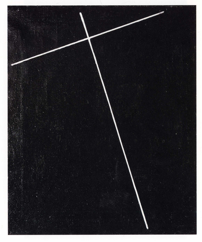
The precision and stark minimalism seen in the works of Malevich’s student Aleksandr Rodchenko, are quintessential features of the Constructivist ideology. In Rodchenko's pieces he plays with lines unaccompanied by shapes or other objects as with his peer El Lissitzky, who will be discussed below. The lines are as such, markedly alone on the page and usually contrasted on a bleak background. They draw in the gaze of the viewer along their lengths, the accuracy of the lines reminds one of the girders on a construction site. It is therefore very fitting that Rodchenko decided to name them his constructions. Rodchenko’s constructions, contrasted with Malevich’s Suprematist compositions, radically deviate in technique, made clear by the precision of the lines in addition to the very existence of a line as such by itself. Looking at Rodchenko's Construction No. 128, the most notable deviation from Suprematism is the lack of abstract shapes, like those present in Malevich's. While still overlapping with suprematism in its minimalism and abstraction, it is notably different from previous works within the genre. Important to note about these lines is that they expose the tool with which they were created, the device of the tool is made made visible. Their shapes are not unique, as with Malevich's, nor are they reproducible or regularized.
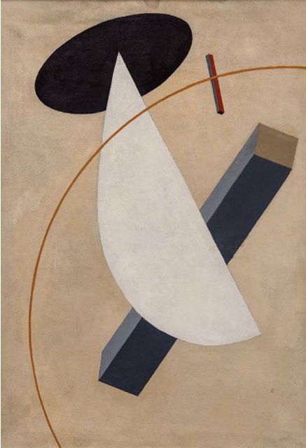
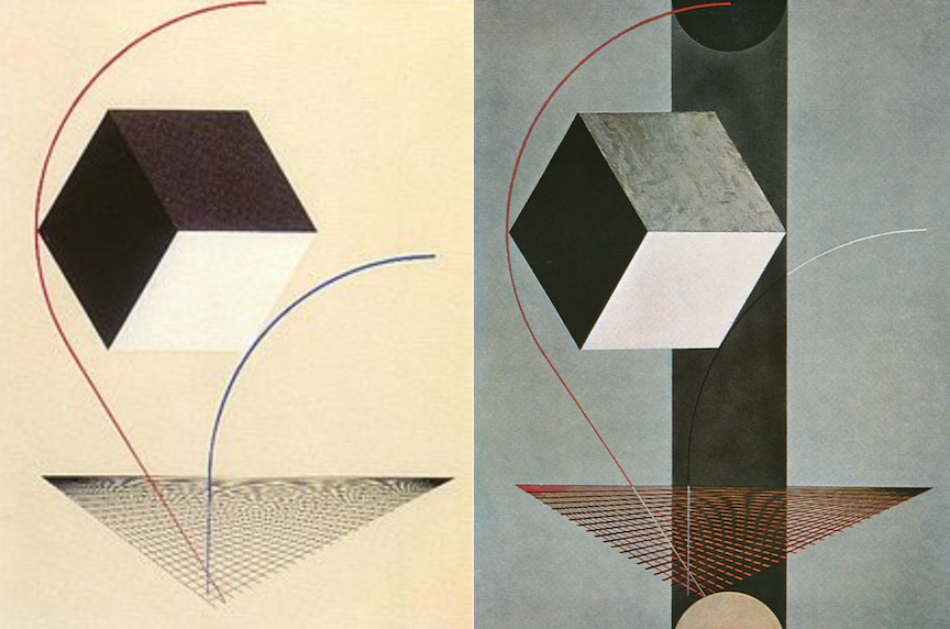
The lines of the Constructivists, as distinct from those of the Futurists and Suprematists, distanced themselves from aestheticism and played with the intersection of art and socially effective architecture. ts of Malevich, was El Lissitzky, whose early pieces, called Prouns, clearly called back to suprematism; Prouns were usually three-dimensional shapes on a white background, clearly reminiscent of suprematism. The shapes and more importantly lines, however, are significantly more precise here, laying bare the mechanical tools with which they were painted, i.e. compass. In Lissitzky's Proun Vrashchenie (rotation) the curvilinear line, as with "A Proun" and "Proun 99," which will be investigated below, orients the picture and ties the discrete parts into a cohesive whole. If the Constructivists' attempts to distance themselves from art as a solely aesthetic venture by incorporating standardization and reproducibility into their processes was not clear enough, then El Lissitzky laid bare his device, the compass, in his untitled piece.
Larionov, preferring the imprecision of handwriting, and Lissitzky, preferring precise lines, whose construction is aided by a mechanical tool in order to be both reproducible and regularized, utilized strikingly distinct techniques. However, the two have a lot more in common than one might imagine. They both repurposed the line in order to lay bare the conventions of their respective periods. In this piece by Larionov it is impossible to definitively say whether this shape is an ear, the Cyrillic letter "C" or both. In this case the imprecision of the line lends to its ambiguity and serves its purpose of dismantling specific signification. It makes the viewer aware of the Dominant of letter type (the suchness of a letter) and its distinctness from a any other line on the page. Lissitzky repurposes the line as well, however in a much different way. In these two pieces a cube is presented; the cube is actually three smaller and simpler geometric shapes, calling back to Malevich's Suprematism. Were the piece only composed of the grid and the cube, we may not even perceive the cube as a cube, but rather a collection of three 2D shapes. However, the two curvilinear lines situate the cube in three dimensional space by orienting the cube in terms of the grid. Here he uses Malevich's motif of two-dimensional shapes on a plain background. He modifies the technique by using the line as such and the aid of mechanical tools to situate the two-dimensional shapes in such a way that they become three-dimensional. Larionov and Lissitzky both use lines to and implement ambiguities within Dominant conventions in order to create multiple possible interpretations.
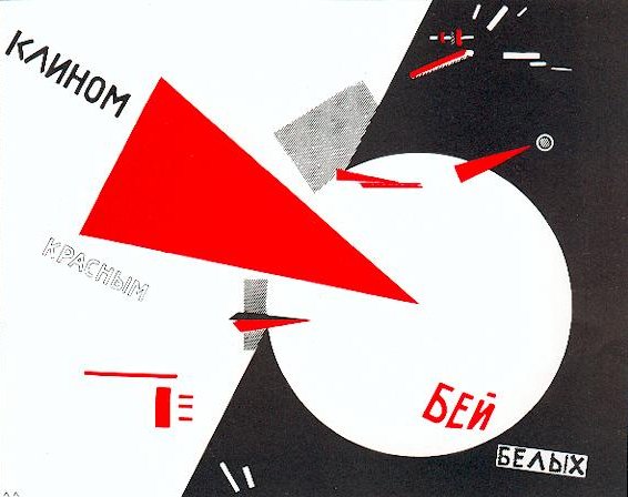
The Russian language in particular lends itself to the reordering of words, and subsequently the deconstruction of literary conventions. Unlike English, which determines syntax through a strict word order, Russian uses a complex case system to determine the parts of speech within a given sentence. This means there is little to no standardized word order in the Russian language. This is significant to the investigation of the line in that it allows for much more restructuring when laying bare the Gutenberg standard. This is perhaps why these art movements that de-standardized the structure of literature could only come from Russia. The Futurists utilized this in their poetry, structuring the page in ways that in some cases took the words completely “out of order,” without altering the reader’s ability to pull semantic meaning from it. In another piece by Lissitzky, this lack of word order is employed as well and the line of text is shattered. In his piece “strike the whites with the red wedge” (Russian: клином красном бей белых, klinom krasnom bej belykh), were the word order translated directly, the sentence would make no sense, “wedge red strike whites.” The path along which line as such guides the viewer’s gaze is ambiguous, it is completely interrupted and there is no definitive order in which to read the piece. However, because of the Russian case system, the sentence within the piece retains its semantic meaning, while also presenting the device explicitly, the Dominant for word organization on a page and the place of text within a painting.
In the Russian avant-garde of the early twentieth century, a pattern emerges of the revealing and examination of the line as such. This line appears in many different forms across many different movements. The Futurists utilized it to reimagine page structure. Kruchenykh brought the Gutenberg standard to light through his re-imagination of the standard page design and his de-regularization of letter type, complicating the relationship between handwriting and print. Larionov used it to redefine the function of illustrations through his Rayism. Rodchenko used the line as scaffolding, and regularized it through the use of tools within his constructions. Lissitzky’s brand of Constructivism played with the line as such to direct the viewer’s gaze in ways that opened each piece to interpretation. His precise linearity regularized art and created the Constructivist movement concerned mainly with design and social utility. The motif of the line as such within the early twentieth century Russian avant-garde ties together in a cohesive whole many, otherwise diametrically opposed ideologies. These artists laid bare the device, re-contextualized the line in each respective period, and defamiliarized artistic and literary conventions. They stripped clean the line of all excess, presenting is as it is, and, putting it on display, re-contextualized it to fit within their own styles. All that remained was the line by itself, the line as such. -
1
2017-04-17T10:03:48-07:00
BookENDS: A Working Theory of Textuality as Cultural Dominant, 1912-
55
An Introduction and Conclusion to a Semester's Investigation into the Book Arts as an Avant-garde Practice
plain
2018-08-29T00:01:18-07:00
Textuality and the Nullification of Dimension
This page marks both a beginning and an end. It is an introduction to the assignments, projects and resources contained in the project, as well as a summary of ideas that resulted from a semester's process of inquiry.
We began our course by considering two artifacts: Kazimir Malevich's "Black Square" (1915) and Aleksei Kruchenykh's first zaum ("transrational") poem "Dyr bul shchyl" (1913) Each is a well-recognized cultural monument in the history of modernism. The "Black Square," an unruly gesture in crudely simplified geometric form, redacts any referentiality with an overlay of thick, black, oil paint; "Dyr bul shchyl" (1913) upends language as such by substituting primordial sounds for poetry in lines scribbled hastily above a tangled thicket of an illustration. Malevich and Kruchenykh were friends and collaborators. The question was whether these two phenomena were parallel, loosely inspired by each other, or whether there was some more fundamental relationship between them, causal or otherwise.
Abstraction has been described as an idea. In a landmark 2012-13 exhibit at the Museum of Modern Art, "Inventing Abstraction, 1910-1925," Curator Leah Dickerman assembled works representing a trans-Atlantic network of artists and theorists, whose collective efforts and social connections, more than any individual discoveries of feats of genius, were responsible for the emergent realization of abstraction as a defining feature of 20th Century visual arts. If one accepts Dickerman's reasonable presupposition, that abstraction was an idea, a shared thought that could transcend any material or formal instance, then making the connection between zaum poetry and Suprematist painting becomes quite easy: each cultural practitioner in his/her/their own way grasped the notion as it spread through their social networks, and sought in the materials, forms and processes of their own media to achieve its realization.
This course in its investigations seeks a different route between artists of different disciplines, bypassing the transmission of ideas. It is inspired by a metaphor less compelling than Dickerman's social network diagram, but one that is, perhaps, more germane to the period under investigation. The goal here is to understand how a few, focused efforts by a very small number of cultural practitioners could effect a wholesale collapse and regeneration of socio-cultural communication by strategically (though perhaps not consciously) targeting the nerve center, the most central nexus point through which the most diverse modalities of expression and communication could travel.
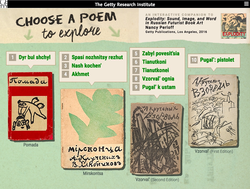
This approach to the general topic of modernity and abstraction has been greatly facilitated by another collection of artifacts, Explodity: Sound, Image, and Word in Russian Futurist Book Art (2016) a book publication by Curator Nancy Perloff of the Getty Research Institute, and accompanying interactive website and tagged materials in an online collection of Russian Futurist Books.
The scenario that emerges from inquiry is one of highly specific, almost accidental, contingencies of personal biography, idiosyncratic processes, and random found material that leverage, nevertheless, immense cultural processes to follow, because the changes occurred simultaneously on the orders of parole (speech) and langue (language). The efforts by the Russian Avant-garde to “emancipate” (words, sounds, meanings, objects, etc.) amounted to an explosion in meaning that reverberated indefinitely in emanating spherical waves in historical time and place, and impacted all things, however minutely, in its wake.
The metaphor of cultural explosion presents a much different set of tasks for researchers. Unlike a social network, which suggests a diffuse series of phenomena over time and space, the prospect of a singular moment or "big bang" event requires a reduction in time, scale, and scope, as well as material specificity as one approaches that occurrence. A period, such as 1910-1925, becomes less important than the compressed moments of late 1912 and early 1913. The global scale of cultural transmission, enabled by travel, publications, and new forms of communication, reduce to the effects of late-evening collaboration between a few people at a worktable creating irregular, limited-edition objects with their hands.Thesis: The Codex as Language and Image
The conclusion of our collaborative work is that a strong case for significant causal connection between the verbal and visual languages of "Dyr bul shchyl" and "Black Square" is to be found in the particular materiality of the "artist books" of the 1910s, especially in the collaborative products issued by Kruchenykh himself, working with many prominent artists and writers who went on, like Malevich, to gain fame and notoriety for their respective investigations in "abstraction." The impact of this work upon the visual arts was to displace mimetic representation and the predominant understanding of a picture frame since the Renaissance as a "window on the world" with a different operative metaphor of a canvas as a page, with characters instead of images, unmarked paper instead of implied space, and margins to distinguish between significant and insignificant areas for meaning.
To grasp the significance of this narrower interpretation of the Russian branch of modernism, one must take into account a number of important scholarly contributions over the past several decades on the specificities of written and printed language, as well as the material form of the codex itself as a kind of language, since its widespread distribution and acceptance after Gutenberg. -
1
2017-02-23T11:33:24-08:00
The 'Deliberate Woman/Nude' in MirsKONtsa (1912) and Pomada (1913)
33
Utopians Prospectus - Lewis
plain
2017-05-02T05:38:25-07:00
In their groundbreaking 1912 text, MirsKONtsa [WorldBACKwards], poets Aleksei Kruchenykh and Velimir Khlebnikov collaborated with painters Natalia Goncharova and Mikhail Larionov to produce a text towards the heart of linguistic 'meaning' through opening-up new possibilities within a literary-artistic item. These texts were unique for several reasons; primarily, though, their handmade quality and collaborative stylistic produced an entirely alternative model for the representation of language.
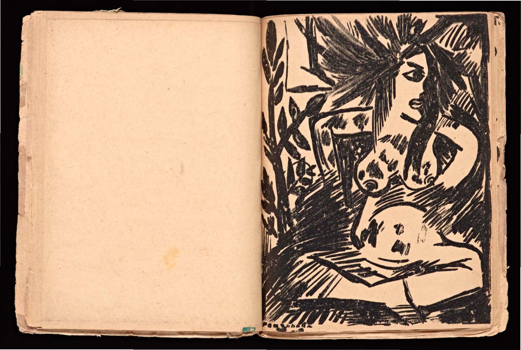
MirsKONtsa is noted for its odd drawings, multiple and diverse copies, and its use of zaum [transrational] poetry. However, MirsKONtsa, is also marked by a prevalence of oftentimes-nude female forms. Perhaps in keeping with the Neo-Primitivist tradition (Perloff 2) that existed within Russian Futurism, MirsKONsa is littered with images of the naked woman. The figures in MirsKONtsa are notable in three thematics: Firstly, the female figures across the images do not look directly out at the reader-- their glances are slanted or attending some other image; Secondly, there is a repeated presentation of the 'woman' with the 'natural' and the 'woman' and the 'supernatural/angelic'; and Thirdly, there are no figures with openly observable genitals, the only deliberate nudity is in the presentation of bare breasts.
What is interesting is the occasion for what I will call the 'deliberate nude/woman' in MirsKONtsa. This 'deliberate nude/woman' is noted as such because the existence of such a figure in a work that seeks to come to the limit/rule of sound-images necessarily must fit in the system. Initial insights about a 'worldbackwards' represented through a tetrad of artists center on the linkage between a naive eroticism--one that barely even attempts to call the reader into seduction, let alone sexual fervor--and sound. Following this linkage, the consideration of the sound of the sensual-- especially as it relates to the natural and the supernatural-- becomes ground for analysis. Further questions on these images lead into the deeper intentions of the artists. One of the first obvious questions is simply, who painted these women-figures? Was it Natalia Goncharova or her late-in-life husband Mikhail Larionov? Was the Dryad painted in collaboration with the poetic text, or does the figure exist in complete distinctness from language?
MirsKONtsa is not the only book of zaum poetry to feature nude women. In Kruchenykh and Larionov's 1913 Pomada [Pomade], the nude woman is again a unique figured occasion in the text. However, the women of Pomada are not as deliberately visible as they are in MirsKONtsa. In the famous poem-painting 'dyr bul shchyl,' there is a nude woman hidden in what simply appears to be scratch marks and scribblings on the page. This nude is the only figure in either MirsKONtsa and Pomada to seemingly expose their genitals. It is notable that in alternative versions of 'dyr bul shchyl,' Kruchenykh's soon-to-be wife Olga Rozanova altered the image of the nude woman to produce an image seemingly more in line with female representations in MirsKONtsa. Later on in the Pomada and in contrast to the "urban prostitutes" (Perloff 75) 'dyr bul shchyl,' a peasant woman with her breasts exposed carries a basket or some other burden. As Pomada lengthens the image of the woman-as-figure becomes more oblique and it begins to discern the sex of the figure at all. In the final image of what appears to be a woman figure, the defining motif of these female nude becomes itself obscured. Is this figure-in-horror exposing their breasts, or do they raise their arm to their chest in quiet exclamation?
Citations:
Perloff, N. (2016). Explodity: Sound, Image, and Word in Russian Futurist Book Art. Los Angeles, CA: The Getty Research Institute, Los Angeles. 2, 74-75.
-
1
2017-02-23T10:18:50-08:00
Finding Meaning from Zaum
16
Utopians, Prospectus - Blackwell
plain
2017-03-14T10:47:57-07:00
How does Kruchenyk's Zaum language relate to the rules of Russian? How can we extract meaning from certain characteristics of this work?
Kruchenyk's poem, as stated by the author, is written in the Zaum language, rather than Russian. Zaum, which roughly translates to "beyond the mind," fills the poem with entirely nonsensical words. In writing this piece, Kruchenyk alternates between following certain conventions of Russian, yet at the same time breaking them through his Zaum language.
In constructing the words of the piece, Kruchenyk generally sticks to the rules of Russian. However, while both "dyr" and "bul" follow the phonological patterns of Russian, but the last word of the line, "schul," does not. After a certain set of seven consonants, the vowel "И" should be used instead of "Ы."
The final line, "р л эз" is also worthy of discussion. If we understand the constituents of this line to be simply letters, then the poem seems to break down from more complex constructions to its individual parts. However, the inclusion of "эз" makes this difficult to corroborate. On the contrary, we could perceive these three to be words themselves. I choose the latter, and see this poem as an exercise in demonstrating the possibilities of the Zaum language. The sounds are more important than the printed letters.
What seems to be scribbles underneath the poem is actually Mikhail Larionov's depiction of a nude woman, a contemporary of Aleksei Kruchenyk. Similar to the construction of the poem, Larionov's creation purposefully distances itself from the conventional process of drawing and artistry.
Starting from the top, we transition from language as we know it, to dabbling in Zaum, to Zaum in artistry. The three components of the page work together to mark this transition into the practice of the Zaum language. The notion of a grammar and a lexicon is what makes the opening statement differ from the poem. I believe that Kruchenyk, unknowingly, is trying to challenge this notion through this piece.