The Tool and the Hand: Linearity in Non-Art
The Gutenberg design is the well established convention of orienting lines of text on a page from left to right, top to bottom. When a custom becomes so ingrained in the social consciousness, expectations tend to overwrite minute discrepancies. In regards to the Gutenberg standard, all books and printed materials generally subscribe to this form, therefore the custom becomes the expectation. When this happens, convention takes over and any unique features are overlooked. This is extremely limiting to artists exploring the full expressive potential of their medium. As Janecek describes in Kruchenykh Contra Gutenberg, the Russian Futurists placed these conventions on display by de-standardizing these customs, namely the organization of lines of text on a page. A. Kruchenykh, a Russian Futurist, co-authored a series of art-books between 1912 and 1916 to do just that. In order to understand the methods they utilized in laying bare the device, the significance of the lines of text themselves must be understood. The Gutenberg design works because the lines of text direct the reader’s gaze; they guide the viewer’s eyes in order to create a linear narrative. So what happens when these lines of text are fragmented and distorted, when the reader is no longer able to rely purely on expectation for where to look next? The reader becomes aware of the device in use.
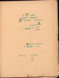
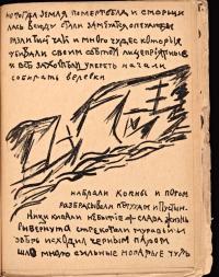
Roman Jakobson, in The Dominant, describes the concept of a Dominant within systems of values, arguing that any given system of values is defined by it. He explains this using the example of verse. “[Verse] possesses its own hierarchy of superior and inferior values and one leading value, the dominant, without which verse cannot be conceived and evaluated as verse.” (Jakobson, The Dominant, p42). The Dominant, he posits, is that which is the defining characteristic of a given system of values. What makes verse, verse? Many of the poems presented in the Futurist Art Books, poems such as “Axmet” by A. Kruchenykh, challenge Gutenbergian notions of page structure, revealing the Dominant. When the structures that organize lines of text on a page are put on exhibition, the question of what makes a book, a book, is raised. It is possible to look at these lines of text as examples of lines as such, lines which direct the reader's gaze around the page. In deviating from expectation by being written sporadically around the page, the lines in this poem call attention to the Gutenbergian organization of the page and lay bare the device; they force the reader to read the text in a new way, allowing them to see the page as a whole, rather than just an instance of a page in a standardized book.
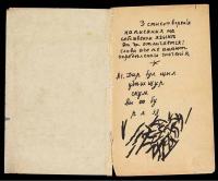
The tool vs hand paradigm shows itself most clear in the lines which comprise the very letters on the page. The first salient feature one is drawn to when looking at “Akhmet,” is the series of out of place and irregular letters. Although they may seem to deviate from the line as defined above, It is still possible to investigate them as lines as such, for they still direct the reader’s gaze around the page. The gaze of the reader is guided from letter to letter. Making up the very structure of these handwritten capital letters, the line as such calls into question the standardization of each letter within a poem. Here the line as such is handwritten and imprecise. Juxtaposed to these handwritten capital letters, letters handprinted by a stamp are scattered throughout as well. These stamped letters call back to the Gutenberg standardization of letter type, but due to both their individual placement and the placement of the lines of text themselves, still manage to lay bare the device and call attention to the regularized Dominant of verse. The seemingly random positioning of the handwritten letters among the printed ones, guides the reader to an awareness of the standardization of letter type in the Gutenberg tradition.
In Mirskontsa, literally The World from the End, A. Kruchenykh's short story, generally referred to by its first line “i travelled for a long time” (Russian: я долго путешествовал, ya dolgo putyeshestvoval), presents a similar phenomenon, but on a different scale. Here, in what is likely Kruchenykh's handwriting, the mixed usage of handwritten letters in print, i.e., multiple individual lines creating a cohesive whole letter; and handwritten letters in script, i.e., one continuous line, the shape of which creates the letter. Although the piece as a whole takes on more Gutenbergian style, lines of text, left to right, top to bottom, what is specifically of note here is rather the text itself. There is no consistency throughout in terms of letter type. There are intermingled script letters and print letters, as well as capital letters and lowercase letters. Balancing this line between Gutenberg and non-traditional page structure is how Kruchenykh lays bare the device and in doing so, for the sake of examination, shines a light on the Dominant, the boundaries of what makes a book, a book, in these art books of early twentieth century Russia.
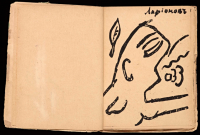
In addition to Kruchenykh’s non-Gutenbergian lines of text, included in the 1912-1916 art books are the lines of ayism was a style of art created by Mikhail Larionov, in which an image as a whole is constructed from lines, or "rays of light." These imprecise lines are not simply the outlines, or the components of some greater form, but rather from the imprecise messy tangle of these lines, a shape precipitates. Take Larionov's rayism drawing for Kruchenykh's "dyr bul shchyl." The lines at the bottom of the page are said to be a picture of a naked woman. Even knowing this, it is hard to see, but what is clear is Larionov’s attempt to elucidate the Dominant; figures are usually drawn by combining lines to create an outline or define the figure. Here, however, the lines are not part of the figure at all, but rather they are rays of light, that present the figure without representing it. Where previously convention dictated the use of lines as only to precisely outline a given form, Larionov centralizes imprecise lines, abstracted from the form. In his “dyr bul shchyl” illustration, Larionov also reimagines the function of illustrations which accompany text. As Janecek argues in Kruchenykh Contra Gutenberg, in refero;s illustrations within the Futurist art books, “The illustrations are not merely tied to the text—they develop and complete the poetic images or contrast with them.” (Janacek, Kruchenykh Contra Gutenberg, p45). This is another way that the art books lay bare the device. Previously, illustrations in books merely precisely and clearly reiterated the content of the text. However, in Larionov’s case this is not so. The imprecision of his Rayist illustrations and the ambiguity of what they depict causes the viewer to question the function of illustrations.
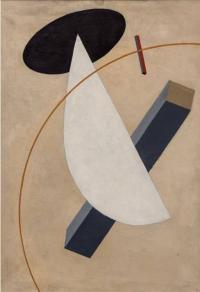
Kazimir Malevich reshaped the avant-garde art world by creating art from his own subjective experience, rather than the previous tradition of objective realism. Beginning with his most famous work, The Black Square, Malevich created the Suprematist art movement. He mentored many young artists who would go on to become Constructivists, a style which visually mimicked Suprematism and yet could not be more ideologically different. Suprematism took much from the art books of the Russian Futurists in that it made plain the utilities of regularity and reproducibility in a given medium. Instead of questioning Gutenberg's conventions, as the Futurists did, the Suprematist movement attempted to redefine the conventions of formal art. As Malevich himself described it in his Suprematist manifesto, The Non-Objective World: The Manifesto of Suprematism, “Art no longer cares to serve the state and religion, it no longer wishes to illustrate the history of manners, it wants to have nothing further to do with the object, as such, and believes that it can exist, in and for itself, without ‘things’ (that is, the ‘time-tested well-spring of life’).” (Malevich, The Non-Objective World: The Manifesto of Suprematism). Suprematist works were almost always a collection of basic abstract shapes; it was art by itself, for itself, and, departing from the more traditional artistic tenets of the time, it was intended to explore and abstract pure artistic feeling into the paintings themselves.
The Constructivist movement spawned out of Malevich’s exploration of subjectivity in art, and opposed it. Although within his corpus of work there is a notable lack of examples of lines as such, Malevich is worth mentioning because of his immense influence on the art world and more specifically on the progression of the Russian avant-garde. Many of Malevich's students went on to start the Constructivist movement, coinciding with the rise of Stalin and concerning itself with the creation of "non-art." Art, to them, had no social utility or value and therefore must be replaced by something that did. Therefore they developed utilitarian strategies of creating art that fit into structural organization of Soviet society. They shifted from Malevich's subjective art and its attempt to express artistic feeling, and much preferred the concept of design, design with social utility. Much of the work that the Constructivists created, juxtaposed against the crude drawings in the Futurist art books and the rough hand drawn nature that was characteristic of Malevich's Suprematism, was very precise, crafted with a compass or some other mechanical tool in order to be reproducible and usable by society at large. The Russian Avant-garde had come full circle.
In the volatile time immediately surrounding the Bolshevik Revolution, cultural ideologies shifted significantly, and especially so for the avant-garde artists of the time. This change affected the Constructivists as well. Desiring collectively to move away from traditionalist values and conceptions of art, the Constructivists moved towards accessibility and social utility. Beginning with creating "precise" art, that is, art which can be regularized, reproduced, their ideals eventually manifested into "non-art." Tired of traditional art centered around aestheticism, which they considered a Bourgeois luxury, the Constructivists adopted mechanical tools to create pieces that were reproducible and therefore had social utility, in order to distance themselves from the pre-revolutionary period. If the hand is unique and representative of the individual, by abstracting the art from the artist, by means of intermediary device, the tool becomes the collective. The tool is regularized, accessible, and reproducible.
With this regularization came the notable resurgence of the line as such, something markedly missing from Malevich's Suprematist works. In Malevich's work, such as in his Supremus No. 55, any and all lines only seem to be components and outlines of other shapes; they existed to define the contours of a greater form. There is a marked lack of the line as such. The lines here are also notably irregular, unique. They are imprecise, and therefore irreproducible, and to the Constructivist mindset, incapable of performing any social function and therefore superfluous.
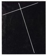
The precision and stark minimalism seen in the works of Malevich’s student Aleksandr Rodchenko, are quintessential features of the Constructivist ideology. In Rodchenko's pieces he plays with lines unaccompanied by shapes or other objects as with his peer El Lissitzky, who will be discussed below. The lines are as such, markedly alone on the page and usually contrasted on a bleak background. They draw in the gaze of the viewer along their lengths, the accuracy of the lines reminds one of the girders on a construction site. It is therefore very fitting that Rodchenko decided to name them his constructions. Rodchenko’s constructions, contrasted with Malevich’s Suprematist compositions, radically deviate in technique, made clear by the precision of the lines in addition to the very existence of a line as such by itself. Looking at Rodchenko's Construction No. 128, the most notable deviation from Suprematism is the lack of abstract shapes, like those present in Malevich's. While still overlapping with suprematism in its minimalism and abstraction, it is notably different from previous works within the genre. Important to note about these lines is that they expose the tool with which they were created, the device of the tool is made made visible. Their shapes are not unique, as with Malevich's, nor are they reproducible or regularized.
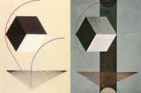
The lines of the Constructivists, as distinct from those of the Futurists and Suprematists, distanced themselves from aestheticism and played with the intersection of art and socially effective architecture. ts of Malevich, was El Lissitzky, whose early pieces, called Prouns, clearly called back to suprematism; Prouns were usually three-dimensional shapes on a white background, clearly reminiscent of suprematism. The shapes and more importantly lines, however, are significantly more precise here, laying bare the mechanical tools with which they were painted, i.e. compass. In Lissitzky's Proun Vrashchenie (rotation) the curvilinear line, as with "A Proun" and "Proun 99," which will be investigated below, orients the picture and ties the discrete parts into a cohesive whole. If the Constructivists' attempts to distance themselves from art as a solely aesthetic venture by incorporating standardization and reproducibility into their processes was not clear enough, then El Lissitzky laid bare his device, the compass, in his untitled piece.
Larionov, preferring the imprecision of handwriting, and Lissitzky, preferring precise lines, whose construction is aided by a mechanical tool in order to be both reproducible and regularized, utilized strikingly distinct techniques. However, the two have a lot more in common than one might imagine. They both repurposed the line in order to lay bare the conventions of their respective periods. In this piece by Larionov it is impossible to definitively say whether this shape is an ear, the Cyrillic letter "C" or both. In this case the imprecision of the line lends to its ambiguity and serves its purpose of dismantling specific signification. It makes the viewer aware of the Dominant of letter type (the suchness of a letter) and its distinctness from a any other line on the page. Lissitzky repurposes the line as well, however in a much different way. In these two pieces a cube is presented; the cube is actually three smaller and simpler geometric shapes, calling back to Malevich's Suprematism. Were the piece only composed of the grid and the cube, we may not even perceive the cube as a cube, but rather a collection of three 2D shapes. However, the two curvilinear lines situate the cube in three dimensional space by orienting the cube in terms of the grid. Here he uses Malevich's motif of two-dimensional shapes on a plain background. He modifies the technique by using the line as such and the aid of mechanical tools to situate the two-dimensional shapes in such a way that they become three-dimensional. Larionov and Lissitzky both use lines to and implement ambiguities within Dominant conventions in order to create multiple possible interpretations.
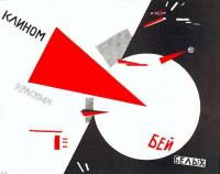
The Russian language in particular lends itself to the reordering of words, and subsequently the deconstruction of literary conventions. Unlike English, which determines syntax through a strict word order, Russian uses a complex case system to determine the parts of speech within a given sentence. This means there is little to no standardized word order in the Russian language. This is significant to the investigation of the line in that it allows for much more restructuring when laying bare the Gutenberg standard. This is perhaps why these art movements that de-standardized the structure of literature could only come from Russia. The Futurists utilized this in their poetry, structuring the page in ways that in some cases took the words completely “out of order,” without altering the reader’s ability to pull semantic meaning from it. In another piece by Lissitzky, this lack of word order is employed as well and the line of text is shattered. In his piece “strike the whites with the red wedge” (Russian: клином красном бей белых, klinom krasnom bej belykh), were the word order translated directly, the sentence would make no sense, “wedge red strike whites.” The path along which line as such guides the viewer’s gaze is ambiguous, it is completely interrupted and there is no definitive order in which to read the piece. However, because of the Russian case system, the sentence within the piece retains its semantic meaning, while also presenting the device explicitly, the Dominant for word organization on a page and the place of text within a painting.
In the Russian avant-garde of the early twentieth century, a pattern emerges of the revealing and examination of the line as such. This line appears in many different forms across many different movements. The Futurists utilized it to reimagine page structure. Kruchenykh brought the Gutenberg standard to light through his re-imagination of the standard page design and his de-regularization of letter type, complicating the relationship between handwriting and print. Larionov used it to redefine the function of illustrations through his Rayism. Rodchenko used the line as scaffolding, and regularized it through the use of tools within his constructions. Lissitzky’s brand of Constructivism played with the line as such to direct the viewer’s gaze in ways that opened each piece to interpretation. His precise linearity regularized art and created the Constructivist movement concerned mainly with design and social utility. The motif of the line as such within the early twentieth century Russian avant-garde ties together in a cohesive whole many, otherwise diametrically opposed ideologies. These artists laid bare the device, re-contextualized the line in each respective period, and defamiliarized artistic and literary conventions. They stripped clean the line of all excess, presenting is as it is, and, putting it on display, re-contextualized it to fit within their own styles. All that remained was the line by itself, the line as such.
This page has paths:
- Book Case Studies Christopher Gilman
This page references:
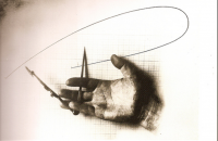
- Untitled (Photo of hand w/ compass)
- Kruchenykh, A. "Dyr bul shchyl," from Pomada (1913)
- el Lissitzky. PROUN vrashchenie (PROUN of Rotation), 1919
- Larionov, Mikhail. Illustration from MirsKONtsa (WorldBACKwards), 1912
- A Proun and Proun 99
- Suprematism
- Construction No. 128
- Mirskontsa - Akhmet poem
- Mirskontsa - Kruchyenykh's short story
- Strike the Whites with the Red Wedge (Russian: клином красным бей белых)