Thanks for your patience during our recent outage at scalar.usc.edu. While Scalar content is loading normally now, saving is still slow, and Scalar's 'additional metadata' features have been disabled, which may interfere with features like timelines and maps that depend on metadata. This also means that saving a page or media item will remove its additional metadata. If this occurs, you can use the 'All versions' link at the bottom of the page to restore the earlier version. We are continuing to troubleshoot, and will provide further updates as needed. Note that this only affects Scalar projects at scalar.usc.edu, and not those hosted elsewhere.
Unpinning History: Japanese Posters in the Age of Commercialism, Imperialism, and ModernismMain MenuIntroductionJapan in the Age of Commercialism, Imperialism, and ModernismThe Rise of Tourism and the Era of Ocean LinersThe Rise of Tourism and the Development of Railway NetworksProvocation of Citizenship: Posters for the Ministry of CommunicationsExhibition CultureBijin: Posters with a Beautiful WomanArrival of Modern Commercial DesignBibliographyCollection NoteReuse and Remix this Exhibition
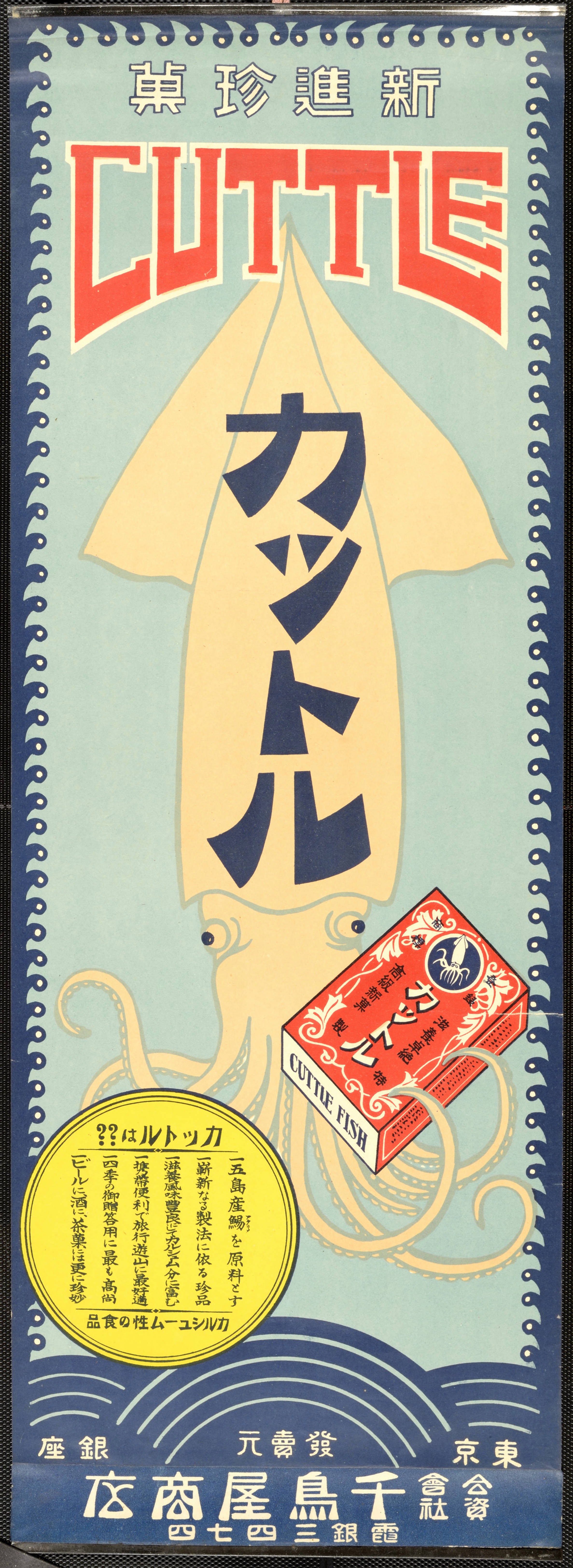
12020-04-29T14:29:36-07:00Anne-Marie Maxwell326ac6eff123bb3f77fb517c66299be8b435b4793714010plain2020-11-17T14:44:15-08:00Tyson Gaskill93cb401bee8f73160b4c4378060de7643c42eee9Kattoru is a poster-ad which the Chidori-ya company employed to rebrand dried cuttlefish, a traditional Japanese delicacy, into a new, modern snack. Kattoru appealed to the emerging young and Western-centric moga (modern girls) and mobo (modern boys) who strayed away from tradition. One tactic Chidori-ya employed was a bright red English “CUTTLE” header. The idea was for a passersby to read the English, associate the traditional product with the West, and redefine the product’s “Japaneseness.” The same red print also matches the red snack packaging the cuttlefish is holding, which uncoincidentally, was designed to look like a popular boxed Morinaga milk caramel (to appeal to children) as well as a cigarette box (to mirror the growing interest in smoking amongst moga and mobo). Similarly, the blue graphic Kattoru characters are a fun revamped version of traditional more block-like katakana script. Then, the yellow emblem, which especially stands out against the opposite-colored blue background, further supports moga and mobo’s “rebellious” lifestyle. It advertises that the “modern” snack pairs well with a night out drinking—another reason why some older, conservative people found moga and mobo to be “degenerative.” However, the same emblem also promotes the nutritional value, presumably for children, and claims how good the snack goes with tea, possibly for an older audience. Thus, this poster may look modern, but Chidori-ya makes sure to subtly think of their other audience—primarily, older people and families. Ultimately, the Kattoru poster represents a larger societal dilemma between modernity and tradition. (Kelli Reitzfeld)
Contents of this tag:
12020-04-10T14:49:25-07:00Anne-Marie Maxwell326ac6eff123bb3f77fb517c66299be8b435b479Arrival of Modern Commercial Design29image_header2020-11-17T14:42:53-08:00Tyson Gaskill93cb401bee8f73160b4c4378060de7643c42eee9