Thanks for your patience during our recent outage at scalar.usc.edu. While Scalar content is loading normally now, saving is still slow, and Scalar's 'additional metadata' features have been disabled, which may interfere with features like timelines and maps that depend on metadata. This also means that saving a page or media item will remove its additional metadata. If this occurs, you can use the 'All versions' link at the bottom of the page to restore the earlier version. We are continuing to troubleshoot, and will provide further updates as needed. Note that this only affects Scalar projects at scalar.usc.edu, and not those hosted elsewhere.
The Promise and Practice of Teaching Data Literacy in Social Studies: A Companion SiteMain MenuA Taxonomy of Data VisualizationsInformation can be visualized in multiple ways, from bar graphs to scatterplots, choropleth maps to distribution maps, timelines to time series. Designers can choose from an array of graphical elements such as points, lines, or icons used to represent data, and multiple aesthetic attributes such as color, shape, and size. Furthermore, designers can apply multiple combinations of titles, legends, and explanatory text to provide context for a data visualization. Given the almost dizzying array of data visualizations students may encounter in social studies, it is helpful to place them in categories related to the types of questions they will help us answer.Data Visualizations as Primary SourcesHumans have been creating different types of data visualizations for centuries. Explore this collection of timelines, maps, graphs and charts to see what they reveal about the historical time and place in which they were produced.How do students learn with data visualizations?Reading data visualizations in print and online social studies texts can improve students' overall comprehension and quality of reasoning. And there is evidence to suggest that reading data visualizations helps students better understand historical and geographic context, multiple causation, and change over time — all important concepts for students to grasp in social studies subject areas. However, students may face significant challenges in trying to make sense of different kinds of data visualizations. This section provides insight into both benefits and challenges of reading timelines, maps, and graphs and charts.How should students analyze data visualizations in social studies?The challenges that data visualizations present, coupled with their prevalence in social studies texts, standardized assessments, in online social studies resources, and as sources of information in society, suggest that teaching with and about data visualizations in social studies is essential. This module provides guidance for how teachers can support students' data literacy for social studies.How do I help students create and integrate data visualizations for social studies?This page highlights several tools that are useful for data-based projects in social studies. And accompanying each tool is a "minimal manual" that provides guidance for using the tool in social studies inquiry- and project-based learning.Project-Based Learning Activities for Data Literacy in Social StudiesLorem ipsum dolor sit amet, nec constituto comprehensam te. Sea no affert nemore comprehensam, eum te purto soleat accusata. Ea est magna malis. No atqui iudico est. In vel propriae suavitate. Est homero timeam cu, novum persecuti mea an.Index of Lesson PlansThis page contains a list of the minimal manuals and lessons found on this website. Minimal manuals are designed to be adapted to different grade levels and do not have a grade designation associated with them. Lesson plans are organized according to the school level for which they are designed. However, many of these lessons can be adapted for different grade levels.Tamara Shreiner72eaa2d1ba1352b75b8a8da73e879a4ceb510ae0
Temporal Data Visualizations
1media/1690049.jpg2020-07-21T13:06:39-07:00Tamara Shreiner72eaa2d1ba1352b75b8a8da73e879a4ceb510ae03513322Temporal data visualizations help us answer "when" questions. They allow us to visualize when events occurred and how they are temporally related to when other events occurred. They help us understand the sequence and duration of events, how events overlapped or were separated in time, and how things may have changed or remained continuous over time.plain2020-09-08T10:52:46-07:00Tamara Shreiner72eaa2d1ba1352b75b8a8da73e879a4ceb510ae0Time is a mysterious and elusive concept. Time passes, and is gone. It moves quickly and slowly. We measure it by the movement of the Earth, the passing of sands through an hourglass, the steady shifting of gears, the frequency of microwaves, the decay of elements -- and by our own "sense." It is difficult to grasp, and therefore essential to visually display.
All temporal data visualizations serve one basic purpose — to show data over time. They allow us to visualize when events occurred and how they are temporally related to when other events occurred. They help us understand the sequence and duration of events, how events overlapped or were separated in time, and how things may have changed or remained continuous over time.
Timelines are probably the most common type of temporal data visualization in social studies, particularly in history. While you might not typically think of timelines as a data visualizations, temporal points on a timeline are, in fact, data points. These data points provide more or less precise information about when and how long an event occurred, as well as information about the sequence with which multiple events occurred.
But there are other temporal data visualizations we commonly use in social studies education as well. As you'll see along the right side of this page, there are various kinds of graphs and charts that show us patterns in data over time, helping us spot trends, anomalies, shifts, and periods of stability that give us insight into change and continuity — a fundamental aspect of historical thinking.
The following sections provide an overview of the different functions temporal data visualizations can serve.
Chronology All temporal data visualizations display chronology. They provide information about a sequence of historical events or other variables in the order by which they occurred. By layering data, they can also provide information about concurrence, or when events were happening at the same time. Units of time on a temporal data visualization can differ drastically, from seconds to millennia, and it's important to pay attention to timeframe over which events, quantities, and other data points are sequenced. Timelines are perhaps most readily associated with the function of chronology, but other temporal visualizations, which use time as a framework for other data, such as time series and line graphs, also display chronology. In fact, as discussed in the section on misleading data visualizations, it would be a gross misrepresentation of data to organize points of time on a graph's axis out of chronological order. In modern society, most people take chronology -- factual information about when and in what sequence something occurred -- for granted. But, in fact, assembling chronologies has been and continues to be a challenging human endeavor. Just think about popular crime shows that revolve around detectives trying to figure who was where when, and doing what. Even trying to sequence events in our own lives can seem like a riddle. Because time is such an amorphous concept, the way that people from modern Western cultures typically display a sequence of events in time, on a straight line, is not the only way to display chronology, and some of the primary source data visualizations you'll encounter on this website will demonstrate that point. Nonetheless, most temporal data visualizations social studies students will encounter represent chronology on a straight line, and all try to distill events or data within a temporal framework that can be readily displayed and easily perceived.
Duration Some spans of time can be nearly impossible to imagine. You can probably easily imagine a minute, a day, or even a year, but not necessarily a century or millennium. For children and adolescents, who have even less of a concrete frame of reference for time periods than adults, this can be particularly challenging. Temporal data visualizations can help us to visualize different spans of time, or durations. Timelines, for example, can help us imagine the nearly unimaginable periods of time we sometime deal with in social studies, typically by comparing them to durations that are easier to grasp. For example, it is easier to imagine how long a century is when we equate a year with a millimeter and juxtapose one millimeter (equaling one year) with 100 millimeters (equaling one century). Timelines accomplish this with design features like lines and bars to show duration, and line graphs and time series accomplish it through the choice of scale on an x-axis. Some timelines are are also scaled, with the distance between each tick mark representing a specific span of time. Other temporal data visualizations, like area graphs or line graphs can show us the duration of positive or negative trends. This can help us see anomalies in data, such as when a long upward trend in average life expectancy is punctuated by a brief dip, which may be caused by war, genocide, or epidemic.
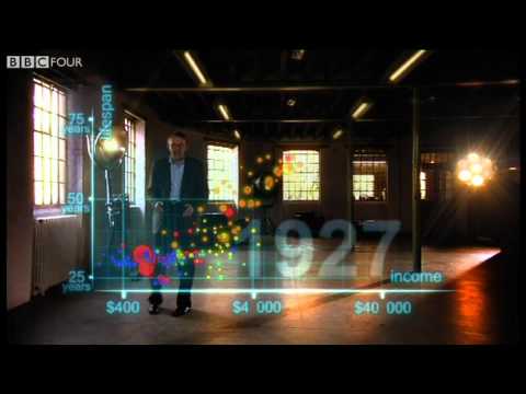
Patterns of Change and Continuity History is a complex mix of change and continuity, not just a list of events. Temporal data visualizations can help students understand this fundamental concept of history by revealing patterns of change and continuity over time. This, in turn, can raise questions about another fundamental concept of history, causes and consequences: Why did things change the way that they did? What accounts for continuities I observe in the data? In the video on the left, the late Hans Rosling demonstrates this well by walking viewers through an example of the animated bubble maps featured on his website, Gapminder. Almost all temporal data visualizations reveal patterns of change and continuity. Even timelines can signal change by noting significant turning points in a national or regional history. However, it is also important to note that data visualizations that show change and continuity in one area, can mask change and continuity in other areas. For example, just because a country's Gross Domestic Product has been steadily increasing, that does not necessarily mean that standards of living have significantly changed for all segments of the country's population.
This page has paths:
1media/6747000.jpgmedia/6747000.jpg2019-10-09T14:04:37-07:00Tamara Shreiner72eaa2d1ba1352b75b8a8da73e879a4ceb510ae0A Taxonomy of Data VisualizationsTamara Shreiner34Information can be visualized in multiple ways, from bar graphs to scatterplots, choropleth maps to distribution maps, timelines to time series. Designers can choose from an array of graphical elements such as points, lines, or icons used to represent data, and multiple aesthetic attributes such as color, shape, and size. Furthermore, designers can apply multiple combinations of titles, legends, and explanatory text to provide context for a data visualization. Given the almost dizzying array of data visualizations students may encounter in social studies, it is helpful to place them in categories related to the types of questions they will help us answer.image_header2023-08-23T06:42:24-07:00Tamara Shreiner72eaa2d1ba1352b75b8a8da73e879a4ceb510ae0
Contents of this path:
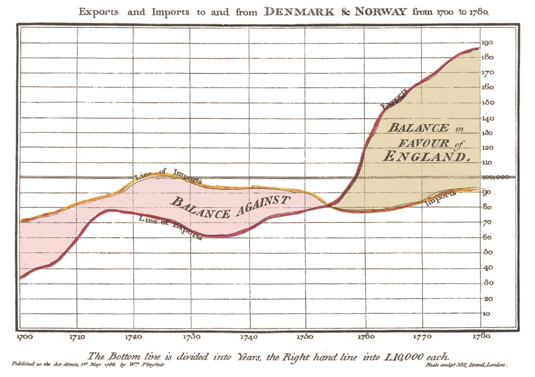
12020-09-08T07:27:29-07:00Tamara Shreiner72eaa2d1ba1352b75b8a8da73e879a4ceb510ae0Area Graphs3William Playfair created this, the first known area graph, in 1786 for The Commercial and Political Atlas. It shows changes in the interest of the British national debt throughout the 18th Century. Area graphs are line graphs with the area below the line filled in with a solid color or pattern, drawing attention to changes in total amounts.plain2020-09-08T09:24:20-07:00Tamara Shreiner72eaa2d1ba1352b75b8a8da73e879a4ceb510ae0
12020-09-08T09:30:19-07:00Tamara Shreiner72eaa2d1ba1352b75b8a8da73e879a4ceb510ae0Line Graphs7Line graphs are used to display quantitative values over a continuous interval or time period. A line graph is most frequently used to show trends and analyze how the data has changed over time, but time does not have to be one of the variables. The are also good for showing how long positive or negative trends last. William Playfair's stacked line graph (with two categories and therefore two lines) shown here is from the 1786 Commercial and Political Atlas was innovative in that it showed the importance of the relationship between the lines too.plain2020-09-09T05:56:09-07:00Tamara Shreiner72eaa2d1ba1352b75b8a8da73e879a4ceb510ae0
1media/Screen Shot 2020-09-08 at 1.42.04 PM_thumb.png2020-09-08T10:42:28-07:00Tamara Shreiner72eaa2d1ba1352b75b8a8da73e879a4ceb510ae0Bubble Charts1A bubble chart is a multi-variable graph that is a cross between a scatterplot and a proportional area chart. Bubble charts use a Cartesian coordinate system to plot points along a grid where the X and Y axis are separate variables. Each point is assigned a label or category. Each plotted point then represents a third variable by the area of its circle. Colors can also be used to distinguish between categories or used to represent an additional data variable. Time can be shown either by having it as a variable on one of the axis or by animating the data variables changing over time. Hans Rosling made the bubble chart famous through his website Gapminder.media/Screen Shot 2020-09-08 at 1.42.04 PM.pngplain2020-09-08T10:42:28-07:00Tamara Shreiner72eaa2d1ba1352b75b8a8da73e879a4ceb510ae0
12020-09-08T09:42:27-07:00Tamara Shreiner72eaa2d1ba1352b75b8a8da73e879a4ceb510ae0Nightingale Rose Charts2Named for its creator, Florence Nightingale, these charts are drawn on a polar coordinate grid. Commonly mistaken for a pie chart, they are different because each category or interval in the data is divided into equal segments. How far each segment extends from the center of the polar axis depends on the value it represents -- the longer the segment, the higher the value. Nightingale used it to show changes in the causes of soldiers' deaths over a 12-month period, before and after sanitation measures were used in hospitals during the Crimean War.plain2020-09-08T10:53:02-07:00Tamara Shreiner72eaa2d1ba1352b75b8a8da73e879a4ceb510ae0
1media/10011000_thumb.jpg2020-09-08T07:20:21-07:00Tamara Shreiner72eaa2d1ba1352b75b8a8da73e879a4ceb510ae0Timelines2Published around 1720 by German engraver Christoph Weigel, this "timeline" has a circular layout with rings representing kingdoms and radial wedges representing centuries. This chart serves as a reminder that time is not always represented on a straight line.media/10011000.jpgplain2020-09-08T07:21:42-07:00Tamara Shreiner72eaa2d1ba1352b75b8a8da73e879a4ceb510ae0
This page references:
1media/11194002_thumb.jpg2020-05-08T06:37:37-07:00Stream of Time of the Chart of Universal History from the German of Strass (1803)3This wall chart created in 1803 is a novel combination of chronologic methods and influences from cartography. Its creator, the Prussian educator and historian Johann Gottlieb Friedrich Strass, was the head of pedagogical institutions and also taught history. In addition, he published history books for use in schools. The Stream of Time introduces a new visual metaphor: world history structured as the history of political entities--that is, kingdoms or nation states--with each being represented as a river. Territorial and political changes are indicated by a division of or a connection between individual rivers. A vertical timescale provides structure for these historical events. The visual can also be viewed at https://www.davidrumsey.com/luna/servlet/s/ar91g4.media/11194002.jpgplain2020-07-31T07:03:18-07:00
12020-09-08T10:04:16-07:00Hans Rosling's 200 Countries, 200 Years, 4 Minutes - The Joy of Stats - BBC Four1Hans Rosling's use of Gapminder data to demonstrate the story of 200 countries in 200 years is a good example of how data visualizations can reveal important patterns of change and continuity. As his narration suggests, noticing such patterns of change and continuity can provide answers to questions about the past, as well as raise questions about the past.plain2020-09-08T10:04:16-07:00