Spatial Data Visualizations
The events, phenomena, and changes that we study in social studies have all happened somewhere. Understanding ourselves, where we've been, where we are now, and how we got here requires us to orient ourselves spatially. Visualizing where events have unfolded, and being able to see the human and physical characteristics that distinguish one place from another, bring us closer to answering questions about why and how events happened the way that they did.
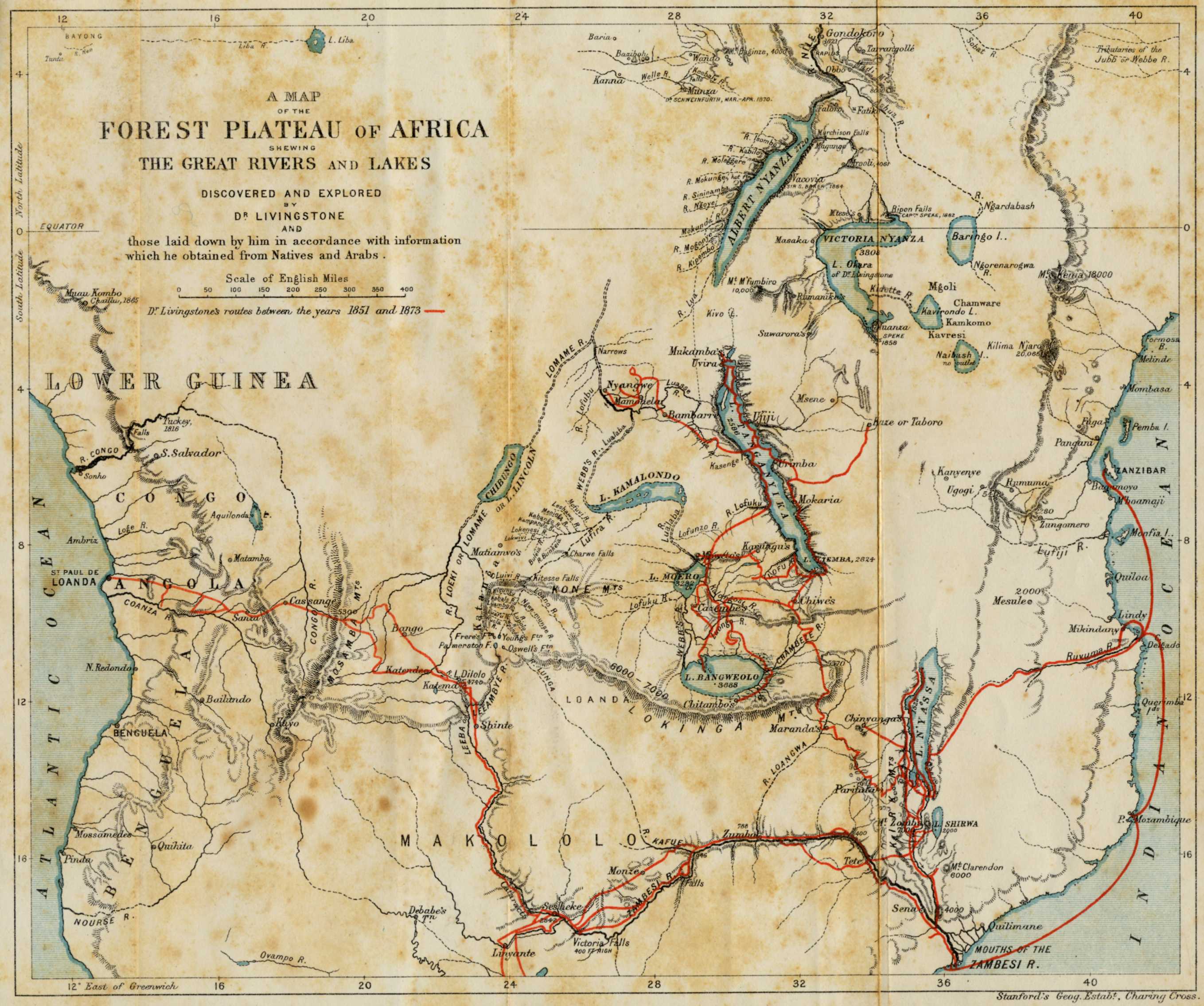
Maps are the most common type of spatial data visualization students will encounter in social studies. Maps allow us to discover and visualize spatial relationships and to make large scale movements or patterns -- those normally outside of human perception -- contained and visible. Historians and social scientists use them to show how people have moved over space and time, how societies have grown or dissolved, how diseases or languages spread, and how resources and people are distributed. Maps can show both the world and parts of the world at the same time, making it possible for us to make comparisons or see how events in one part of the globe relate to the whole. Maps have also played an important role in the human story. Way-finding maps have led travelers, explorers, and conquerors across waterways and to new lands, and facilitated the spread of ideas, technologies, foods, diseases, and people. When viewed as primary source evidence, maps can reveal the habits, thoughts, and perspectives of the people who created them, helping us understand how people of the past saw the world, where they had gone, where they thought they could go, who they thought they could conquer.[3]
But land is not the only space humans have visualized. They have tried to visualize space beneath the earth, and in the sky. And they have visualized the spaces of the human body, often revealing prejudices tied to sex, race, or religion.[4]
The spatial data visualizations that students will typically see in social studies, or that they can use for inquiry in social studies, serve six basic functions: They show us locations, allow us to see patterns, distribution, movements, or relationships, or help us make comparisons. Most of the spatial data visualizations students will encounter in social studies are maps, but it's important to recognize that not all maps are the same, and not every map fulfills the same function. In addition, some of the spatial data visualizations students might encounter in social studies are not traditional geographic maps at all -- they represent humans' efforts to map out stars and planets, caverns and tunnels, or parts of the human body. Regardless, all of them use "data" to visualize a space that humans have found worthy of exploration or conquest, or that they know is important to our survival or growth.
Location
The one function that all spatial data visualizations (see specific types along the right side of the page) share is showing location. This is as true of maps as it is of visualizations depicting the stars or the human body. Regardless, it's important to remember that they are all human creations. When making maps, for example, cartographers can choose to include different structural features, and they make choices about scale, projection, symbol systems, and color schemes, and what to include and what to leave out. Regardless of the form, it's important to pay attention to all of its features and to remember that visualizations have authors with their own intentions and biases, as well as a knowledge base and perspective limited by the time and place in which they lived.
Patterns
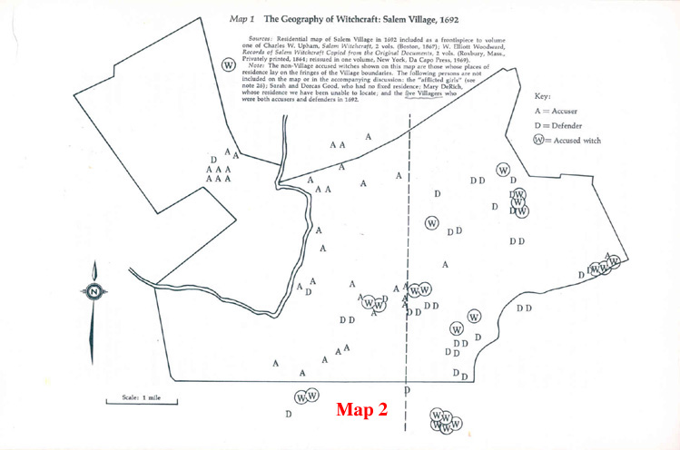
Historians use maps such as choropleth maps, connection maps, and dot maps to visualize spatial patterns that cannot be seen with the naked eye. They can use such visualizations to help them answer questions about the past, or to provide evidence when they are making arguments or providing explanations about the past. For example, in their influential study Salem Possessed: The Social Origins of Witchcraft (1974), Paul Boyer and Steve Nissenbaum made significant use of a map of Salem Village in 1692, which showed the locations of virtually all the households in Salem Village. Boyer and Nissenbaum plotted the locations of the accusers and the accused in the Village, and used the map to argue that economic difference divided the village geographically into two conflicting groups -- poorer agrarian householders with Puritan sensibilities on the western side of the village versus more prosperous and commercially minded neighbors in the eastern part of the village. According to Boyer and Nissenbaum, the clash led the frustrated westerners to respond by charging the easterners with witchcraft. Salem Possessed succeeded so well in explaining the witchcraft episode in Salem Village that it was not significantly challenged by another scholarly account until the appearance of Mary Beth Norton's innovative and more comprehensive work, In the Devil's Snare, in 2002.[5]
Distribution
Connection maps, dot maps, and flow maps show how data is clustered or spread out in space. As with maps that show patterns, historians and other scholars use them to answer questions about the past, or to provide evidence when they are making arguments or providing explanations. Perhaps the most famous distribution maps in history is physician John Snow’s 1854 cholera map. In the 1850s, germs were not yet understood and people believed that cholera was spread by miasma, a noxious form of "bad air. Snow was one of several scientists at the time who had doubts about miasma theory, and decided he would map cases in order to better understand a serious and tragic outbreak in London's Soho District. He used bars to represent each case, and it became apparent that the cases were clustered around the pump on Broad Street. As it turned out the pump had been contaminated by cholera-infected sewage from a nearby cesspit.[6]
Movement or Flow
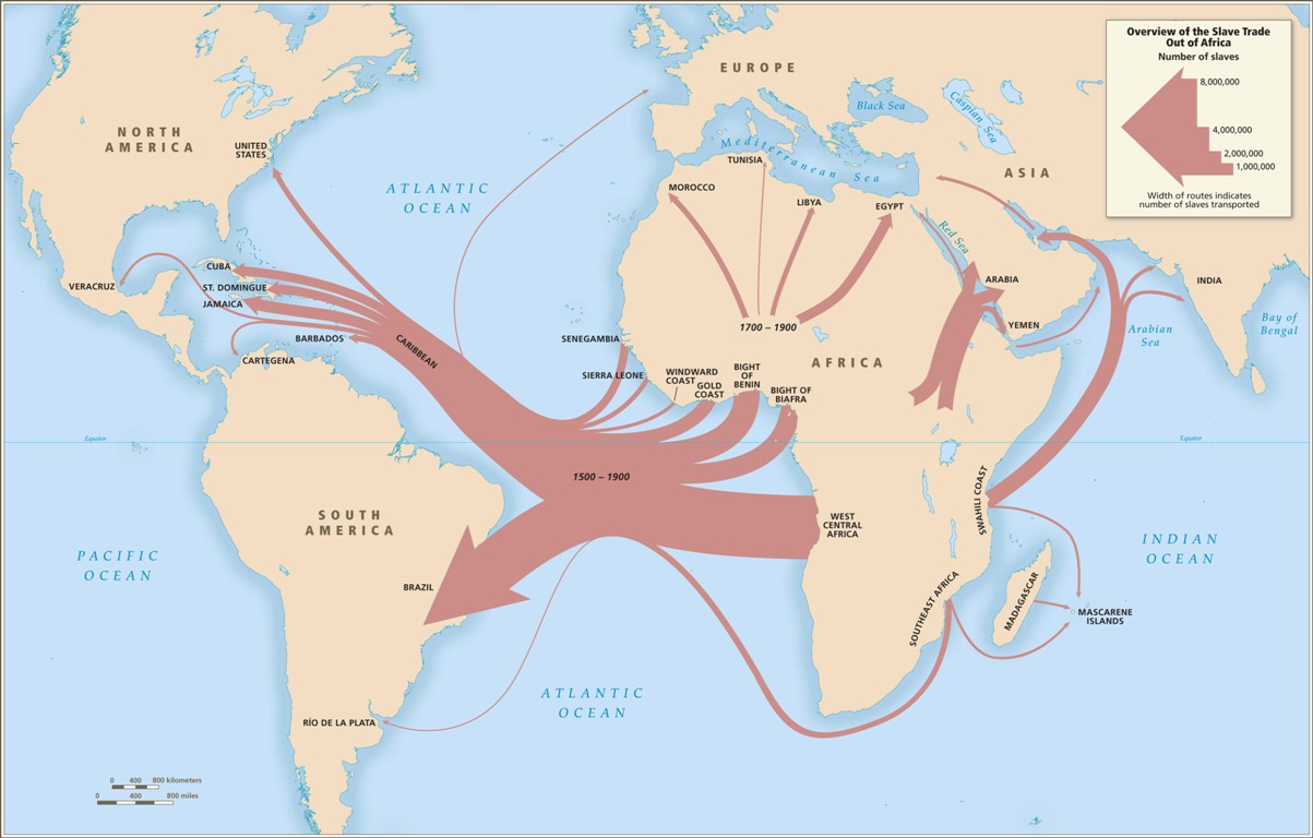
Movement and migration are important concepts in history, best visualized through either connection or flow maps. Connection maps allow us to see how locations are connected by travel or trade routes, while flow maps represent quantities of goods or people that have moved across space. For example, the website slavevoyages.org utilizes several connection and flow maps, such as the one pictured here, to help people understand the extent of the Transatlantic slave trade and the volume of human beings that were kidnapped from different locations and then unwillingly transported to strange places across the ocean, where they were forced into slavery.
Proportions, Comparisons, Relationships
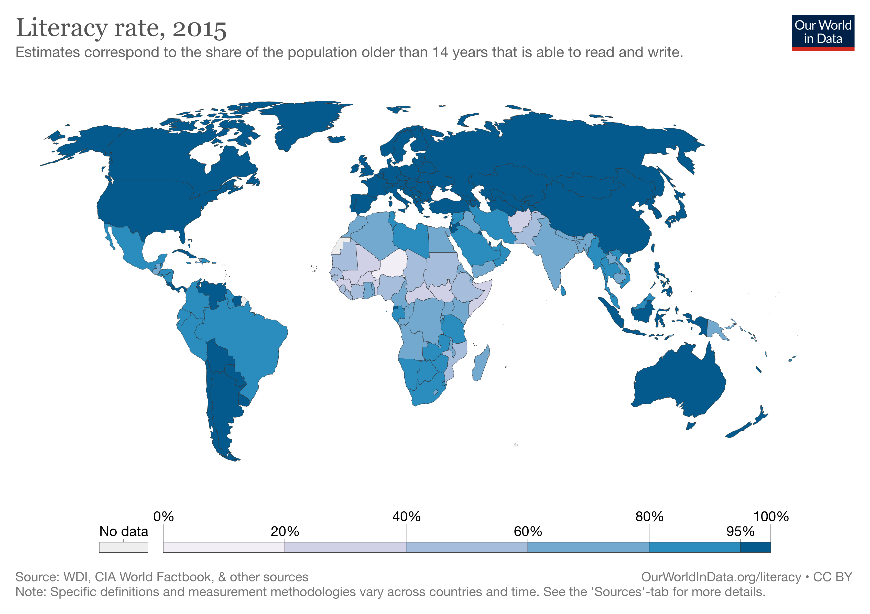
Spatial data visualizations are also useful for showing proportions, comparisons, or relationships. Choropleth maps, such as the one from Our World in Data on the right, display political units or other other geographic divisions that are colored, shaded, or patterned in relation to data variables. This allows readers to easily compare data across geographic units. In social studies, you will often come across choropleth maps that display election data, or rates for things like literacy or poverty. Bubble maps, on the other hand, use bubbles or circles to show data over a geographic space, with the size of the bubbles proportional to its value within a dataset.