Thanks for your patience during our recent outage at scalar.usc.edu. While Scalar content is loading normally now, saving is still slow, and Scalar's 'additional metadata' features have been disabled, which may interfere with features like timelines and maps that depend on metadata. This also means that saving a page or media item will remove its additional metadata. If this occurs, you can use the 'All versions' link at the bottom of the page to restore the earlier version. We are continuing to troubleshoot, and will provide further updates as needed. Note that this only affects Scalar projects at scalar.usc.edu, and not those hosted elsewhere.
The Promise and Practice of Teaching Data Literacy in Social Studies: A Companion SiteMain MenuA Taxonomy of Data VisualizationsInformation can be visualized in multiple ways, from bar graphs to scatterplots, choropleth maps to distribution maps, timelines to time series. Designers can choose from an array of graphical elements such as points, lines, or icons used to represent data, and multiple aesthetic attributes such as color, shape, and size. Furthermore, designers can apply multiple combinations of titles, legends, and explanatory text to provide context for a data visualization. Given the almost dizzying array of data visualizations students may encounter in social studies, it is helpful to place them in categories related to the types of questions they will help us answer.Data Visualizations as Primary SourcesHumans have been creating different types of data visualizations for centuries. Explore this collection of timelines, maps, graphs and charts to see what they reveal about the historical time and place in which they were produced.How do students learn with data visualizations?Reading data visualizations in print and online social studies texts can improve students' overall comprehension and quality of reasoning. And there is evidence to suggest that reading data visualizations helps students better understand historical and geographic context, multiple causation, and change over time — all important concepts for students to grasp in social studies subject areas. However, students may face significant challenges in trying to make sense of different kinds of data visualizations. This section provides insight into both benefits and challenges of reading timelines, maps, and graphs and charts.How should students analyze data visualizations in social studies?The challenges that data visualizations present, coupled with their prevalence in social studies texts, standardized assessments, in online social studies resources, and as sources of information in society, suggest that teaching with and about data visualizations in social studies is essential. This module provides guidance for how teachers can support students' data literacy for social studies.How do I help students create and integrate data visualizations for social studies?This page highlights several tools that are useful for data-based projects in social studies. And accompanying each tool is a "minimal manual" that provides guidance for using the tool in social studies inquiry- and project-based learning.Project-Based Learning Activities for Data Literacy in Social StudiesLorem ipsum dolor sit amet, nec constituto comprehensam te. Sea no affert nemore comprehensam, eum te purto soleat accusata. Ea est magna malis. No atqui iudico est. In vel propriae suavitate. Est homero timeam cu, novum persecuti mea an.Index of Lesson PlansThis page contains a list of the minimal manuals and lessons found on this website. Minimal manuals are designed to be adapted to different grade levels and do not have a grade designation associated with them. Lesson plans are organized according to the school level for which they are designed. However, many of these lessons can be adapted for different grade levels.Tamara Shreiner72eaa2d1ba1352b75b8a8da73e879a4ceb510ae0
Categorical or Topical Data Visualizations
12020-07-21T13:10:16-07:00Tamara Shreiner72eaa2d1ba1352b75b8a8da73e879a4ceb510ae03513327Categorical or topical data visualizations help us answer what or how questions. They are useful for comparisons, distributions, patterns, proportions, and relationships.plain2020-09-10T10:58:25-07:00Tamara Shreiner72eaa2d1ba1352b75b8a8da73e879a4ceb510ae0Sometimes inquiry in social studies involves making comparisons, observing relationships, or noticing patterns at a particular time or in a specific setting, rather than over time and space. When this is the case, it is often helpful to use categorical or topical data visualizations. These types of data visualizations are more focused on helping us answer what or how questions, rather than where or when questions. These types of data visualizations usually fulfill one or more of the following functions.
Comparisons 
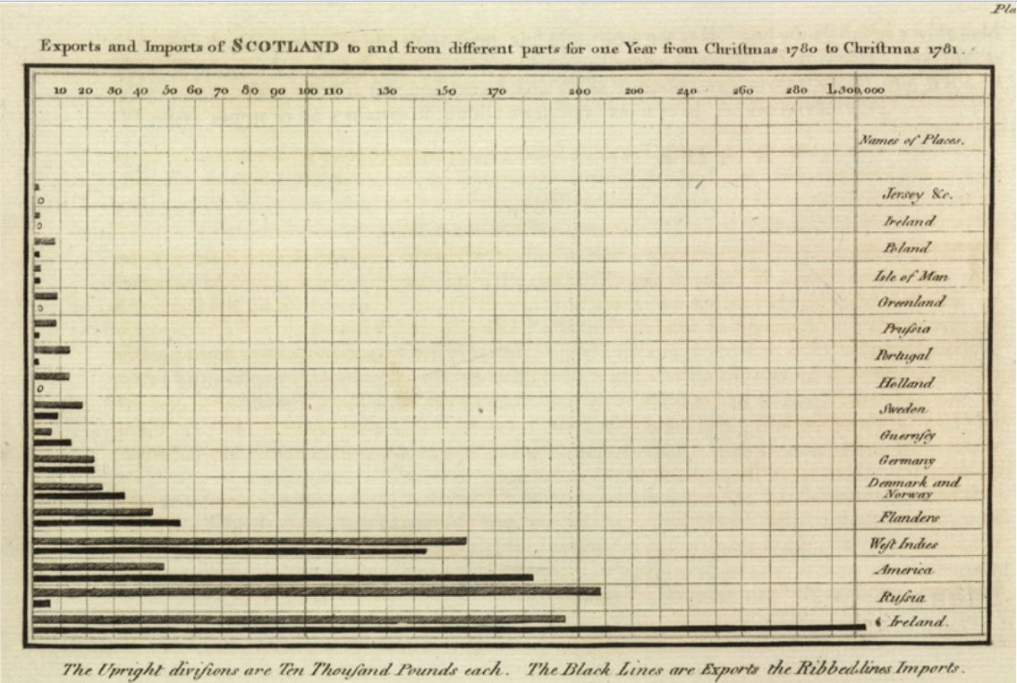
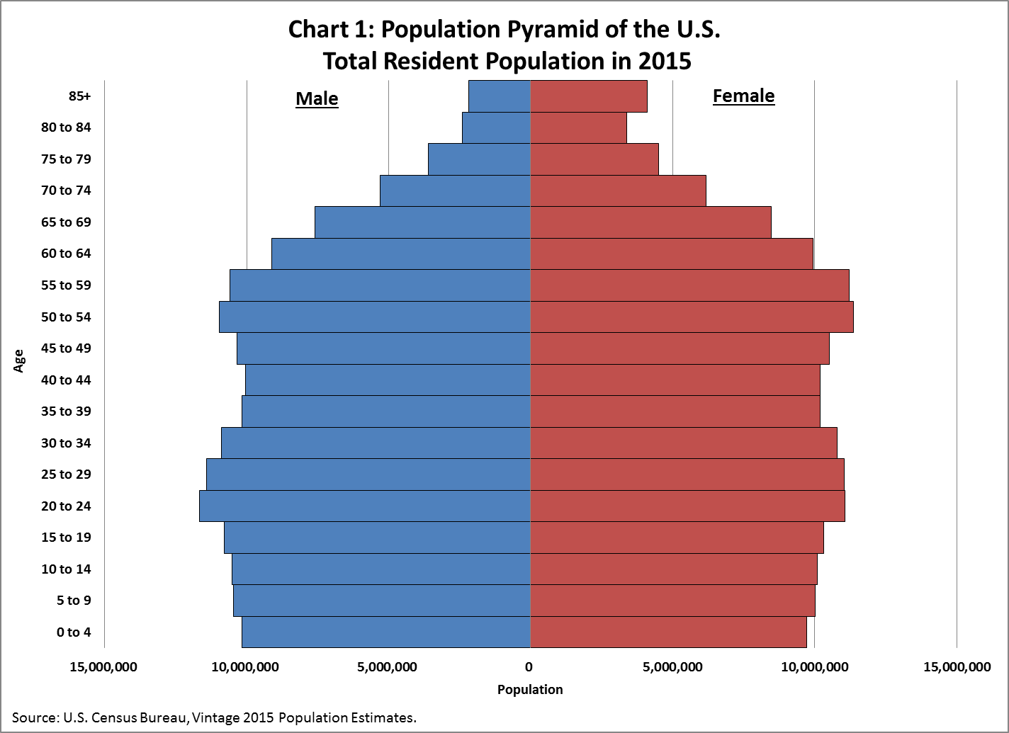
Comparisons are an important aspect of social studies education. The Michigan K-12 Social Studies Standards ask students to compare physical, cultural, political, and economic aspects beginning in early elementary and in every grade level thereafter. Bar graphs, line graphs, pie charts, population pyramids, and treemaps are commonly used to compare categories of data. In his data documentary, The Fallen of World War II, Neil Halloran makes extensive and effective use of bar graphs to compare countries' losses in WWII, and to compare total WWII deaths to deaths in other wars.
Distribution Bubble charts, multi-set bar graphs, and scatterplots help us to see distributions of data. That is, they help us see how data is spread out or grouped. In social studies, we are often concerned about outliers -- people or countries who lie outside of the majority with regard to income, education, access to resources and so on. For example the Our World in Data visualization to the left, which displays countries by a combination of their literacy rates and numeracy rates (the size of the circle corresponds to population) raises questions about what is going on in countries at the lower left of the graph.
Patterns Area graphs, bar graphs, bubble charts, line graphs, population pyramids, and scatterplots all reveal patterns that give meaning to the data and allow us to draw inferences. Look, for example at the population pyramid for Germany on the left. Being able conclusions from the population pyramid depends upon observation of patterns -- in this case, observing that a large portion of the population is "middle-aged" tells you that birth rates, and therefore population growth, are low. On the other hand, the population pyramid for Nigeria on the right shows that there are a lot of young people and very few people past the typical window of child-rearing. This points toward a high birth rate and fast population growth.
Proportions Sometimes in social studies, we are interested in questions related to proportions or parts of a whole. For example, what proportion of the world's nuclear weapons are concentrated in non-democratic nations? What fraction of global deaths each year are due to violent conflict? To curable diseases? In cases like these, data visualizations like bubble charts, pie charts, stacked bar graphs, treemaps, and word clouds are useful. The treemap above, for example, displays different categories for causes of childhood deaths, and shows the proportions for specific causes within the different categories in 1990. It then overlays information about proportionate causes of death in 2017 so that observers can see what's changed.
Relationships Bubble charts and scatterplots are ideal for showing relationships between variables. This is what Hans Rosling depends upon in the compelling arguments he made in his many TED Talks. Though he depends on "low-tech" visualization for a large portion of this video, he drives home his point toward the end by highlighting the relationship between child mortality and children per women. He argues that in order to slow the pace of population growth in the world, we need to provide better access to resources and healthcare in the poorest countries so that children are more likely to survive and thrive and family sizes decrease.
This page has paths:
1media/6747000.jpgmedia/6747000.jpg2019-10-09T14:04:37-07:00Tamara Shreiner72eaa2d1ba1352b75b8a8da73e879a4ceb510ae0A Taxonomy of Data VisualizationsTamara Shreiner34Information can be visualized in multiple ways, from bar graphs to scatterplots, choropleth maps to distribution maps, timelines to time series. Designers can choose from an array of graphical elements such as points, lines, or icons used to represent data, and multiple aesthetic attributes such as color, shape, and size. Furthermore, designers can apply multiple combinations of titles, legends, and explanatory text to provide context for a data visualization. Given the almost dizzying array of data visualizations students may encounter in social studies, it is helpful to place them in categories related to the types of questions they will help us answer.image_header2023-08-23T06:42:24-07:00Tamara Shreiner72eaa2d1ba1352b75b8a8da73e879a4ceb510ae0
Contents of this path:
12020-09-08T07:27:29-07:00Tamara Shreiner72eaa2d1ba1352b75b8a8da73e879a4ceb510ae0Area Graphs3William Playfair created this, the first known area graph, in 1786 for The Commercial and Political Atlas. It shows changes in the interest of the British national debt throughout the 18th Century. Area graphs are line graphs with the area below the line filled in with a solid color or pattern, drawing attention to changes in total amounts.plain2020-09-08T09:24:20-07:00Tamara Shreiner72eaa2d1ba1352b75b8a8da73e879a4ceb510ae0
12020-09-08T16:19:00-07:00Tamara Shreiner72eaa2d1ba1352b75b8a8da73e879a4ceb510ae0Bar Graphs2Bar graphs use either horizontal or vertical bars (column chart) to show discrete, numerical comparisons across categories. One axis of the chart shows the specific categories being compared and the other axis represents a discrete value scale. Bar graphs can also be multi-set, with multiple variables in one category, or stacked to show proportions of values within a category.This bar graph was created by William Playfair to show exports and imports of Scotland to and from different countries for one year.plain2020-09-09T05:53:17-07:00Tamara Shreiner72eaa2d1ba1352b75b8a8da73e879a4ceb510ae0
1media/Screen Shot 2020-09-08 at 1.42.04 PM_thumb.png2020-09-08T10:42:28-07:00Tamara Shreiner72eaa2d1ba1352b75b8a8da73e879a4ceb510ae0Bubble Charts1A bubble chart is a multi-variable graph that is a cross between a scatterplot and a proportional area chart. Bubble charts use a Cartesian coordinate system to plot points along a grid where the X and Y axis are separate variables. Each point is assigned a label or category. Each plotted point then represents a third variable by the area of its circle. Colors can also be used to distinguish between categories or used to represent an additional data variable. Time can be shown either by having it as a variable on one of the axis or by animating the data variables changing over time. Hans Rosling made the bubble chart famous through his website Gapminder.media/Screen Shot 2020-09-08 at 1.42.04 PM.pngplain2020-09-08T10:42:28-07:00Tamara Shreiner72eaa2d1ba1352b75b8a8da73e879a4ceb510ae0
12020-09-08T09:30:19-07:00Tamara Shreiner72eaa2d1ba1352b75b8a8da73e879a4ceb510ae0Line Graphs7Line graphs are used to display quantitative values over a continuous interval or time period. A line graph is most frequently used to show trends and analyze how the data has changed over time, but time does not have to be one of the variables. The are also good for showing how long positive or negative trends last. William Playfair's stacked line graph (with two categories and therefore two lines) shown here is from the 1786 Commercial and Political Atlas was innovative in that it showed the importance of the relationship between the lines too.plain2020-09-09T05:56:09-07:00Tamara Shreiner72eaa2d1ba1352b75b8a8da73e879a4ceb510ae0
12020-09-08T17:39:24-07:00Tamara Shreiner72eaa2d1ba1352b75b8a8da73e879a4ceb510ae0Pie Charts1This is one of the earliest known pie charts, showing proportions of the Turkish Empire and included among several other pie charts in William Playfair's "Commercial and Political Atlas and Statistical Breviary." Pie Charts help show proportions and percentages between categories, by dividing a circle into proportional segments. Each arc length represents a proportion of the whole while the full circle represents the total sum of all the data, equal to 100%.plain2020-09-08T17:39:25-07:00Tamara Shreiner72eaa2d1ba1352b75b8a8da73e879a4ceb510ae0
12020-09-08T16:33:01-07:00Tamara Shreiner72eaa2d1ba1352b75b8a8da73e879a4ceb510ae0Population Pyramids2Population pyramids display the distribution of a population in all age groups and in both sexes. The x-axis is used to plot population numbers and the y-axis lists age groups. Population pyramids are ideal for detecting changes or differences in population patterns. Multiple Population Pyramids can be used to compare patterns across nations or selected population groups. This particular population pyramid was created by the U.S. Census bureau and displays population distribution in 2015.plain2020-09-08T17:30:21-07:00Tamara Shreiner72eaa2d1ba1352b75b8a8da73e879a4ceb510ae0
12020-09-08T17:51:33-07:00Tamara Shreiner72eaa2d1ba1352b75b8a8da73e879a4ceb510ae0Scatterplots2Scatterplots use a collection of points placed using Cartesian Coordinates to display values from two variables. By displaying a variable in each axis, you can detect if a relationship or correlation between the two variables exists. This scatterplot was used in a Pew Research study to see how many people could correctly interpret it. As the display reads, 63% of respondents answered correctly.plain2020-09-08T17:53:40-07:00Tamara Shreiner72eaa2d1ba1352b75b8a8da73e879a4ceb510ae0
1media/Screen Shot 2020-09-08 at 8.49.05 PM_thumb.png2020-09-08T17:58:32-07:00Tamara Shreiner72eaa2d1ba1352b75b8a8da73e879a4ceb510ae0Treemaps1Treemaps display both a hierarchical structure of categories and quantities for each category via area size. Each category is assigned a rectangle area with their subcategory rectangles nested inside of it. When a quantity is assigned to a category, its area size is displayed in proportion to that quantity and to the other quantities within the same parent category. This treemap, which was interactive on the Office of Management and Budget website (see https://obamawhitehouse.archives.gov/interactive-budget), was used to show the 2016 Obama White House budget.media/Screen Shot 2020-09-08 at 8.49.05 PM.pngplain2020-09-08T17:58:33-07:00Tamara Shreiner72eaa2d1ba1352b75b8a8da73e879a4ceb510ae0
12020-09-08T18:02:06-07:00Tamara Shreiner72eaa2d1ba1352b75b8a8da73e879a4ceb510ae0Word Clouds2Word clouds are popular for textual analysis because they can compare the frequency with which words appear in a text by making the size of each word proportional to its frequency. This word cloud shows word usage in the U.S. Constitution's Bill of Rights.plain2020-09-08T18:04:48-07:00Tamara Shreiner72eaa2d1ba1352b75b8a8da73e879a4ceb510ae0
This page references:
1media/download_thumb.png2020-09-09T15:15:02-07:00Population Pyramid for Germany1media/download.pngplain2020-09-09T15:15:02-07:00
1media/download (1)_thumb.png2020-09-09T15:16:57-07:00Population Pyramid for Nigeria1media/download (1).pngplain2020-09-09T15:16:57-07:00
12020-09-09T15:54:44-07:00Hans Rosling: Global population growth, box by box1http://www.ted.com The world's population will grow to 9 billion over the next 50 years -- and only by raising the living standards of the poorest can we check ...plain2020-09-09T15:54:44-07:00
1media/Screen Shot 2020-09-01 at 11.18.52 AM_thumb.png2020-09-01T08:54:34-07:00Fallen of WWII Image1media/Screen Shot 2020-09-01 at 11.18.52 AM.pngplain2020-09-01T08:54:34-07:00
1media/numeracy-vs-literacy-skills-of-adults_thumb.png2020-09-09T13:40:09-07:00Literacy vs Numeracy1media/numeracy-vs-literacy-skills-of-adults.pngplain2020-09-09T13:40:09-07:00