How do I help students create and integrate data visualizations for social studies?
*******************************
ArcGIS StoryMaps
The ArcGIS StoryMaps allows a user to create custom maps through illustration of spatial relationships and visual elements. One can add text, photos and videos to the maps to make them interactive. They are easy to publish and share. The 'Simple mapmaking' module will be of most help to teachers as express mapmaking is highlighted. One can add points, pop-ups and arrows as well as use existing web maps and web scenes. They also have a curated collection of ready-to-use maps from "ArcGIS Living Atlas of the World".
CREATE YOUR OWN STORYMAP
CODAP
CODAP is a drag-and-drop data analysis and visualization tool designed for middle and high school classes. It offers many options for visualizations. Many databases are built-in to CODAP, and you can extend it with your own databases. From their website: "CODAP provides an easy-to-use web-based data analysis platform, geared toward middle and high school students, and aimed at teachers and curriculum developers. CODAP can be incorporated across the curriculum to help students summarize, visualize and interpret data, advancing their skills to use data as evidence to support a claim. Through research on learning, collaborative software design, web application development and user testing, we’re developing a Common Online Data Analysis Platform (CODAP) that will serve subsequent curriculum development projects as a basis for the technology with which students engage with data."
VISUALIZE PATTERNS AND TRENDS WITH CODAP
Data USA
The Data USA site consists of data visualizations of U.S. public data. Data USA provides an open, easy-to-use platform that converts data into knowledge. Social studies teachers will find their Viz Builder tool useful as it will allow students to dig deep into U.S. public data. From this page, you can select any topic located on the left, specify custom groupings and filters, and then view the resulting data as a series of visualizations. Watching the video present on this page will be helpful for using the application. Students can use the Viz Builder to create data stories similar to those housed on the site. For example, one can group the total U.S. population by race and state, and view an accompanying line graph as well as two color-coded data visualizations.
USE DATA VISUALIZATIONS TO CONSTRUCT AN ARGUMENT WITH DATA USA
DV4L: Data Visualization for Literacy
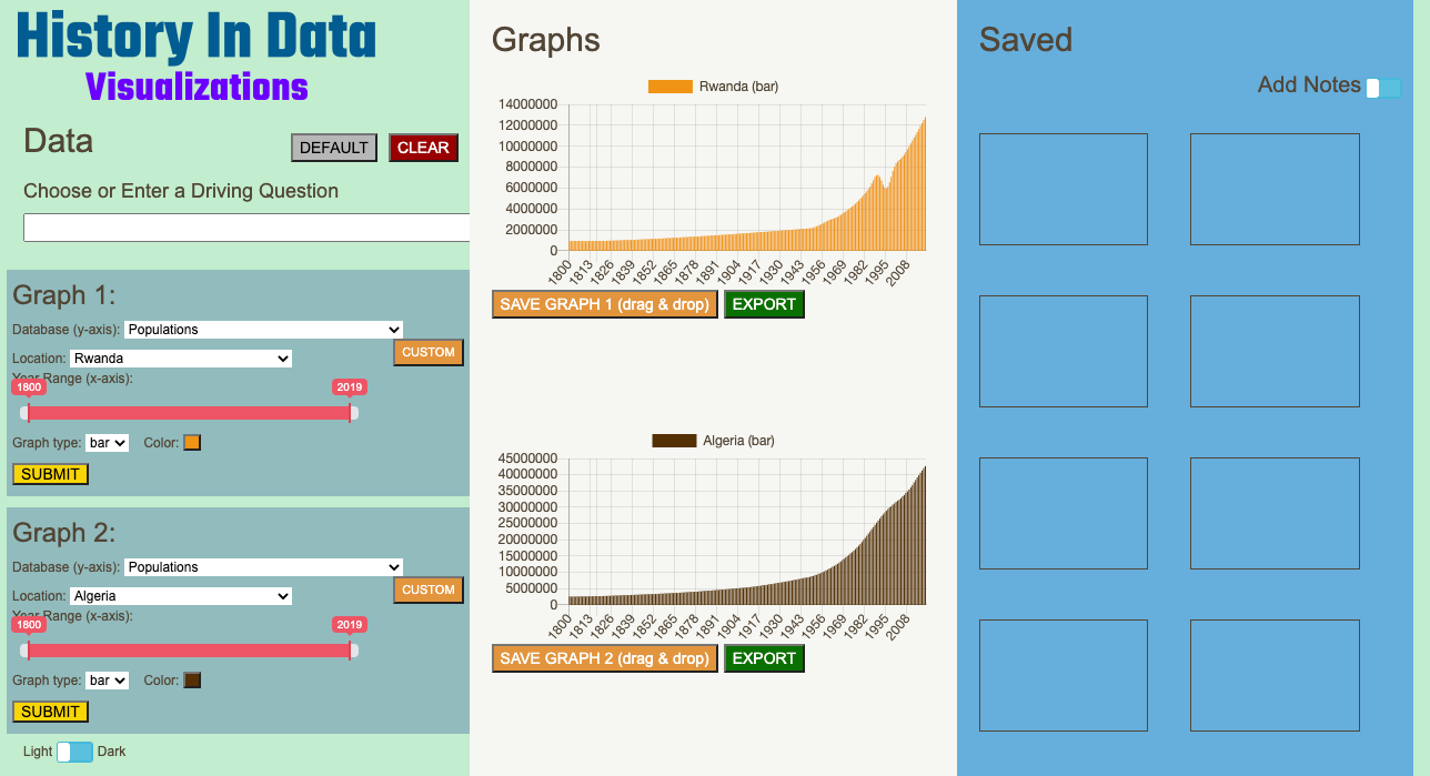 DV4L has been developed in the last two years as a collaboration between social science and computer science educators -- Dr. Tamara Shreiner, Dr. Mark Guzdial, and their students. It's an easy-to-use tool to support historical inquiry. Teachers using DV4L have reported that it's easier than CODAP and is more easily tied to social studies standards. We are developing DV4L to support data visualization in social studies classes and to introduce students to fundamental ideas of computer science.
HISTORICAL INQUIRY WITH DATA VISUALIZATIONS IN SOCIAL STUDIES CLASSES
Gapminder
Gapminder is an independent Swedish foundation that uses reliable data to develop easy to understand teaching materials to correct systematic misconceptions about important global trends and figures. The site consists of a variety of resources. Social studies teachers will find the 'Tools' section most useful as it allows one to explore data through bubble charts, income mountain charts, maps, trendlines, rankings and population charts. At the top of the page is a 'Facts' tab that explains how students can download the data visualizations they create on the site to embed in their written arguments. Additionally, the 'Teach' tab offers insights on how Gapminder tools can be utilized in classrooms. There is also an instructional 'How to Use' video tab located right after the 'Teach' tab. Other helpful resources include Downloads, Videos, and Frameworks.
Google Charts
Google Charts is a relatively easy way for students to create data visualizations and embed them in a website or document. From simple line charts to complex hierarchical tree maps, Google Charts provides a large number of ready-to-use, highly interactive chart types. Because Google Charts is integrated with Google Sheets, students and teachers can begin with a database that they have either created themselves or downloaded from a website. Beginning with a dataset in Google Sheets provides students an opportunity to work with and prepare raw data for visualization, which will help build skills in selecting data most relevant to a question or topic, and thinking about how data needs to be reworked or "scrubbed." Moving from raw data to data visualization with Google Charts is also useful for building critical thinking skills and data literacy because it asks students to think about the purpose and function different data visualizations serve, and the different stories they can tell with data.
CREATING A CHART WITH GOOGLE
Google Earth
One of the most exciting features of Google Earth for social studies instruction is Voyager, which has dozens of spatially-driven stories, including topics like the Underground Railroad, Congressional Redistricting, and Explorers. Social studies teachers can use these stories to support instruction across grade levels, historical periods, and topics. Even more exciting is that students can use Google Earth to create their own stories. For example, after exploring Google Earth's existing story about the Underground Railroad, students might explore and create a story about the underground railroad in their own state. They could choose an important figure in the struggle for civil rights in the United States, and trace their life and contributions from a spatial perspective. They could even create a story about important landmarks in their own community in order to educate others about what makes their community special. The share feature in Google Earth allows them to share the link with teachers, students, and parents, or they can embed their project in a class website.
CREATE A SPATIAL STORY USING GOOGLE EARTH.
Google Maps
Google Maps is a web-based mapping service developed by Google. It offers satellite imagery, aerial photography, and interactive panoramic street views that allow students to develop geographic perspective and reason spatially about topics they're studying. Google Maps' satellite view is a bird's-eye view, with most of the aerial photography taken from aircraft flying at 800 to 1500 feet. Other imagery is from satellites, usually no more than three years old and updated on a regular basis. Although Google Maps previously used a variant of a Mercator projection, it was updated to show a 3D globe in 2018. Google Maps has several useful features for students to learn about places they're studying, but the ability to create custom map projects is probably the most useful feature for project-based instruction.
CREATE A CUSTOM MAP WITH GOOGLE MAPS
Storyline JS
Storyline JS is an open-source tool that enables a user to create an annotated, interactive line chart. Beginners can create a timeline using nothing more than a Google spreadsheet. The website includes the chart, axis labels and cards. Users can customize the headlines, context, and more specifics. The x-axis only accepts date/time formats. It works best when there are less than 12 cards, and titles and paragraphs are no more than 54 characters and 200 characters respectively. If one clicks the "Make a Storyline" button in the center of the page, it will provide detailed instructions on how to use Storyline JS. The Storyline JS homepage has six examples of how the tool can be used to present information at specific points in time. It is a useful tool for students to create projects that engage their understanding of events of historical significance, and allow them to analyze change and continuity over time.
CONTEXTUALIZE AND ANNOTATE A GRAPH WITH STORYLINE
StoryMap JS
The StoryMap website is a free tool that allows a user to tell a story by highlighting locations of events. The site can pull media from Twitter, Flickr, YouTube, Vimeo, Vine, Dailymotion, Google Maps, Wikipedia, SoundCloud, Document Cloud and more. One can add slides that set the location and change visual style with Mapbox. StoryMapJS recommends keeping the number of slides to less than 20, picking a story thats centered around one location, writing each event as part of the larger narrative and including events that build up to major occurrences. There are several examples of the kinds of projects that StoryMap JS allows users to build, including the Southern Literary Trail and the Midwest Time Machine. It provides a useful tool for students to create projects that engage their geographical understanding of events of historical significance.
CREATE AN INTERACTIVE MAP STORY WITH STORYMAP
Timeline JS
Timeline JS is a project of Northwestern University's Knight Lab, a community of designers, developers, students, and educators. It is an open-source tool that enables anyone to build visually rich, interactive timelines. Beginners can create a timeline using nothing more than a Google spreadsheet. There are several examples of the kinds of projects that Timeline JS allows users to build, including one on Nelson Mandela and another on North Korea's nuclear ambitions. The timelines of primary source data visualizations on this website, such as the one with data visualizations relevant to U.S. History, also use Timeline JS. It provides a useful tool for students to create projects that engage their understanding and interpretation of historical significance, and allow them to analyze and illustrate change and continuity over time.
SHOW CHANGE OVER TIME WITH TIMELINE JS
Voyant Tools
Voyant Tools is a web-based text reading and analysis environment. Voyant was developed by Stéfan Sinclair (McGill University) and Geoffrey Rockwell (University of Alberta). It is a scholarly project that is designed to facilitate reading and interpretive practices for digital humanities students and scholars as well as for the general public. Students can use Voyant to study texts that they find on the web or that they have downloaded and saved on their computers. One example of a scholar using Voyant to analyze historical texts is here.
TEXT MINING AND VISUALIZING WITH VOYANT
*****************************************
PROTOTYPE TOOLS AND DEMOS
Below are some tool demos and prototypes that our team has been building to support social studies instruction. Please watch the demos and review the available tool prototypes. We would love your feedback!
Timeline Builder
Watch this demo and provide your feedback on this form.
Slow Construct Graph Tool
Watch this demo and provide your feedback on this form.
Slow Analysis Tool
We are developing a tool to walk students through analysis of graphs from websites like Our World in Data. This website's section on population and demographics has a prototype we have been playing with.