Leftward-Leaning: The Diagonals of Communism
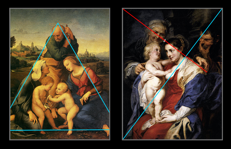
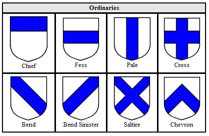
In the Baroque era, painters and sculptors sought a visual language that would allow them to strike through the Renaissance ethos of stability and reflect a new era of drama, tension, and emotional dynamism. They found their answer in the diagonal line. Whether projecting upwards or slanting downwards, diagonal lines draw the viewer’s eye in a particular direction, simulating a feeling of movement. However, is movement always progress? Mathematically, diagonals are considered in terms of positive or negative slope. Positive slopes indicate that as x increases, y also increases. This is shown on a graph as a line with its lowest point in the left, increasing in height toward the right. Negative slopes go in the opposite direction, where y decreases as x increases. This gives the impression of a “downward” trajectory, beginning in the top left and moving toward the bottom right. While positive and negative may be neutral descriptors of direction, culturally they take on a moral significance. Positive=good, Negative=bad. Upward=good, Downward=bad. Progress=good, Regress=bad. Fittingly, in compositional analysis, positive diagonals are commonly referred to as “Baroque diagonals,” and negative as “Sinister diagonals.” This terminology may originate from heraldry, which uses the Latin words “dexter” and “sinister” to indicate the right and left sections of a coat of arms. The evolution of the word “sinister” in the English language clearly indicates the conception that anything leftward-leaning is evil or unlucky. Given this culturally and historically-steeped reading of diagonals, what might we make of the fact that directional lines—specifically right-to-left diagonals—appear so frequently in Russian visual culture as a symbol of futuristic progress? …Is a world that launches toward the left Mirskonsta--a “world backwards”?
READING LANGUAGE
To be able to “read” images, that is, to apply a linguistic sensibility to the analysis of symbols, we must first understand the conventions of the Western linguistic codex. All writing systems have some element of directionality coded in their structure. Latin, Cyrillic, and Greek alphabets for instance are read left to right. This means you, reader, have been scanning through every sentence on this page beginning in the left and moving toward the right in order to uncover meaning from the words on this page. (Take a moment to feel the way your eyes glide across this sentence.) Very few writing systems are read conversely, from right to left—the most well known are the Semitic languages Arabic and Hebrew. In all cases, the eye is culturally trained to expect some kind of semiotic logic from the direction of words.
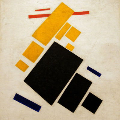
The advent of the moveable type printing press by Johannes Gutenberg in the mid-15th century played a paramount role in the standardization of language through the mass production and dissemination of books and pamphlets throughout Europe. The term “Gutenbergian” refers to the elements of type that inform much of our standard thought patterns today. Some elements of Gutenbergian type include rigid linearity and an absence of multidirectional or non-horizontal text (Janecek, 42). The Russian avant-garde practice of bookmaking that proliferated in the early 20th century directly challenged these standards. Indeed, as Janecek notes, the turn of the century was a time for all art forms to be deconstructed and reevaluated: “Rather suddenly the trend in all the arts was to interrogate the nature of every art form and to establish and maximally focus on the most basic traits, goals, and means in each of them.” Reducing things to their most essential forms found expression in painterly movements such as Suprematism, which extolls the supremacy of non-figurative shapes, and Rayism or Rayonism, which focused on the primacy of light in creating spatial forms. To make the transition from visual culture to political culture—for the remainder of this inquiry will be concerned with the intersection between the two—we may return again to this idea of language. Most linguists agree that the essence of language is verbal communication (Pinker, 16). This is true of politics, as well—Michael Morris defines political rhetoric as “the examination of how political leaders within a given speech community use words to lead or mislead the public” (31). So, if the spoken language is the most basic trait of political practice, then political art must focus on somehow communicating sound rhetoric through visual means. Thus we see time and again the thrust of a diagonal, both a signifier for radiating sound and linear (read: “forward”) progression.
TRAJECTILE TENDENCIES IN RUSSIAN ART
From here we launch an inquiry into the socio-political implications of the directional line in Russian visual culture. A directional line may be more accurately referred to as a "ray," or a line that begins at a definitive point and extends infinitely into one direction. The word ray derives from Latin radius, meaning "beam." As with all things that radiate, from light to sound ("radio" derives from the same root), there is an origin point- a source of projection. For Russia, as we will see, this source is Lenin.
Figuring Lenin: Leader of the Left
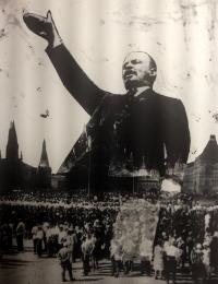
One of the most famous depictions of Lenin (and the one Lissitsky used in his design for the Lenin Tribune) is G.P. Goldstein’s photograph of Lenin addressing the Red Army in Sverdlov Square, Moscow. It was taken on May 5th, 1920 as the soldiers were about to depart for the Polish front, and Lenin is captured in a moment of impassioned speech: his mouth open and brow furrowed as he leans out over the edge of his platform. Lenin is not a static figure, and his mobility here can be viewed as a symbol for the fervent dissemination of Communist rhetoric across Russia. His leftward projecting body allows his leftist message to reach thousands.
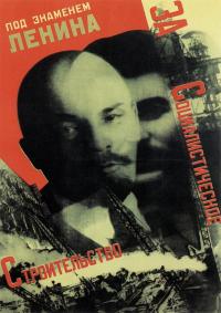
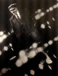
Gustave Klutsis' gelatin prints take the political symbolism of Lenin’s body and abstract it into a compositional device. Lenin’s larger than life form is oriented on a diagonal axis from the lower right corner of the page to the top left. The raised hand gesture and open mouth indicate declamatory speech and will crop up again in a variety of shapes and forms throughout propagandist print media.
Communist Posters and Print Media
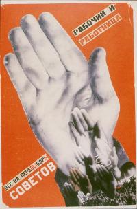
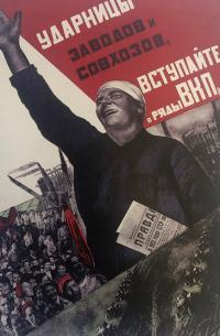
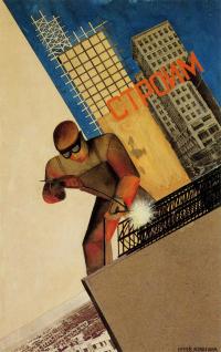
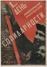
Husband and wife duo Gustav Klutsis and Valentina Kulagina produced numerous Soviet photomontages throughout their careers, both individually and collaboratively. Many of these materials utilize directional imagery: for example, Kulagina’s poster design for the female shock workers of the Communist party shows a central figure taking up the entire mid-ground of the composition, angled diagonally from lower right to upper left, just like Klutsis’ Lenin prints. The figure raises an arm in salute, reinforcing the upward thrust of the diagonal. Similarly, Klutsis’ piece entitled “Workers, Everyone Must Vote in the Election of Soviets!” emphasizes the diagonally raised hand. Kulagina’s postcard design “We Are Building” incorporates Constructivist imagery of industry and urbanization, again along a progressive and futuristic diagonal.
(More work by Klutsis: Here and here)
Building a Future: Constructivist Architecture
El Lissitzky's unrealized design for the Lenin Tribune exemplifies the avant-garde desire to disrupt and conquer space. Lissitzky's 1920 design is for a moving speaker's podium; thus, inherent to the structure is the possibility for mobility and transport. The tribune evokes other engineering feats of Western technology such as the Eiffel Tower and the skyscrapers of New York City and Chicago, speaking to the vision of constructing a new modern society. In doing so, it merges the abstract elements of Suprematism with a utilitarian consciousness, seen also in the mid-avant-garde "techno-fetishism" which privileges machine-driven artistic endeavors in service of a utopian vision.
The hybrid architectonic forms in Lissitzky's proun paintings realize the spatial depth implied in the two-dimensional forms of Suprematist works by artists such as Malevich. One can see in Lissitsky's prouns a similar vocabulary to the tribune: a deliberate construction from parts, operating around a central, energetic diagonal. Furthermore, this diagonal draws the eye from the bottom right into the upper left field of vision, challenging the linguistic impulse to "read" forms from left to right. Language is in fact employed in the tribune's design through the word "proletary" emblazoned across a sign over Lenin's head.
Through the Lenin Tribune, Lissitzky enacts the Suprematist principles of motion and layering in three dimensions, while also distilling the dynamic, aural quality of Russian culture by functioning as a platform for the projection of Lenin's propagandist oration. The diagonal composition of the tribune reinforces the outward projection of Lenin's voice. Further, the insertion of Lenin's body into the tribune design replicates the iconography of propaganda posters: leaning forward toward the crowd, the embodiment of potential motion. Here as well, he is foregrounded by text, the words on his podium being the first line of the Communist Manifesto. These words, just like the "proletary" sign affixed to the tribune, undergo a transformation from text to sound, and with Lenin's body as the medium, from theory to practice.
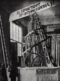
Vladimir Tatlin’s Monument to the Third International is another iconic, unrealized example of projectile architecture designed to serve a political function. The project, a building to house the communist government, “represented a vital extension of construction into the public sphere, exemplifying the wedding of constructivism and social commitment” (Milner, 151). The first model was exhibited in 1920 first in Petrograd and then in Moscow, and was often compared to the Eiffel Tower, although far exceeding in height. Tatlin’s Tower consists of spiral twists around a vertical axis that appears to lean leftward and recede from a wide horizontal base to a small focal point. The perspective forced by this diagonal diminution emphasizes the large scale of the structure (153). As Milner describes, “the monument appeared to lean, dramatically emphasizing its energetic qualities: the spiral there seems to heave forward off its base upwards and forwards, the screw thread of a tunneling device screwing into the air as it emerged from the earth.” The tower takes on a modified pyramidal form by having one of its sides vertical, contributing to the “leaning” effect, which simultaneously suggests instability while remaining in engineered equilibrium. Additionally, the tower was designed to actually rotate, producing the visual effect of a monument that emerges from the earth and ascends forward and upward, screwing and spiraling into the sky. Scholar John Milner compares the tower to the forceful stride of Italian Futurist Boccioni’s sculpture, Unique forms of Continuity in Space, a comparison which highlights the militant, forward-moving progress of communism (155-56). As a political vessel, Tatlin’s Tower embodies the processes of governmental decision-making: the decrease in size toward the top indicates the hierarchy of power, with fewer individuals at the top, “higher in authority and altitude” (160). The emphasis on progress and process, an active “becoming” versus a static “being” carries spiritual and political aspirations for human evolution. The dynamic diagonal, like Lenin’s tribune, is a call to action and a reach for a material Utopia.
This page has paths:
This page references:
- Prizrak brodit po Evrope, prizrak kommunizma [A Specter Is Haunting Europe—the Specter of Communism]
- Malevich, K. "Eight Red Rectangles," 1915
- Renaissance vs. Baroque Composition
- el Lissitzky and Studio. Lenin Tribune, 1920
- Under the Banner of Lenin for Socialist Construction
- Lissitsky, Proun, 1922-3
- Monument to the Third International
- Gustav Klutsis, Untitled (Lenin), ca. 1929
- Klutsis, Untitled (Lenin), ca. 1929
- Workers, Everyone Must Vote in the Election of Soviets!
- Female shock-workers of factories and collective farms enter the ranks of VKP(b), 1932
- We Are Building
- First of May-Day of the International Proletarian Solidarity
- Larionov, Red Rayonism, 1913
- Lenin's Call to Arms
- Slope
- Heraldry
- Umberto Boccioni, Unique Forms of Continuity in Space