Effective Uses of Ineffective DesignsMain MenuEffective Uses of Ineffective DesignIntroductionThe Basic Trends of Web DesignAward Worthy Examples of Good Web DesignElements of DesignCaptain MarvelLINGsCARS.comYale University School of ArtThe Benign Violation TheoryUsability and AccessibilityStriking a BalanceWorks CitedRylee Rucker145774e89599fc9d29e5fb0cad5c978fe2693c1a
Contrast to Clashing
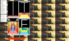
12019-05-10T15:46:59-07:00Rylee Rucker145774e89599fc9d29e5fb0cad5c978fe2693c1a338652plain2019-05-10T15:50:20-07:00Rylee Rucker145774e89599fc9d29e5fb0cad5c978fe2693c1aThis color, which I would describe as blood orange, contrasts so much that it actually clashes with the rest of the site. But that link is visible to all, which means that if anyone wants to learn more about the art project above it, they can.
Contents of this annotation:
12019-05-10T15:45:42-07:00Rylee Rucker145774e89599fc9d29e5fb0cad5c978fe2693c1aYale University School of Art Alternate Page1media/Yale School of Art Alt.pngplain2019-05-10T15:45:43-07:00Rylee Rucker145774e89599fc9d29e5fb0cad5c978fe2693c1a