Captain Marvel
Popular as this film was, it's popularity alone isn't responsible for how well received the website was. Every Marvel movie has it's own website to help fans keep informed about the movies, but these sites don't generally attract very much attention. If it were about popularity, then Avengers: Endgame, which is shattering box office records as we speak, should have one of the most popular websites ever (it doesn't). So what makes Captain Marvel so special? Why was it shared all around the internet by fans? Why does it's view counter, at this writing, read 13,031,968? Because of its website design.
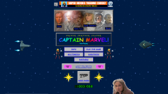
The website only has one page, which users can scroll through as they wish, but this is the very first thing users see upon visiting the Captain Marvel site, and it sets the tone for every page that follows it.
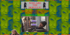
This page is all about the Skrulls, the film's shape shifting alien villains, and features a very simple flash game where users try to identify which random people on a train are human, and which are Skrulls in disguise. The game is very simplistic, but it's also reminiscent of the simple, easy to program flash games that popped up on all sorts of websites back in the 90's.
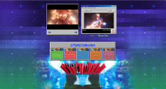
The site's multimedia page features two trailers, a photo gallery, ans five stereograms for users to enjoy. This page is designed to be reminiscent of a standard 1990's attempt at adding multimedia to a page, only without the wait time dial up would have required. The bulky video player, the dark blue text on a gray background, and even the 3D text effect all contribute to the general 90's vibe of this section. The ba
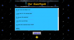
The site also features a mock guestbook, which is the very last section of the website. Users can't really sign it, but the messages it displays really cement the feeling of 90's nostalgia that the site has worked so hard to capture. At the bottom of the page is the Captain Marvel star, last seen at the very top of the website. By including it again here at the end, the website is able to create a sort of boarder effect for the site.
The Captain Marvel website is a totally unique site, and it completely disregards a lot of the basic rules of webdesign in favor of the outdated aesthetics of the 1990's. However, the site is still very clearly well made, and every part of it functions as intentioned. There are dozens of minor animations all over the site, but they never interfere with the site's ability to function, and everything loads almost instantly. The site also features more modern design elements in the sense that it's made up of one long page that users can scroll through as they please, with headings and background changes to separate different sections. This style of webdesign grew popular because it makes for an easy transfer to mobile devices, which the site also functions perfectly on. The site's ability to function so well despite it's garish appearance is part of what made it so popular: it allows users to feel nostalgia for a time long since passed, without inconveniencing them in the process. This site therefore follows Benign Violation Theory, which makes it funny, memorable, and a very successful way to create publicity for the film.