Yale University School of Art
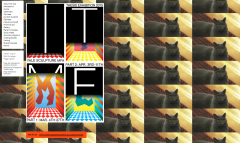
So, why is Yale University's website so...like that? Simple: it has this very unique feature where anyone can go in and swap out the background of the site. Currently, this means that the site is being used to honor Stephanie Washington, who was non-fatally shot by a university police officer last month. However, the website has also been graced with random, more light-hearted images.
Whatever the image is, the site's white and black boxes, which detail the links to other pages and tell you who the last editor of the site was, are always the same. Why? Contrast. The boxes don't look good with most images, and more often than not they actually tend to clash with the background, but they're always readable. This type of precaution allows for the site to regularly change without compromising it's usability.
Why does the School or Art give everyone the ability to use it? Simple: Art is about more than just looking good. Art is about making a statement, and expressing yourself. Sure, skill is important to a degree, but because of photos, the world no longer relies on artists to capture reality. Instead, art comments on reality, and Yale's School of Art is giving it's students the chance to do that with their very website. And sure, sometimes people will change the site's background to a cat, but sometimes students will use this feature of the site to make a political statement about police brutality.