Effective Uses of Ineffective DesignsMain MenuEffective Uses of Ineffective DesignIntroductionThe Basic Trends of Web DesignElements of DesignCaptain MarvelLINGsCARS.comYale University School of ArtThe Benign Violation TheoryUsability and AccessibilityStriking a BalanceWorks CitedRylee Rucker145774e89599fc9d29e5fb0cad5c978fe2693c1a
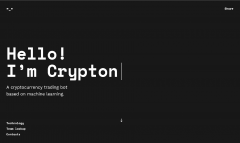
This site is minimalism at it's finest, with nothing but text and one little emoticon for style. This homepage sets the tone for the rest of the site though, as it's based entirely on a bot meant to help users understand crypto currency. The lack of images may be surprising to some users, but there really aren't any images that would have been effective for this particular site. Crypton isn't selling anything, and since it's all about digital currency there aren't many physical example to show. The site introduces itself with nothing extra added, and it presents itself in a clean, professional manner. There's nothing eye catching about this site, but then, if someone is visiting the site, they're probably already interested in crypto currency. It's not exactly something you just stumble upon, unless of course you're looking at website design.
Mikiya
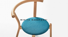
This site is also clearly influenced by minimalism, but it's meant to sell things, so it's homepage switches between several different images of furniture, most very similar in composition to the one seen above. The site gets a bit more intricate once the user moves into the actual products that are up for sale, but this page does a fairly good job of introducing users to the general style of Mikiya's furniture designs.
ETQ
ETQ, if you couldn't guess, is an online shoe store, and while you may be wondering if the white, black, and gray sneakers are a good representation of their catalog, let me assure you, they are. Nearly all the shoes I saw for sale are sneakers, and very few of them appeared to come in other colors. The site's homepage sets the tone for the rest of site, which is also in grey scale, and which follows a very minimalist grid layout that is pretty much all pictures.
This page has paths:
12019-05-06T22:33:06-07:00Rylee Rucker145774e89599fc9d29e5fb0cad5c978fe2693c1aThe Basic Trends of Web DesignRylee Rucker8plain8734282019-05-10T16:08:07-07:00Rylee Rucker145774e89599fc9d29e5fb0cad5c978fe2693c1a
This page references:
12019-05-06T23:17:55-07:00Mikiya Homepage4A white background, with a wooden chair with a turquoise cushion as the focus. In the center of the screen are the words 'Mikiya Kobayashi' in black text, and at the bottom of the page is the word 'scroll'.media/Mikiya.pngplain2019-05-07T15:34:11-07:00
12019-05-06T22:57:59-07:00ETQ Homepage2An off-white background, featuring white and black sneakers scattered across it. Very minimalist.media/ETQ.pngplain2019-05-07T15:25:54-07:00
12019-05-06T22:47:27-07:00Crypton Homepage2A black screen with white text, introducing Crypton.media/Crypton.pngplain2019-05-07T15:42:24-07:00