Effective Uses of Ineffective DesignsMain MenuEffective Uses of Ineffective DesignIntroductionThe Basic Trends of Web DesignAward Worthy Examples of Good Web DesignElements of DesignCaptain MarvelLINGsCARS.comYale University School of ArtThe Benign Violation TheoryUsability and AccessibilityStriking a BalanceWorks CitedRylee Rucker145774e89599fc9d29e5fb0cad5c978fe2693c1a
Animation
12019-05-07T15:57:41-07:00Rylee Rucker145774e89599fc9d29e5fb0cad5c978fe2693c1a338652plain2019-05-07T16:00:46-07:00Rylee Rucker145774e89599fc9d29e5fb0cad5c978fe2693c1aThis picture pops up around different areas of the screen while users browse the site. She doesn't stay very long, and if you click her the photo briefly changes to her being punched before she goes away. She never blocks content on the desktop version, but she can occasionally get in the way of things on mobile. But again, she's easily gotten rid of, so it doesn't detract from the site's usability.
Contents of this annotation:
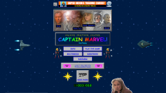
12019-05-06T18:16:07-07:00Rylee Rucker145774e89599fc9d29e5fb0cad5c978fe2693c1aCaptain Marvel Official Website1The background of the site is an 8-bit pixel art version of space, with flashing stars and two spaceships, also made of pixel art. In the center of the screen is an orange and gray banner advertising superhero trading cards. Below that is a slightly grainy collage of characters from the movie, with the names Kree, Nick Fury, Carol Danvers, and Skrull listed in blue text with a balck highlight. Below that is a banner of the movie's title, stuck inside a gray box and with rainbow colored font. Below that are boxes containing links to other sections of the website, all listed in blue text on gray backgrounds. These boxes are set in between two pixel art animations of Captain Marvel. At the bottom of the page is a visitor counter, and at the bottom right is a grainy photo of an elderly woman.media/Captain Marvel Top.pngplain2019-05-06T18:16:07-07:00Rylee Rucker145774e89599fc9d29e5fb0cad5c978fe2693c1a