Presentation matters: Basics of graphic design in educational technology
By Renata Kuba, Ph.D. Candidate, Instructional Systems and Learning Technologies at Florida State University
This article proposes several visual design guidelines for designing more appealing and readable instructional materials. The guidelines follow the design principles of alignment, contrast, repetition, and proximity. In addition, this article presents tips for combining fonts, selecting colors, and finding resources.
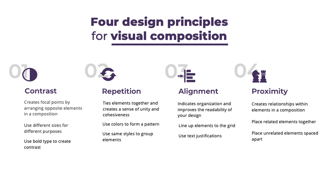
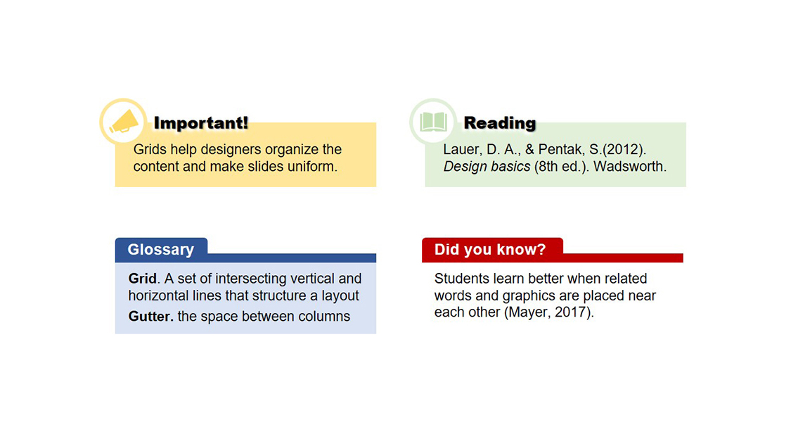
The alignment principle refers to the arrangement of elements in a composition that creates a sense of equilibrium and order, indicates organization, and improves the readability of your design (Lauer & Pentak, 2012). An effective way to achieve alignment is by constructing and using a grid. A grid is a set of intersecting vertical and horizontal lines that structures a layout and facilitate the arrangement of elements (Samara, 2017). Grids help designers organize content and make slides uniform while providing flexibility to generate various layouts.
Design idea: Apply different layouts to inform learners of the structure of the lessons. For example: use one layout for the learning objectives, one for the content, and another for the takeaway points.
Figure 3. Layout (4x3 grid) for an opening slide.
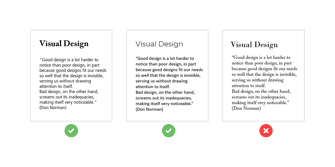
Design idea: Consider each of the above features when styling titles, subtitles, and paragraphs to create distinct characteristics and enhance the content structure. For example, Fig. 5 shows a simple layout composition. The main title uses all the above features (i.e., bolded letters, large size font, upper case letters, white space, color, and graphic elements). The subtitle uses many features but not all, and the key sentence uses bolded letters and a light gray rectangular box. In contrast, the paragraph style for the text is the simplest, with no color or shape, smaller font, and less white space around it.
Fig. 6 shows an example of repeating colors and font styles to strengthen the content structure by signaling elements with the same function and hierarchy (i.e., all subtitles share similar characteristics).
Fig. 9 shows two versions of a lesson: one with the application of the spatial contiguity principle (left) and the other with the violation of the principle (right).
Design idea: Use gutters and white space to group related content and space apart unrelated content. For example, in Fig. 12, the narrow vertical gutters indicate that the content split into columns is related. In contrast, the large horizontal gutters suggest that the content placed in the upper and bottom parts is less related.
Design idea. Keep it simple. In instructional materials, using one or two font families is ideal. You can use one font family for the title and one for the text, or play with font styles (e.g., bold and light) within the same family (Fig. 15).
Figure 15. Combining and contrasting fonts: (a) serif for the title and sans serif for text, (b) same font family but an extra-light style for the title and regular for text, and (c) two similar serif fonts with not enough contrast.
One common approach is to apply the core brand colors of your organization to your design. Before doing so, designers must understand and follow the brand identity and evaluate how and when to use the brand colors. Here are some considerations:
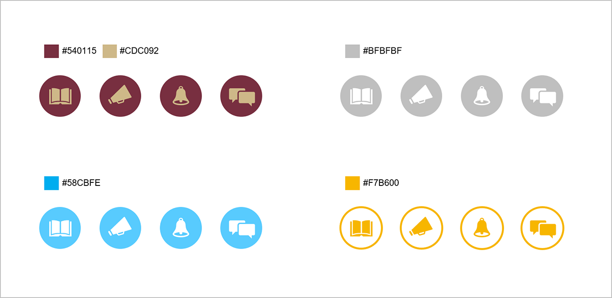
Design idea. Use the brand colors as a design accent. Fig. 16 shows icons colored based on different color pallets.
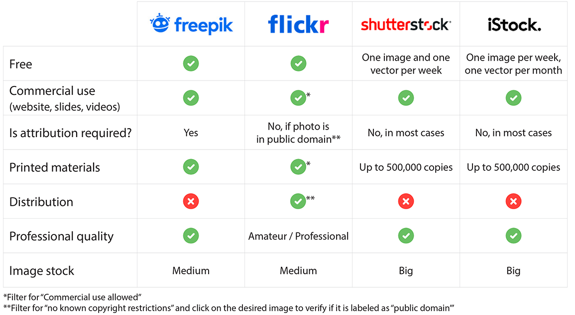
Whether you are working in the industry or academia, there are many free resources that can help you. See some websites below for finding free images (Fig. 17), icons, audio, and fonts. You may want to consult each of them for more updated info on copyright, royalty, and license information.
Introduction
In this increasingly digital world, the growing demand for online materials has made visual communication products dominate learning environments, making visuals no longer an add-on but an essential factor in conveying meanings (Ervine, 2016). Further, the aesthetically appealing design of such products can maintain learners' attention and induce positive emotions that facilitate the cognitive processes required to achieve better learning. Studies show that instructional material developed based on design principles promotes better comprehension, knowledge transfer, motivation, and can reduce the perception of task difficulty (Plass et al., 2014). Although the artistic skills and sensibility of a graphic designer are often required to develop compelling visual communication products, the body of research in visual literacy has and continues to produce new empirical evidence supporting the use of design principles by non-designers to improve instructional materials.
Alignment: Using Grids
The modular grid is the most applicable grid for instructional materials and is built based on four parameters (Fig. 1):
- Margins: the area surrounding your content. Margins create an invisible frame around the content, letting your design breathe.
- Columns: the vertical divisions inside the margins that organize and contain the content.
- Baselines and rows: the horizontal divisions and lines inside the margins that organize and align elements.
- Gutters: the space between columns that creates breathing room within your content.
Figure 1. Elements of a modular grid.
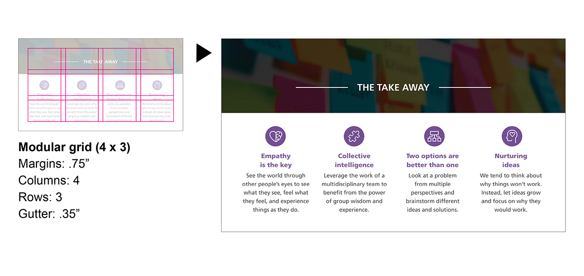
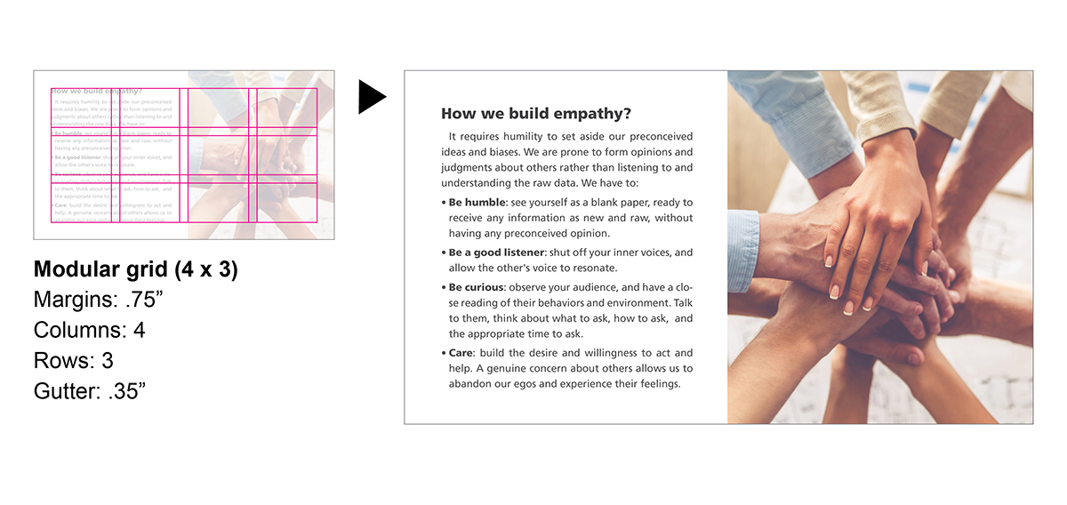
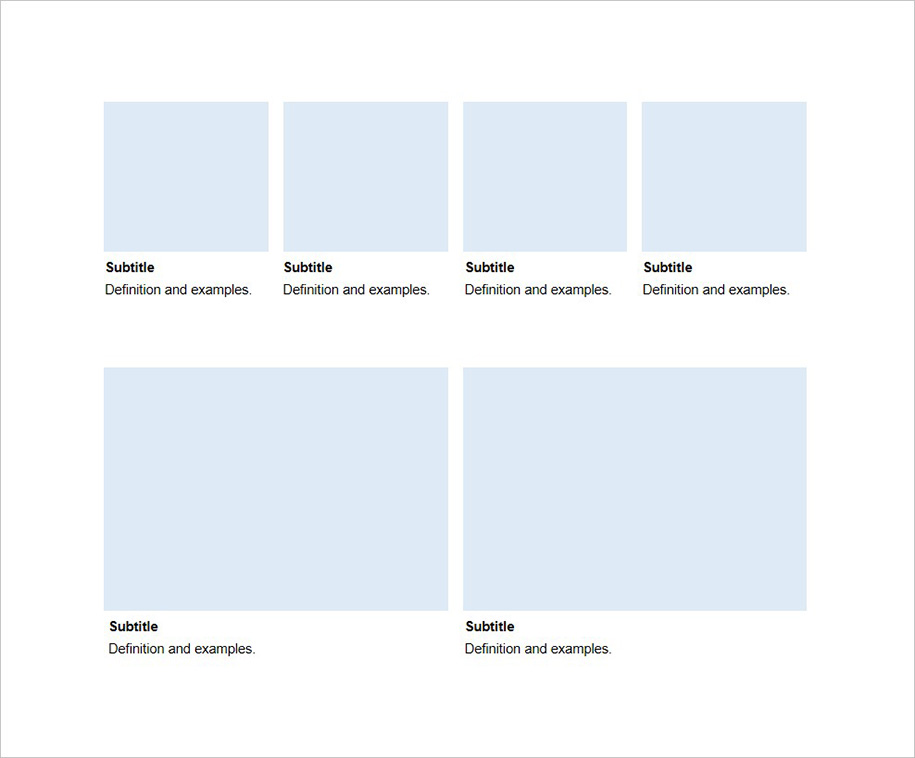
Using columns and rows is a great way to establish a visual hierarchy based on spatial zones. For example, in Fig. 2, the design was organized on a layout of 4x3 (column x row), in which the title and image were placed on a spatial zone of one row and four columns, and each takeaway point was placed in one column. Further, the grid is handy for aligning elements and creating a sense of order and balance. Notice how the margins and gutters allow the design to breathe, the columns organize the content and improve the reading flow, and baselines align elements across columns (e.g., icons and subtitles). Also, grids provide flexibility. Fig. 3 and 4 show the same 4x3 grid used for different layouts.
Design idea: Apply different layouts to inform learners of the structure of the lessons. For example: use one layout for the learning objectives, one for the content, and another for the takeaway points.
Figure 2. Layout (4x3 grid) for the takeaway slide.
Figure 4. Layout (4x3 grid) for the content.
Contrast: Establishing Visual Hierarchy
Also known as focal point, the contrast principle refers to the arrangement of opposite elements in a composition that draws viewers’ attention to specific parts (Lauer & Pentak, 2012; Williams, 2008). Perhaps, in designing instructional materials, the most common purpose is to establish a visual hierarchy that corresponds to the function and importance of certain contents. With that in mind, some simple features can help you achieve this objective:
- Font weight: use bolded letters to highlight key content. Studies have shown that bolding letters to emphasize keywords helps learners remember the important content (Jin, 2013).
- Size: use different font sizes to inform learners of titles’ and subtitles’ levels. Making a clear distinction between the hierarchy of contents helps learners comprehend the content structure and build a better conceptual schema.
- Font case: apply upper case letters to main titles to enhance the visual hierarchy.
- White space: place white space around the main title or key sentences to help them stand out and draw in the viewer’s attention.
- Colors: apply color in the titles and subtitles. You can use the colors of your organizational brand to strengthen and connect your design to the brand visual identity.
- Shapes: alternatively, you can also place small shapes close to key content to make them stand out and direct the reading flow.
Design idea: Consider each of the above features when styling titles, subtitles, and paragraphs to create distinct characteristics and enhance the content structure. For example, Fig. 5 shows a simple layout composition. The main title uses all the above features (i.e., bolded letters, large size font, upper case letters, white space, color, and graphic elements). The subtitle uses many features but not all, and the key sentence uses bolded letters and a light gray rectangular box. In contrast, the paragraph style for the text is the simplest, with no color or shape, smaller font, and less white space around it.
Figure 5. Example of visual hierarchy among elements.
Repetition: Enhancing Content Structure
Also known as similarity, the repetition principle states that elements that share similar characteristics are perceived as related, while a lack of pattern indicates that they are unrelated (Lauer & Pentak, 2012; Williams, 2008). Designers can repeat colors, graphic elements, and icon styles to signal related content and strengthen the content structure in instructional materials.
Figure 6. Repeating colors and styles to signal same hierarchy.
Alternatively, you can repeat colors to connect related content, as shown in Fig. 7. The designer used the same color for each group of content (e.g., all contrast elements are purple) and repeated the same style (e.g., use of boxes) and visual structure (e.g., subtitles under icons) for each group.
Figure 7. Repeating colors and styles to signal related content.
Design idea: Create distinct styles and repeat them throughout the lesson. Fig. 8 shows examples of graphic elements used for different purposes. For instance, you can repeat the Reading box every time you propose a reading for students. When they see the box, they will immediately recognize it as a reading recommendation. Lastly, the idea of creating specific layouts for the learning objectives, content, and takeaway slides mentioned earlier is also an example of the repetition principle when you follow the same layout consistently across your lessons.
Figure 8. Distinct graphic elements for different purposes.
Proximity: Reinforcing Relationship
Also known as spatial contiguity, the proximity principle states that elements that are close to each other are perceived as related, and elements that are spaced apart are perceived as unrelated (Lauer & Pentak, 2012). In multimedia instructional materials, students learn better when corresponding words and graphics are near each other (Mayer, 2017). Studies found that students engage in more appropriate cognitive processing (Makransky et al., 2019) and have higher scores on transfer and retention tests (Johnson & Mayer, 2012) when studying with materials designed based on this principle.
Figure 9. Spatial contiguity principle (adapted from Johnson & Mayer, 2012).
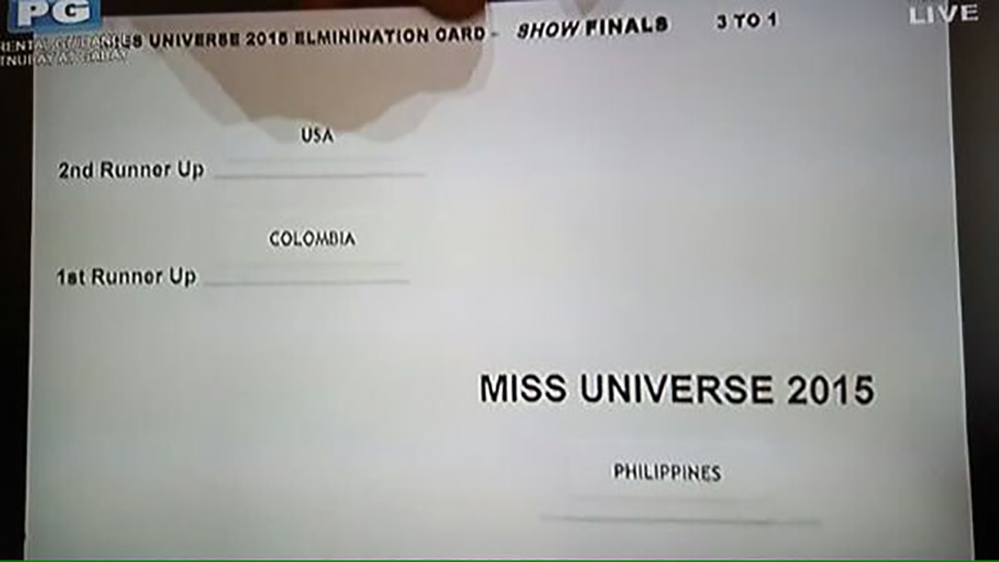
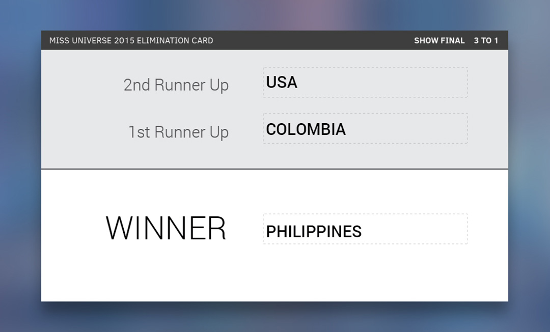
The failed application of proximity can confuse readers. Recall the gaff made by Steve Harvey at the 2015 Miss Universe pageant. The image below (Fig. 10) displays the card handed to him. Notice how the visual communication is unclear. The winner clause is too far from the first and second runners-up. Harvey had to read the card during a live broadcast, so it was crucial to have clear visual communication for immediate interpretation. By simply approximating the winner clause to the related items, we can improve the readability flow and organization. When combining the proximity principle with the other principles (e.g., alignment and contrast), we can get an even more effective visual communication (Fig. 11). In many design cases, especially in instructional design, the primary goal is not to achieve attractiveness but to communicate efficiently by presenting a successful information architecture.
Figure 10. Elimination card (retrieved from www.ics.com/blog).
Figure 11. Elimination card redesigned by LeBlanc (2015) (retrieved from www.ics.com/blog).
Figure 12. Example of proximity principle.
Combining Fonts
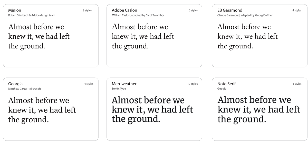
- Choose contrasting fonts. You want the fonts to contrast each other. If fonts share similar characteristics and are not distinct enough, the design can be perceived as a mistake. You can use serif fonts for titles and sans serif fonts for text, or vice-versa. Pairing serif and san serif fonts is a classic combination and usually cannot go wrong. Figs. 13 and 14 present high legible sans serif and serif fonts, respectively (most of these fonts are available on Google Fonts for free).
- Contrast font weights. You can use a single font family and contrast different weights for differentiating titles and text. For example, make the titles much heavier or much lighter than the text (e.g., using extra-bold for the title and regular for text). Also, sticking with one family is always a good choice because it provides a cleaner design, and you know that the font versions will work well together.
Design idea. Keep it simple. In instructional materials, using one or two font families is ideal. You can use one font family for the title and one for the text, or play with font styles (e.g., bold and light) within the same family (Fig. 15).
Figure 13. Suggestions for sans serif fonts.
Figure 14. Suggestions for serif fonts.
Figure 15. Combining and contrasting fonts: (a) serif for the title and sans serif for text, (b) same font family but an extra-light style for the title and regular for text, and (c) two similar serif fonts with not enough contrast.
Selecting Colors
- Consult the brand style guide. A brand style guide is a rulebook with specifications on logos, colors, typography–all regarding the brand. You want to consult the guide to find the exact color hex or RGB values for the brand colors. Then, you can add the core brand colors to your color pallet.
- Check how to use the colors. If not stated in the brand guide, check previous visual communication products to see how designers applied the brand colors. For example, Google and Slack have five core brand colors each, but Google uses mainly grayscale shades and one core color in its products while Slack combines multiple brand colors to compose colorful and bright designs.
- Evaluate when to use the brand colors. In most cases, the designer is the mediator between the organization and the end-user, responsible for reflecting the organization’s values in the created visual communication products. Thus, some organizations might have restrictions on using the brand colors in certain materials. For example, 99 Taxi’s organizational voice is defined as enthusiastic and vibrant. In their instructional materials about defensive driving, they opted to use grayscale for images that had a negative feel (e.g., car accident) and only used their colors to show positive attitudes.
Design idea. Use the brand colors as a design accent. Fig. 16 shows icons colored based on different color pallets.
Figure 16. Using core brand colors as design accents.
Finding Resources
- Icons:
- Iconfinder: https://www.iconfinder.com/
- Freepik: https://freepik.com
- Audios:
- YouTube: https://studio.youtube.com/channel/UCi1Lw-sMpxu48Gixn1ATJOQ/music
- Freesound: https://freesound.org/
- Fonts
- Google: https://fonts.google.com/
- DaFont: https://www.dafont.com/pt/
Figure 17. Resources for royalty-free images.
Lastly, I want to share a ready-to-use ppt template designed based on the guidelines discussed in this article (you may need a new PowerPoint version). Just remember to go to the View tab and turn on the guides.
Conclusion
Visual design skills are essential in all academic areas, but especially in instructional design, since students must be prepared to work in an environment where designing visuals for learning will be part of their daily work. To shed light on this matter, this article presented several visual design recommendations for developing readable and appealing instructional materials. The recommendations follow the design principles of alignment, contrast, repetition, and proximity. I hope this article can help practitioners and researchers design better visual communication products for learning and make visual design skills more tangible.
References
Ervine, M. (2016). Visual literacy in instructional design programs. Journal of Visual Literacy, 35(2), 104-113.
http://dx.doi.org/10.1080/1051144X.2016.1270630
http://dx.doi.org/10.1080/1051144X.2016.1270630
Jin, S. H. (2013). Visual design guidelines for improving learning from dynamic and interactive digital text. Computers and Education, 63, 248–258. doi.org/10.1016/j.compedu.2012.12.010
Johnson, C. I., & Mayer, R. E. (2012). An eye movement analysis of the spatial contiguity effect in
multimedia learning. Journal of Experimental Psychology: Applied, 18(2), 178–191. doi.org/10.1037/a0026923
multimedia learning. Journal of Experimental Psychology: Applied, 18(2), 178–191. doi.org/10.1037/a0026923
Kuba, R., Rahimi, S., Smith, G., Shute, V.J., & Dai, C. (2021). Using the First Principles of Instruction and multimedia principles to design and develop in-game learning support videos. Educational Technology Research and Development, 69(2), 1201-1220. http://dx.doi.org/10.1007/s11423-021-09994-3
Lauer, D. A., & Pentak, S.(2012). Design basics (8th ed.). Boston, MA: Wadsworth.
LeBlanc, J. (2015, December 22). And the Winner Is…(The (Miss) Universe of Bad Design). ICS.
https://www.ics.com/blog/and-winner-isthe-miss-universe-bad-design
https://www.ics.com/blog/and-winner-isthe-miss-universe-bad-design
Makransky,G., Terkildsen, T. S., & Mayer, R. E. (2019). Role of subjective and objective measures of cognitive processing during learning in explaining the spatial contiguity effect. Learning and Instruction, 61, 23–34. https://doi.org/10.1016/j.learninstruc.2018.12.001
Mayer, R. E. (2017). Using multimedia for e-learning. Journal of Computer Assisted
Learning, 33(5), 403–423. https://doi.org/10.1111/jcal.12197
Learning, 33(5), 403–423. https://doi.org/10.1111/jcal.12197
Plass, J. L., Heidig, S., Hayward, E. O., Homer, B. D., & Um, E. (2014). Emotional design in multimedia learning: Effects of shape and color on affect and learning. Learning and Instruction, 29, 128–140.
doi.org/10.1016/j.learninstruc.2013.02.006
doi.org/10.1016/j.learninstruc.2013.02.006
Samara, Timothy. (2017). Making and breaking the grid: A graphic design layout workshop (2nd ed.). Gloucester, MA: Rockport.
Williams, R. (2008). The non-designer’s design book: Design and typographic principles for the visual novice (3rd ed.). Berkeley, CA: Peachpit Press.
About the Author
Renata Kuba is a Ph.D. candidate in Instructional Systems and Learning Technologies at Florida State University. She also works as a UX/UI design consultant and has been working with visual and digital design for the past 12 years. She earned an M.P.S. in Interactive Telecommunications from New York University and has since developed wide-ranging designs for agencies, e-learning, and editorial brands. Her research and professional interests include game-based learning, immersive environments, visual design, and multimedia learning.
Her email is rk18d@my.fsu.edu.
| Previous page on path | Cover, page 7 of 21 | Next page on path |
Discussion of "Presentation matters: Basics of graphic design in educational technology"
Add your voice to this discussion.
Checking your signed in status ...