Thanks for your patience during our recent outage at scalar.usc.edu. While Scalar content is loading normally now, saving is still slow, and Scalar's 'additional metadata' features have been disabled, which may interfere with features like timelines and maps that depend on metadata. This also means that saving a page or media item will remove its additional metadata. If this occurs, you can use the 'All versions' link at the bottom of the page to restore the earlier version. We are continuing to troubleshoot, and will provide further updates as needed. Note that this only affects Scalar projects at scalar.usc.edu, and not those hosted elsewhere.
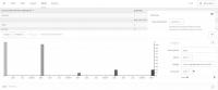
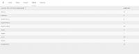
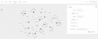
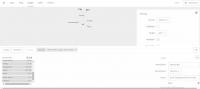
12018-04-07T05:02:42-07:00Pushpita Eshika9ecb80b3ce9aa93591f8202f17ccefcbfaf1081e278014plain2018-05-19T10:02:36-07:00Andrea Davise50475e163fb87bc8bd10c6c0244468fd91e8da5I was looking for the international enrolment in last five years from 2012 to 2016. I made some categories based on the number of students enrolled every year in fall. Therefore I picked those countries from where more than 10 students have enrolled in the ASU in undergrad and graduate program. And I put the rest of the countries in the category of others and combined together their enrolment. I tried to look at the number and rate of international student in ASU. Hence I used Palladio to find the graph and table of the enrolled international students. I found that the maximum number of students come in ASU from China. Saudi-Arabia and India has the second position. Last two years a great number of students from Nepal and Bangladesh also coming to ASU. It is interesting, that, until 2013 there were a good number of students from Turkey came to ASU, but the number reduced in 2014. To generate the data, I first collected the data and made an excel sheet and uploaded the excel file to Palladio as raw data. There it generated the information and presented as the form of graphs and tables with different variables. It is observed that, two particular columns only can be analyzed in this software. And it is not possible to visualize the whole relativity other than the generated information in this software. All the images have been copied from Palladio generated data, as it can not be saved.