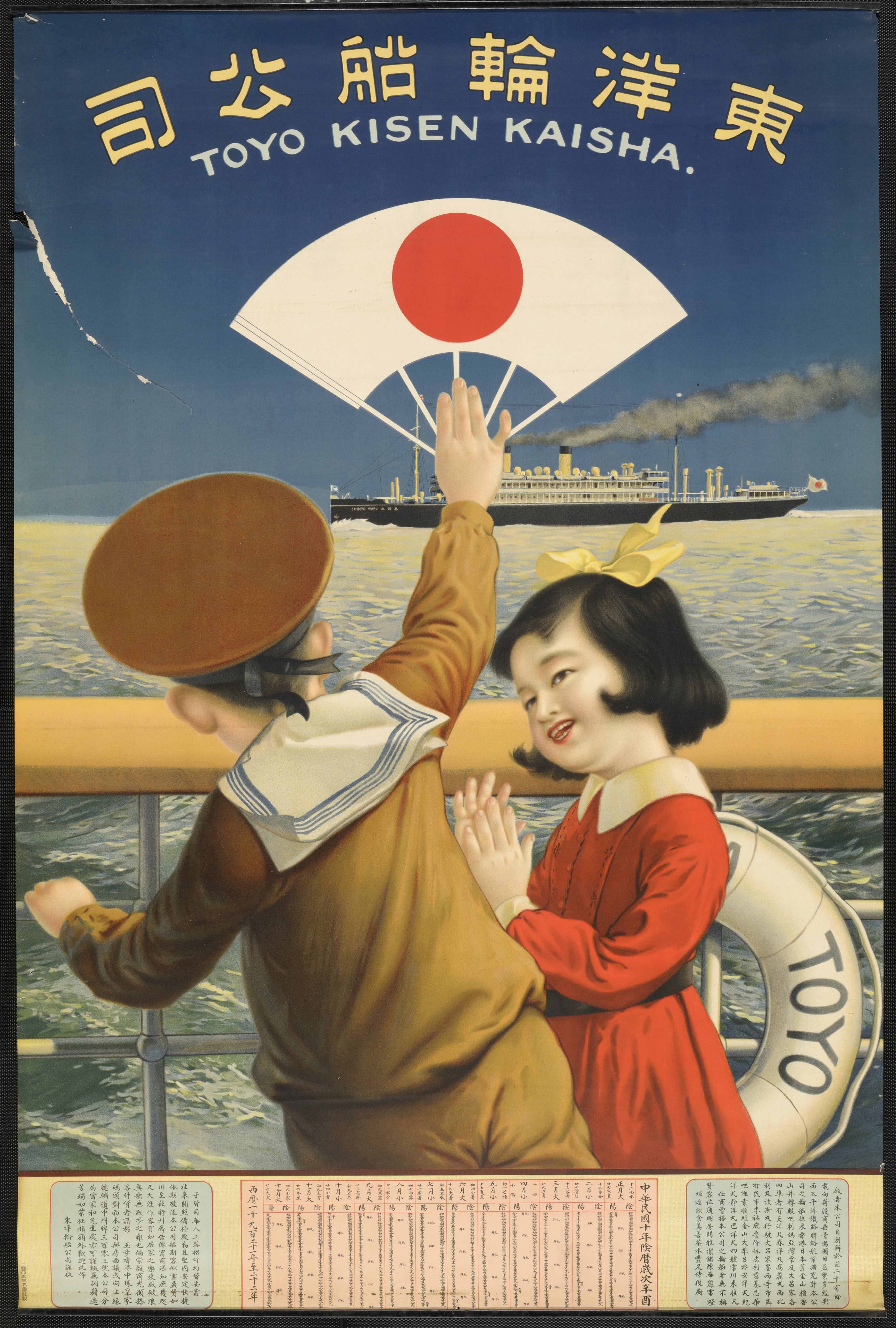
Tōyō Rinsen Kōshi = Toyo Kisen Kaisha [Children on board]
This is a Chinese-language poster commissioned by Japan’s Tōyō Kisen Kabushiki Kaisha, or Oriental Steamship Company. It shows the recurring theme of migration and progression in 1921 interwar Japan. During this time, Japan harnessed its post-First World War economic surge to work toward becoming an international power, utilizing advances in industry and trade. The poster’s vibrant, animated colors show the fruits of a colonial economy and Western trade. It features two porcelain-faced children doused in crimson and camel textiles, amidst a bright navy sea and sky. The coloring enlivens the extreme presence of the little girl’s blood-red dress, matching the Japanese flag-marked fan waved by the young boy, against the deep indigo sky, which symbolizes the color and fan of the Tōyō Kisen company logo. The children in vividly colored Western-style dress speak of bright futures and innovation. Since such coloring could not simply be derived from the natural world, it also implies Japanese artistic advancements obtained in modernization with the use of synthetic dyes. The imagery of the Tōyō Kisen Kabushiki Kaisha ship facing ”Shun’yō-maru,” another industrial steamboat with the Japanese flag raised in the air, represents a medley of world powers. The way in which they all seem to melt onto the poster symbolizes a mixing of countries into one global entity. (Ella Wilson)