Thanks for your patience during our recent outage at scalar.usc.edu. While Scalar content is loading normally now, saving is still slow, and Scalar's 'additional metadata' features have been disabled, which may interfere with features like timelines and maps that depend on metadata. This also means that saving a page or media item will remove its additional metadata. If this occurs, you can use the 'All versions' link at the bottom of the page to restore the earlier version. We are continuing to troubleshoot, and will provide further updates as needed. Note that this only affects Scalar projects at scalar.usc.edu, and not those hosted elsewhere.
Unpinning History: Japanese Posters in the Age of Commercialism, Imperialism, and ModernismMain MenuIntroductionJapan in the Age of Commercialism, Imperialism, and ModernismThe Rise of Tourism and the Era of Ocean LinersThe Rise of Tourism and the Development of Railway NetworksProvocation of Citizenship: Posters for the Ministry of CommunicationsExhibition CultureBijin: Posters with a Beautiful WomanArrival of Modern Commercial DesignBibliographyCollection NoteReuse and Remix this Exhibition
12020-04-29T14:31:29-07:00Anne-Marie Maxwell326ac6eff123bb3f77fb517c66299be8b435b479371406plain2020-05-07T15:57:58-07:00Rebecca Corbetta90733ad69f461205618486aa72143b4a46f0ff9The Puraton man’nenhitshu, Puraton ink poster for the Nakayama Taiyōdō company, based out of Osaka, is an early 1920s advertisement for an ink and fountain pen. It depicts a Western woman holding up an enlarged “Platon Ink” bottle, with a text reading “Superior Platon Ink. Fine Red. Nakayama Taiyōdō.” The product names, written vertically in a traditional yet stylized manner, sandwich the woman. The bust of Plato, which appears twice on the ink bottle and above the left-side copy, symbolizes the integrity of the product and western intelligence. Additionally, the employment of the western woman in a flamboyant dress suggests that the product is enjoyable, even seductive, and more importantly modern. All in all, the poster presents the perfect branding image and smart design.
Nakayama Taiyōdō, the parent company that produced Platon ink and fountain pens, was part of the Club Cosmetics company until 1954. Around the time when the poster was produced, Japan underwent a period of prosperity and modernization, which often meant a break from tradition. The poster illustrates the push for modernization through westernization in such elements as the western woman in Art Nouveau style, the Greek bust, and the English writing on the ink bottle. In short, this poster exemplifies how influential and popular western culture was in 1920s Japan. (Caroline Cotten)
Contents of this tag:
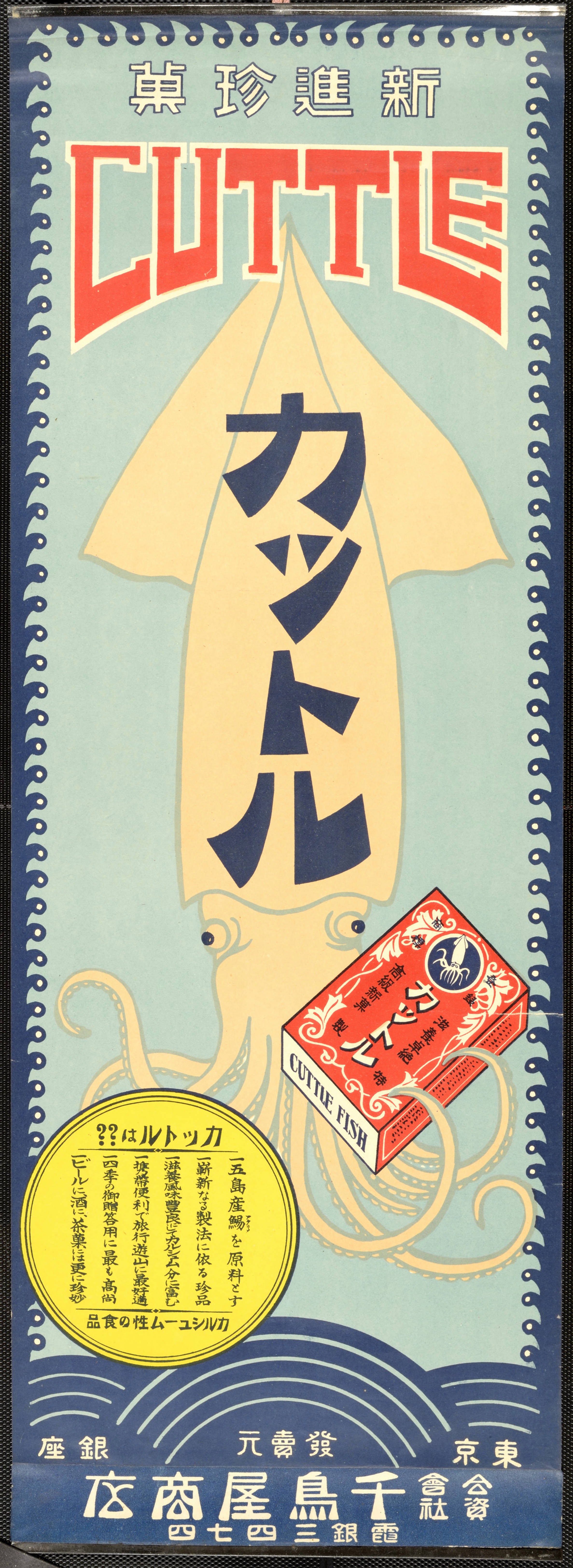
12020-04-10T14:49:25-07:00Anne-Marie Maxwell326ac6eff123bb3f77fb517c66299be8b435b479Arrival of Modern Commercial Design29image_header2020-11-17T14:42:53-08:00Tyson Gaskill93cb401bee8f73160b4c4378060de7643c42eee9