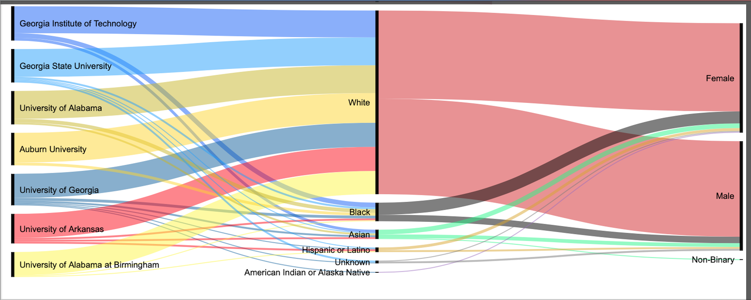
1media/Screen Shot 2019-12-05 at 1.11.51 AM_thumb.png2019-12-04T23:18:18-08:00Sam Meurer886185f60296eed6debb66f1b24ed06967c75fe3356591This sample visualization illustrates the R1 institutions in Arkansas, Georgia, and Alabama. The colors of the schools coincide with the colors within the data set.plain2019-12-04T23:18:18-08:00Sam Meurer886185f60296eed6debb66f1b24ed06967c75fe3
Using RAWgraphs, I built an alluvial diagram detailing the qualities of professors that are hired at public R1: Doctoral Universities in the South. Reading from left to right, the name of the public institution flows into the racial categories of each professor employeed at the institution which then flows into the classification of gender. More analysis will be done.
This data visualization represents the overall racial profiles of English professors at R1 universities in Alabama, Arkansas, and Georgia. Before working with the data, I expected the overall racial makeup of these universities to be quite diverse; however, from the visualization you can clearly see this is not the case. Out of the 237 professors used for this sample portfolio, 84% were white beating the next category (Black) by 75%. Considering English is such a vast, diverse subject field with a special emphasis on representing all people, I expected the results to be a tad more spread out.