Photos of Thomas M. Disch's "AMNESIA"
Folio, Front
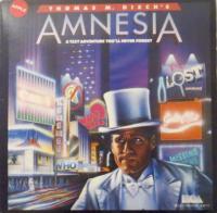
The folio measures 8 12/16” x 8 11/16” in size and is made of a heavy card stock with white and blue faded text on a drawn image. The image is of a man in a white tux and top hat that looks confused in a city with bright and glowing signs and measures from the edge of the folio at 3/16” bottom, 6 /16” left, 4 /16” top, and 4/16” right. The space between the edge of the folio and the edge of the image is black.
The top of the folio contains the information on Amnesia. The text covers one-fourth of the page. The author’s name is centered, white, and sans-serif font, and centered in a tapered red border. The red border measures 8 2/16” bottom, 4/16” top, 1 ½” bottom-left, 1 10/16” top-left, 1 1/2” top-right, and 1 6/16” bottom-right. Underneath the author’s name is the title AMNESIA. The title is centered, sans-serif font, and light blue at the top then fades to a light pink toward the bottom. The first and last letters of the title measure 6 13/16” bottom, 1 ½” left, 10/16” top, and 1 6/16” right. The center letters of the title measure 7 2/16” bottom, 2 9/16” left, 11/16” top, and 2 6/16” right. The title contains a dark grey drop shadow offset to the bottom right of the letters AMN and offset to the bottom left of the letters ESIA. Underneath the title letters of MNESI is teaser text. The teaser text is centered, white, sans-serif font, and is located 6 13/16” bottom, 2 12/16” left, 1 12/16” top, and 2 9/16” right. The teaser text reads: “A TEXT ADVENTURE YOU’LL NEVER FORGET”. The bottom right of the folio contains a white logo of the Electronic Arts. Underneath the logo are the words “Electronic Arts” that are centered to the logo, sans font, and white.
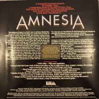
Folio, Back
The folio measures 8 12/16” x 8 11/16” in size and is made of a heavy card stock with white, red, yellow, and blue faded text on a black background. The top of the folio contains teaser text and the title Amnesia that cover one-fourth of the page. The teaser text is centered, red, sans-serif font, separated into six lines, and is located at 7 7/16” bottom, 2 7/16” left, 6/16” top, and 2 3/16” right. Line one reads: “A STRANGE WOMAN WANTS”, line two reads: “TO MARRY YOU.”, line three reads: “A STRANGE MAN IS TRYING TO KILL YOU.”, line four reads: “THE STATE OF TEXAS WANTS YOU FOR MURDER.”, line five reads: “BUT THAT’S NOT YOUR PROBLEM.”, and line six reads: “YOUR REAL PROBLEM IS…” The title Amnesia is centered, sans-serif font, and light blue at the top then fades to a light pink toward the bottom. The first and last letters of the title measure 6 1/16” bottom, 1 9/16” left, 1 6/16” top, and 1 6/16” right. The center letters of the title measure 6 6/16” bottom, 2 9/16” left, 1 7/16” top, and 2 6/16” right. The title contains a dark grey drop shadow offset to the bottom right of the letters AMN and offset to the bottom left of the letters ESIA.
The center of the folio contains information on Amnesia. The synopsis of the work, information about the author, an example of in game text, and technical details start at the center of the page. The synopsis is sans-serif font, white, and separated into two columns. The column on the left is right aligned, separated into seventeen lines, and is located 3 7/16” bottom, 9/16” left, 13/16” top, and 4 6/16” right. Line one reads: “The nightmare begins in a hotel room in midtown Manhattan.”, line two reads: “As you take stock of the situation you realize that you have no”, line three reads: “clothes and no money, and worse still, your memory seems to have”, line four reads: “been replaced with an unyielding dense fog. But this much”, line five reads: “you do know: Manhattan is jungle enough under the best of”, line six reads: “circumstances. Putting it simply, if you don’t soon discover who”, line seven reads: “you are and what you’re doing, you will surely come to an untimely”, line eight reads: “demise. Or worse. Your destiny is completely in your hands…”, line nine reads: “Suppose you find yourself in Times Square at”, line ten reads: “midnight and you are approached by a gun-toting”, line eleven reads: “mugger. You can try to REASON WITH HIM, or simply”, line twelve reads: “FIGHT, or even TAKE HIS GUN AND THROW IT IN THE”, line thirteen reads: “GARBAGE CAN AND SAY ‘YOUR MAMA’ AND THEN RUN.”, line fourteen reads: “But where can you run to? And where will you find”, line fifteen reads: “food, money, or shelter? Gather your wits. You may”, line sixteen reads: “find puzzling clues to your identity among the”, and line seventeen reads: “byways, landmarks, and characters of New York City.”
The column on the right is left aligned, separated into two sections. Section one is separated into four lines, and is located at 5 5/16” bottom, 4 9/16” left, 2 13/16” top, and 7/16” right. Line one reads: “You may even run into Thomas M. Disch himself as you attempt to”, line two reads: “untangle the threads of your pre-amnesic existence.”, line three reads: “Hitchcockian in its intricacy and dark humor, Amnesia will”, and line four reads: “take you on a journey you’ll never forget.”
Section two is information about the author that is separated into twelve lines and is located at 3 7/16” bottom, 4 9/16” left, 3 9/16” top, and 7/16” right. Line one reads: “THOMAS M. DISH is a science fiction writer’s science fiction writer.”, line two reads: “In addition to his 1980 Campbell Award for On Wings of Song,”, line three reads: “Disch has received major science fiction and fantasy awards in”, line four reads: “England and Japan.”, line five reads: “’A robust writer…a virtuoso.’—The New York”, line six reads: “Times Book Review”, line seven reads: “’Today no intelligent person dares call him/herself”, line eight reads: “well read without a thorough grounding in Dish’s”, line nine reads: “work.’—Harlan Ellison”, line ten reads: “’He tosses off bits of verbal virtuosity the way a”, line eleven reads: “fine jazz player tosses off musical phrases.’”, and line twelve reads: “—Chicago Tribune Book World”.
The example of in game text is centered, yellow, sans font, centered in a border shaped like a rounded computer screen, and separated into two sections. The border is a white 1-pixel line with a dark grey inside that measures 3 7/16” bottom, 3 11/16” left, 4” top, and 3 7/16” right. Section one is separated into seven lines and is located at 3 14/16” bottom, 3 12/16” left, 4 2/16” top, and 3 ½” right. Line one reads: “You are locked in a cell. It is”, line two reads: bare and dark and smells of lives”, line three reads: “gone sour. The only light is a feeble”, line four reads: “fluorescent glow that slants in through”, line five reads: “the louvered grill in the iron door. Your”, line six reads: “hands are sore, and your right eye”, and line seven reads: “is swollen shut. You ache all over.” Section two is separated into three lines and is located at 3 9/16” bottom, 3 12/16” left, 4 14/16” top, and 3 ½” right. Line one reads: “Worse than the ache is the hunger, and”, line two reads: “worse than the hunger is the fear that”, and line three: “you will never leave this cell alive.”
The technical details are sans-serif font and centered underneath the synopsis and the author information. The title of the technical details is red and is located at 3 2/16” bottom, 3 14/16” left, 5 7/16” top, and 3 11/16” right. The title reads: “TECHNICAL FEATURES”. The technical details are centered, white, sans-serif font, separated into nine lines, marked by square, red bullet points, and located at 1 12/16” bottom, 1” left, 5 9/16” top, and 12/16” right. Line one reads: “- 4 disk sides – 1500 word vocabulary”, line two reads: “- internal clock that keeps track of time as you play, so that at night stores close, muggers emerge, the evening”, line three reads: “news is televised, and you start to feel hungry and sleepy”, line four reads: “- Novel-length manuscript, possibly the largest ever in a major text adventure”, line four reads: “- Close to 4000 separate locations in Manhattan, including 650 streets”, line five reads: “Includes virtually the entire Manhattan subway system – Recognizes complicated commands in plain English”, line five reads: “Requires money or credit cards to buy food, clothes, hotel rooms, and phone calls”, line six reads: “Unique scoring system awards points for character development, survival, and solving the mystery”, and line seven Includes address book, a map of Manhattan, and a tourist guide –”.
The bottom of the folio contains the information on the publisher’s information. The logo, the publisher, the creators, and the company information cover a little than one-fourth of the page. The logo is white with a square, circle, and triangle shape and is located at 1 4/16” bottom, 4 1/16” left, 7 2/16” top, and 3 13/16” right. Underneath the logo is the publisher’s name “Electronic Arts” that is centered to the logo, sans font, white, and located at 1 2/16” bottom, 4 1/16” left, 7 ½” top, and 3 10/16” right. The creators’ information is centered, white, sans-serif font, separated into three lines, and is located at 12/16” bottom, 1 1/16” left, 7 11/16” top, and 14/16” right. Line one reads: “WRITTEN BY Thomas M. Disch / PROGRAMMING: Kevin Bently / ADDITIONAL SUPPORT: Charles Kreitzberg, James Terry, Pat Reilly”, line two reads: “PRODUCER: Don L. Daglow / ASSOCIATE PRODUCER: Shelley Day / TEST COORDINATION: Sherry Herrgott / PACKAGE COPY: Nicholas Lavroff / ART DIRECTOR: Nancy Fong”, and line three reads: “PACKAGE DESIGN: Howard Jacobsen / Triad / COVER ILLUSTRATON: Jim Salvati / PHOTOGRAGHS: Jamie Spracher /DEDICATED TO Glen Hartley”.
The company information is centered, sans serif, white, separated into two sections, and is located at 3/16” bottom, 12/16” left, 8 1/16” top, and ½” right. Section one is separated into three lines. Line one reads: “ABOUT OUR COMPANY: We’re an association of electronic artists who share a common goal. We want to fulfill the potential of personal computing. That’s a tall order.”, line two reads: “But with enough imagination and enthusiasm we think there’s a good chance for success. Our products, like this program, are evidence of our intent. If you’d like a”, and line three reads: “product brochure, please send $.50 and a self-addressed, stamped envelope to: Electronic Arts, 1820 Gateway Drive, San Mateo, CA 94404.” Section two is one line that reads: “Electronic Arts provides a ninety day warranty on the recording media. See limited warranty statement enclosed. This warranty does not apply to the software programs themselves, which are provided as is. Made in U.S.A.”
Folio, Spine
The folio spine is black and measures 8 11/16” x 3/16” in size. The title of the work and the publishing company name are text contained on the spine. The left text of the spine is white, sans-serif font, and reads: “AMNESIA”. The right text of the spine is white, sans-serif font, and reads: “Electronic Arts”.
Folio, Inside, Opened
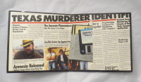
Folio, Inside left: The left side of the opened folio page contains text and images that are made to look like newspaper articles that extend over to the right side of the folio. The top of the page is text that reads: “TEXAS MURDERER IDENTIFIED”. Underneath the top text are articles about the writer, Amnesia, and artists that helped create the game. The article titles include: “Famous Science Fiction Writer Lost in Manhattan”, “Amnesia Released”, “The Amnesia Phenomenon”, and “Graffiti Artists Up Against the Wall”.
Folio, Inside right: The right side contains text and images that are made to look like newspaper articles that extend over to the left side of the folio. The top of the page is text that reads: “TEXAS MURDERER IDENTIFIED”. Underneath the top text are articles about Amnesia, programmers that worked on Amnesia, the character of the game, and Manhattan maps. The article titles include: “All Not to Be Forgotten”, Programming Geniuses Fit Manhattan into Computer”, “Suspect Found Wandering the Streets of New York; Escapes Authorities”, “Manhattan Maps a Hit”, and “Thousands Forget to Pay Taxes, IRS…”
Floppy Disk, Macintosh, Front
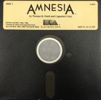
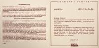
The floppy disk is black and measures 5 ¼” x 5 ¼”. The label on the front is golden with black text and image and measures 4 14/16” x 1 ½”. The top left is the disk information. The disk information is black, sans serif font, and reads: “DISK 1” or “DISK 2”. The top center text is the title of the work and who created it. The title of the work is centered, sans serif font, black, and reads: ”AMNESIA”. The creator’s text is centered, serif font, black, and reads: “by Thomas M. Disch and Cognetics Corp.”. Underneath the creator’s text is the publisher’s logo and name. The logo is black with a square, circle, and triangle shape and centered on the label. The publisher’s name is serif font, black, and reads: “ELECTRONIC ARTS”. The bottom-right of the label contains the copyright information. The copyright information is sans-serif font, black, and separated into three lines. Line one reads: “Software ©1984, 1985, 1986”, line two reads: “Thomas M. Disch and Cognetics Corp.”, and line three reads: “Story ©1984, 1985, 1986 Thomas M. Disch”. The bottom-right of the label contains the computer information. The computer information is sans-serif font, black, and reads: “Apple II+,//e,//c; 64K”.
Floppy Disk, Macintosh, Back
The floppy disk is black and measures 5 ¼” x 5 ¼”. The back is blank.
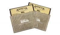
Floppy Disk Sleeve, Front
The floppy disk sleeve is grey paper with a light grey marbling texture and measures 5 9/16” x 3 13/16”. The white 2-pixel border is ½” away from the edge of the sleeve. The 2-pixel border contains a white 1-pixel border 1/16” away. The center of the sleeve is the publisher’s logo and name. The logo is white with a square, circle, and triangle shape. The publisher’s name reads: “ELECTRONIC ARTSTM”.
Floppy Disk Sleeve, Back
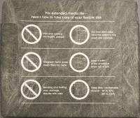
The floppy disk sleeve is grey paper with a light grey marbling texture and measures 5 9/16” x 4 13/16”. The text and images explain how to extend this media’s life. The text is sans-serif font and white. The don’t instructions include: “Precision surface. No fingers, please!”, “Magnetic fields erase. Keep them away.”, and “Bending and folding may damage. Handle with care.”.
Registration Mailer, Front
The registration mailer is a white postcard with black inked text. The top-right of the postcard contains text for stamp placement. The center of the postcard is addressed to ELECTRONIC ARTS.
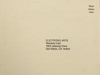
Registration Mailer, Back
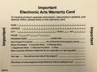
The registration mailer is a white postcard with black inked text. The title at the top reads: “IMPORTANT ELECTRONIC ARTS WARRARNTY CARD”. The text prompts the reader to write down information about their name, address, city, state, zip, phone, program name, computer, where it was purchased, your age, how you learned about it, and what kind of programs should be made for you.
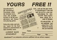
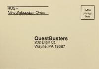
Newsletter Subscription Postcard, Front
The newsletter subscription is a light grey postcard with black inked text. The top-left of the postcard text identifies it as a new Rush subscriber. The top-right of the postcard contains text for stamp placement. The center of the postcard is addressed to QuestBusters.
Newsletter Subscription Postcard, Back
The newsletter subscription is a light grey postcard with black inked text. The title at the top reads: “YOURS FREE!!” The left column of text explains what QuestBusters does. The center contains an image of a QuestBusters newsletter. The right column of text explains about their subscriptions. The bottom text prompts the reader to write down information about their name, street, city, state, and zip.
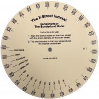
Street Indexer, Front
The street indexer is made of two off-white heavy card stock circles with black text and lines. The smaller inner circle contains the instructions and street names. The instructions read: “1. Align the avenue name on the inner wheel with the street address on the outer wheel.
2. The small window in the inner wheel shows the nearest cross street.” The larger outer circle contains numbers.”
Street Indexer, Back
The street indexer is made of an off-white heavy card stock. The back is blank with a small hole in the center.
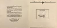
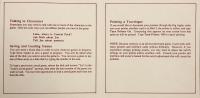
Command Summary, Front and Back
Front: The page is made of white card stock red inked text and measures 5 4/16” x 5 4/16”. The top of the page contains the game title Amnesia and computers “APPLE II+, IIe, IIc”. The contents of the page are the instructions on how to get started and how to perform actions.
Back: The page is made of white card stock with red inked text and measures 5 4/16” x 5 4/16”. The page contains the information on the limited warranty and what is not covered in the warranty.
Command Summary, Inside Opened, Left and Right
Left: The page is made of white card stock with red inked text and measures 5 4/16” x 5 4/16”. The contents of the page are the instructions on talking to characters and how to save and load the game.
Right: The page is made of white card stock with red inked text and measures 5 4/16” x 5 4/16”. The contents of the page are the instructions on printing a travelogue and an extra note about printing.
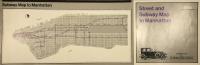
Street and Subway Map, Front, Opened
The map is made of a trifold glossy paper and each fold measures 7 12/16” x 7 12/16”. The far right page is the cover of the map. The cover page contains the title “Street and Subway Map to Manhattan”, an image of a person driving an classic car, the publisher’s name, and text that reads, “Compliments of The SUNDERLAND HOTEL”. The left two pages is a detailed subway map to Manhattan.
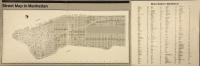
Street and Subway Map, Back, Opened
The map is made of a trifold glossy paper and each fold measures 7 12/16” x 7 12/16”. The far right page is the back of the map. The back of the map contains the information of the street index to Manhattan. The left two pages is a detailed street map to Manhattan.
Manual, Front
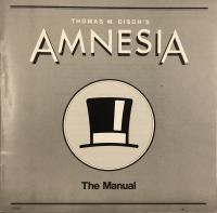
The booklet front is made of a grey glossy paper with black and white inked text and measures 7 12/16” x 7 12/16”. The top and the bottom of the page contain two black lines that create a border. The line that is closest to the edge of the page is 1/16”. The inner line is about 1-pixel. The top of the page contains the author’s name and the title of the work. The author’s name is sans-serif font, white, and reads: “THOMAS M. DISCH’S”. The title of the work is sans-serif font, white, and reads: “AMNESIA”. The title contains a black drop shadow offset to the bottom right of the letters AMN and offset to the bottom left of the letters ESIA. The center of the page contains the drawn image of a top hat in the center of two circles. The space between the two circles is white. The space of the inner circle is light grey. Underneath the circles is text. The text is sans-serif font, black, and reads: “The Manual”.
Manual, Copyright and Table of Contents
Copyright: The page is not numbered, made of white glossy paper, and measures 7 12/16” x 7 12/16”. The page contains the information on the license agreement, warranty, copyright for Electronic arts, and copyright for Thomas M. Disch and Cognetics.
Table of Contents: The page is not numbered, made of white glossy paper, and measures 7 12/16” x 7 12/16”. The page explains what and where each section starts.
Manual, Artwork and Page 1
Artwork: The page is not numbered, made of white glossy paper, and measures 7 12/16” x 7 12/16”. The center of the page contains an image of a woman in a fancy dress standing between two undefined and shadowy men in tuxedos.
Page 1: The page is made of white glossy paper and measures 7 12/16” x 7 12/16”. The contents of the page are the prologue. The title of the page is “Prologue”. Each step is bolded at the start of a paragraph.
Manual, Page 2 and Page 3
Page 2: The page is made of white glossy paper and measures 7 12/16” x 7 12/16”. The contents of the page are a continuation of the prologue. The title of the page is “Prologue”. Each step is bolded at the start of a paragraph.
Page 3: The page is made of white glossy paper and measures 7 12/16” x 7 12/16”. The contents of the page are a continuation of the prologue. The title of the page is “Prologue”. Each step is bolded at the start of a paragraph.
Manual, Page 4 and Page 5
Page 4: The page is made of white glossy paper and measures 7 12/16” x 7 12/16”. The contents of the page are a continuation of the prologue. The title of the page is “Prologue”. Each step is bolded at the start of a paragraph.
Page 5: The page is made of white glossy paper and measures 7 12/16” x 7 12/16”. The contents of the page are a continuation of the prologue. The title of the page is “Prologue”. Each step is bolded at the start of a paragraph.
Manual, Page 6 and Page 7
Page 8: The page is made of white glossy paper and measures 7 12/16” x 7 12/16”. The contents of the page are an explanation of what the game is. The title of the page is “Amnesia—The Game”.
Page 7: The page is made of white glossy paper and measures 7 12/16” x 7 12/16”. The contents of the page are an explanation of how to use the Amnesia game. The title of the page is “Amnesia—The Program”.
Manual, Page 8 and Page 9
Page 8: The page is made of white glossy paper and measures 7 12/16” x 7 12/16”. The contents of the page are a continuation of how to use the Amnesia game and the vocabulary available.
Page 9: The page is made of white glossy paper and measures 7 12/16” x 7 12/16”. The contents of the page are a continuation of how to use the Amnesia game and the vocabulary available.
Manual, Page 10 and Page 11
Page 10: The page is made of white glossy paper and measures 7 12/16” x 7 12/16”. The contents of the page are a continuation of how to use the Amnesia game and the vocabulary available.
Page 11: The page is made of white glossy paper and measures 7 12/16” x 7 12/16”. The contents of the page are an explanation of the additional features of the Amnesia game. The title of the page is “Additional Features”.
Manual, Page 12 and Page 13
Page 12: The page is made of white glossy paper and measures 7 12/16” x 7 12/16”. The contents of the page are hints of the Amnesia game. The title of the page is “Hints”.
Page 13: The page is made of white glossy paper and measures 7 12/16” x 7 12/16”. The contents of the page are a continuation of hints of the Amnesia game. The title of the page is “Specific Hints”.
Manual, Page 14 and Page 15
Page 14: The page made of white glossy paper and measures 7 12/16” x 7 12/16”. The contents of the page are a continuation of hints of the Amnesia game.
Page 15: The page made of white glossy paper and measures 7 12/16” x 7 12/16”. The contents of the page are a continuation of hints of the Amnesia game.
Manual, Page 16 and Page 17
Page 16: The page is made of white glossy paper and measures 7 12/16” x 7 12/16”. The contents of the page are a continuation of hints of the Amnesia game.
Page 17: The page is made of white glossy paper and measures 7 12/16” x 7 12/16”. The contents of the page are a continuation of hints of the Amnesia game.
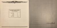
Manual, Back
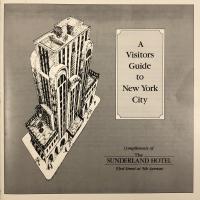
The booklet back is made of a grey and white glossy paper with black inked text and measures 7 12/16” x 7 12/16”. The page contains a black 1-pixel border that separates the white edge from the inner grey. The left side of the page contains an image of a tall hotel drawn in black ink. The right and center of the page is a black 1-pixel border surrounding another black 1-pixel border with rounded edges on the inside. The borders are white on the inside and in the inner border is light grey. The inner border contains text. The text is serif font, black, and reads: “A Visitors Guide to New York City”. The bottom-right of the page contains text. The text is serif font, black, and reads: “Compliments of The SUNDERLAND HOTEL 53rd Street at 5th Avenue”.
Manual, Message and Sunderland Hotel
Message: The page is made of white glossy paper and measures 7 12/16” x 7 12/16”. The top of the page contains a fancy black border with text that reads: “SUNDERLAND”. The content of the page is a letter from the Sunderland manager. The title of the page is “A Personal Message From The Manager”.
Sunderland Hotel: The page is made of white glossy paper and measures 7 12/16” x 7 12/16”. The top of the page contains a fancy black border with text that reads: “SUNDERLAND”. The content of the page is information about the Sunderland Hotel. The title of the page is “New York’s Distinguished SUNDERLAND HOTEL 53rd Street at 5th Avenue”.
Manual, The All-Faith Chapel and The Rathskeller
The All-Faith Chapel: the page is made of white glossy paper and measures 7 12/16” x 7 12/16”. The top of the page contains a fancy black border with text that reads: “SUNDERLAND”. The content of the page is information about The All-Faith Chapel, Roe & Harpmeister, and Koch’s Florists. The title of the page is “The All-Faith Chapel”.
The Rathskeller: the page is made of white glossy paper and measures 7 12/16” x 7 12/16”. The top of the page contains a fancy black border with text that reads: “SUNDERLAND”. The content of the page is information about the restaurant The Rathskeller and it’s food. The title of the page is “The Rathskeller”.
Manual, The Health Club and Getting Around
The Health Club: The page is made of white glossy paper and measures 7 12/16” x 7 12/16”. The top of the page contains a fancy black border with text that reads: “SUNDERLAND”. The content of the page is information about The Health Club and Rolo’s Pizzeria. The title of the page is “The Health Club”.
Getting Around: The page is made of white glossy paper and measures 7 12/16” x 7 12/16”. The top of the page contains a fancy black border with text that reads: “SUNDERLAND”. The content of the page is information about how to get around. The title of the page is “Getting Around the Big Apple”. The places that are mentioned are Lower Manhattan, Chinatown, and The Lower East Side.
Manual, Getting Around and Getting Around
Getting Around: The page is made of white glossy paper and measures 7 12/16” x 7 12/16”. The top of the page contains a fancy black border with text that reads: “SUNDERLAND”. The content of the page is a continuation of the information about how to get around. The title of the page is “Getting Around the Big Apple”. The places that are mentioned are SoHo, The Bowery, Greenwich Village, The East Village, Chelsea, Murray Hill, and Mid-Town.
Getting Around: The page is made of white glossy paper and measures 7 12/16” x 7 12/16”. The top of the page contains a fancy black border with text that reads: “SUNDERLAND”. The content of the page is a continuation of the information about how to get around. The title of the page is “Getting Around the Big Apple”. The places that are mentioned are The Theater District, Fifth Avenue, Upper East Side, Upper West Side, and Central Park.
Booklet, Phone Directory and Address Book
Phone Directory: The page is made of white glossy paper and measures 7 12/16” x 7 12/16”. The top of the page contains a fancy black border with text that reads: “SUNDERLAND”. The content of the page is information about the Sunderland phone numbers. The title of the page is “SUNDERLAND HOTEL PHONE DIRECTORY”.
Address Book: The page is made of a grey glossy paper and measures 7 12/16” x 7 12/16”. The bottom of the page contains a horizontal black border. The top-right of the border contains cursive black text that reads: “Address Book”.
Booklet, Address Book and Address Book
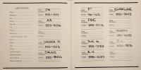
Address Book: The page is made of white glossy paper and measures 7 12/16” x 7 12/16”. The left column contains a space for a person’s identification. The identification information is not filled in. The right column contains names and phone numbers of contacts.
Address Book: The page is made of white glossy paper and measures 7 12/16” x 7 12/16”. The content of the page is a continuation of the names and phone numbers of contacts.
Booklet, Address Book and Blank Page
Address Book: The page is made of white glossy paper and measures 7 12/16” x 7 12/16”. The content of the page is a continuation of the names and phone numbers of contacts.
Blank Page: The page is made of a grey glossy paper and measures 7 12/16” x 7 12/16”. The bottom-center of the page and flipped upside down is the Electronic Arts name, logo, and address.
This page has paths:
This page references:
- Disch, Registration Mailer, Front
- Disch, Floppy Disk, Macintosh, Front
- Disch, Manual, Back
- Disch, Registration Mailer, Back
- Disch, Street Indexer, Back
- Disch, Manual, Front
- Disch, Street and Subway Map, Front, Opened
- Disch, Floppy Disk Sleeve, Back
- Disch, Street Indexer, Front
- Disch, Street and Subway Map, Back, Opened
- Disch, Floppy Disk Sleeve, Front
- Disch, Manual, First Page
- Disch, Command Summary, Inside
- Disch, Folio, Back
- Disch, Folio, Spine
- Disch, Command Summary, Front and Back
- Floppy Disks of Thomas M. Disch's AMNESIA
- Front Cover of Thomas M. Disch's "AMNESIA"
- Disch, Address Book, Last Page
- Disch, Newsletter Subscription Postcard, Back
- AMNESIA Folio, Opened
- Disch, Manual, Address Book, Inside
- Disch, Newsletter Subscription Postcard, Front
- Disch, Floppy Disk, Macintosh, Back
- Disch, Manual, Address Book, Cover