This content was created by Carrie Finholm.
Scalar's 'additional metadata' features have been disabled on this install. Learn more.
The Promise and Practice of Teaching Data Literacy in Social Studies: A Companion Site
Main Menu
A Taxonomy of Data Visualizations
Information can be visualized in multiple ways, from bar graphs to scatterplots, choropleth maps to distribution maps, timelines to time series. Designers can choose from an array of graphical elements such as points, lines, or icons used to represent data, and multiple aesthetic attributes such as color, shape, and size. Furthermore, designers can apply multiple combinations of titles, legends, and explanatory text to provide context for a data visualization. Given the almost dizzying array of data visualizations students may encounter in social studies, it is helpful to place them in categories related to the types of questions they will help us answer.
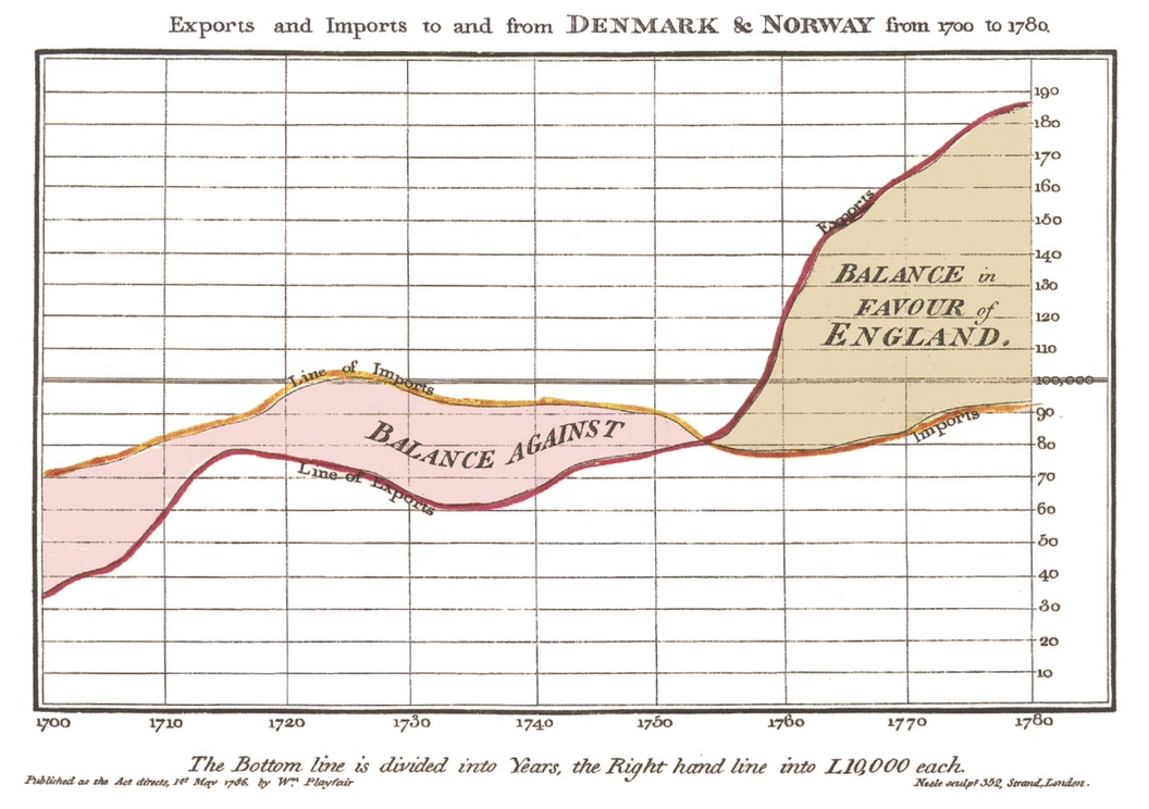
Data Visualizations as Primary Sources
Humans have been creating different types of data visualizations for centuries. Explore this collection of timelines, maps, graphs and charts to see what they reveal about the historical time and place in which they were produced.
How do students learn with data visualizations?
Reading data visualizations in print and online social studies texts can improve students' overall comprehension and quality of reasoning. And there is evidence to suggest that reading data visualizations helps students better understand historical and geographic context, multiple causation, and change over time — all important concepts for students to grasp in social studies subject areas. However, students may face significant challenges in trying to make sense of different kinds of data visualizations. This section provides insight into both benefits and challenges of reading timelines, maps, and graphs and charts.
How should students analyze data visualizations in social studies?
The challenges that data visualizations present, coupled with their prevalence in social studies texts, standardized assessments, in online social studies resources, and as sources of information in society, suggest that teaching with and about data visualizations in social studies is essential. This module provides guidance for how teachers can support students' data literacy for social studies.
How do I help students create and integrate data visualizations for social studies?
This page highlights several tools that are useful for data-based projects in social studies. And accompanying each tool is a "minimal manual" that provides guidance for using the tool in social studies inquiry- and project-based learning.
Project-Based Learning Activities for Data Literacy in Social Studies
Lorem ipsum dolor sit amet, nec constituto comprehensam te. Sea no affert nemore comprehensam, eum te purto soleat accusata. Ea est magna malis. No atqui iudico est. In vel propriae suavitate. Est homero timeam cu, novum persecuti mea an.
Index of Lesson Plans
This page contains a list of the minimal manuals and lessons found on this website. Minimal manuals are designed to be adapted to different grade levels and do not have a grade designation associated with them. Lesson plans are organized according to the school level for which they are designed. However, many of these lessons can be adapted for different grade levels.
Tamara Shreiner
72eaa2d1ba1352b75b8a8da73e879a4ceb510ae0
The Hockey Stick Chart on Climate Change (1999)
1 2020-07-01T13:22:47-07:00 Carrie Finholm 6639ecc7d8d3786478af93b68ebed21d6d95960d 35133 1 Climate scientist Michael Mann and of his colleagues, created and developed a chart in 1999 commonly known as the northern hemisphere hockey stick graph chart. The chart displays the change in climate within the last 1,000 years, with a dramatic change within the last 30 years (1961 to 1990). The chart also has lines representing different scientists' data as well. plain 2020-07-01T13:22:47-07:00 Carrie Finholm 6639ecc7d8d3786478af93b68ebed21d6d95960dThis page is referenced by:
-
1
media/2152017.jpg
2020-09-15T12:01:03-07:00
Graphs and Charts: Benefits and Challenges
52
Graphs are a common type of data visualization and can be distinguished from the other types of data visualizations by their well-defined reference system, such as horizontal or vertical axes on which data are plotted. Charts are topical or categorical data visualizations with no inherent reference systems, such as pie charts or word clouds. Graphs and charts can tell a powerful story and they can serve as compelling evidence. However, they also present multiple challenges for students trying to make sense of them.
plain
2020-11-03T08:46:52-08:00
Graphs are a common type of data visualization in social studies and can be distinguished from the other types of data visualizations by their well-defined reference system, such as horizontal or vertical axes on which data are plotted. There are temporal graphs such as line graphs, and topical or categorical graphs such as bar graphs and scatter plots. Charts, also relatively common in social studies, are topical or categorical data visualizations with no inherent reference systems, such as pie charts or word clouds.[13]
Although almost all states require that students study or use graphs or charts in social studies at some point in their school career, only 14 states require students to do so across elementary, middle, and high school. All too frequently, graphs and charts are not mentioned in social studies disciplines where you might expect them to have a prominent role. For example, twenty-two state standards documents contain no explicit references to graphs and charts in history, 31 state standards documents contain no explicit references in civics, and 30 contain no references in economics. Furthermore, it is strikingly uncommon for state standards to recommend that students learn how to critically analyze or evaluate graphs and charts.[14]
Why does this matter? How will students benefit from learning about graphs and charts in social studies? What challenges will students face when they attempt to learn from and with them?
Graphs and Charts Can Tell a Powerful Story
The benefits of learning to read graphs and charts in social studies are ample. First, graphs and charts can tell a powerful story. Consider using the following stacked and multi-set bar graph plus pie chart to teach students about the characteristics and consequences of World War II. What can students learn from this graph?The graph above not only provides a picture of the overall number of deaths, but also allows students to compare losses across countries. In addition, it breaks down losses by civilian and military deaths and provides a snapshot of the differences between the proportion of civilian and military deaths suffered by Axis and Allied powers. Due in large part to the Holocaust, the proportion of civilian Allied deaths among all deaths is striking. And look at the two bars associated with Poland. The sheer number of deaths does not stand out, but the bar representing the number of deaths as a percentage of the country's population tells a different story – Poland lost around 18% of its population, and most of those losses were Polish Jews.
Now consider what students can learn from this interactive data documentary, The Fallen of World War II, created by Neil Halloran. Halloran creates a compelling narrative about the loss of human life during WWII. Using icons that each represent 1000 people – civilians or soldiers – Halloran uses categorical bar graphs to compare deaths across countries, as well as a temporal bar graph to show the progression of losses during the war. He also disaggregates data so that you can see the proportion of deaths by battles and fronts. Moreover, Halloran connects to his mostly U.S. audience by beginning with numbers of U.S. deaths and comparing World War II losses with other wars of recent memory. In addition, he intersperses the data with photographic images, adding an important human element to the otherwise nameless and faceless statistics. While Halloran's data documentary represented a sophisticated use of technology to be sure, he nonetheless uses strategies – disaggregating data, connecting to people's lived experiences, and humanizing data with images and stories – that all teachers can use.
Graphs and Charts Can Serve as Powerful Evidence
Graphs can also serve as compelling evidence for arguments. The article below from the Pew Research Center, for example, relies heavily on graphs as evidence for the argument that differences in political values – not gender, race or ethnicity, religion, or education – are what have led to increasing divisions between political parties and between the people who identify with different parties.
While the use of graphs to support arguments about current topics is not surprising, it is important to note that historians have become increasingly creative about using graphs and other data visualizations to support their arguments about the past. For example, in an article highlighting results from a digital history project on slave narratives, Lauren Tilton uses graphs to show how "dialect was not only racialized but also connected to a particular (cultural) geography—the American South." In another article, Shawn Martin uses multiple graphs to illustrate topical changes in American scientific journals from 1888 to 1922.
Challenges to Student Learning
Although graphs and charts can be powerful tools for students in social studies, making sense of them can be challenging. Unfortunately, teachers will not find much guidance on how to teach students to read them or how to build students' graph reading skills over time in state standards documents. Among the 14 states that consistently address graphs and charts across school levels only 6 provide any guidance to teachers about how to build graph skills over grade and school levels. Michigan is one of them, but only if you pay attention to the "process and skills" standards that precede the content expectations at different school levels. For example, Michigan's Social Studies Process and Skills standards require that, by the end of elementary school, students express information in line and bar graphs, and use data from graphs or charts to answer questions. Then in middle school, Michigan Social Studies Standards recommend that students add pie charts to their repertoire and that they know how to evaluate data presented in graphs. This guidance, while better than in many states, is still insufficient.
First, students are going to encounter more than just line graphs, bar graphs, and pie charts during their time in school, and they'll certainly encounter pie charts before middle school. In fact, a recent analysis of school textbooks reveals that elementary school students will encounter pie charts, bar graphs, line graphs, and even the occasional area graph or multi-set bar graph (i.e., bar graphs with multiple cases compared across one variable category). Plus, by middle school they'll encounter these same types of data visualizations, as well as population pyramids, stacked bar graphs, and multilayered graphical representations that, for example, combine bar graphs and line graphs. If students did not become adept at working with the multiple types of graphs and charts that they encountered in elementary school, the variety of middle school graphs and charts will be even more overwhelming.
Second, standards provide little to no guidance on what students need to do to be able to draw facts and inferences from graphs and charts. Yet, research has indicated that reading graphs is a complex process with several discrete steps, and a breakdown in any one of the steps could negatively impact a student's understanding.[15]
First, viewers must read the data. Because data is encoded as various visual elements (e.g., shapes, colors, text) in a graph, readers must identify the important visual elements such as the shape and directions of a line or numbers on an axis.[16] Ignoring or skipping over visual elements is similar to skipping over words or punctuation in a paragraph – doing do can change the meaning of the passage. When you look at the U.S. Census Bureau graph below, for example, what visual elements do you see?
Then viewers must see between the data. They must relate the visual elements to the conceptual relations that are represented by those elements – that is, they must map between the elements themselves and their meaning, such as recognizing that a curved line implies an accelerating relationship. This ability is largely dependent upon the viewer’s experience with different graphics, or their understanding of graphical conventions.[17] What does each line on the multi-set graph above show you? What's the difference in what they're showing you?Click through this animation to see the important visual elements of this graph
Finally, a viewer must be able to make associations between the graphic representation and the context or the referents (e.g., immigrant population or number of casualties) that are being quantified.[18] That is, they must read beyond the data. This last factor implies that students should work with graphs within a specific context, rather than as abstractions disconnected from content. Indeed, psychologists Priti Shah and James Hoeffner argued, “students taught about graph reading in an abstract context may not be able to apply graph reading knowledge to real contexts in which their beliefs or expectations might influence their interpretations." They further argued that an added benefit to teaching graphs in the context of the disciplines is that “students may also learn that graphs are a tool for critically evaluating data, not just a tool for information delivery." [19]
Again, consider the graph above. What is the graph trying to tell you? And what can you actually infer from the graph? The space between those two questions is where even students who are good at reading graphs (say, from their learning in math class) may struggle. Drawing inferences combines evidence and reasoning, and reasoning often requires knowledge beyond what is right in front of us. For example, what is meant by the word poverty in this context? What does it mean to live in poverty? Is there a difference in the poverty rate among different groups of people? Does this graph better support a positive or negative argument about economic progress in the country? Can we rely on it for answering this question? These are the type of questions you want students to ask in order to read beyond the data and draw inferences, but it is not something they are apt to do on their own. As teachers we must therefore consider these questions on our own before presenting data visualizations to students, and be prepared to support students in asking such questions themselves.