Thanks for your patience during our recent outage at scalar.usc.edu. While Scalar content is loading normally now, saving is still slow, and Scalar's 'additional metadata' features have been disabled, which may interfere with features like timelines and maps that depend on metadata. This also means that saving a page or media item will remove its additional metadata. If this occurs, you can use the 'All versions' link at the bottom of the page to restore the earlier version. We are continuing to troubleshoot, and will provide further updates as needed. Note that this only affects Scalar projects at scalar.usc.edu, and not those hosted elsewhere.
The Promise and Practice of Teaching Data Literacy in Social Studies: A Companion Site
Main Menu
A Taxonomy of Data Visualizations
Information can be visualized in multiple ways, from bar graphs to scatterplots, choropleth maps to distribution maps, timelines to time series. Designers can choose from an array of graphical elements such as points, lines, or icons used to represent data, and multiple aesthetic attributes such as color, shape, and size. Furthermore, designers can apply multiple combinations of titles, legends, and explanatory text to provide context for a data visualization. Given the almost dizzying array of data visualizations students may encounter in social studies, it is helpful to place them in categories related to the types of questions they will help us answer.
Data Visualizations as Primary Sources
Humans have been creating different types of data visualizations for centuries. Explore this collection of timelines, maps, graphs and charts to see what they reveal about the historical time and place in which they were produced.
How do students learn with data visualizations?
Reading data visualizations in print and online social studies texts can improve students' overall comprehension and quality of reasoning. And there is evidence to suggest that reading data visualizations helps students better understand historical and geographic context, multiple causation, and change over time — all important concepts for students to grasp in social studies subject areas. However, students may face significant challenges in trying to make sense of different kinds of data visualizations. This section provides insight into both benefits and challenges of reading timelines, maps, and graphs and charts.
How should students analyze data visualizations in social studies?
The challenges that data visualizations present, coupled with their prevalence in social studies texts, standardized assessments, in online social studies resources, and as sources of information in society, suggest that teaching with and about data visualizations in social studies is essential. This module provides guidance for how teachers can support students' data literacy for social studies.
How do I help students create and integrate data visualizations for social studies?
This page highlights several tools that are useful for data-based projects in social studies. And accompanying each tool is a "minimal manual" that provides guidance for using the tool in social studies inquiry- and project-based learning.
Project-Based Learning Activities for Data Literacy in Social Studies
Lorem ipsum dolor sit amet, nec constituto comprehensam te. Sea no affert nemore comprehensam, eum te purto soleat accusata. Ea est magna malis. No atqui iudico est. In vel propriae suavitate. Est homero timeam cu, novum persecuti mea an.
Index of Lesson Plans
This page contains a list of the minimal manuals and lessons found on this website. Minimal manuals are designed to be adapted to different grade levels and do not have a grade designation associated with them. Lesson plans are organized according to the school level for which they are designed. However, many of these lessons can be adapted for different grade levels.
Tamara Shreiner
72eaa2d1ba1352b75b8a8da73e879a4ceb510ae0
Misleading data visualizations: wrong data
1 2020-05-19T16:40:15-07:00 Tamara Shreiner 72eaa2d1ba1352b75b8a8da73e879a4ceb510ae0 35133 1 plain 2020-05-19T16:40:15-07:00 Tamara Shreiner 72eaa2d1ba1352b75b8a8da73e879a4ceb510ae0This page is referenced by:
-
1
2020-04-30T10:30:24-07:00
A Closer Look at Misleading Data Visualizations
46
There are multiple ways that data visualizations can mislead readers or viewers. This page provides a summary of the ways data visualizations can deceive, and provides some examples.
plain
2020-11-14T06:29:21-08:00
READ THE FOLLOWING INFORMATION AND THEN CHECK OUT THIS CLASSROOM ACTIVITY ON MISLEADING DATA VISUALIZATIONS!
Data visualizations can serve as efficient and effective means to communicate information, but they can also spread misinformation by misrepresenting, distorting, or obfuscating data. Sometimes misleading data visualizations are the result of good intentions – they have simply been created by people who are bad or inexperienced at visualizing data. Other times, the creator may have lacked relevant information because of the limitations of the time or place in which they were creating the data visualization, or because of poor research methods. And, unfortunately, misleading data visualizations can be the result of purposeful manipulation, created and/or disseminated by people who want to sway people’s beliefs or opinions. In any case, it is important to be aware of the ways that data visualizations can confuse or misinform learners.
Common ways that data visualizations can mislead learners include:- Hiding or omitting relevant data that provides context
- Distorting the presentation of data, such as
- Omitting the baseline
- Manipulating the x- and/or y-axis
- Using the wrong visualization
- Going against conventions
- Describing the data inaccurately in annotations, title, or within the visualization itself
- Rendering a data visualization useless, including
- Presenting the wrong data
- Presenting too much data
Hiding or omitting data that provides context
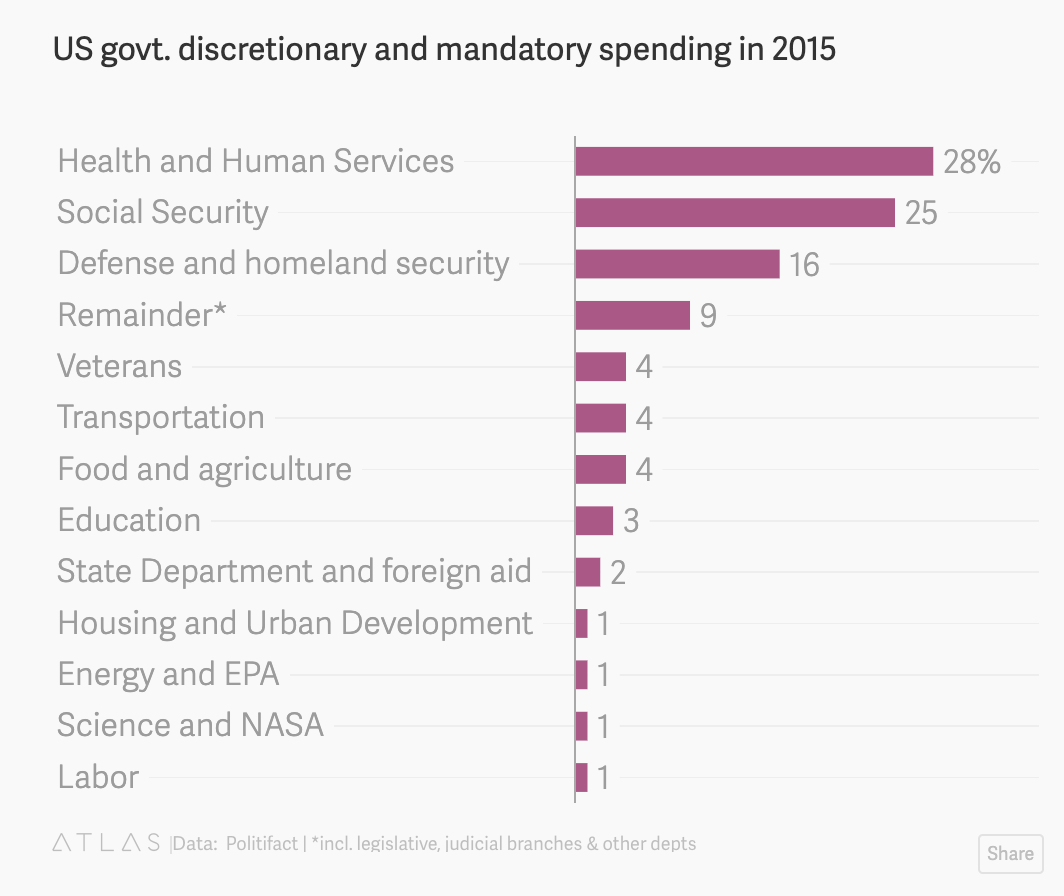
In 2015, this pie chart on federal spending circulated as a meme on social media. The problem with the chart, as Politifact pointed out in an August 2015 article, is that it shows only the government’s discretionary spending, and leaves out mandatory spending on programs like Medicare, Medicaid, and Social Security. These mandatory programs, of which food stamps are a part, account for 60% of all government spending. A Quartz article showed what the chart would look like if mandatory spending was included.
It is difficult to say if the person who created the pie chart-turned-meme purposely left out relevant data on government spending, or if they had a fundamental misunderstanding of the concept. Either way, readers with an incomplete understanding of government spending would be misinformed as a result of the incomplete picture the pie chart presented.
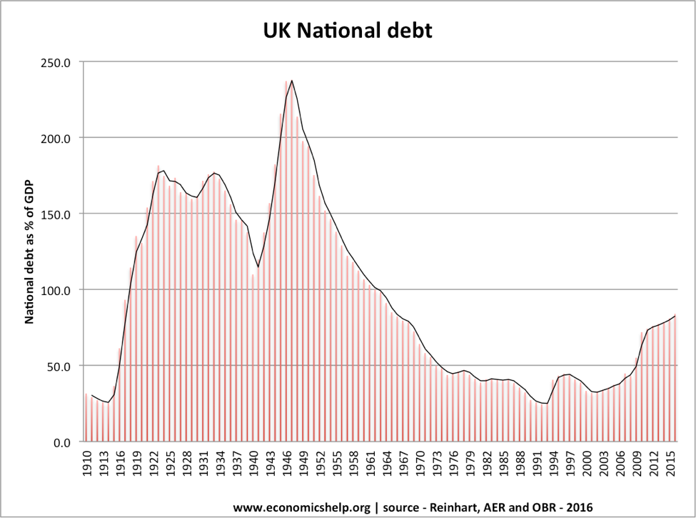
Another way that data visualization creators can manipulate information is to hide data from the data set so that only trends or patterns that suit their narrative are included. One good example of this was used in an article to illustrate the impact of "cherry picking" data. If you look at the following graph, it appears that UK federal debt is abnormally high, which might lead you to believe that the government needs to implement policies to reduce the debt.
However, if you add previous years' data on federal debt, you are presented with a much different picture of current debt compared to that of previous years.
Distorting the presentation of data
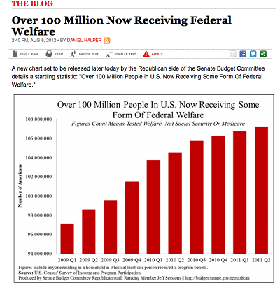
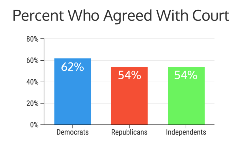
While the examples above illustrate how data visualization creators can leave out data points, there are also ways that they can include data points but distort their presentation in such a way that people come away with wholly or partially inaccurate conclusions. One way to manipulate a visualization is by omitting the baseline. For example, as pointed out on the site Statistics How To, this USA Today graph makes it look like welfare between 2009 and 2011 was spiraling out of control. However, notice that the y-axis starts at 95,000,0000.Why does this matter? Omitting the baseline can make small changes look incredibly large. Venngage contributor, Ryan McCready, illustrates this phenomenon by showing how different a graph with an omitted baseline would look if you started at zero. The first graph below is similar to one used by CNN to show who agreed with the decision to remove Terry Schiavo from life support after a years-long court battle. Notice where the y-axis begins. The second graph is the one Venngage created to provide a more accurate comparison of party-affiliated viewpoints.
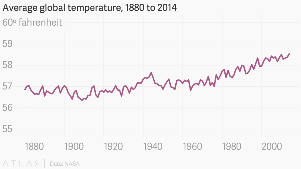
This is not to say, however, that graphs should always start at zero. In graphs that show changes or trends over time, such as line graphs, it may be that small changes can only be shown by starting the y-axis at a higher number so that you can include smaller increments within a reasonable space. And sometimes small changes can be incredibly impactful and therefore important to capture. Think about how seemingly small changes in body temperature, sodium levels, or white blood cell count can lead doctors to evaluate you as healthy or unhealthy. Small changes are also important with regard to climate, where every degree of difference in average temperatures over a period of time can have a devastating impact on ecosystems. In this case, starting at zero on a graph could diminish or downplay the problem, as these graphs on global climate change illustrate. Notice how the first graph barely shows any change at all, while the second graph from a Quartz article illustrates the changes that catch climate scientists' attention because they know they matter.
Rather than thinking only, "The y-axis should always start at zero," which is a common maxim, it might be better to think, "What difference would this make in the overall message if the baseline were different?"
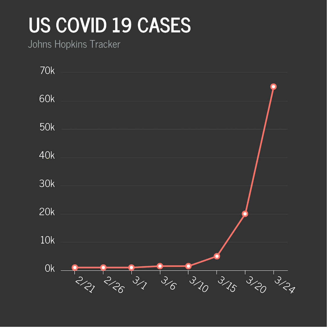
In addition to adjusting the baseline, data visualization creators can manipulate the x- and/or y-axis to distort the data and the message that it conveys. Two particularly egregious examples appeared amid the COVID-19 crisis. The first, from Fox News, claims to show COVID-19 cases in the United States from late February through March. Clearly the numbers are rising, but they actually downplayed the severity of the line slope by manipulating both of the graph's axes — the x-axis by choosing seemingly randomly spaced dates, and the y-axis by going from zero to 5000, and then from 5000 to 20,000. A more accurate graph, again created by Venngage contributor Ryan McCready, would look like the one below it.
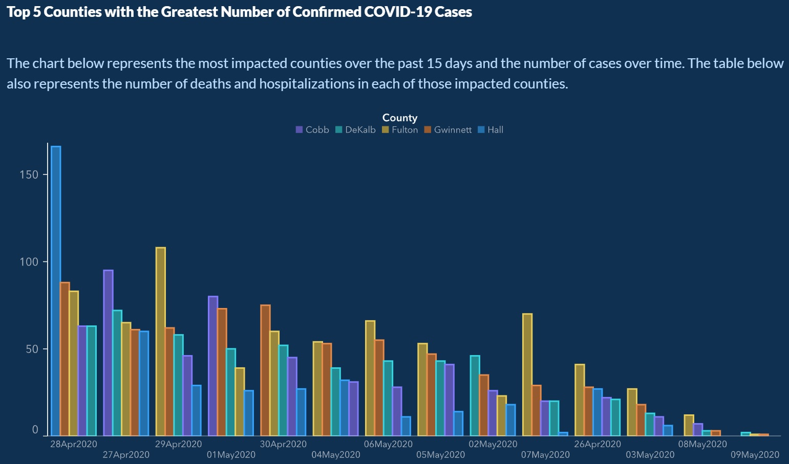
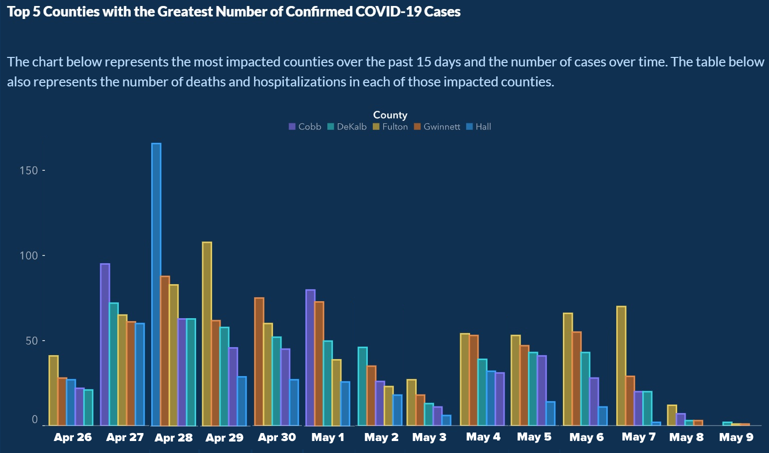
Another COVID-19 graph, released by the Georgia Department of Public Health, was circulated quickly on social media when people noticed that the dates on the x-axis were out of order (You can click on the graph to see them clearly, but they are April 28, 27, 29, May 1, April 30, May 4, 6, 5, 2, 7, April 26, May 3, 8, 9). It is hard to imagine that this wasn't done purposely since the reordering made it appear as though cases across counties were consistently declining, versus the reality that is shown more accurately in the subsequent graph, created by Joey Devilla.
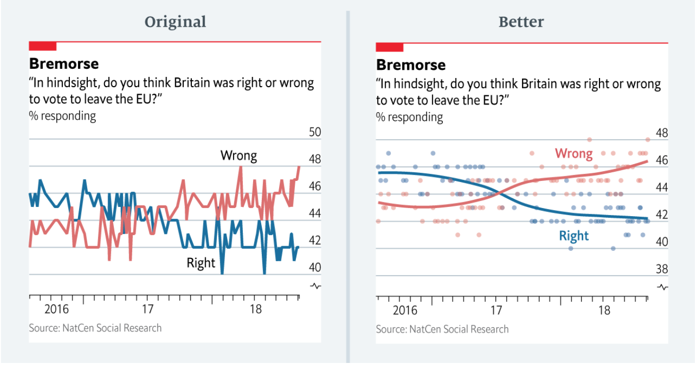
Using the wrong visualization is another way that data visualization creators can distort data. Sometimes this is an innocent mistake by data visualization creators. For example, the following set of graphs was shared by a contributor to The Economist. She pointed out that the original graph she created for an article on opinions about the wisdom of Brexit gave the unintended impression that views were wildly erratic. She admits that a better graph would have the been the one on the right.
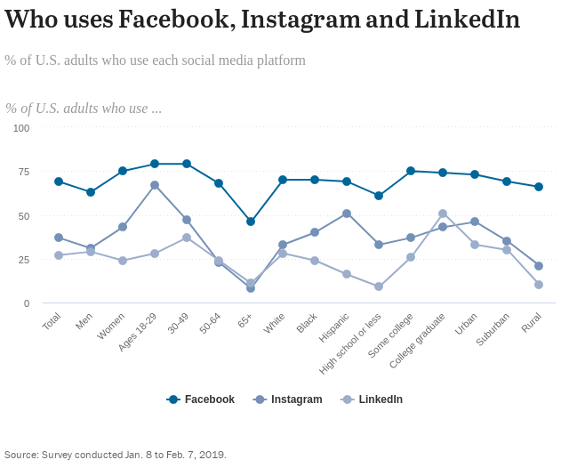
The next graph, from the Pew Research Center, uses lines to connect data points on social media use. This is a curious choice, given that there is no need to draw lines between data for discrete categories, because lines typically signal that you are looking at trends rather than comparisons among categories. A multi-set bar graph would have been a better choice here.Finally, readers come to expect that data visualizations follow certain conventions in the display of data, so they might make assumptions about what particular colors, lines, or symbols represent. Therefore, going against conventions qualifies as another way to distort data and mislead readers. For example, choropleth maps that use a spectrum of colors typically choose a spectrum so that the extreme end uses the most eye-catching color. That is not the case with the choropleth map below. There are other issues with the map, too, such as throwing in purple, and going from a subdued to vivid color, and then back to a subdued color.
Describing data inaccurately
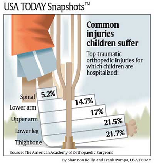
Sometimes authors or data visualization creators present accurate data, but they describe the data inaccurately in annotation, surrounding text, the title or caption, or within the data visualization itself. Unless readers take the time to read the data carefully, they will never know that they have been misled, and most readers are apt to trust the author's or creator's interpretation. Consider the data visualization below. Looking at the large title, one might be led to believe that the percentages indicate the percentage of children in the population who suffer each kind of injury. Spinal cord injuries among the general youth population would be alarming to any parent. However, as the smaller print indicates, the chart shows percentages among all reported injuries to children, not among children themselves. The percentage in the general population is actually a fraction of a percent.
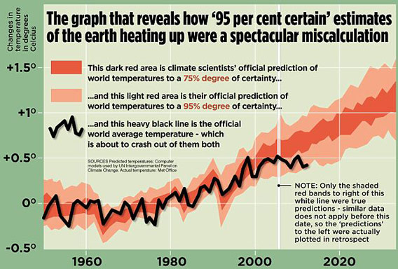
In this graphical display, which appeared in a British tabloid newspaper, the author used accurate data about temperature but he didn't say what kind of temperature he's showing. In fact, the graph shows air temperature, which is a poor indicator of global warming, and, in any case, scientists use several indicators to measure global warming. Note that he also shows only short-term trends, thereby committing another sin of data visualization, which is omitting data.
Rendering a data visualization useless
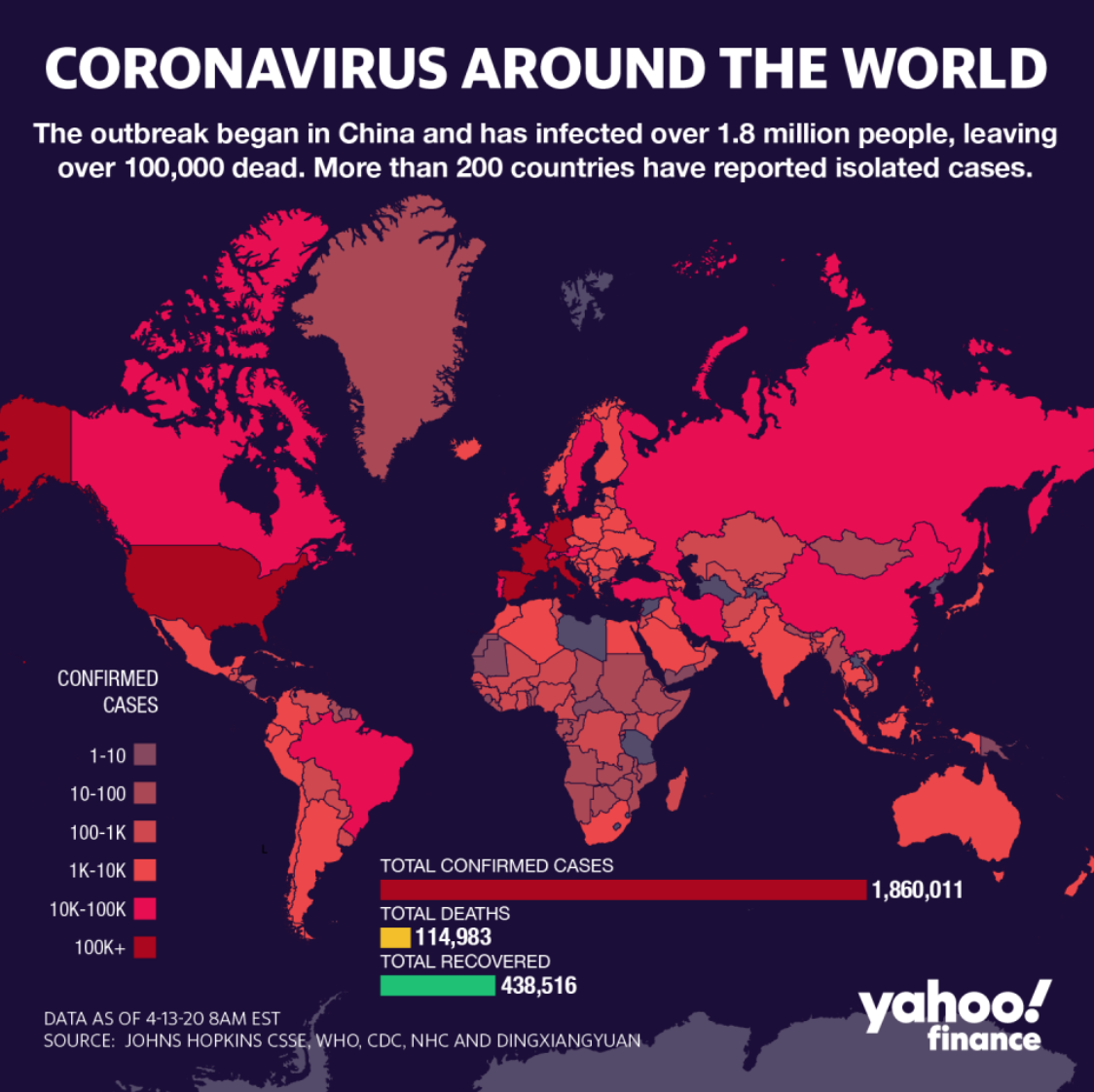
Sometimes data visualizations show and describe data accurately, but the creator does something else to render the data visualization basically useless. One is showing data that does not really fit the intent of the visualization. Here, for example, the data visualization is intended to illustrate the extent and severity of COVID-19, but the creator has used the wrong data. The map shows raw numbers of cases, but percentages of the population in the region would be much more useful for understanding how the virus is impacting communities. In addition, the map uses several bins for ranges under 101, and lumps any number over 101 in one bin. However, 102 cases is much different than 502, and certainly matters when you're considering the severity of the virus.
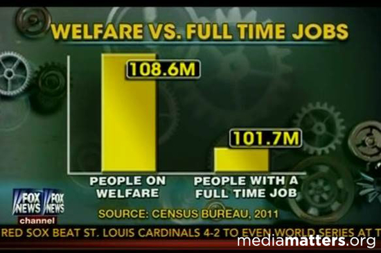
An even worse case of using the wrong data is taking mismatched data points and using them for comparison. In the following graph, the data on welfare recipients adds up numbers of people in households where one member is a welfare recipient, and compares it to individuals who are employed. In other words, if an adult family member in a household of five receives welfare, the number on the left includes all five people. However, if an adult family member in a household of five is employed, the number on the right only includes that one person.
Other data visualizations just show too much information. They overwhelm the reader to the point that they will probably draw little information from the display. Here are a few examples.
There are numerous ways that data visualization creators and authors can use data to mislead learners. As educators, we have a unique opportunity to help students understand how data can be used to spread misinformation, and to help them develop a critical and discerning eye.