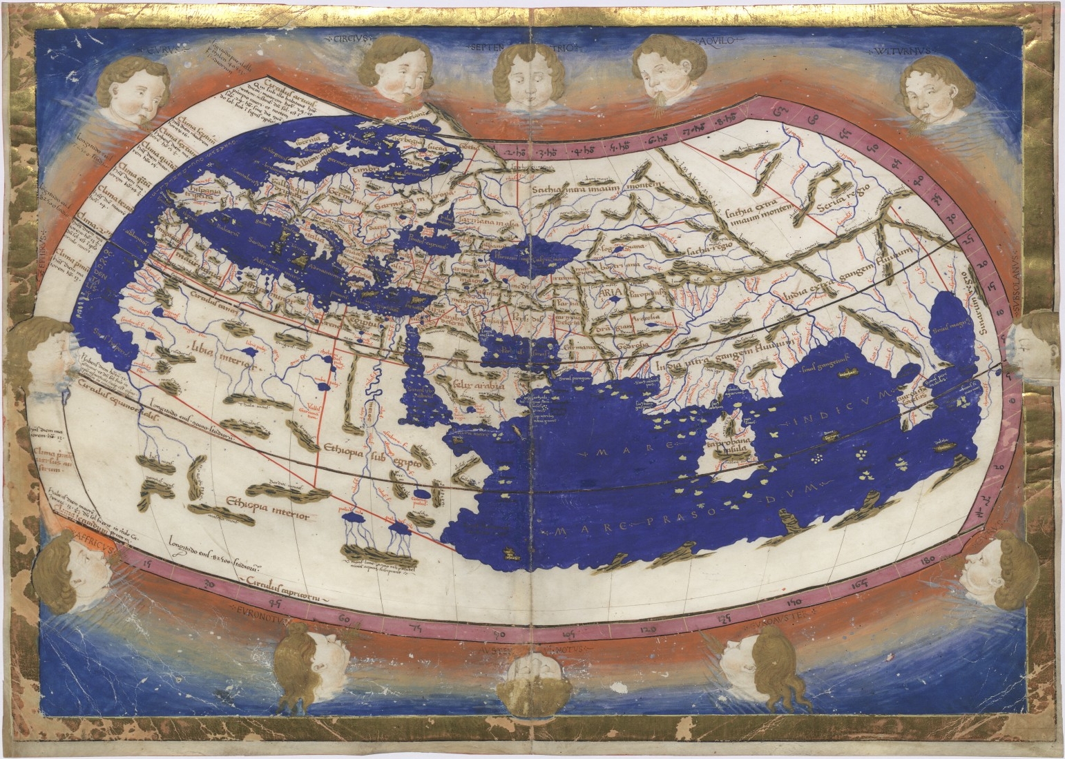
Location
Bubble Map
Bubble maps use circles to represent data over a geographical region. The area of the circle is proportional to its value in the dataset.
Choropleth Map
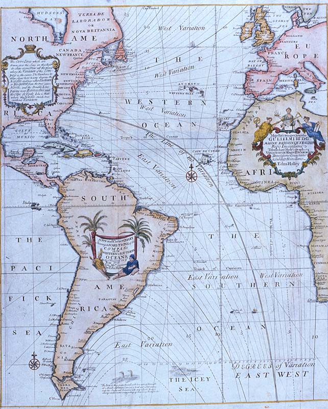
Connection Map
Dot Map
Flow Map
This page has paths:
- Spatial Data Visualizations Tamara Shreiner