Data Visualizations
Page
| resource | rdf:resource | https://scalar.usc.edu/works/sams-portfolio-/data-visualization |
| type | rdf:type | http://scalar.usc.edu/2012/01/scalar-ns#Composite |
| is live | scalar:isLive | 1 |
| banner | scalar:banner | media/Data Visualization.jpg |
| was attributed to | prov:wasAttributedTo | https://scalar.usc.edu/works/sams-portfolio-/users/30527 |
| created | dcterms:created | 2019-11-20T23:16:49-08:00 |
Version 33
| resource | rdf:resource | https://scalar.usc.edu/works/sams-portfolio-/data-visualization.33 |
| versionnumber | ov:versionnumber | 33 |
| title | dcterms:title | Data Visualizations |
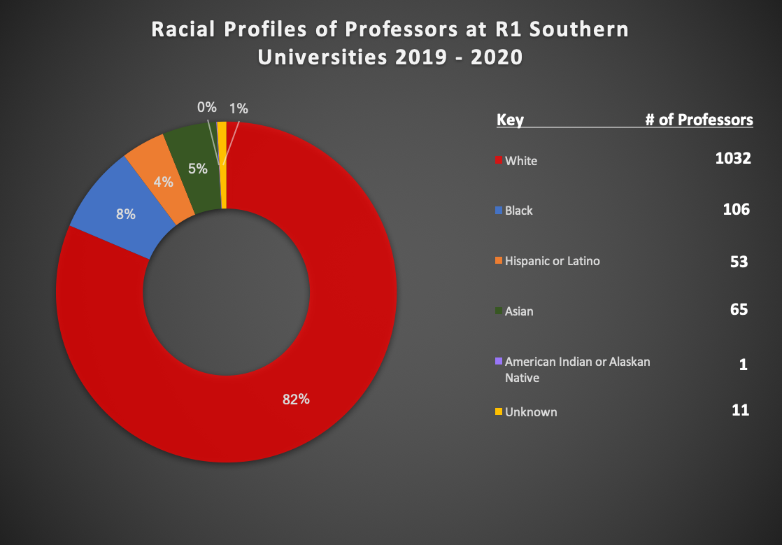
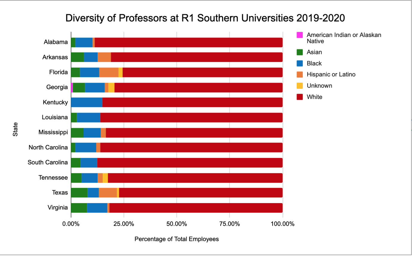
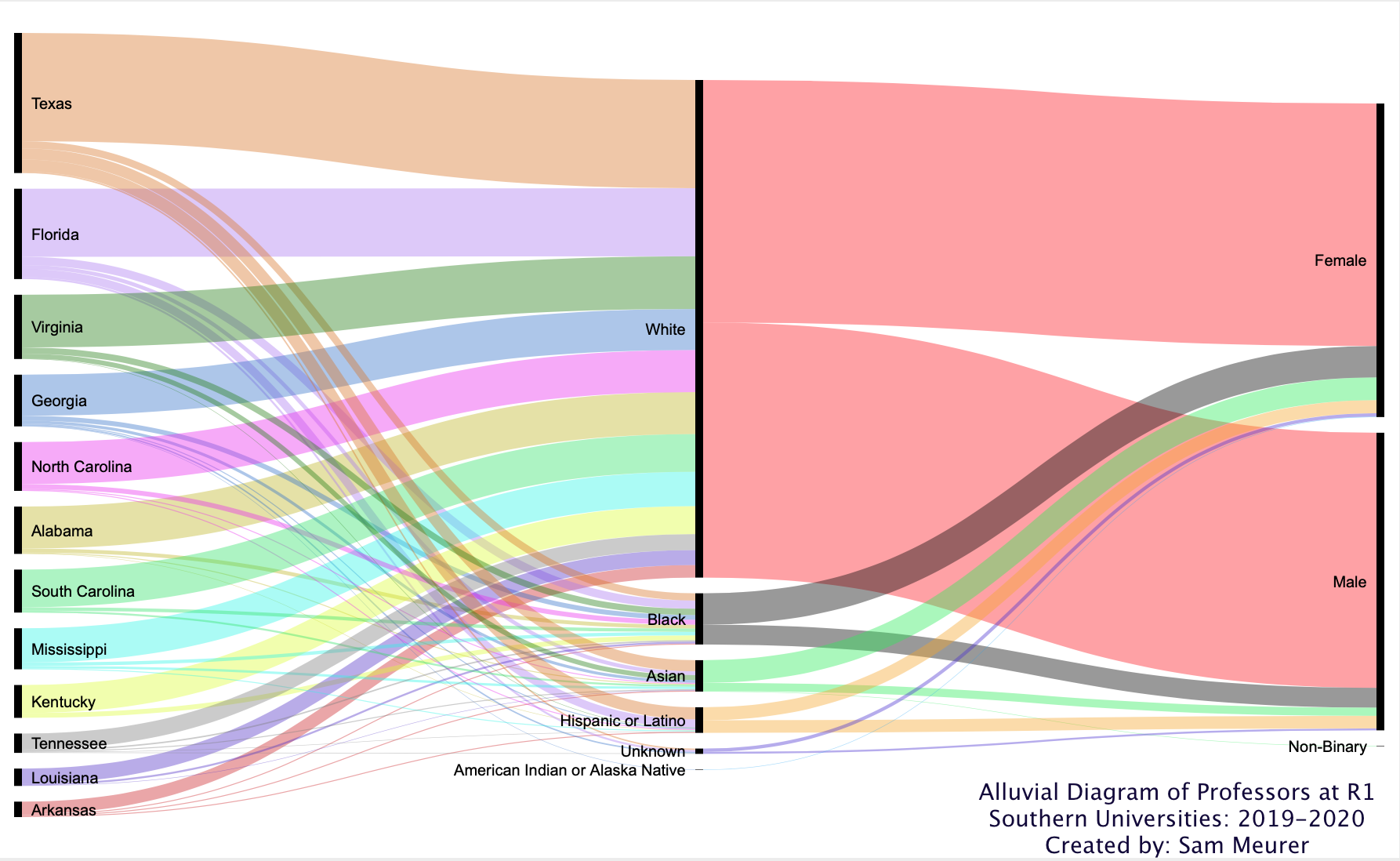
| content | sioc:content | Using RAWgraphs, I built an alluvial diagram detailing the qualities of professors that are hired at public R1: Doctoral Universities in the South. Reading from left to right, the name of the state, containing each R1 doctoral university in that particular state, flows into the racial categories of each professor employeed at the institutions within that state which then flows into the classification of gender of the professors. From this diagram, you can see that most professors are racially classified as White. This didn't surprise me; however, the gender equality among the professors did surprise me a bit. The diagram roughly shows an equal amount of female and male professors in addition to one non-binary identifying professor. This data visualization represents the overall racial profiles of English professors at R1 universities in the southern states. Before working with the data, I expected the overall racial makeup of these universities to be quite diverse; however, from the visualization you can clearly see this is not the case. Out of the 1267 professors used for this data set, 82% were white beating the next category (Black) by 74%. Considering English is such a vast, diverse subject field with a special emphasis on representation, I expected the results to be a tad more spread out. After reviewing these two visualizations, I wanted to represent the diversity of professors in each state. From the alluvial diagram, it seemingly appears that the states with the most professors employeed (Texas, Florida, Virginia, Georgia) have the highest rate of diversity. This new visualization, which defines each race with its percentage of the whole count of professors in each state, also reveals that no R1 southern university has more than 25% of diverse employees. The Tableau diagram below represents the top universities where English professors received their highest degree. More than 1/3 (38%) of the English professors in this data set are represented in this diagram. The red color scheme represents R1 doctoral universities and the gray color represents non-R1 doctoral universities. It is evident that all the top universities are R1 doctoral institutions. This means that many of the English professors who teach at R1 doctoral universities come from R1 doctoral programs. 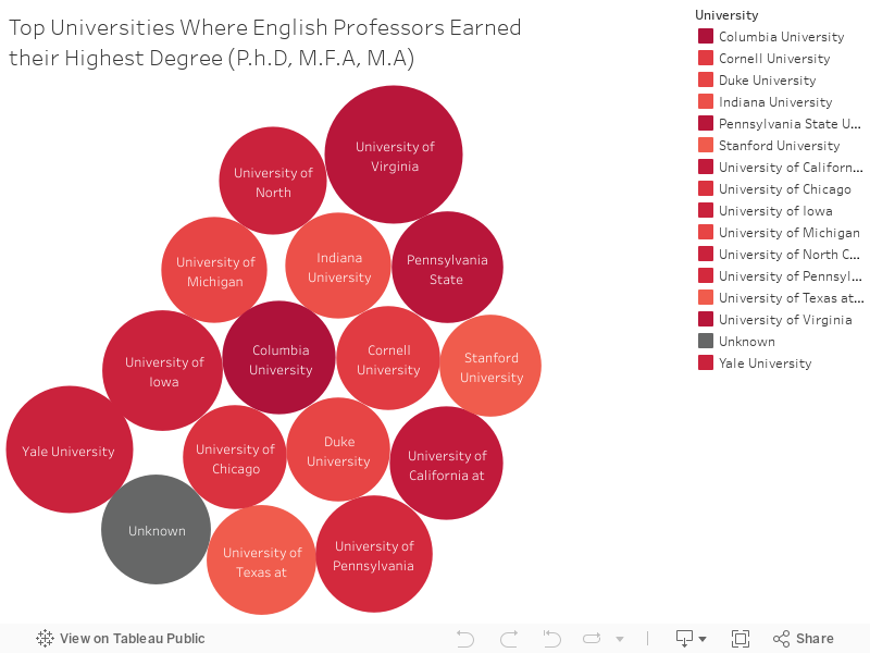 |
| default view | scalar:defaultView | image_header |
| was attributed to | prov:wasAttributedTo | https://scalar.usc.edu/works/sams-portfolio-/users/30527 |
| created | dcterms:created | 2020-04-15T12:19:42-07:00 |
| type | rdf:type | http://scalar.usc.edu/2012/01/scalar-ns#Version |
Version 32
| resource | rdf:resource | https://scalar.usc.edu/works/sams-portfolio-/data-visualization.32 |
| versionnumber | ov:versionnumber | 32 |
| title | dcterms:title | Data Visualizations |
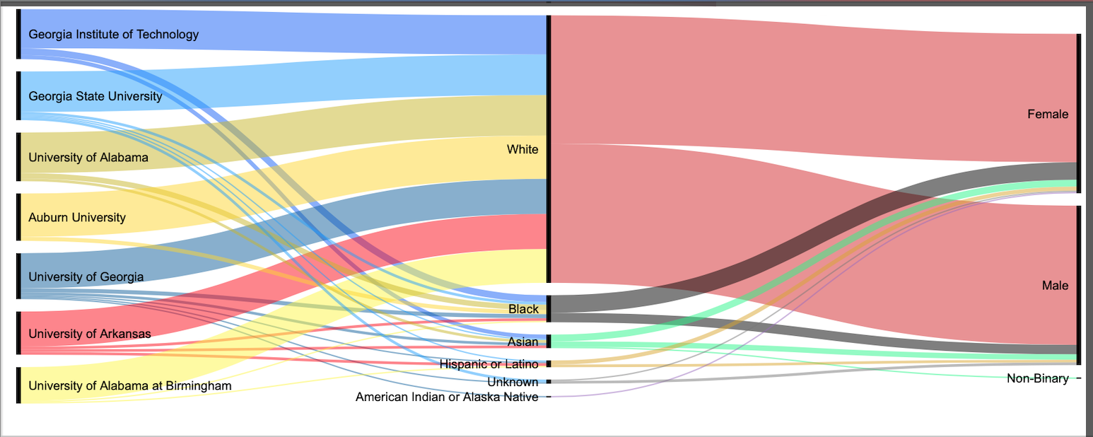
| content | sioc:content | Using RAWgraphs, I built an alluvial diagram detailing the qualities of professors that are hired at public R1: Doctoral Universities in the South. Reading from left to right, the name of the public institution flows into the racial categories of each professor employeed at the institution which then flows into the classification of gender. From this diagram, you can see that most professors are racially classified as White. This didn't surprise me; however, the gender equality among the professors did surprise me a bit. The diagram roughly shows an equal amount of female and male professors in addition to one non-binary identifying professor. This data visualization represents the overall racial profiles of English professors at R1 universities in the southern states. Before working with the data, I expected the overall racial makeup of these universities to be quite diverse; however, from the visualization you can clearly see this is not the case. Out of the 1268 professors used for this data set, 82% were white beating the next category (Black) by 74%. Considering English is such a vast, diverse subject field with a special emphasis on representation, I expected the results to be a tad more spread out. After reviewing these two visualizations, I wanted to represent the diversity of professors in each state. From the alluvial diagram, it seemingly appears that the states with the most professors employeed (Texas, Florida, Virginia, Georgia) have the highest rate of diversity. This new visualization, which defines each race with its percentage of the whole count of professors in each state, also reveals that no R1 southern university has more than 25% of diverse employees. The Tableau diagram below represents the top universities where English professors received their highest degree. More than 1/3 (38%) of the English professors in this data set are represented in this diagram. The red color scheme represents R1 doctoral universities and the gray color represents non-R1 doctoral universities. It is evident that all the top universities are R1 doctoral institutions. This means that many of the English professors who teach at R1 doctoral universities come from R1 doctoral programs. |
| default view | scalar:defaultView | image_header |
| was attributed to | prov:wasAttributedTo | https://scalar.usc.edu/works/sams-portfolio-/users/30527 |
| created | dcterms:created | 2020-04-14T22:41:21-07:00 |
| type | rdf:type | http://scalar.usc.edu/2012/01/scalar-ns#Version |
Version 31
| resource | rdf:resource | https://scalar.usc.edu/works/sams-portfolio-/data-visualization.31 |
| versionnumber | ov:versionnumber | 31 |
| title | dcterms:title | Data Visualizations |
| content | sioc:content | Using RAWgraphs, I built an alluvial diagram detailing the qualities of professors that are hired at public R1: Doctoral Universities in the South. Reading from left to right, the name of the public institution flows into the racial categories of each professor employeed at the institution which then flows into the classification of gender. From this diagram, you can see that most professors are racially classified as White. This didn't surprise me; however, the gender equality among the professors did surprise me a bit. The diagram roughly shows an equal amount of female and male professors in addition to one non-binary identifying professor. This data visualization represents the overall racial profiles of English professors at R1 universities in the southern states. Before working with the data, I expected the overall racial makeup of these universities to be quite diverse; however, from the visualization you can clearly see this is not the case. Out of the 1268 professors used for this data set, 82% were white beating the next category (Black) by 74%. Considering English is such a vast, diverse subject field with a special emphasis on representation, I expected the results to be a tad more spread out. After reviewing these two visualizations, I wanted to represent the diversity of professors in each state. From the alluvial diagram, it seemingly appears that the states with the most professors employeed (Texas, Florida, Virginia, Georgia) have the highest rate of diversity. This new visualization, which defines each race with its percentage of the whole count of professors in each state, also reveals that no R1 southern university has more than 25% of diverse employees. |
| default view | scalar:defaultView | image_header |
| was attributed to | prov:wasAttributedTo | https://scalar.usc.edu/works/sams-portfolio-/users/30527 |
| created | dcterms:created | 2020-04-14T22:35:44-07:00 |
| type | rdf:type | http://scalar.usc.edu/2012/01/scalar-ns#Version |
Version 30
| resource | rdf:resource | https://scalar.usc.edu/works/sams-portfolio-/data-visualization.30 |
| versionnumber | ov:versionnumber | 30 |
| title | dcterms:title | Data Visualizations |
| content | sioc:content | Using RAWgraphs, I built an alluvial diagram detailing the qualities of professors that are hired at public R1: Doctoral Universities in the South. Reading from left to right, the name of the public institution flows into the racial categories of each professor employeed at the institution which then flows into the classification of gender. From this diagram, you can see that most professors are racially classified as White. This didn't surprise me; however, the gender equality among the professors did surprise me a bit. The diagram roughly shows an equal amount of female and male professors in addition to one non-binary identifying professor. This data visualization represents the overall racial profiles of English professors at R1 universities in the southern states. Before working with the data, I expected the overall racial makeup of these universities to be quite diverse; however, from the visualization you can clearly see this is not the case. Out of the 1268 professors used for this data set, 82% were white beating the next category (Black) by 74%. Considering English is such a vast, diverse subject field with a special emphasis on representation, I expected the results to be a tad more spread out. After reviewing these two visualizations, I wanted to represent the diversity of professors in each state. From the alluvial diagram, it seemingly appears that the states with the most professors employeed (Texas, Florida, Virginia, Georgia) have the highest rate of diversity. This new visualization, which defines each race with its percentage of the whole count of professors in each state, also reveals that no R1 southern university has more than 25% of diverse employees. |
| default view | scalar:defaultView | image_header |
| was attributed to | prov:wasAttributedTo | https://scalar.usc.edu/works/sams-portfolio-/users/30527 |
| created | dcterms:created | 2020-04-14T22:34:41-07:00 |
| type | rdf:type | http://scalar.usc.edu/2012/01/scalar-ns#Version |
Version 29
| resource | rdf:resource | https://scalar.usc.edu/works/sams-portfolio-/data-visualization.29 |
| versionnumber | ov:versionnumber | 29 |
| title | dcterms:title | Data Visualizations |
| content | sioc:content | Using RAWgraphs, I built an alluvial diagram detailing the qualities of professors that are hired at public R1: Doctoral Universities in the South. Reading from left to right, the name of the public institution flows into the racial categories of each professor employeed at the institution which then flows into the classification of gender. From this diagram, you can see that most professors are racially classified as White. This didn't surprise me; however, the gender equality among the professors did surprise me a bit. The diagram roughly shows an equal amount of female and male professors in addition to one non-binary identifying professor. This data visualization represents the overall racial profiles of English professors at R1 universities in the southern states. Before working with the data, I expected the overall racial makeup of these universities to be quite diverse; however, from the visualization you can clearly see this is not the case. Out of the 1268 professors used for this data set, 82% were white beating the next category (Black) by 74%. Considering English is such a vast, diverse subject field with a special emphasis on representation, I expected the results to be a tad more spread out. After reviewing these two visualizations, I wanted to represent the diversity of professors in each state. From the alluvial diagram, it seemingly appears that the states with the most professors employeed (Texas, Florida, Virginia, Georgia) have the highest rate of diversity. This new visualization, which defines each race with its percentage of the whole count of professors in each state, also reveals that no R1 southern university has more than 25% of diverse employees.  |
| default view | scalar:defaultView | image_header |
| was attributed to | prov:wasAttributedTo | https://scalar.usc.edu/works/sams-portfolio-/users/30527 |
| created | dcterms:created | 2020-04-14T22:04:50-07:00 |
| type | rdf:type | http://scalar.usc.edu/2012/01/scalar-ns#Version |
Version 28
| resource | rdf:resource | https://scalar.usc.edu/works/sams-portfolio-/data-visualization.28 |
| versionnumber | ov:versionnumber | 28 |
| title | dcterms:title | Data Visualizations |
| content | sioc:content | Using RAWgraphs, I built an alluvial diagram detailing the qualities of professors that are hired at public R1: Doctoral Universities in the South. Reading from left to right, the name of the public institution flows into the racial categories of each professor employeed at the institution which then flows into the classification of gender. From this diagram, you can see that most professors are racially classified as White. This didn't surprise me; however, the gender equality among the professors did surprise me a bit. The diagram roughly shows an equal amount of female and male professors in addition to one non-binary identifying professor. This data visualization represents the overall racial profiles of English professors at R1 universities in the southern states. Before working with the data, I expected the overall racial makeup of these universities to be quite diverse; however, from the visualization you can clearly see this is not the case. Out of the 1268 professors used for this data set, 82% were white beating the next category (Black) by 74%. Considering English is such a vast, diverse subject field with a special emphasis on representation, I expected the results to be a tad more spread out. After reviewing these two visualizations, I wanted to represent the diversity of professors in each state. From the alluvial diagram, it seemingly appears that the states with the most professors employeed (Texas, Florida, Virginia, Georgia) have the highest rate of diversity. This new visualization, which defines each race with its percentage of the whole count of professors in each state, also reveals that no R1 southern university has more than 25% of diverse employees. https://public.tableau.com/views/Professors_15869269219210/Sheet1?:display_count=y&publish=yes&:origin=viz_share_link |
| default view | scalar:defaultView | image_header |
| was attributed to | prov:wasAttributedTo | https://scalar.usc.edu/works/sams-portfolio-/users/30527 |
| created | dcterms:created | 2020-04-14T22:04:09-07:00 |
| type | rdf:type | http://scalar.usc.edu/2012/01/scalar-ns#Version |
Version 27
| resource | rdf:resource | https://scalar.usc.edu/works/sams-portfolio-/data-visualization.27 |
| versionnumber | ov:versionnumber | 27 |
| title | dcterms:title | Data Visualizations |
| content | sioc:content | Using RAWgraphs, I built an alluvial diagram detailing the qualities of professors that are hired at public R1: Doctoral Universities in the South. Reading from left to right, the name of the public institution flows into the racial categories of each professor employeed at the institution which then flows into the classification of gender. From this diagram, you can see that most professors are racially classified as White. This didn't surprise me; however, the gender equality among the professors did surprise me a bit. The diagram roughly shows an equal amount of female and male professors in addition to one non-binary identifying professor. This data visualization represents the overall racial profiles of English professors at R1 universities in the southern states. Before working with the data, I expected the overall racial makeup of these universities to be quite diverse; however, from the visualization you can clearly see this is not the case. Out of the 1268 professors used for this data set, 82% were white beating the next category (Black) by 74%. Considering English is such a vast, diverse subject field with a special emphasis on representation, I expected the results to be a tad more spread out. After reviewing these two visualizations, I wanted to represent the diversity of professors in each state. From the alluvial diagram, it seemingly appears that the states with the most professors employeed (Texas, Florida, Virginia, Georgia) have the highest rate of diversity. This new visualization, which defines each race with its percentage of the whole count of professors in each state, also reveals that no R1 southern university has more than 25% of diverse employees. |
| default view | scalar:defaultView | image_header |
| was attributed to | prov:wasAttributedTo | https://scalar.usc.edu/works/sams-portfolio-/users/30527 |
| created | dcterms:created | 2020-04-14T22:03:38-07:00 |
| type | rdf:type | http://scalar.usc.edu/2012/01/scalar-ns#Version |
Version 26
| resource | rdf:resource | https://scalar.usc.edu/works/sams-portfolio-/data-visualization.26 |
| versionnumber | ov:versionnumber | 26 |
| title | dcterms:title | Data Visualizations |
| content | sioc:content | Using RAWgraphs, I built an alluvial diagram detailing the qualities of professors that are hired at public R1: Doctoral Universities in the South. Reading from left to right, the name of the public institution flows into the racial categories of each professor employeed at the institution which then flows into the classification of gender. From this diagram, you can see that most professors are racially classified as White. This didn't surprise me; however, the gender equality among the professors did surprise me a bit. The diagram roughly shows an equal amount of female and male professors in addition to one non-binary identifying professor. This data visualization represents the overall racial profiles of English professors at R1 universities in the southern states. Before working with the data, I expected the overall racial makeup of these universities to be quite diverse; however, from the visualization you can clearly see this is not the case. Out of the 1268 professors used for this data set, 82% were white beating the next category (Black) by 74%. Considering English is such a vast, diverse subject field with a special emphasis on representation, I expected the results to be a tad more spread out. After reviewing these two visualizations, I wanted to represent the diversity of professors in each state. From the alluvial diagram, it seemingly appears that the states with the most professors employeed (Texas, Florida, Virginia, Georgia) have the highest rate of diversity. This new visualization, which defines each race with its percentage of the whole count of professors in each state, also reveals that no R1 southern university has more than 25% of diverse employees. |
| default view | scalar:defaultView | image_header |
| was attributed to | prov:wasAttributedTo | https://scalar.usc.edu/works/sams-portfolio-/users/30527 |
| created | dcterms:created | 2020-04-14T22:02:45-07:00 |
| type | rdf:type | http://scalar.usc.edu/2012/01/scalar-ns#Version |
Version 25
| resource | rdf:resource | https://scalar.usc.edu/works/sams-portfolio-/data-visualization.25 |
| versionnumber | ov:versionnumber | 25 |
| title | dcterms:title | Data Visualizations |
| content | sioc:content | Using RAWgraphs, I built an alluvial diagram detailing the qualities of professors that are hired at public R1: Doctoral Universities in the South. Reading from left to right, the name of the public institution flows into the racial categories of each professor employeed at the institution which then flows into the classification of gender. From this diagram, you can see that most professors are racially classified as White. This didn't surprise me; however, the gender equality among the professors did surprise me a bit. The diagram roughly shows an equal amount of female and male professors in addition to one non-binary identifying professor. This data visualization represents the overall racial profiles of English professors at R1 universities in the southern states. Before working with the data, I expected the overall racial makeup of these universities to be quite diverse; however, from the visualization you can clearly see this is not the case. Out of the 1268 professors used for this data set, 82% were white beating the next category (Black) by 74%. Considering English is such a vast, diverse subject field with a special emphasis on representation, I expected the results to be a tad more spread out. After reviewing these two visualizations, I wanted to represent the diversity of professors in each state. From the alluvial diagram, it seemingly appears that the states with the most professors employeed (Texas, Florida, Virginia, Georgia) have the highest rate of diversity. This new visualization, which defines each race with its percentage of the whole count of professors in each state, also reveals that no R1 southern university has more than 25% of diverse employees. |
| default view | scalar:defaultView | image_header |
| was attributed to | prov:wasAttributedTo | https://scalar.usc.edu/works/sams-portfolio-/users/30527 |
| created | dcterms:created | 2020-04-14T17:14:44-07:00 |
| type | rdf:type | http://scalar.usc.edu/2012/01/scalar-ns#Version |
Version 24
| resource | rdf:resource | https://scalar.usc.edu/works/sams-portfolio-/data-visualization.24 |
| versionnumber | ov:versionnumber | 24 |
| title | dcterms:title | Data Visualization |
| content | sioc:content | Using RAWgraphs, I built an alluvial diagram detailing the qualities of professors that are hired at public R1: Doctoral Universities in the South. Reading from left to right, the name of the public institution flows into the racial categories of each professor employeed at the institution which then flows into the classification of gender. From this diagram, you can see that most professors are racially classified as White. This didn't surprise me; however, the gender equality among the professors did surprise me a bit. The diagram roughly shows an equal amount of female and male professors in addition to one non-binary identifying professor. This data visualization represents the overall racial profiles of English professors at R1 universities in the southern states. Before working with the data, I expected the overall racial makeup of these universities to be quite diverse; however, from the visualization you can clearly see this is not the case. Out of the 1268 professors used for this data set, 82% were white beating the next category (Black) by 74%. Considering English is such a vast, diverse subject field with a special emphasis on representation, I expected the results to be a tad more spread out. After reviewing these two visualizations, I wanted to represent the diversity of professors in each state. From the alluvial diagram, it seemingly appears that the states with the most professors employeed (Texas, Florida, Virginia, Georgia) have the highest rate of diversity. This new visualization, which defines each race with its percentage of the whole count of professors in each state, also reveals that no R1 southern university has more than 25% of diverse employees. |
| default view | scalar:defaultView | image_header |
| was attributed to | prov:wasAttributedTo | https://scalar.usc.edu/works/sams-portfolio-/users/30527 |
| created | dcterms:created | 2020-04-14T17:14:18-07:00 |
| type | rdf:type | http://scalar.usc.edu/2012/01/scalar-ns#Version |
Version 23
| resource | rdf:resource | https://scalar.usc.edu/works/sams-portfolio-/data-visualization.23 |
| versionnumber | ov:versionnumber | 23 |
| title | dcterms:title | Data Visualization |
| content | sioc:content | Using RAWgraphs, I built an alluvial diagram detailing the qualities of professors that are hired at public R1: Doctoral Universities in the South. Reading from left to right, the name of the public institution flows into the racial categories of each professor employeed at the institution which then flows into the classification of gender. From this diagram, you can see that most professors are racially classified as White. This didn't surprise me; however, the gender equality among the professors did surprise me a bit. The diagram roughly shows an equal amount of female and male professors in addition to one non-binary identifying professor. This data visualization represents the overall racial profiles of English professors at R1 universities in the southern states. Before working with the data, I expected the overall racial makeup of these universities to be quite diverse; however, from the visualization you can clearly see this is not the case. Out of the 1268 professors used for this data set, 82% were white beating the next category (Black) by 74%. Considering English is such a vast, diverse subject field with a special emphasis on representation, I expected the results to be a tad more spread out. After reviewing these two visualizations, I wanted to represent the diversity of professors in each state. From the alluvial diagram, it seemingly appears that the states with the most professors employeed (Texas, Florida, Virginia, Georgia) have the highest rate of diversity. This new visualization, which defines each race with its percentage of the whole count of professors in each state, also reveals that no R1 southern university has more than 25% of diverse employees. |
| default view | scalar:defaultView | image_header |
| was attributed to | prov:wasAttributedTo | https://scalar.usc.edu/works/sams-portfolio-/users/30527 |
| created | dcterms:created | 2020-04-14T17:13:33-07:00 |
| type | rdf:type | http://scalar.usc.edu/2012/01/scalar-ns#Version |
Version 22
| resource | rdf:resource | https://scalar.usc.edu/works/sams-portfolio-/data-visualization.22 |
| versionnumber | ov:versionnumber | 22 |
| title | dcterms:title | Data Visualization |
| content | sioc:content | Using RAWgraphs, I built an alluvial diagram detailing the qualities of professors that are hired at public R1: Doctoral Universities in the South. Reading from left to right, the name of the public institution flows into the racial categories of each professor employeed at the institution which then flows into the classification of gender. From this diagram, you can see that most professors are racially classified as White. This didn't surprise me; however, the gender equality among the professors did surprise me a bit. The diagram roughly shows an equal amount of female and male professors in addition to one non-binary identifying professor. This data visualization represents the overall racial profiles of English professors at R1 universities in the southern states. Before working with the data, I expected the overall racial makeup of these universities to be quite diverse; however, from the visualization you can clearly see this is not the case. Out of the 1268 professors used for this data set, 82% were white beating the next category (Black) by 74%. Considering English is such a vast, diverse subject field with a special emphasis on representation, I expected the results to be a tad more spread out. After reviewing these two visualizations, I wanted to represent the diversity of professors in each state. From the alluvial diagram, it seemingly appears that the states with the most professors employeed (Texas, Florida, Virginia, Georgia) have the highest rate of diversity. |
| default view | scalar:defaultView | image_header |
| was attributed to | prov:wasAttributedTo | https://scalar.usc.edu/works/sams-portfolio-/users/30527 |
| created | dcterms:created | 2020-04-14T17:10:00-07:00 |
| type | rdf:type | http://scalar.usc.edu/2012/01/scalar-ns#Version |
Version 21
| resource | rdf:resource | https://scalar.usc.edu/works/sams-portfolio-/data-visualization.21 |
| versionnumber | ov:versionnumber | 21 |
| title | dcterms:title | Data Visualization |
| content | sioc:content | Using RAWgraphs, I built an alluvial diagram detailing the qualities of professors that are hired at public R1: Doctoral Universities in the South. Reading from left to right, the name of the public institution flows into the racial categories of each professor employeed at the institution which then flows into the classification of gender. From this diagram, you can see that most professors are racially classified as White. This didn't surprise me; however, the gender equality among the professors did surprise me a bit. The diagram roughly shows an equal amount of female and male professors in addition to one non-binary identifying professor. This data visualization represents the overall racial profiles of English professors at R1 universities in the southern states. Before working with the data, I expected the overall racial makeup of these universities to be quite diverse; however, from the visualization you can clearly see this is not the case. Out of the 1268 professors used for this data set, 82% were white beating the next category (Black) by 74%. Considering English is such a vast, diverse subject field with a special emphasis on representation, I expected the results to be a tad more spread out. |
| default view | scalar:defaultView | image_header |
| was attributed to | prov:wasAttributedTo | https://scalar.usc.edu/works/sams-portfolio-/users/30527 |
| created | dcterms:created | 2020-04-14T17:06:38-07:00 |
| type | rdf:type | http://scalar.usc.edu/2012/01/scalar-ns#Version |
Version 20
| resource | rdf:resource | https://scalar.usc.edu/works/sams-portfolio-/data-visualization.20 |
| versionnumber | ov:versionnumber | 20 |
| title | dcterms:title | Data Visualization |
| content | sioc:content | Using RAWgraphs, I built an alluvial diagram detailing the qualities of professors that are hired at public R1: Doctoral Universities in the South. Reading from left to right, the name of the public institution flows into the racial categories of each professor employeed at the institution which then flows into the classification of gender. This data visualization represents the overall racial profiles of English professors at R1 universities in the southern states. Before working with the data, I expected the overall racial makeup of these universities to be quite diverse; however, from the visualization you can clearly see this is not the case. Out of the 237 professors used for this sample portfolio, 84% were white beating the next category (Black) by 75%. Considering English is such a vast, diverse subject field with a special emphasis on representing all people, I expected the results to be a tad more spread out. |
| default view | scalar:defaultView | image_header |
| was attributed to | prov:wasAttributedTo | https://scalar.usc.edu/works/sams-portfolio-/users/30527 |
| created | dcterms:created | 2020-04-14T17:01:50-07:00 |
| type | rdf:type | http://scalar.usc.edu/2012/01/scalar-ns#Version |
Version 19
| resource | rdf:resource | https://scalar.usc.edu/works/sams-portfolio-/data-visualization.19 |
| versionnumber | ov:versionnumber | 19 |
| title | dcterms:title | Data Visualization |
| content | sioc:content | Using RAWgraphs, I built an alluvial diagram detailing the qualities of professors that are hired at public R1: Doctoral Universities in the South. Reading from left to right, the name of the public institution flows into the racial categories of each professor employeed at the institution which then flows into the classification of gender. This data visualization represents the overall racial profiles of English professors at R1 universities in the southern states. Before working with the data, I expected the overall racial makeup of these universities to be quite diverse; however, from the visualization you can clearly see this is not the case. Out of the 237 professors used for this sample portfolio, 84% were white beating the next category (Black) by 75%. Considering English is such a vast, diverse subject field with a special emphasis on representing all people, I expected the results to be a tad more spread out. |
| default view | scalar:defaultView | image_header |
| was attributed to | prov:wasAttributedTo | https://scalar.usc.edu/works/sams-portfolio-/users/30527 |
| created | dcterms:created | 2020-04-14T17:00:41-07:00 |
| type | rdf:type | http://scalar.usc.edu/2012/01/scalar-ns#Version |
Version 18
| resource | rdf:resource | https://scalar.usc.edu/works/sams-portfolio-/data-visualization.18 |
| versionnumber | ov:versionnumber | 18 |
| title | dcterms:title | Data Visualization |
| content | sioc:content | Using RAWgraphs, I built an alluvial diagram detailing the qualities of professors that are hired at public R1: Doctoral Universities in the South. Reading from left to right, the name of the public institution flows into the racial categories of each professor employeed at the institution which then flows into the classification of gender. This data visualization represents the overall racial profiles of English professors at R1 universities in the southern states. Before working with the data, I expected the overall racial makeup of these universities to be quite diverse; however, from the visualization you can clearly see this is not the case. Out of the 237 professors used for this sample portfolio, 84% were white beating the next category (Black) by 75%. Considering English is such a vast, diverse subject field with a special emphasis on representing all people, I expected the results to be a tad more spread out. |
| default view | scalar:defaultView | image_header |
| was attributed to | prov:wasAttributedTo | https://scalar.usc.edu/works/sams-portfolio-/users/30527 |
| created | dcterms:created | 2020-04-14T17:00:11-07:00 |
| type | rdf:type | http://scalar.usc.edu/2012/01/scalar-ns#Version |
Version 17
| resource | rdf:resource | https://scalar.usc.edu/works/sams-portfolio-/data-visualization.17 |
| versionnumber | ov:versionnumber | 17 |
| title | dcterms:title | Data Visualization |
| content | sioc:content | Using RAWgraphs, I built an alluvial diagram detailing the qualities of professors that are hired at public R1: Doctoral Universities in the South. Reading from left to right, the name of the public institution flows into the racial categories of each professor employeed at the institution which then flows into the classification of gender. This data visualization represents the overall racial profiles of English professors at R1 universities in the southern states. Before working with the data, I expected the overall racial makeup of these universities to be quite diverse; however, from the visualization you can clearly see this is not the case. Out of the 237 professors used for this sample portfolio, 84% were white beating the next category (Black) by 75%. Considering English is such a vast, diverse subject field with a special emphasis on representing all people, I expected the results to be a tad more spread out. |
| default view | scalar:defaultView | image_header |
| was attributed to | prov:wasAttributedTo | https://scalar.usc.edu/works/sams-portfolio-/users/30527 |
| created | dcterms:created | 2020-04-14T16:59:02-07:00 |
| type | rdf:type | http://scalar.usc.edu/2012/01/scalar-ns#Version |
Version 16
| resource | rdf:resource | https://scalar.usc.edu/works/sams-portfolio-/data-visualization.16 |
| versionnumber | ov:versionnumber | 16 |
| title | dcterms:title | Data Visualization |
| content | sioc:content | Using RAWgraphs, I built an alluvial diagram detailing the qualities of professors that are hired at public R1: Doctoral Universities in the South. Reading from left to right, the name of the public institution flows into the racial categories of each professor employeed at the institution which then flows into the classification of gender. This data visualization represents the overall racial profiles of English professors at R1 universities in the southern states. Before working with the data, I expected the overall racial makeup of these universities to be quite diverse; however, from the visualization you can clearly see this is not the case. Out of the 237 professors used for this sample portfolio, 84% were white beating the next category (Black) by 75%. Considering English is such a vast, diverse subject field with a special emphasis on representing all people, I expected the results to be a tad more spread out. |
| default view | scalar:defaultView | image_header |
| was attributed to | prov:wasAttributedTo | https://scalar.usc.edu/works/sams-portfolio-/users/30527 |
| created | dcterms:created | 2020-04-14T16:58:46-07:00 |
| type | rdf:type | http://scalar.usc.edu/2012/01/scalar-ns#Version |
Version 15
| resource | rdf:resource | https://scalar.usc.edu/works/sams-portfolio-/data-visualization.15 |
| versionnumber | ov:versionnumber | 15 |
| title | dcterms:title | Data Visualization |
| content | sioc:content | Using RAWgraphs, I built an alluvial diagram detailing the qualities of professors that are hired at public R1: Doctoral Universities in the South. Reading from left to right, the name of the public institution flows into the racial categories of each professor employeed at the institution which then flows into the classification of gender. This data visualization represents the overall racial profiles of English professors at R1 universities in the southern states. Before working with the data, I expected the overall racial makeup of these universities to be quite diverse; however, from the visualization you can clearly see this is not the case. Out of the 237 professors used for this sample portfolio, 84% were white beating the next category (Black) by 75%. Considering English is such a vast, diverse subject field with a special emphasis on representing all people, I expected the results to be a tad more spread out. |
| default view | scalar:defaultView | image_header |
| was attributed to | prov:wasAttributedTo | https://scalar.usc.edu/works/sams-portfolio-/users/30527 |
| created | dcterms:created | 2020-04-14T16:57:40-07:00 |
| type | rdf:type | http://scalar.usc.edu/2012/01/scalar-ns#Version |
Version 14
| resource | rdf:resource | https://scalar.usc.edu/works/sams-portfolio-/data-visualization.14 |
| versionnumber | ov:versionnumber | 14 |
| title | dcterms:title | Data Visualization |
| content | sioc:content | Using RAWgraphs, I built an alluvial diagram detailing the qualities of professors that are hired at public R1: Doctoral Universities in the South. Reading from left to right, the name of the public institution flows into the racial categories of each professor employeed at the institution which then flows into the classification of gender. This data visualization represents the overall racial profiles of English professors at R1 universities in the southern states. Before working with the data, I expected the overall racial makeup of these universities to be quite diverse; however, from the visualization you can clearly see this is not the case. Out of the 237 professors used for this sample portfolio, 84% were white beating the next category (Black) by 75%. Considering English is such a vast, diverse subject field with a special emphasis on representing all people, I expected the results to be a tad more spread out. |
| default view | scalar:defaultView | image_header |
| was attributed to | prov:wasAttributedTo | https://scalar.usc.edu/works/sams-portfolio-/users/30527 |
| created | dcterms:created | 2020-04-14T16:57:27-07:00 |
| type | rdf:type | http://scalar.usc.edu/2012/01/scalar-ns#Version |
Version 13
| resource | rdf:resource | https://scalar.usc.edu/works/sams-portfolio-/data-visualization.13 |
| versionnumber | ov:versionnumber | 13 |
| title | dcterms:title | Data Visualization |
| content | sioc:content | Using RAWgraphs, I built an alluvial diagram detailing the qualities of professors that are hired at public R1: Doctoral Universities in the South. Reading from left to right, the name of the public institution flows into the racial categories of each professor employeed at the institution which then flows into the classification of gender. This data visualization represents the overall racial profiles of English professors at R1 universities in the southern states. Before working with the data, I expected the overall racial makeup of these universities to be quite diverse; however, from the visualization you can clearly see this is not the case. Out of the 237 professors used for this sample portfolio, 84% were white beating the next category (Black) by 75%. Considering English is such a vast, diverse subject field with a special emphasis on representing all people, I expected the results to be a tad more spread out. |
| default view | scalar:defaultView | image_header |
| was attributed to | prov:wasAttributedTo | https://scalar.usc.edu/works/sams-portfolio-/users/30527 |
| created | dcterms:created | 2020-04-14T16:56:42-07:00 |
| type | rdf:type | http://scalar.usc.edu/2012/01/scalar-ns#Version |
Version 12
| resource | rdf:resource | https://scalar.usc.edu/works/sams-portfolio-/data-visualization.12 |
| versionnumber | ov:versionnumber | 12 |
| title | dcterms:title | Data Visualization |
| content | sioc:content | Using RAWgraphs, I built an alluvial diagram detailing the qualities of professors that are hired at public R1: Doctoral Universities in the South. Reading from left to right, the name of the public institution flows into the racial categories of each professor employeed at the institution which then flows into the classification of gender. This data visualization represents the overall racial profiles of English professors at R1 universities in the southern states. Before working with the data, I expected the overall racial makeup of these universities to be quite diverse; however, from the visualization you can clearly see this is not the case. Out of the 237 professors used for this sample portfolio, 84% were white beating the next category (Black) by 75%. Considering English is such a vast, diverse subject field with a special emphasis on representing all people, I expected the results to be a tad more spread out. |
| default view | scalar:defaultView | image_header |
| was attributed to | prov:wasAttributedTo | https://scalar.usc.edu/works/sams-portfolio-/users/30527 |
| created | dcterms:created | 2020-04-14T16:56:09-07:00 |
| type | rdf:type | http://scalar.usc.edu/2012/01/scalar-ns#Version |
Version 11
| resource | rdf:resource | https://scalar.usc.edu/works/sams-portfolio-/data-visualization.11 |
| versionnumber | ov:versionnumber | 11 |
| title | dcterms:title | Data Visualization |
| content | sioc:content | Using RAWgraphs, I built an alluvial diagram detailing the qualities of professors that are hired at public R1: Doctoral Universities in the South. Reading from left to right, the name of the public institution flows into the racial categories of each professor employeed at the institution which then flows into the classification of gender. This data visualization represents the overall racial profiles of English professors at R1 universities in the southern states. Before working with the data, I expected the overall racial makeup of these universities to be quite diverse; however, from the visualization you can clearly see this is not the case. Out of the 237 professors used for this sample portfolio, 84% were white beating the next category (Black) by 75%. Considering English is such a vast, diverse subject field with a special emphasis on representing all people, I expected the results to be a tad more spread out. |
| default view | scalar:defaultView | image_header |
| was attributed to | prov:wasAttributedTo | https://scalar.usc.edu/works/sams-portfolio-/users/30527 |
| created | dcterms:created | 2020-04-14T16:55:52-07:00 |
| type | rdf:type | http://scalar.usc.edu/2012/01/scalar-ns#Version |
Version 10
| resource | rdf:resource | https://scalar.usc.edu/works/sams-portfolio-/data-visualization.10 |
| versionnumber | ov:versionnumber | 10 |
| title | dcterms:title | Data Visualization |
| content | sioc:content | Using RAWgraphs, I built an alluvial diagram detailing the qualities of professors that are hired at public R1: Doctoral Universities in the South. Reading from left to right, the name of the public institution flows into the racial categories of each professor employeed at the institution which then flows into the classification of gender. This data visualization represents the overall racial profiles of English professors at R1 universities in the southern states. Before working with the data, I expected the overall racial makeup of these universities to be quite diverse; however, from the visualization you can clearly see this is not the case. Out of the 237 professors used for this sample portfolio, 84% were white beating the next category (Black) by 75%. Considering English is such a vast, diverse subject field with a special emphasis on representing all people, I expected the results to be a tad more spread out. |
| default view | scalar:defaultView | image_header |
| was attributed to | prov:wasAttributedTo | https://scalar.usc.edu/works/sams-portfolio-/users/30527 |
| created | dcterms:created | 2020-04-14T16:55:36-07:00 |
| type | rdf:type | http://scalar.usc.edu/2012/01/scalar-ns#Version |
Version 9
| resource | rdf:resource | https://scalar.usc.edu/works/sams-portfolio-/data-visualization.9 |
| versionnumber | ov:versionnumber | 9 |
| title | dcterms:title | Data Visualization |
| content | sioc:content | Using RAWgraphs, I built an alluvial diagram detailing the qualities of professors that are hired at public R1: Doctoral Universities in the South. Reading from left to right, the name of the public institution flows into the racial categories of each professor employeed at the institution which then flows into the classification of gender. This data visualization represents the overall racial profiles of English professors at R1 universities in the southern states. Before working with the data, I expected the overall racial makeup of these universities to be quite diverse; however, from the visualization you can clearly see this is not the case. Out of the 237 professors used for this sample portfolio, 84% were white beating the next category (Black) by 75%. Considering English is such a vast, diverse subject field with a special emphasis on representing all people, I expected the results to be a tad more spread out. |
| default view | scalar:defaultView | image_header |
| was attributed to | prov:wasAttributedTo | https://scalar.usc.edu/works/sams-portfolio-/users/30527 |
| created | dcterms:created | 2020-04-14T16:55:19-07:00 |
| type | rdf:type | http://scalar.usc.edu/2012/01/scalar-ns#Version |
Version 8
| resource | rdf:resource | https://scalar.usc.edu/works/sams-portfolio-/data-visualization.8 |
| versionnumber | ov:versionnumber | 8 |
| title | dcterms:title | Data Visualization |
| content | sioc:content | Using RAWgraphs, I built an alluvial diagram detailing the qualities of professors that are hired at public R1: Doctoral Universities in the South. Reading from left to right, the name of the public institution flows into the racial categories of each professor employeed at the institution which then flows into the classification of gender. This data visualization represents the overall racial profiles of English professors at R1 universities in the southern states. Before working with the data, I expected the overall racial makeup of these universities to be quite diverse; however, from the visualization you can clearly see this is not the case. Out of the 237 professors used for this sample portfolio, 84% were white beating the next category (Black) by 75%. Considering English is such a vast, diverse subject field with a special emphasis on representing all people, I expected the results to be a tad more spread out. |
| default view | scalar:defaultView | image_header |
| was attributed to | prov:wasAttributedTo | https://scalar.usc.edu/works/sams-portfolio-/users/30527 |
| created | dcterms:created | 2020-04-14T16:49:21-07:00 |
| type | rdf:type | http://scalar.usc.edu/2012/01/scalar-ns#Version |
Version 7
| resource | rdf:resource | https://scalar.usc.edu/works/sams-portfolio-/data-visualization.7 |
| versionnumber | ov:versionnumber | 7 |
| title | dcterms:title | Data Visualization |
| content | sioc:content | Using RAWgraphs, I built an alluvial diagram detailing the qualities of professors that are hired at public R1: Doctoral Universities in the South. Reading from left to right, the name of the public institution flows into the racial categories of each professor employeed at the institution which then flows into the classification of gender. More analysis will be done. This data visualization represents the overall racial profiles of English professors at R1 universities in Alabama, Arkansas, and Georgia. Before working with the data, I expected the overall racial makeup of these universities to be quite diverse; however, from the visualization you can clearly see this is not the case. Out of the 237 professors used for this sample portfolio, 84% were white beating the next category (Black) by 75%. Considering English is such a vast, diverse subject field with a special emphasis on representing all people, I expected the results to be a tad more spread out. |
| default view | scalar:defaultView | image_header |
| was attributed to | prov:wasAttributedTo | https://scalar.usc.edu/works/sams-portfolio-/users/30527 |
| created | dcterms:created | 2019-12-05T09:12:51-08:00 |
| type | rdf:type | http://scalar.usc.edu/2012/01/scalar-ns#Version |
Version 6
| resource | rdf:resource | https://scalar.usc.edu/works/sams-portfolio-/data-visualization.6 |
| versionnumber | ov:versionnumber | 6 |
| title | dcterms:title | Data Visualization |
| content | sioc:content | Using RAWgraphs, I built an alluvial diagram detailing the qualities of professors that are hired at public R1: Doctoral Universities in the South. Reading from left to right, the name of the public institution flows into the racial categories of each professor employeed at the institution which then flows into the classification of gender. I was surprised to see that female and male categories were roughly the same. More analysis will be done. This data visualization represents the overall racial profiles of English professors at R1 universities in Alabama, Arkansas, and Georgia. Before working with the data, I expected the overall racial makeup of these universities to be quite diverse; however, from the visualization you can clearly see this is not the case. Out of the 237 professors used for this sample portfolio, 84% were white beating the next category (Black) by 75%. Considering English is such a vast, diverse subject field with a special emphasis on representing all people, I expected the results to be a tad more spread out. |
| default view | scalar:defaultView | image_header |
| was attributed to | prov:wasAttributedTo | https://scalar.usc.edu/works/sams-portfolio-/users/30527 |
| created | dcterms:created | 2019-12-05T08:52:27-08:00 |
| type | rdf:type | http://scalar.usc.edu/2012/01/scalar-ns#Version |
Version 5
| resource | rdf:resource | https://scalar.usc.edu/works/sams-portfolio-/data-visualization.5 |
| versionnumber | ov:versionnumber | 5 |
| title | dcterms:title | Data Visualization |
| content | sioc:content | Using RAWgraphs, I built an alluvial diagram detailing the qualities of professors that are hired at public R1: Doctoral Universities in the South. Reading from left to right, the name of the public institution flows into the racial categories of each professor employeed at the institution which then flows into the classification of gender. This data visualization represents the overall racial profiles of English professors at R1 universities in Alabama, Arkansas, and Georgia. Before working with the data, I expected the overall racial makeup of these universities to be quite diverse; however, from the visualization you can clearly see this is not the case. Out of the 237 professors used for this sample portfolio, 84% were white beating the next category (Black) by 75%. Considering English is such a vast, diverse subject field with a special emphasis on representing all people, I expected the results to be a tad more spread out. |
| default view | scalar:defaultView | image_header |
| was attributed to | prov:wasAttributedTo | https://scalar.usc.edu/works/sams-portfolio-/users/30527 |
| created | dcterms:created | 2019-12-05T06:38:52-08:00 |
| type | rdf:type | http://scalar.usc.edu/2012/01/scalar-ns#Version |
Version 4
| resource | rdf:resource | https://scalar.usc.edu/works/sams-portfolio-/data-visualization.4 |
| versionnumber | ov:versionnumber | 4 |
| title | dcterms:title | Data Visualization |
| content | sioc:content | |
| default view | scalar:defaultView | image_header |
| was attributed to | prov:wasAttributedTo | https://scalar.usc.edu/works/sams-portfolio-/users/30527 |
| created | dcterms:created | 2019-12-05T02:48:14-08:00 |
| type | rdf:type | http://scalar.usc.edu/2012/01/scalar-ns#Version |
Version 3
| resource | rdf:resource | https://scalar.usc.edu/works/sams-portfolio-/data-visualization.3 |
| versionnumber | ov:versionnumber | 3 |
| title | dcterms:title | Data Visualization |
| content | sioc:content | |
| default view | scalar:defaultView | image_header |
| was attributed to | prov:wasAttributedTo | https://scalar.usc.edu/works/sams-portfolio-/users/30527 |
| created | dcterms:created | 2019-12-05T02:47:36-08:00 |
| type | rdf:type | http://scalar.usc.edu/2012/01/scalar-ns#Version |
Version 2
| resource | rdf:resource | https://scalar.usc.edu/works/sams-portfolio-/data-visualization.2 |
| versionnumber | ov:versionnumber | 2 |
| title | dcterms:title | Data Visualization |
| default view | scalar:defaultView | image_header |
| was attributed to | prov:wasAttributedTo | https://scalar.usc.edu/works/sams-portfolio-/users/30527 |
| created | dcterms:created | 2019-12-03T15:29:20-08:00 |
| type | rdf:type | http://scalar.usc.edu/2012/01/scalar-ns#Version |
Version 1
| resource | rdf:resource | https://scalar.usc.edu/works/sams-portfolio-/data-visualization.1 |
| versionnumber | ov:versionnumber | 1 |
| title | dcterms:title | Data Visualization |
| default view | scalar:defaultView | image_header |
| was attributed to | prov:wasAttributedTo | https://scalar.usc.edu/works/sams-portfolio-/users/30527 |
| created | dcterms:created | 2019-11-20T23:16:49-08:00 |
| type | rdf:type | http://scalar.usc.edu/2012/01/scalar-ns#Version |