Akmet + Translation
1 2017-02-28T00:15:12-08:00 Ian Lehine b028c384a69e4b92166e7791b002fa3f2cee5818 12041 1 plain 2017-02-28T00:15:12-08:00 Ian Lehine b028c384a69e4b92166e7791b002fa3f2cee5818This page has annotations:
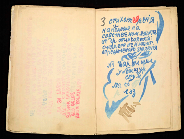
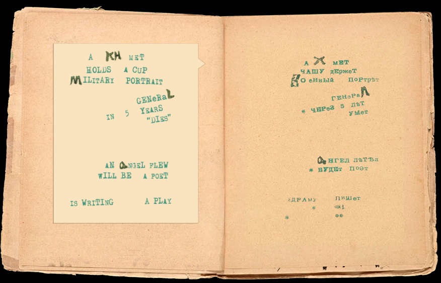
- 1 2017-05-13T23:59:21-07:00 Dexter Blackwell 92e005ca94195f836c6089cf147faff4c74fa79e The poem creates a rhyme scheme with the repeated use of words with the same stress at the end of most lines. The harsh attack of the repetition of “ET” is suddenly broken by the final word. “Пишет” sees its stress fall on the first vowel, “и,” rather tha Dexter Blackwell 1 plain 2017-05-13T23:59:21-07:00 Dexter Blackwell 92e005ca94195f836c6089cf147faff4c74fa79e
- 1 2017-05-02T00:59:57-07:00 Ian Lehine b028c384a69e4b92166e7791b002fa3f2cee5818 Printed type, but rotated away from standard orientation. Ian Lehine 1 plain 2017-05-02T00:59:57-07:00 Ian Lehine b028c384a69e4b92166e7791b002fa3f2cee5818
- 1 2017-05-02T01:00:38-07:00 Ian Lehine b028c384a69e4b92166e7791b002fa3f2cee5818 Mix of typed and handwritten. Ian Lehine 1 plain 2017-05-02T01:00:38-07:00 Ian Lehine b028c384a69e4b92166e7791b002fa3f2cee5818
- 1 2017-05-02T01:01:47-07:00 Ian Lehine b028c384a69e4b92166e7791b002fa3f2cee5818 One line with a large space? Two lines? Ian Lehine 1 plain 2017-05-02T01:01:47-07:00 Ian Lehine b028c384a69e4b92166e7791b002fa3f2cee5818
- 1 2017-05-13T23:58:13-07:00 Dexter Blackwell 92e005ca94195f836c6089cf147faff4c74fa79e Annotation Dexter Blackwell 1 plain 2017-05-13T23:58:13-07:00 Dexter Blackwell 92e005ca94195f836c6089cf147faff4c74fa79e
- 1 2017-05-13T23:58:32-07:00 Dexter Blackwell 92e005ca94195f836c6089cf147faff4c74fa79e The use of type with small instances of inserted handwritten letters relies on the user to connect them and formulate meaning. The random spacing and faded letters create additional hardships in this act. Dexter Blackwell 1 plain 2017-05-13T23:58:32-07:00 Dexter Blackwell 92e005ca94195f836c6089cf147faff4c74fa79e
This page is referenced by:
-
1
2017-04-13T11:04:35-07:00
Dyr bul shchyl and the Dominant
39
plain
2017-05-14T00:05:24-07:00
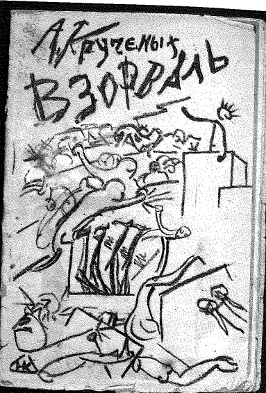
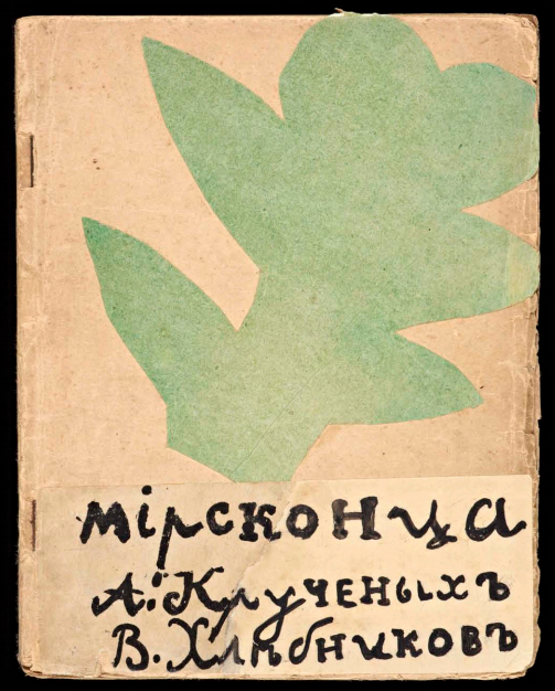
Debate over the importance of oral and handwritten components of poetry surfaced among art and literary scholars who examined the works of the Russian avant garde. Centered on the poetry included in handmade books such as Vzorval’ and Mirskontsa, scholars sought to establish a theory over a balance in the oral qualities of the poetry versus the handwritten visual design of the poems and books themselves. In terms of poetic language within these handmade books of the Russian avant garde, Gerald Janecek cites the handwriting and drawing as the important visual elements in the creation of the poems. On the other hand, Johanna Drucker’s insight into these works focuses on the qualities of the printed text instead. However, both authors evidently focus on the printed text of the poem, not its oral qualities. In order to understand the ruling force behind the creation of these works and the importance of their oral components, we can look to Yury Tynyanov’s theory of the Dominant to decipher this puzzle. Lastly, we will see that not only was the oral the preferred element, but various works also challenged our understanding of the visual in art.
As a vital component to Russian Formalist theory, the Dominant is the ruling force of an artistic work. According to Roman Jakobson's description of the Dominant, each type of work holds a system of values, which are organized into a hierarchy. The time period determines which of these values is at the top of the hierarchy, thus becoming the “dominant” feature of a work. Furthermore, one established dominant form that existed during the era of the Russian avant-garde was the textual, which began with the rise of the novel as a literary form during the Romantic period and through the poetry of Pushkin. Ultimately, the dominant can help uncover which is more important, vocal or written.
When asked to explain Anna Karenina, Tolstoy replied that he would have to re-write the whole book, exactly the same. This is to say, there is no reduction of the novel's textual form. The Romantic period created a cascade of literary styles that were focused on the individual as a subject experiencing the world. This experience through text established the dominant form of literature present in the early 20th century and still today.
In terms of the Russian avant-garde, the works of Kruchenyk and Khlebnikov best exemplify the ambiguity between oral and visual elements of poetry. The poem “Akhmet” from Mirskontsa exemplifies the intertwining of these different values within their poems. The different qualities of the poetry, oral and visual, are at odds with each other when attempting to assign meaning to the works.
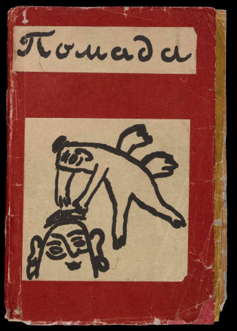
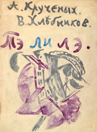
However, Kruchenyk's Dyr bul shchyl gives us insight into which of these competing poetic qualities is more important. The poem itself has at least three different textual forms created by the author, all quite different in their appearance. With this many inconsistent variants of the poem, it suggests that the textual aspect is not the dominant feature of the poem. Instead, sound has become the dominant feature of this first instance of Zaum poetry.
According to Jakobson, cultural change reflects itself through a re-ordering of values in artistic works, therefore asserting a new dominant. Pre-dating the Russian avant-garde was the so-called "Golden Age" of Russian literature. The 19th century saw the rise and acclaim of novelists and poets such as Tolstoy, Dostoevsky, and Pushkin, who remain as some of Russia's most celebrated writers. Their literary dominance, as well as the influence of the Romantic era in general, made the textual form the dominant aspect of the era.
However, the dominant form was changing amongst the Russian avant-garde. Starting in 1913, Alexei Kruchenyk authored at least three different versions of his Zaum poem Dyr bul shchyl. These three versions had varied textual presentations, sourced from the same author. The first appeared in his book Pomada in 1913. This version included an illustration of a nude woman by Mikhail Larionov, which aids to the poems’s “monosyllabic, primordial, and erotic sounds,” as described by Nancy Perloff. (Explodity, Getty Publications, 2016. pg. 75)
Furthermore, Kruchenyk asserts before the poem that Dyr bul shchyl is a work that is written “in its own language, the words have no other meaning.” However, the first word “Дыр” is actually a Russian word, being the genitive plural form of “holes.” The rest of the poem does not contain any known word forms from the Russian language, falling in line with Kruchenyk’s assertion of the poem containing its own language.
A second version was produced in the book Te li le, a written collaborative effort by Kruchenyk and Khlebnikov, illustrated by Olga Rozanova. This version of Dyr bul schul from 1914 is the richest of the three in color and is the only one to have a feminine creative influence, as Rozanova was deemed responsible for its creation. Some of the letters in this version are heavily faded on the page, which resulted in a different first reading for the class and myself. Despite this, the oral qualities of the original first printing of the work remain.
Lastly, in his 1913 essay The Word as Such (Слово как таковое), Kruchenyk printed yet another version of the poem to use as an example in the work. It is devoid of illustration and any handwritten creation, existing only in print on the page. The type in this version actually ends up further asserting the poem's oral qualities above all else.
Overall, the only things that are consistent between these three variations of Dyr bul shchyl are the authorship and the sounds of the recitation of the poem itself. The three printed versions of Kruchenyk's poem leave us unable to pin down a singular "stable" text, but maintain the same phonetic qualities in all three. This should lead us to acknowledge sound as the Dominant force of Kruchenyk's poem, rather than its textual, artistic, and physical elements.
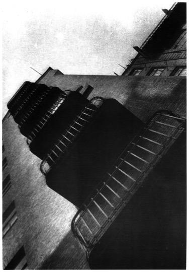
Kruchenyk was not alone in his reorganization of traditional artistic values in the era of the Russian avant garde. Other artists of the same time period allowed their works to uphold a different dominant feature, and also contributed to undermining the concept of the visual in art. One example of this is Alexander Rodchenko’s photograph of his own apartment building.
While photography usually does not contain oral elements in its creation, Rodchenko is clearly toying with our expectations of normal visual understanding. The photo is tilted on a different axis, giving the viewer a radical perspective of an ordinary, familiar construction. Most photography is level with the eye, creating a representation similar to human vision. This leveled orientation, in my opinion, is the dominant hierarchical feature of photography in other works. It also serves in making us question the visual medium in all sources of art.
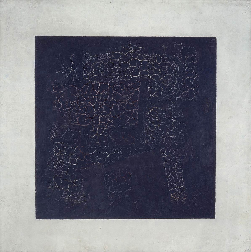
Similar to Rodchenko, Kazimir Malevich’s Black Square and its associated artistic movement, Suprematism, reflect a reordering into a new hierarchy of dominance. The painting, now cracked from age, attempts to represent the purest form of a geometric shape.
Such assertions about purity and perfection might be comparable to the still life or trompe l’oeil movements in art. Rather than depicting the real world, the Black Square reaches towards an abstract perfect form of the square. Since traditional depictions of perfection consisted of physical objects, Malevich’s painting causes his audience to reflect on the geometry and abstract shapes which make up our world.
Not only do the poems of the Russian avant garde mark the importance of the vocal, auditory qualities as dominant, but purely visual works challenge our sense of sight and our preconceived notions of art. Overall, there exists a reduction in the visual, textual form, that rules over most other artistic and literary movements. The significance of this move has primordial overtones. Before writing systems, geometry, and even language itself, there was only sound. Perhaps this is what the Russian avant garde hoped to achieve: humans envisioning a world without systematic human imposition on all things.
-
1
2017-04-13T11:06:07-07:00
Don't read this!
35
(but you couldn't resist could you?)
plain
2017-05-14T23:59:46-07:00
There is something really strange about the process of reading. Language in general often seems to be a sort of strange and unknowable thing despite being a centerpiece of daily life. There is a certain dimensionality (or lack thereof) experienced in the action of reading text in the printed verse or prose. That is to say that words and language in general have a certain quality to compel the reader to do something, whether that be to imagine a scene, to live a certain moment in a different world, or even simply to move the reader's eyes across a page from one side to another. For an unofficial term that fairly accurately addresses this quality, one might say "textuality" or "codicy". These phrases represent attempts to grasp at that certain quality of text a "bookiness" of such that one experiences in the action of reading the printed word.
This quality seems to have its roots in the Gutenbergian formatting of the page, the standard left-to-right, top-to-bottom, black on white that we are so accustomed to. One point of disruption popular among the Russian Futurist Bookartists was developing their craft in opposition this standard orientation of that text. In these examples, one is able to see how the rotation or otherwise altering of text away from the Gutenbergian feels strange and often disorienting. Given a pile of words without lines nor consistency, the reader feels their force, compelling as they did before, but now without a clear way to discern the best course of action. "Should they even be read at all?" is a question that might even be asked as it seems as though the loss of the Gutenbergian order of things had stripped the work of every last thing, it still seemed impossible not to read, maybe now more difficult than ever to resist. Maybe this readability, or rather the demand to be read, this "bookiness" was then coming not from the book, but from the language itself.
As the deviation of text from a held standard, in a sense an unexpected modification to the medium of book was a point of disruption for these artists and thinkers, so too was the addition of word to the more visual mediums. By looking at the presentation of text therefore in other mediums, one might be able to gain valuable insight regarding this question. One example to investigate might be the medium of painting, as it was a cornerstone of this entire Avantgarde movement.
In this piece by Lyubov Popova, it can confidently be said that there are words depicted upon (as) the various images in the scene. It can also be said without causing too much commotion that this is unusual, as often it is said that a "picture is worth a thousand words" or intuited that if an artist were to need to say something, they usually would do so with painterly images. Words in a painting can be distracting, the viewer becomes a reader and suddenly their attention is lost to the word instead of the painting as a whole. It is this quality of distraction that stands out. Because there are words, and because the reader is forced to read them in order to acknowledge them as such, the reader reaffirms their textuality even outside the original medium.
Upon investigation, we find these words are not very easy to read to begin with. We seem to be missing a few letters from "ПЕ Р" and the tilted newspaper-looking-object seems to read "РАННЕЕ УТРО" (early morning). These two experience of uncertainty highlight this textuality. In the first, the reader is left wondering what the word could be. The reader has to experience "ПЕ Р" to then fail to come up with an answer, to then assert that letters are missing and that to have them there would make a legible word. In the second example, the reader "fills in" the missing letters, requiring a reading of what is ("РАНН-ТР-"), a guess of what isn't, and a list of other similar-looking words to make any sense of the thing whatsoever.
We find similar movements in another piece painted two years later. Once again faced with words, the reader of the painting has a better time with this one, clearly making out words resembling "gas" (газ) and "hat" (шляп), two things which seems useful to a traveler and thus make sense as a part of this scene. If that is the case though, do these words "stand-in" for those objects which would seem so much more at home on a canvas than their linguistic representatives? And if that is the case, is it important to diferentiate these "words" from "pictures"?Additionally, it might be worth pointing out that there are two kinds of words in this image, and that both seem to defy the conventions of linguistic presentation to similar but different ends. The most obvious are those kinds of words detailed in the paragraph above: газ, шляп, журналы (magazines), and so on. However, there is a second kind of word present on this canvass, and if it is the case that the first kind is "not to be read" as claimed above, then maybe these are even less so. These words are those present on the white geometry near the center of the painting; those words sprawled across what seems to be a newspaper. This tactic for depicting newspaper in drawing is one not uncommon to doodle artists from young to old.
The idea is that developing the full headline and story content that a normal newspaper would have takes time. Additionally, it would be difficult considering the fineness of brush and precision of hand that would be necessary to do so. But, probably most compellingly, the primary reason for using this method would seem to be that it doesn't actually matter. That is to say, without the fullness of content, the thing depicted still resembles a newspaper in form, and does so in a way that is close enough for the viewer to understand what the artist is attempting to convey. In this way, the appearance of the words seems more important than their content, and this appearance seeks to impart a feeling of "newspaperness" upon the painting, and thus the viewer. Popova has created internally to the painting a hierarchy that can be traversed up and down. The reduction of these words then to scribbles across the top of a white rectangle from things of higher linguistic value to convey a sense of "newspaperness" seems then to mirror the way in which газ, шляп, and журналы are altered to convey a sense of "travelerness" to the painting.
It would seem as if in both these paintings, as well as in other examples of her work, Popova seems to be playing with the concept of word and image as components of her painting by conflating the two and obscuring their distinctions. In doing so, a number of interesting qualities of both are revealed. For one, we see that text when not presented in the Gutenbergian style as described above inline and sequential requires a different kind of treatment from its receiver the reader. We see then that the grammatical and other syntactic components of language that is normally accepted and "everyday" (sentence structure, clauses, etc...) is not internal to the words so much as to their presentation. A sentence is read like a sentence because the Gutenbergian style lends itself to sentence as its presentation of language. Identifying the style then as the more accurate source of the language as words' true then reinforces the thought that when language is presented differently, it then should be read differently. In short, Popova's choice to present these words in this way as opposed to the Gutenbergian confirms both the fact that the Gutenbergian style is significant in the creation of a certain kind of meaning and that she intends a different kind of meaning, one that uses words more as set pieces or tonal objects reinforcing the image in the same way that their image analogues would.
This style was not exclusively unique to Popova, but rather a feature of many of the other works done during this era by her contemporaries. Other examples come from the likes of Kasimir Malevich and Olga Rozonova, artists who also worked in Russia during this time period parallel to Popova using similar methods and materials. In An Englishman in Moscow, Malevich plays in a familiar way with the reader's tendencies to explore text in a certain fashion. When viewed from afar, it seems as though the text represents a unified phrase, the Russian words for "partial" and "eclipse", suggesting that this text, like the hat or magazine in Popova's stands in the place of an actual image of a solar eclipse. However, this method of reading seems to be one of many, as it ignores the phrase "скаковое общество" (racing club?) in the same way that the text of Popova's newspaper is while also assuming a continuity to the the three word phrases "час", "тич", and "ное" which may in fact not be necessary and true.
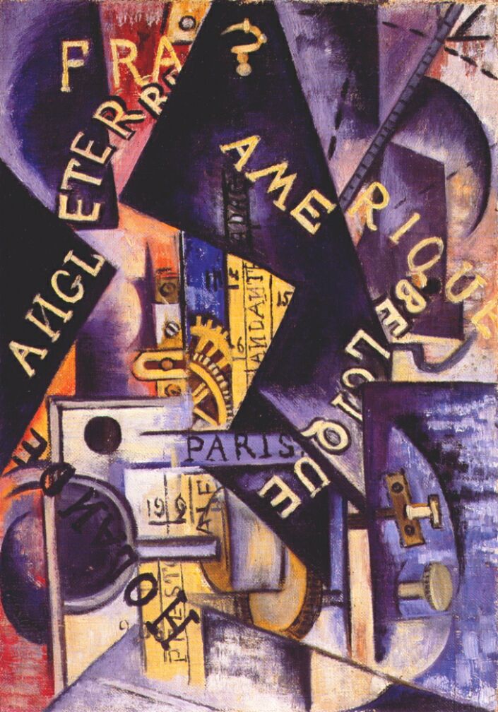
Another example of this sort of visual wordplay comes from Olga Rozonova's piece Metronome. In it, there are a variety of possible words and word fragments in different color shades, sizes, and orientations. Yet of course, the reader is still able to read them and the effect is similar to those above. The words once again act as tonal pieces, presenting the names of countries and concepts that would be otherwise do not appear on this canvass.
A fourth artist involved with this sort of play was the constructivist to-be El Lissitzky, though his approach provides even another question to ponder on. In one of, if not his most famous example Strike the Whites with the Red Wedge, the reader is presented with text with similar intent presented entirely differently. Due to the Russian language's sentence structure, the sentence "Strike the whites with the red wedge" can be extrapolated from the picture simply by looking at the endings of the words. However, it still stands in opposition to the Gutenbergian by nature of the varying presentation of the words. In this way, the Russian speaker is able to lift from the art a tone similar to the way in which they were able to with the objects in The Traveler. The words must be read to be understood as words, and then must be made into a sentence due to the author's choice to decline their endings. In this way, reading the painting is as necessary as the phrase "Don't read this!". The words act also like those in the paintings above, and thus because it can be seen as a tonal sentence, the words in some way animate the work, adding direction and dynamism to the scene.Throughout all of these examples, one can see that text, when presented outside of its natural territory, becomes raises quite a number of interesting questions regarding that text, but also the ways in which its readers approach both the image it is a part of and the linguistic structures it originates from. For example, can text ever go unread? Even if the language is unknown or the words lack lexical value, must they not be first "read" to be determined as unreadable? Additionally, if text can be used as a stand in for an image, or to impart a tone without calling upon an image, how does one determine how to approach it? Overall, the fact that one is able to do anything at all with these words seems to support the idea that text need not be upon a page to be read, and in fact can be read in such a way that it becomes apparent that the communicative quality belongs internally to the language first and its presentation after.
-
1
2017-02-23T11:38:06-08:00
Art: Language
33
uTOPIAN Prospectus -- Ian R. Lehine
image_header
2017-02-28T10:22:15-08:00
Introduction
One of the many facets of the Russian avantgarde movements that we have been investigating in this course has been the visual representations of language in various mediums. On some occasions, we are presented with hand-made books of poetry in which words presented to us are assigned additional layers of meaning by their visual presentation (orientation, size of the letter-forms, etc...). On other occasions, words appear along-side visuals and become a part of the art they accompany. Below are a few examples of such instances of language as art.Examples
Here on the left, we are presented with an example of a painting in which words take center-stage. Or maybe they're something resembling words? An almost immediate reaction to Rozanova's Suprematist painting Metronome, is to begin trying to read these word. This could be seen as futile, as few of these "words" seem to possess any obvious quality of meaning. Words such as "АИGL", "АМЕ", and "RIQUE" seems to hint at their definitions hiding in the English, French, and Russian linguistic traditions while also suggesting that their meanings lie outside of those systems. Additionally, the meanings of those more decipherable words, "PARIS" and "ENTER" are called into question, for what's to say that the system that failed us before with the other "words" would suddenly apply? It could be the case that it is in this very movement to assign meanings to these "words" from these systems that their true meaning is lost.
Next, a futurist poem from the book "Mirskontsa". The poem titled "Akhmet" resembles its fellow works in the book, as well as others in the zaum (trans-sense) tradition in its presentation. The curious mix of handwritten and printed letter-forms, as well as the stanzas' orientation on the page are cause for pause when examining this piece. Additionally, as the rough translation of the poem shows, these stanzas, if we can call them that, seem to be disconnected in meaning; hardly supporting an argument that would call this poem typical. How then do we read this work? How do we interpret the choice of letters as handwritten? Do we even read it as a single poem, or maybe four disjointed "poems"?
Here, another example, this one a piece from the artist El Lissitzky. It is commonly known as "Strike the Whites with the Red Wedge", but it is in this title that a question, similar to those asked of the works above arises. In the Russian language, different suffixes denote a word's place in a sentence, and thus impart a certain meaning onto the word (mostly) regardless of its position in the sentence. In this "sentence", the verb is the command-form of "to strike" (БЕЙ) while the indirect object is the word for "by means of wedge" (КЛИНОМ) as well as the adjective form of the word "red" (КРАСНЫМ) and the plural direct object form of the word "white" (БЕЛЫХ). But, in a way, the audience can understand this, even without knowing the Russian. The words that describe the scene are inseparable from it. The question then becomes why include them, or rather, what to they add to this piece?Discussion
So, we have seen three examples of language in, or rather language as art within this movement, but what makes this move significant, and what is going on in each of these works?
In Metronome, we are presented with a puzzle: some words seem to lack meaning while others are clearly recognizable. However, this problem seeks to highlight something important about our experience of the art, namely, a need to read it. To call these words "nonsense", to say they lack meaning is only possible when comparing it to the systems mentioned above. Sure, they seems useless when marked against an English, French, or Russian dictionary, but what about when observed solely as a phenomenon in relation to their frame instead? After all, to attempt to read them at all, you are already contorting yourself physically, tilting your head as to observe them in some sort of "right-side-up" fashion, is it from there too much of a stretch to say then that their meaning should be observed in a similar way? Their color, their location and orientation on the page, and their varying fonts seem to imply a mood rather than convey a definition. In fact, as a result of lacking a semantic definition, these "words" are able to embody this modal quality even more so; the mood shines through, undistracted by such definitions.
In Strike the Whites, we are presented with the opposite effect, our scene is in a very real sense narrated by words given both vocabulary and grammatical definitions. The vocabulary comes from the fact that these words resemble so closely words in the Russian language with commonly accepted meanings. The grammatical comes from the fact that Russian is a language in sentences can be written in nearly any order without losing too much meaning (though usually, this means any order in a sentence that is in-line like this one and contains proper punctuation). In this case, the words add something unexpected to the piece: temporality. By creating a "sentence" of sorts, the artist posits a world of verbs, a world where actions have starting and ending points, and thus where time as the metric of how those actions are satisfied. This addition of time makes this a dynamic piece, as now movement is implied as movement through time, and thus through space as the wedge "strikes" from left to right.
Finally, in Ahkmet