3B: The Editing Interface and the DNA of Images
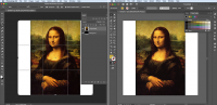
The image below compares the workspaces (also called the “interfaces”) of Photoshop and Illustrator. Even a complete novice can recognize, at a quick glance, things in this workspace that you would have seen around Leonardo da Vinci’s studio when he painted the Mona Lisa 500 years ago, such as a canvas, frame, paint brush, pens, pots of paint, and even the artist’s own hand.
But the interfaces involve much more than just the physical tools that artists use to create and edit images. The Photoshop interface on the left and the Illustrator interface on the right are so similar because both are designed to make it easy for you to realize the principles of and elements of visual composition. They make it easy for you to create compelling images.
For example, you might have heard of the “rule of thirds,” which suggests that it’s often more effective for you to place the subject of your image in one third of the frame, rather than the dead center. In the left interface from Photoshop, I’ve activated the Crop tool, which has automatically divided the frame horizontally and vertically into thirds. With the help of the Crop tool guidelines, you can see that Mona Lisa’s chin rests almost exactly on the top third of da Vinci’s composition. In the screenshot from Illustrator, I used the Eyedropper tool to select the paint color in the sky over Mona Lisa’s shoulder. I then activated the Color Guide properties panel, which analyzes da Vinci’s use of color and displays a bunch of color swatches that belong in the palette.
You can search the Internet for many outstanding primers on the principles and elements of image design, especially if you want to learn more. But I’ll breeze through a quick overview using the Mona Lisa to explain their roles in using Photoshop and Illustrator.
Elements: color, line, shape, texture, space, and typography
Da Vinci’s color palette, his choice of colors, is somber and muted, which produces a melancholy feel in the scene, as opposed to bright, saturated colors. There are a number of dominant lines in the landscape backdrop, but the more important lines are the thin veil across the forehead, the shadow line of the chin, and the outline of the posture of the body, which all convey a feeling of subdued composure. However, the most important lines are the mouth and eyes, which express the emotion of the subject. The complementary soft, round shapes of the forehead, cheeks, chest, and hands portray the subject as feminine and gentle. The texture of the gown makes the portrait feel photorealistic, centuries before photography was invented. The space around the subject’s head and the positioning of the subject vertically in the top-third of the frame let us known that this was a conventional portrait — which was almost like a photo ID at the time. There are currently some conspiracy theories about the hidden use of typography in the Mona Lisa — are they the source of a da Vinci code?
Principles: unity, balance, hierarchy, scale, emphasis, rhythm/contrast, and concept
Principles are often harder to define and determine, but we’ll give it a whirl to illustrate the point. The separation between the foreground and background in the portrait seems to lack unity — the subject is painted so realistically, but the background is contrived and artificial by contrast. You could argue that the concept of the painting is an obsessive attempt to capture a subtle expression, which might explain why da Vinci wanted the background to be weak, so that you focus attention on the face. As discussed already, the composition is well-balanced in the frame according to the rule of thirds. The facial expression in the top-third of the portrait is clearly the star, with the hands and landscape backdrop at the bottom of the hierarchy. The subject consumes at least two-thirds of the frame, and the scale of the mountains and water in the backdrop suggests that they are far away.
So, how does this quick romp through the principles and elements of images using the Mona Lisa help you understand Photoshop and Illustrator? Each of the elements of an image (color, line, shape, texture, type) has a digital tool for you to click. And each of the principles of visual composition (unity, balance, scale, etc.) has functions, commands, and gauges to help you achieve it. For example, the paint tools enable you to select specific colors and color palettes. And, as we’ve already shown, the Crop tool can help you visualize the rule of thirds for unity, balance, and scale.
In other words, the workspaces and interfaces of image-creating applications in Creative Cloud are designed to make it easy for you to bring together the elements of your composition and to apply the principles of visual design to make images. The table below outlines some of the relationships between image design and the specific tools and functions in Photoshop and Illustrator.
| Artistic tools, commands, and functions | |
| Line | Pen, Line |
| Color | Color, Color Guide, Swatches, Eyedropper |
| Shape | Rectangle, Ellipse, Polygon |
| Texture | Texture, Gradient |
| Type | Type, Character |
| Scale | Perspective, Scale |
| Balance | Align, Snap |
| Hierarchy | Layers, Arrange |
Of course, there are important functions that are purely mechanical and not necessarily artistic. Even Leonardo da Vinci used his hands to grab things, and he needed blades and frames to build his canvasses. Below is a list of the more mechanical tools in Creative Cloud that are key to creating and editing images:
| Mechanical tools, commands, and functions | |
| Grabbing things | Selection Arrow, Lasso, Marquee, Hand |
| Magnifying glass | Zoom |
| Frame/crop, canvas | Crop, Slice, Canvas Size, Image Size |
| Paint brushes | Brush |
| Fill/stroke | Paint Bucket, Properties |
| Measure/align | Rulers, Guidelines, Snapping |
The tools and functions listed in the tables above are just a fraction of what’s available in Photoshop and Illustrator. Notice, however, that these tools are identical or similar in the two different applications. The reason for this is because both interfaces were built according to the elements and principles of image design. This is good news for you at least two reasons. First, once you get the hang of Photoshop, then it’s pretty easy to also learn Illustrator — or vice versa. Second, the way you create and edit images in both applications is very logical. It makes sense and it makes your work efficient and effective.
You might ask at this point: If Photoshop and Illustrator or so similar, then why are there two different applications? How do I pick between them? The next section, 3C, describes the differences between the applications so you can pick the right one. They’re both so powerful that some professionals are able to do all of their work in either one effectively. But, in a nutshell, Photoshop is better for editing photographs, and Illustrator is better for creating images from scratch. Before we turn to 3C, there is one last, hugely important aspect of both Photoshop and Illustrator that you must be aware of: working with layers.
Working with layers
The images you build in Photoshop and Illustrator are largely two-dimensional, and they’re typically meant to be viewed on a flat service, like paper, a screen, or a poster. Even so, these images are actually built in layers from the foreground to the background, and layer architecture is fundamental to working in Creative Cloud.
Painters commonly compose their work in layers. They might paint the entire background before adding the subject and the foreground. Researchers now use X-rays and other technologies to look beneath the finished top layers of famous paintings, such as Henri Matisse’s “Bathers by the River,” which might have as many as six versions with one layer painted on top of another.
In Photoshop and Illustrator, you can independently create and edit as many layers as you can handle. I often duplicate layers and then conceal and reveal them in different versions to see which approach works best. Working with layers is best explained and understood through the video tutorial so that you can see them in action. But layers are so important to working in Photoshop and Illustrator that they have to be mentioned at this point in the guide.
This page has paths:
- Images: Photographs, Illustrations, Graphics Todd Taylor