Visualization in NVivo 11 for Research, Teaching, and Writing
By Cynthia Jacobs, QSR International (Americas)
NVivo 11 offers a number of new visualization tools. Each one is quite flexible and offers many potential applications. The examples that follow are intended to help spark new thinking. Note that some visualizations become available in the Professional and Plus editions. For each idea below, you’ll see [StarterProPlus] if available in all editions, [ProPlus] or [Plus] if not.
Starting a Project and Thinking about Node Hierarchies
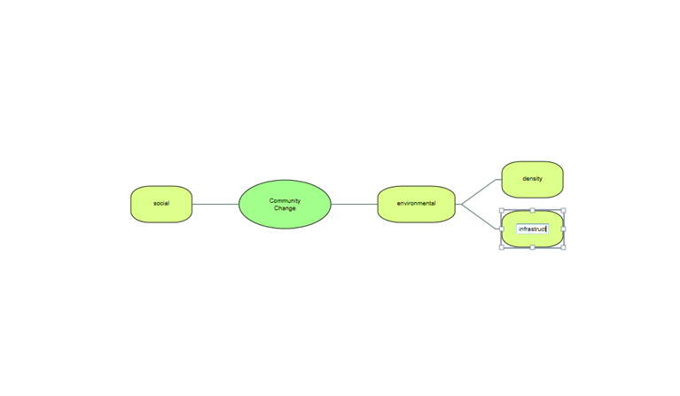
Sometimes you may begin a project with some coding in mind. This might be an overall concept, for which you anticipate some refined categories or sub-themes. Suppose I am interested in an overall theme of Community Change. I might begin with a Mind Map [ProPlus], where I can create "ideas" with "child" and "sibling" ideas.
Figure 1: An Initial Mind Map to Start a Research Project
The Project Map then offers me a range of options to refine my map, and then to create this map as a node hierarchy.
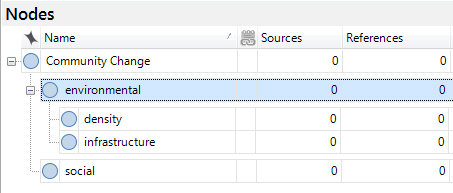
Figure 2: Refining the Mind Map and Creating as a Node Hierarchy
Now, I can work with these nodes as "codes" in my qualitative analysis. From here, I can right click to access each node’s properties to create a Description or definition. I can select, click and drag content of interviews (whether transcribed as text, or from a video or audio timeline), survey data, images or other data. My analysis has begun.
Figure 3: Starting the Qualitative Analysis by Interacting with the Nodes
Depth in Analysis and Looking for Patterns
Fast forward. Later in my analysis, after substantial coding, I may be interested in looking for patterns.
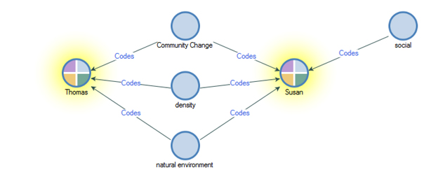
Suppose I’d like to see how two of the cases in my study differ in terms of their representation across the themes I have identified. Here, I can see that Susan and Thomas discuss environmental aspects of change in the community, but only Susan’s data has been coded for social issues. This is a Comparison Diagram [StarterProPlus].
Figure 4: Using a Comparison Diagram to Compare Case Nodes
Using a Project Map [ProPlus], I can see that all those who discuss social aspects of community change, also mention density.
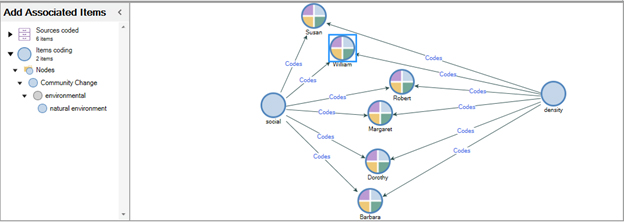
Figure 5: Drawing a Project Map to Identify Discussants around a Topic
From here, I can further explore – what other themes come up in relation to density, and in which cases? I can click through to see the coded data, and export the diagram for a presentation or paper.
Teaching a Course: Building a Project and Sharing Key Concepts
Just last week, leading a workshop on NVivo 11, a participant working with these tools quickly saw an application for her teaching. Using a Concept Map [ProPlus], I could create a dynamic model as I talk with students about key concepts in a course. If I first build an NVivo project containing key course documents, including even PDF articles, my own notes, and other materials, I can hold a discussion with students that readily moves between ideas and literature.
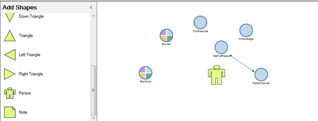
Figure 6: Using NVivo Concept Maps to Convey Complex Ideas
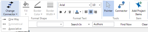
We can create connectors – which theorists see this as a causal relationship? Bi-directional, or a mere association?
Figure 7: Creating Connectors to Indicate Relationships between Project Elements
As always with NVivo, we can double click an item to access our data. Double click our node for the theorist Jerome Bruner, and see the articles or notes we have imported related to his work.
Academic Writing: Taking a Course or Working toward an Advanced Degree
Just like the professor in the prior example, if you are a doctoral student, you are pulling together a great deal of literature, across many courses, papers, examinations, and phases of your degree. An NVivo project can help you gather this data, and visualizations can help you create models of your thinking as you work toward a literature review, qualifying paper, or preparation for comprehensive examinations.
Specialized Analysis: Social Network Analysis (SNA)
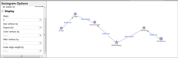
In NVivo 11 Plus, you will find capabilities or Social Network Analysis. Let’s take a simple example, continuing with our work above. A sociogram - in this case, an egocentric diagram [Plus] - can help us see the evolution of a concept across theorists and time.
Figure 8: Using a Sociogram to show Interrelationships between Egos
Notice that we have options to use size and color of vertices, and the weight of connectors, to help us display a more complex diagram using the measures of social network analysis – such as degree in, degree out, betweenness.
Power from Flexibility
If you have been working with NVivo, you will know that the great power of query tools comes from their flexibility. The visualizations we have discussed here have similar power. There are many ways these might be applied in your work, throughout the contexts of research, teaching, writing, and other work.
Does this discussion spark some ideas for you? If so, please be sure to let us know. We’d love to have you share your ideas in a blog post or webinar. In the meantime, we hope you enjoy the exploration.
About the Author
Dr. Cynthia Jacobs, Training & Research Consultancy Manager - Americas, QSR International (Americas), conducts trainings in NVivo both in person and online. She may be reached at C.Jacobs@qsrinternational.com and
(617) 491-1850.
| Previous page on path | Cover, page 9 of 28 | Next page on path |
Discussion of "Visualization in NVivo 11 for Research, Teaching, and Writing"
Add your voice to this discussion.
Checking your signed in status ...