Scalar's 'additional metadata' features have been disabled on this install. Learn more.
Visualizing Crisis: News, the Rohingya, and knowledge formation
Main Menu
Visualizing Crisis: News, the Rohingya, and knowledge formation
IML 502 Spring 2018
The Mourning News
Analyzing Affective Language in Reporting on the Rohingya Crisis
Crisis Coverage: Mapping Rohingya Stories
Prototype + Proposal
Melissa M. Chan
807710a760198fde2f096a6b49e2e6d3a882ce18
fig 2
1 2018-04-20T23:27:21-07:00 Melissa M. Chan 807710a760198fde2f096a6b49e2e6d3a882ce18 29280 2 AP's interactive map of their stories. plain 2018-04-22T04:48:29-07:00 Melissa M. Chan 807710a760198fde2f096a6b49e2e6d3a882ce18This page is referenced by:
-
1
media/IML 502 Chan Final Project Landing Page draft.jpg
2018-04-20T23:18:38-07:00
Crisis Coverage: Mapping Rohingya Stories
9
Prototype + Proposal
plain
2018-04-22T04:57:10-07:00
Summary
This project seeks to address how information on states of crisis are visualized. Focusing on the Rohingya Crisis in Myanmar, the interactive map I propose draw on various sources and types of information and sheds light on the intersection between data, the construction of knowledge, and the visual. The Rohingya Crisis refers to the mass migration of the Rohingya people to other parts of southeast Asia, such as Thailand and Indonesia, as well as the violence in and around Rakhine Province in Myanmar. According to Myanmar’s government, the Rohingya are not a legally recognized group and are, therefore, illegally occupying the region. Much of this strife comes from the religious and ethnic divisions in Myanmar’s already unstable state.[1] The Rohingya are a minority Muslim group in a majority Buddhist country, and Myanmar’s state has had a history of attempting to quell or suppress groups whose religious or ethnic identities do not align with the majority for fear of independence movements and more regional strife.[2] Moreover, the crisis and religious divisions have been further exacerbated by the global rhetoric surrounding Muslims, and political conservative groups have argued that the Rohingya have ties to militant groups in the middle-east.[3]
This interactive map emerges out of my extended research on the Rohingya Crisis and how it is represented in the news. The news as such is an aggregation of materials, interviews, and witnesses that is already mediated by the ideologies of the sources and re-mediated in as a news story. With these varying levels of mediation, the news participates in the construction of how data and information become facts and knowledge about reported events. The Rohingya crisis is not an exception from this cycle. Its representation in western media (particularly, media in English) has undergone various forms of mediation and transformation. The interactive map here, then, is an aggregation of aggregates that puts into conversation information conveyed in text and image form.
While previous interactive maps have mainly used a variety of information graphics in a sequential order to portray information, the interactivity of such representations is limited to a linear format (see figure 1).[4] This project seeks to go beyond singular source material and fixed paths of exploration. The purpose of this map is to not only bring together different forms of knowledge about the Rohingya Crisis into one space, but it attempts to address and imagine how information and knowledge is conveyed about an on-going crisis. In this case, much is at stake as the conditions of the Rohingya has been declared a humanitarian crisis. How can we use data to imagine events and people who happen or exist elsewhere? What does interactivity add to or take away from the representation of a crisis? This interactive map is a mode of representation of aggregate data that veers from traditional news models that are timelines or simply archived lists. It seeks to explore new ways of representing information to examine how knowledge is constructed about current events.
Data Set and its Generation
My data set comes from various news sites across the ideological spectrum. These stories are published in English, and while there are stories of the Rohingya in Burmese and other languages, access to these sources has proved to be difficult. The majority of the news sites I have chosen range from large news agencies that have material syndicated to other sources and are circulated widely. Reuters is a more centrist source, and BBC leans left. I have also opted to include a few sites from the international reporting community, such as Zee News, which is based in India and has been categorized as a right-wing news agency. Depending on the how much original news coverage rather than reprints of other sources found on these sites, the project may have to expand the number of sources.
The dates from which the stories come were published around two main sparking points: the eruption of violence between the Rohingya and Myanmar’s army in October 2016 and August 2017. The articles on the interactive map span the entire month of October 2016 and August 25, 2017 to September 30, 2017. In both instances, border posts set up by the Burmese state were attacked by the Rohingya. These are key events as well because of the aftermath that affected numerous villages in Rakhine province. Myanmar’s government burned down numerous Rohingya villages, and as a result, there was a mass exodus of refugees into border regions who then would attempt dangerous sea journeys to escape persecution in Myanmar. I chose these two dates because of the congruence of these two events as well as the way in which a process of forced migration was depicted. Aside from the violence between the state and other actors, the migration pattern that ensued because of the violence is strikingly similar. In a way the 2017 migration is a continuation of the 2016 movement of refugees that never completely stopped, but they are also two points where violence explicitly erupted. The purpose of this data set is to mark out two key dates for the Rohingya and the region, and these articles give a broad survey of the crisis’ coverage.
The final set of data will be the news reports from January 1, 2018 to December 31, 2018. While October 2016 and August 2017 news reports exemplifies the long duration of the crisis and contextualizes what types of events have been occurring, the 2018 data set will provide a contemporary look at what kinds of reporting are currently happening. Furthermore, this contemporaneous data may show a shift in attitudes towards the crisis as more information about the Rohingya unfolds. More importantly, in April 2018, Myanmar’s government has also claimed that Rohingya repatriation has begun, but some sources say that news about the repatriated family was false.[5] With these developments surrounding the Rohingya, it is essential to track the reportage and rhetoric around the crisis.
Theoretical Issues
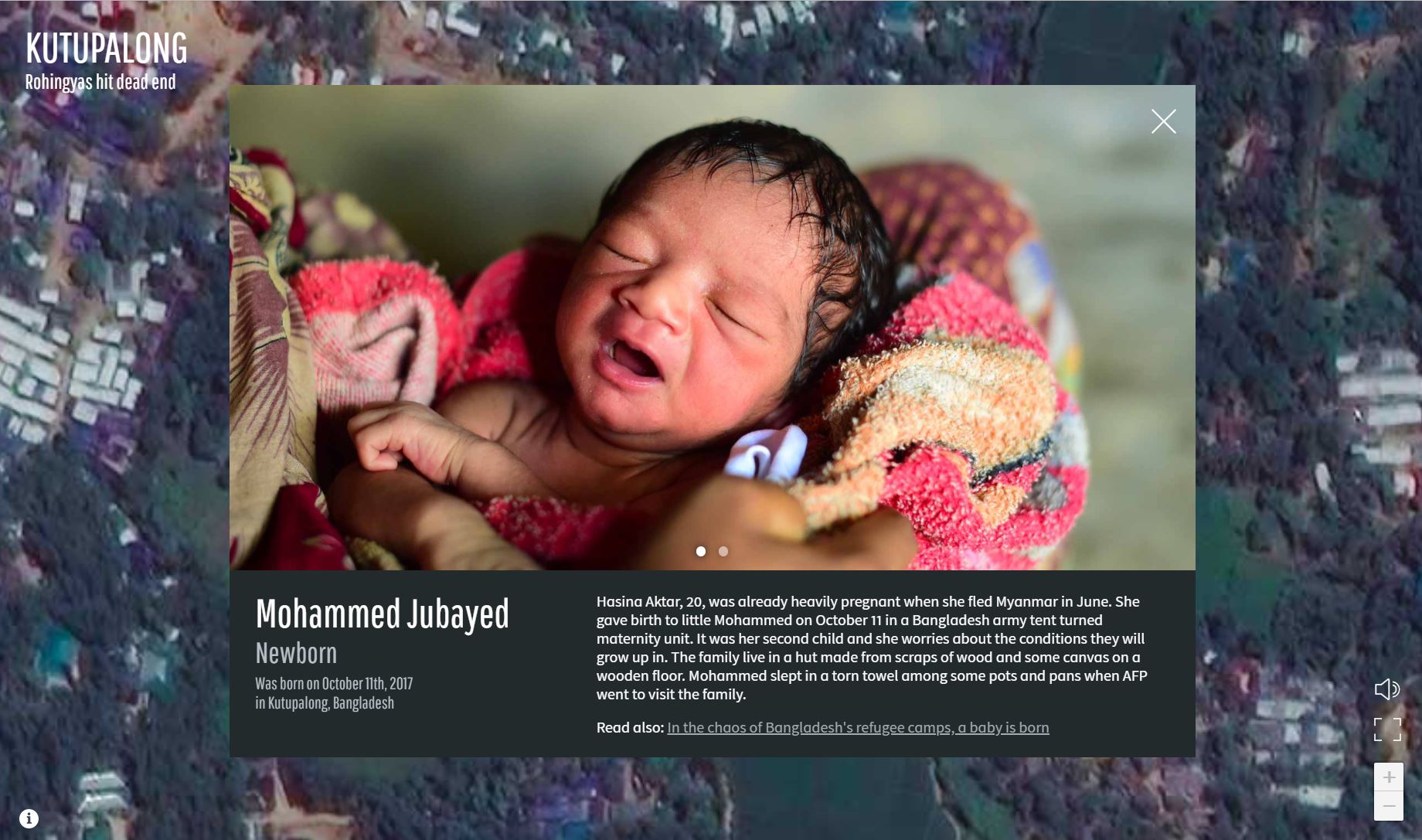
Regarding the Rohingya Crisis, a multitude of interactive maps have been used to explore the situation and conditions. Of those maps, one published by the Associated Press (AP) has been successful at aggregating various forms of data and turning it into a multisensory experience.[6] The map created by the AP gathers various news stories and links out to related stories in the AP archive. On the landing page, drone footage of the refugee camps plays, and the video is annotated with different individuals’ names and ages. The page then shifts to a static image of an aerial shot of the camps with numbers. Each of these numbers leads to a brief blurb about a refugee, and on the bottom, there is a link to another related AP story. For example, when the user clicks on number eleven, the screen shows us an image of a newborn his name, “Mohammed Jubayed,” a text excerpt, and the link to a story, “In the chaos of Bangladesh's refugee camps, a baby is born” (see figure 2). A background sound of the daily sounds in the camp also plays in a loop. The audience can hear children playing, adults speaking, and people walking.
The AP map is interactive in a multitude of ways from the sounds to linking out to other stories, but its limitations lie in the fact that its stories only come from its own sources and archive. It cannot give the audience the various voices and perspectives that are present in the discussion of the crisis. In other words, the data it represents is not wide. I refer to wide data drawing on Lev Manovich’s work in “The Science of Culture? Social Computing, Digital Humanities and Cultural Analytics.” He argues that wide data in contrast to long data is “very large and potentially endless number of variables describing a set of cases…Rather than dividing cultural history using one dimension (time), or two (time and geographic location) or a few more (e.g., media, genre), endless dimensions can be put in play.”[7] The AP interactive experience, perhaps in certain aspects, exemplifies data that is not seen. Nancy Baym’s work mainly focuses on the role of the audience and how to measure it, but the underlying current of the piece, “Data not seen: The uses and shortcomings of social media metrics,” is data that is missing.[8] When audiences are measured, much of the time the positive metrics are emphasized, but such forms of measurement cannot account for data that is not measured. In this logic, the AP map is also highlighting that other data exists even when it attempts to be a multisensory experience. All of the reporting is from the AP, and therefore, data coming from other news sources is that which is not seen and not accounted for in the map. The AP interactive map is merely a representation of a limited perspective of the Rohingya Crisis.
This project expands on the perspectives considered by representing wide data in an interactive way. Moreover, it focuses on how digital data can reflect the part of the humanities ethos with its emphasis on an analysis of representation. Considering Manovich’s claims about the humanities, this project seeks to explore how the humanities are reshaped and transformed with the presence of the digital and wide data sets. This task proves to be productive because it does not draw specific categories, such as “the humanities” or “data,” to close off possibilities of analysis, but it examines how rethinking representation as a practice in multiplicity opens the possibilities of how we conceptualize the humanities. By gathering various news sources through time and constructing a wide data set, representation of the crisis is not singularized or limited to one source. Wide data allows for perspectives on the crisis to go beyond such limits because it can potentially put an endless number of variables on the same plane. Source, source bias, publication date, terms used, and other factors can be considered simultaneously in wide data. Furthermore, connections between these data points can be made in unconventional ways through visual paths, which are themselves limited representations that can then give way to wider perspectives. This type of analysis can then in turn be used to speak about how crisis is represented. Wide data, therefore, is not in opposition to the humanities, but they can work in tandem to rethink data sets and representation.
Outline of the project
The interactive map will be a navigable map of the region. The image of the map will not have the topography, but I opt for a solid color with only key sites and city names listed along with the borders of various countries. This visually simple map will allow for the focus to shift to the stories of the Rohingya but also keep the larger image of the map in sight.
Stories from different news agencies will be superimposed onto this map. Each story headline will be color coded according to the news agency from which it is taken. For example, news stories from Reuters will be in dark green. To mark the 2016 and 2017 differences, the map will have a toggle function. All stories will be shown on the landing page with equal weight, but on the side, there will be legend with 2016 and 2017 indicators. When one year is clicked, the stories published during that time will become bold. The other stories will become less opaque but not completely disappear. This choice is to highlight the connection between these two events that are a year apart.
In another panel, there will be different paths that the user can traverse. One set of paths will be according to the type of news agency: liberal, neutral, and conservative. Another path will trace the types of language (such as the word “refugee” or “terrorist”) used in the reporting. This path will highlight the possible intersections between different news agencies in how they report on the crisis at different times. Finally, there will be the option of not having any paths highlighted so that the user themselves can create their own aggregate path (free flow). When a predetermined path is chosen, the stories will pop-up according to chronological order, and on the right side of the page, a list of all the stories will appear. In the free flow path, when users click the stories, they can add it to their right panel aggregation. This panel will also can toggle the order of the stories. With this aggregation function, the users can create their own news archive of the crisis and reflect on how information is gathered, ordered, and read.
Timeline and personnel needed
This project will take approximately six months to one year to complete. Most of the time will be devoted to gathering the stories from the news sources, going through their online archives, and sifting through the various stories to make sure that there are no repeated articles. Time will also be allotted to ensure that the materials gathered are from their news sources and not reprints from other websites. The metadata for each article will also be stored and, we will be tagging additional metadata. In addition to the date published, key words, news source, and word count, each article will be tagged according to the paths to which they are relevant.
Each source may have up to one hundred articles over the period of thirty days relevant to the Rohingya crisis. With three news sources and two separate dates to consider, the number of articles can reach six hundred. Due to this large amount of data, personnel to find, sift through, and tag the articles is necessary. To complete this project in six months, at least five individuals who have archival research skills are needed. Of these five archivists, three who are familiar with the process of tagging and metadata are also essential to the project.
Finally, because of the interactive nature of the map with its various moving parts and components, such as the paths and aggregation panel, website building and coding is essential. We will also need to build a map image to work from. Knowledge of the Adobe Creative Suites, therefore, is also necessary. Along with the five archivists, two website programmers and designers are also needed.[1] Much of the instability in Myanmar on a national level comes from the transition of Myanmar’s governance from a military junta to a civilian led government. While the military junta has stepped down and permitted democratic elections, the junta’s officials still are dominating military forces. See Peter Carey, From Burma to Myanmar: military rule and the struggle for democracy (London: Research Institute for the Study of Conflict and Terrorism, 1997) for more information.[2] See John Martin Smith, Burma: insurgency and the politics of ethnicity (New York: Zed Books, 1999) for more information.[3] Aljazeera, “India: Rohingya have ‘terror’ ties.” Aljazeera, September 18, 2017. Accessed April 19, 2018. https://www.aljazeera.com/news/2017/09/india-rohingya-muslims-terror-ties-170918134840406.html[4] Reuters Graphics, “Mass exodus: The scale of the Rohingya crisis.” Reuters, September 21, 2017. Accessed April 10, 2018. http://fingfx.thomsonreuters.com/gfx/rngs/MYANMAR-ROHINGYA/010050XD232/index.html[5] Bard Wilkinson, “UN disputes Myanmar Rohingya repatriation claim.” CNN, April 16, 2018. Accessed April 17, 2018. https://www.cnn.com/2018/04/16/asia/myanmar-rohingya-bangladesh-un-intl/index.html[6] Associated Press, “Kutupalong: Rohingyas hit dead end.” Associated Press, November 2, 2017. Accessed April 18, 2018. https://graphics.afpforum.com/builds/20171102-kutupalong/#/en[7] Lev Manovich, “The Science of Culture? Social Computing, Digital Humanities and Cultural Analytics.” http://manovich.net/content/04-projects/088-cultural-analytics-social-computing/cultural_analytics_article_final.pdf. Accessed April 10, 2018, p.13.[8] Nancy K. Baym, “Data not seen: The uses and shortcomings of social media metrics.” First Monday, Vol. 18, No. 10 – 7, October 2013. http://firstmonday.org/ojs/index.php/fm/article/view/4873/3752.
-
1
2018-04-23T22:47:25-07:00
Widening Data in the Humanities
5
plain
2018-04-23T23:10:25-07:00
Theory
Regarding the Rohingya Crisis, a multitude of interactive maps have been used to explore the situation and conditions. Of those maps, one published by the Associated Press (AP) has been successful at aggregating various forms of data and turning it into a multisensory experience. The map created by the AP gathers various news stories and links out to related stories in the AP archive. On the landing page, drone footage of the refugee camps plays, and the video is annotated with different individuals’ names and ages. The page then shifts to a static image of an aerial shot of the camps with numbers. Each of these numbers leads to a brief blurb about a refugee, and on the bottom, there is a link to another related AP story. For example, when the user clicks on number eleven, the screen shows us an image of a newborn his name, “Mohammed Jubayed,” a text excerpt, and the link to a story, “In the chaos of Bangladesh's refugee camps, a baby is born” (see figure 2). A background sound of the daily sounds in the camp also plays in a loop. The audience can hear children playing, adults speaking, and people walking.
The AP map is interactive in a multitude of ways from the sounds to linking out to other stories, but its limitations lie in the fact that its stories only come from its own sources and archive. It cannot give the audience the various voices and perspectives that are present in the discussion of the crisis. In other words, the data it represents is not wide. I refer to wide data drawing on Lev Manovich’s work in “The Science of Culture? Social Computing, Digital Humanities and Cultural Analytics.” He argues that wide data in contrast to long data is “very large and potentially endless number of variables describing a set of cases…Rather than dividing cultural history using one dimension (time), or two (time and geographic location) or a few more (e.g., media, genre), endless dimensions can be put in play.” The AP interactive experience, perhaps in certain aspects, exemplifies data that is not seen. Nancy Baym’s work mainly focuses on the role of the audience and how to measure it, but the underlying current of the piece, “Data not seen: The uses and shortcomings of social media metrics,” is data that is missing. When audiences are measured, much of the time the positive metrics are emphasized, but such forms of measurement cannot account for data that is not measured. In this logic, the AP map is also highlighting that other data exists even when it attempts to be a multi-sensory experience. All of the reporting is from the AP, and therefore, data coming from other news sources is that which is not seen and not accounted for in the map. The AP interactive map is merely a representation of a limited perspective of the Rohingya Crisis.
This project expands on the perspectives considered by representing wide data in an interactive way. Moreover, it focuses on how digital data can reflect the part of the humanities ethos with its emphasis on an analysis of representation. Considering Manovich’s claims about the humanities, this project seeks to explore how the humanities are reshaped and transformed with the presence of the digital and wide data sets. This task proves to be productive because it does not draw specific categories, such as “the humanities” or “data,” to close off possibilities of analysis, but it examines how rethinking representation as a practice in multiplicity opens the possibilities of how we conceptualize the humanities. By gathering various news sources through time and constructing a wide data set, representation of the crisis is not singularized or limited to one source. Wide data allows for perspectives on the crisis to go beyond such limits because it can potentially put an endless number of variables on the same plane. Source, source bias, publication date, terms used, and other factors can be considered simultaneously in wide data. Furthermore, connections between these data points can be made in unconventional ways through visual paths, which are themselves limited representations that can then give way to wider perspectives. This type of analysis can then in turn be used to speak about how crisis is represented. Wide data, therefore, is not in opposition to the humanities, but they can work in tandem to rethink data sets and representation.