Widening Data in the Humanities
Theory
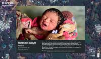
Regarding the Rohingya Crisis, a multitude of interactive maps have been used to explore the situation and conditions. Of those maps, one published by the Associated Press (AP) has been successful at aggregating various forms of data and turning it into a multisensory experience. The map created by the AP gathers various news stories and links out to related stories in the AP archive. On the landing page, drone footage of the refugee camps plays, and the video is annotated with different individuals’ names and ages. The page then shifts to a static image of an aerial shot of the camps with numbers. Each of these numbers leads to a brief blurb about a refugee, and on the bottom, there is a link to another related AP story. For example, when the user clicks on number eleven, the screen shows us an image of a newborn his name, “Mohammed Jubayed,” a text excerpt, and the link to a story, “In the chaos of Bangladesh's refugee camps, a baby is born” (see figure 2). A background sound of the daily sounds in the camp also plays in a loop. The audience can hear children playing, adults speaking, and people walking.The AP map is interactive in a multitude of ways from the sounds to linking out to other stories, but its limitations lie in the fact that its stories only come from its own sources and archive. It cannot give the audience the various voices and perspectives that are present in the discussion of the crisis. In other words, the data it represents is not wide. I refer to wide data drawing on Lev Manovich’s work in “The Science of Culture? Social Computing, Digital Humanities and Cultural Analytics.” He argues that wide data in contrast to long data is “very large and potentially endless number of variables describing a set of cases…Rather than dividing cultural history using one dimension (time), or two (time and geographic location) or a few more (e.g., media, genre), endless dimensions can be put in play.” The AP interactive experience, perhaps in certain aspects, exemplifies data that is not seen. Nancy Baym’s work mainly focuses on the role of the audience and how to measure it, but the underlying current of the piece, “Data not seen: The uses and shortcomings of social media metrics,” is data that is missing. When audiences are measured, much of the time the positive metrics are emphasized, but such forms of measurement cannot account for data that is not measured. In this logic, the AP map is also highlighting that other data exists even when it attempts to be a multi-sensory experience. All of the reporting is from the AP, and therefore, data coming from other news sources is that which is not seen and not accounted for in the map. The AP interactive map is merely a representation of a limited perspective of the Rohingya Crisis.
This project expands on the perspectives considered by representing wide data in an interactive way. Moreover, it focuses on how digital data can reflect the part of the humanities ethos with its emphasis on an analysis of representation. Considering Manovich’s claims about the humanities, this project seeks to explore how the humanities are reshaped and transformed with the presence of the digital and wide data sets. This task proves to be productive because it does not draw specific categories, such as “the humanities” or “data,” to close off possibilities of analysis, but it examines how rethinking representation as a practice in multiplicity opens the possibilities of how we conceptualize the humanities. By gathering various news sources through time and constructing a wide data set, representation of the crisis is not singularized or limited to one source. Wide data allows for perspectives on the crisis to go beyond such limits because it can potentially put an endless number of variables on the same plane. Source, source bias, publication date, terms used, and other factors can be considered simultaneously in wide data. Furthermore, connections between these data points can be made in unconventional ways through visual paths, which are themselves limited representations that can then give way to wider perspectives. This type of analysis can then in turn be used to speak about how crisis is represented. Wide data, therefore, is not in opposition to the humanities, but they can work in tandem to rethink data sets and representation.