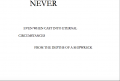
Rereading Un Coup de Des
To quote Mallarme: “[Our consciousness] joins the book now here, now there, varies its melodies, guesses its riddles, and even re-creates it unaided” (Drucker p. 36). When looking at his work Un coup de des it’s clear that Mallarme aids the reader by providing a landscape rich in visual choices. Both shape and font link ideas and provide visual meaning to his poem.
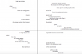
Look first thing at his choice in fonts; they each carry across the pages to create isolated phrases of similar text. The presentation of the page compels us to consider the text as a whole, but changes in font help focus on specific ideas. On page 7 in the top right corner, the imagery of a “solitary distraught feather” is immediately established with the smaller font in relation to the previous page. As well the italics give a feeling of drifting – much different than the straight text of “memorable crisis” on page 10. Further, on page 8 the collection of words linked by font share the same theme – “evaporated in mists”, “ a delicate tenebrous stature”, “in its siren twists”, all similarly floating along the page in italics.
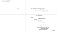
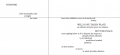
Shape and font interplay in multiple ways as well. Consider how font can change the shape of the reading as well. First compare the step-like shape on page 6 with that on page 3. The italics change the fluidity of the reading, causing the text to visually roll off the tongue. This is a very different feeling from the abrupt steps of “blanched”, “unbound” and “furious”. How would it feel if it were switched
Blanched enrolled with irony
Unbound or
Furious the mystery
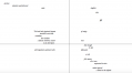
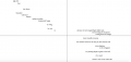
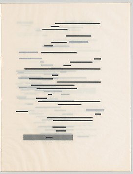
The other effect font has is recreating the shape by seemingly making unrelated text invisible. For example on page 9 in the top right quadrant there are at least 3 obvious readings. With two fonts the lines can be separated or read together.
“THE NUMBER
WERE IT TO EXIST
WERE IT TO BEGIN AND END
WERE IT TO BE COUNTED
WERE IT TO ILLUMINATE”
or
“other than as a scattered hallucination of dying
rising only to be denied and closed off when revealed
at last
by some thinly spread profusion
evidence of the sum however small”
or read both together
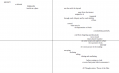
This change in reading creates multiple narratives without changing the physical order of words on the page. More, it allows for reader input to create each of these new stories. Even independent of font, the shape of the reading changes the meaning based on the path the reader chooses. For English readers (and French) we are pulled left to right and top to bottom on the page. The primary way Mallarme has broken our expectations is by breaking the barrier the gutter creates. With the option then to follow the traditional reading down the verso side then recto, or to cross the gutter, the reader is faced by yet another narrative-deciding choice. Marcel Broodthaer's work is a excellent abstraction of the shape of the poem, and can be used to visualize the layout's affect.
Overall, Un coup de des creates multiple narrative paths that weave meaning fluidly together, inseparable if the reader so chooses, but also with distinct themes when isolated.
Lets contrast the fluidity of this reading with the distinct crossovers of Joanna Drucker’s History of the/my wor(l)d
For another reading on Un coup de des check out this page.