More Aesthetically Please Fonts
1 2018-11-18T23:52:49-08:00 Sriram Satyavolu 2164a22a6fd8d39c114a418d12c34b1202c37634 32050 1 connects to the idea that typography matters plain 2018-11-18T23:52:50-08:00 Sriram Satyavolu 2164a22a6fd8d39c114a418d12c34b1202c37634This page is referenced by:
-
1
2018-11-15T19:48:27-08:00
The Significance of Typography
20
In this specific work, images are not used, rather the way the text is formatted is the visual component
plain
2018-11-19T15:11:56-08:00
In electronic literature, the use of visual and auditory components are prevalent. Even though most electronic literature have these other sensory components, the use of these components in their stories varies. For example, in “Whacked”, the visual component is not similar to other types of electronic literature since there is no use of images. The authors, Young-Hae Chang Heavy Industries, use a black text on a white background. The simplicity of the background and the overall piece allows for other components to stand out such as the use of varying font sizes to amplify the intensity of the story. The composition of the text itself is known as typography and it is prevalent in "Whacked".
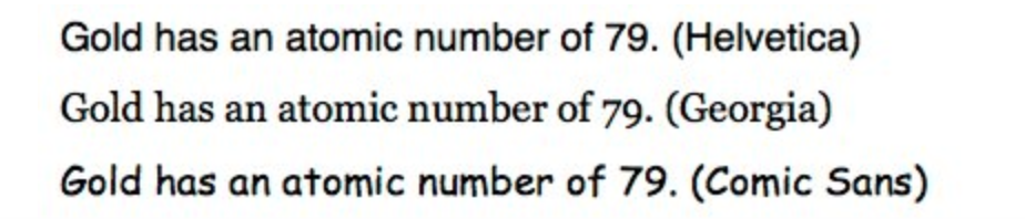
Typography has a significant effect on the way that the narrative is read. In this electronic literature work, typography is very relevant since the style of the text is an important element to the narration. Without the varying font sizes and formats, the literature will have not have the same intensity. Typography allows the use of visual hierarchy where certain words or phrase seem to stick out more due to the color, size, and font of the work provided. Young-Hae Chang Heavy Industries do not use any colors except for black and white, but the way the font is oriented and the size of the font speaks to how the text is the main visual focus of the narrative. In the article "How Typography Affects Readers" by Ankit Oberoi, typography is discussed as an important component to improving reader engagement (Oberoi). It has been shown in a study done in the New York Times, where readers were asked questions as well as choose from a list of random sentences in varying fonts (Oberoi). The study showed that people choose the options that were most attractive to them such as Georgia compared to fonts such as Comic Sans (Morris). In "Whacked" the font that is used is Monaco, also an attractive font for many (Tedford). This is an interesting discovery because it shows that fonts actually do matter to readers (Oberoi). The changing sizes between pages and the pacing is also significant since it make certain parts more emphasized such as power words like "bust my head open" or "frogmarched in to the street". In "Whacked", the use of all capital letters with varying sizes was an important component since it allows the readers to be engaged to the text itself. Engaging the reader seems to be a struggle for many authors since there are so many distractions on the internet that can cause the lack of engagement. By allowing for a minimalist piece of electronic literature such as “I Got Whacked in the Face with a Baseball Bat” makes the readers more immersed in the text itself rather than being distracted by images and other visual components.