Data Visualizations
Data Ideology (AKA Service Standards)Before any data is analyzed, any methods used in obtaining data need to be valid. While this is a massive area for consideration, I will not delve into deeper aspects of it as this section is geared to selecting data visualization tools for a pre-existing data collection. After analyzing your perceptual standpoint, it is usually the case that you will have an idea of what you want to pop out at you. So now it boils down to choice (which can be critiqued - a requirement of good, scholarly research and public debate) of what will be used to make that happen.
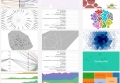
So, let's assume that you have a chunk of data (however large) and that it is valid, accurate, and correctly labelled. It is here that you must identify segments. Once identified, you then need to decide whether any segments will be analyzed for itself and/or compared against other segments. At this point, many simply revert to earlier training of basic charts and graphs. This may be effective if you are looking for linear representations with only two or three dimensions/axes, however this may not be effective in extrapolating the details sought after. To provide examples on what is possible, RAW offers a selection of visualizations that include multiple forms of groupings and color coding schemes (as shown in Figure 1, below).
Figure 1 - Various examples of data visualizations RAW can generate.
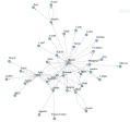
What if that isn't rich enough? What if there are more dimensions that need to be factored in so that you are presented with all the required data? For example, in Figure 2 (below; generated by Gephi), communication flows are highlighted. This may well serve to identify hubs or bottlenecks, but it does not reveal anything about frequency, rank or status of individuals, weighted direction (i.e. person A sends stuff to person B and then person B disseminates to others, but person B seldom sends anything to person A). Fortunately, there are a variety of display options in Gephi (see Figure 3, below) as well as other tools.
Figure 2 - Communication flow diagram taken from "Methods of Digital Analysis" presentation by M. Monkman at Carleton University, 2016.
You can also represent additional aspects in Gephi, such as:
Figure 3 - Generic examples of circular and chord diagrams available in Gephi.
Suffice it to say, data visualizations in Gephi and other tools can be very intricate.
In short, it is at this point where you can compare various visualizations to determine which one highlights the narrative sought. This involves an awareness of the applicable data ideology.
******
If you would like to explore considerations of sound representations, click here.
For a general list of perception-based questions, click here.
If you are comfortable with perception, you can move on to data ideology considerations.
This page has paths:
- Perception Bedrock Richard Soulliere