Overview of Web Accessibility Practices
Examples of accessibility features include:
• Captions and video description for online streaming videos
• Labeled fields in web forms (such as shopping carts)
• Sufficient color contrast in graphics and text
• Alternate text for images
• Links with text that describes their action (not generic text, such as "click here")
• Keyboard navigation controls
These features often require that pages use HTML in particular ways in order to function. If the code does not incorporate accessibility measures, the resulting page is often more difficult for many people with disabilities to use.
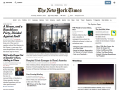
Here, I have provided a recent screenshot of the homepage of The New York Times. Visually, it resembles a print newspaper. Larger and bolder lettering is used to indicate headlines, images are interspersed with text, and the newspaper's logo appears in an "old-fashioned" print style.
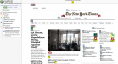
The second image is of this same page as it appeared when run through the web accessibility evaluation tool (WAVE) provided by Web Accessibility in Mind (WebAIM). The red elements highlight accessibility errors, while the yellow elements flag warnings. The blue and purple material highlights elements of page structure (headings, etc.); they help to understand the page and its implications for accessibility, but they do not indicate problems.
The first error on this page is an empty header tag; this would mean that anyone navigating the page using a screenreader would encounter a confusing situation in which there is an indication of importance (a header) but no content.
There are two small red elements on the right; these signal images that appear without alternate text. Generally, all meaningful images should have alternate text, which a screenreader would read when encountering an image element. Filling the alternate text field with a blank indicates to the screenreader that the element is not meaningful, and can be skipped. Failing to provide any alternate text, though, is an error. These images are not meaningful, and ought to be signalled with a blank alternate text field.
Many of the warnings are simple alerts - that text is quite small, for instance, or that two proximate links go to the same destination. Both of these are likely intentional, but they are flagged because they do not aid accessibility and, if they are mistakes, can be cleaned up.
A tool like WAVE (and older tools such as Bobby and CynthiaSays) provides a useful first pass at evaluating the accessibility of a web page, though accessibility experts caution that there is a great deal of interpretation that goes into creating accessible content and understanding the principles, techniques, and outcomes that guidelines and standards seek to encourage.