Mind The Gap (single page version)
Wages and Earnings
American inequality is rooted in the weakness of the wage structure. Job insecurity and low wages were, of course, commonplace through formative years of the modern American economy, an era capped by the Great Depression. But the political response to the Depression, and to the challenges posed by World War II, dramatically improved the bargaining power of ordinary workers—and just as dramatically increased chances that they might claim a living wage, and a modicum of security against illness, unemployment, and retirement.1 Wage (and income) inequality lessened during the turmoil of the Great Depression and World War II, and that “compression” held through the 1960s—largely as a result of the policy innovations (minimum wage, social insurance, collective bargaining) of the 1930s and 1940s.2
This began to unravel in the 1970s as wage-setting policies and institutions upon which they relied came under attack. One consequence of this was that the share of national income paid out as wages and salaries began to fall.3 For the last generation (and accelerating in recent years) capital (interest, rent, dividends) has claimed a greater share of national income, while the share claimed by labor (wages and salaries, work-based benefits) has slipped. Labor’s share of national income (calculated as the ratio of total labor compensation [wages and benefits] to total output in the nonfarm business sector, hovered around 65 percent for most of the postwar era and then—beginning in the early 1980s—began to fall off [see FIG below]. This is not just a categorical shift: Since labor income is evenly distributed across American households but capital income is not, it is a key driver of inequality.
More starkly, wage growth for most Americans slowed to a crawl [see sidebar below]. At the lower income thresholds, workers lost ground with the slow collapse of the labor movement (especially important for men) and with the sliding value of the minimum wage (especially for women). During the 1970s and 1980s, the wage gap widened at both ends of the income spectrum: the gap between the poorest 10 percent of workers and those at the median wage grew at roughly the same rate as the gap between those at the median and the richest 10 percent of workers. Since then, the gap has been much more pronounced at the top end: the gap between the poorest and the median has leveled off, while the gap between the richest and the median has continued to grow.4
The key point here is not just that wages have stagnated, but they have done so over an era in which the productivity and educational attainment of American workers have improved dramatically. The last generation has been marked by a stark disconnect between productivity growth (up 80 percent between 1973 and 2011) and slow or stunted wage growth.5 The real hourly wages of the median worker grew only 4 percent over this span, and real hourly compensation (wages and benefits) grew only 10.7 percent [see FIG below]. For all workers, the erosion of real wages was broad and uneven from 1973 through 1995. The upturn of 1995–2000, the latter part of the 1989–2000 business cycle, brought a brief respite of across-the-board wage growth, some of which spilled past 2000 (although the wage growth from 2000–2007 skews much more to higher earners). The recent recession (2007–2011) brought with it wage losses for most workers.
For men, the pattern is particularly stark. Real wages began falling for low-wage men in the mid-1970s, and this spread across all but the highest percentiles through 1979–1989 and through the first half of the 1990s. The late 1990s brought some relief, but this was short-lived: wage growth slowed in 2000–2007 and then lost ground—for all but highest earners—from 2007–2011. The wage numbers alone (which include only men who are working) undercount the real damage. In 1970, 94 percent of men aged 25-64 worked. Today—reflecting chronic unemployment and higher rates of incarceration—that share is closer to 80 percent. The real earnings of all working-age men, whether they have a job or not, have dropped almost 20 percent since 1970.6
The pattern, then, is pretty clear: Low– and middle-wage men and women lost ground across the last 40 years—a pattern interrupted only by the sustained growth, low unemployment, and minimum wage increases of the late 1990s. And the lessons are clear as well: Shared prosperity rests on policies and institutions (collective bargaining, a decent minimum wage, strong labor standards, etc.) that sustain the bargaining power of workers. In the absence of those institutions, only exceptional stretches of full employment have interrupted the failure of the wages, incomes, and living standards of ordinary Americans to benefit from the fruits of economic growth.
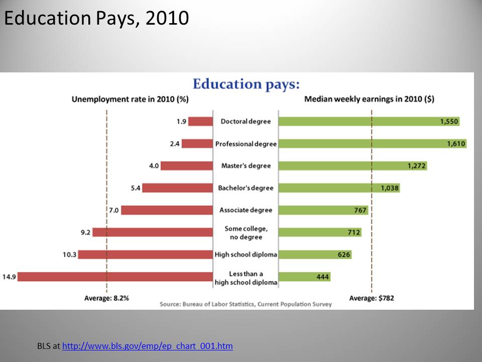
Some of this growing wage gap is shaped by education [see FIG above]: The median wage for those with less than a high school education has fallen by almost 20 percent in the last 30 years. The median wage for those with just a high school diploma has fallen slightly. And the median age for those with a university education has risen about 20 percent. In 1979, to put it another way, the median wage for a worker with a University education was about $8.00 higher than the median wage for a worker who had not graduated high school; today that gap is closer to $15.00/hour. Similar patterns held during the recent business cycle—as both median earnings and the prospects for unemployment were much weaker for less-educated workers [see FIG below].
At the same time, educational payoff has slowed in recent years, and the rewards of pushing beyond high school can no longer be taken for granted. In 1979, 40 percent of low-wage workers had not completed high school and just over 25 percent had completed some college [see FIG below]. By 2011, these numbers had nearly reversed: fewer than 20 percent of low-wage workers came from the “less-than-high-school” cohort; and more than 43 percent had some college under their belts.7
For men, the pattern is particularly stark. Real wages began falling for low-wage men in the mid-1970s, and this spread across all but the highest percentiles through 1979–1989 and through the first half of the 1990s. The late 1990s brought some relief, but this was short-lived: wage growth slowed in 2000–2007 and then lost ground—for all but highest earners—from 2007–2011. The wage numbers alone (which include only men who are working) undercount the real damage. In 1970, 94 percent of men aged 25-64 worked. Today—reflecting chronic unemployment and higher rates of incarceration—that share is closer to 80 percent. The real earnings of all working-age men, whether they have a job or not, have dropped almost 20 percent since 1970.6
The pattern, then, is pretty clear: Low– and middle-wage men and women lost ground across the last 40 years—a pattern interrupted only by the sustained growth, low unemployment, and minimum wage increases of the late 1990s. And the lessons are clear as well: Shared prosperity rests on policies and institutions (collective bargaining, a decent minimum wage, strong labor standards, etc.) that sustain the bargaining power of workers. In the absence of those institutions, only exceptional stretches of full employment have interrupted the failure of the wages, incomes, and living standards of ordinary Americans to benefit from the fruits of economic growth.
Some of this growing wage gap is shaped by education [see FIG above]: The median wage for those with less than a high school education has fallen by almost 20 percent in the last 30 years. The median wage for those with just a high school diploma has fallen slightly. And the median age for those with a university education has risen about 20 percent. In 1979, to put it another way, the median wage for a worker with a University education was about $8.00 higher than the median wage for a worker who had not graduated high school; today that gap is closer to $15.00/hour. Similar patterns held during the recent business cycle—as both median earnings and the prospects for unemployment were much weaker for less-educated workers [see FIG below].
At the same time, educational payoff has slowed in recent years, and the rewards of pushing beyond high school can no longer be taken for granted. In 1979, 40 percent of low-wage workers had not completed high school and just over 25 percent had completed some college [see FIG below]. By 2011, these numbers had nearly reversed: fewer than 20 percent of low-wage workers came from the “less-than-high-school” cohort; and more than 43 percent had some college under their belts.7
Underlying the weakness of wages and earnings is a dramatic decline in the quality of jobs. A nasty combination of recession, inflation, union decline, concessionary bargaining, and deindustrialization through the 1970s and early 1980s undercut wages for those at the median wage and below. As business refocused its managerial and political energies on cutting costs, the employment relationship itself began to deteriorate—not only with the losses of union coverage, but with relentless waves of downsizing and outsourcing. The patterns for the subsequent decades were clear: less security and job tenure, longer bouts of unemployment, more part-time work (much of it involuntary), more nonstandard “contingent” or “temporary” work arrangements.8
This has been accompanied by a steady erosion of workplace benefits, so that real compensation has slipped even further [see FIG above]. Employment-based health care has fallen off since its peak in the early 1970s, much more sharply for low-wage workers. And, as coverage has slipped so too has its quality: premiums and out-of-pocket costs continue to run well ahead of inflation, especially for family coverage. And, while employment-based pension coverage has not fallen as steeply, the coverage that remains offers less value and less security. If we look to a higher threshold, the share of “good jobs”—those that pay a living wage, and offer job-based health and retirement coverage—we can see these trends clearly [see FIG below]. In 1979, almost 28 percent of jobs met this modest threshold; in 2011, less than 25 percent did so—a decline that was even sharper for male workers (from 37 to 29 percent).9
We can also see this playing out in the persistently high share of low-wage work. About one in four American workers are in low-wage jobs (those paying less than two-thirds of the median wage), a share that is growing—and easily the highest rate among our democratic and developed peers. In 31 states (as of 2011), more than a quarter of the workforce work at a wage insufficient to pull a full-time worker above the poverty level [see sidebar below]. Across our most recent business cycles, low-wage workers have suffered the brunt of economic downturns and enjoyed few of the fruits of economic booms or recoveries. Since 2007, the lion’s share of recovery jobs are in lower-wage occupations than those lost during the preceding recession. And projections of future job growth are heavily skewed towards low-wage service occupations.10
Sidebar: Low Wage Work: Past, Present, Future
All of this is abetted—as we shall see below—by remarkably weak labor market institutions and policies. The minimum wage sets a meager floor. Workers lack voice or bargaining power. Meager employment standards are accompanied by little serious enforcement of those (overtime, minimum wages, tipped wages) that do exist. In the face of both declining workplace benefits and the shrinking rewards of education and hard work, the broader promise of economic insecurity has collapsed.11
Incomes
Wage inequality captures the gap between wage-earning individuals. Let’s shift our attention to a more common measure (for the study of inequality) of income. Income includes non-wage forms of income like return on investment or capital gains, and it groups individuals (depending on the way in which the data is collected) into families, households, or tax units.12 For the purposes of measuring income distribution or inequality, we conventionally focus on slices of the population such as percentiles (the poorest 20 percent, the next poorest 20 percent, etc) or deciles (the same, but broken into 10 groups). In recent years, increased attention has been devoted to small slices at the top of this distribution—the richest five or one percent.Here, the basic story is simple and compelling [see FIG above]. For the first 30 years after World War II, income for all groups (shown in Figure are the median, the top 5% and the bottom 20%) closely tracked the expansion of the postwar economy. We were growing together. For the last 30 years, the gains have been starkly unequal: As productivity and incomes for higher earners continued to rise, the incomes of this in the middle and lower percentiles flattened off. We are growing apart. The basic pattern holds--sorted by decade, business cycle, or party-in-power—across the last generation: gains for those in the lower income groups are crowded into the early postwar expansions (especially 1948-53 and 1960-69). Upper income groups, by contrast, share in that early prosperity—and then capture virtually all of the gains of the last thirty years [see FIG below].
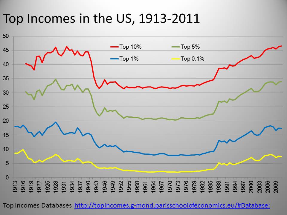
Research based on tax returns over nearly a century confirm this pattern.13 The share of income claimed by the top 10, 5, and 1 percent of households [see FIG below] rose during the roaring twenties and fell back slightly with the onset of the Great Depression. It then fell dramatically in response to the political innovations and institutions of the New Deal and held at that lower level into the 1970s. Sidebar: Tracking Top Incomes
As the New Deal was dismantled, however, so too was the equality that it had sustained--the share of income claimed by the top 10 percent has now risen to levels not since the 1920s. While these trends can be found across the industrialized world, they are undeniably starker in the United States [see FIG 1.14]. In 1980 the share of income going to the top 1 percent in the United States was on the high side (about 8 percent)--but similar to that of its international peers. By 2008, this share had ballooned to 18 percent—sharply higher than that of any of its peers, and more than double the share claimed by the top 1 percent in most of those other settings. Narrowing our attention to just the past 20 years, the American “one percent” start with a bigger share than that of any of their peers, and gain more over that span than any of them.14
The magnitude of that redistribution is driven home by recent research from the Congressional Budget Office [see FIG below]. From 1979 to 2007, the after-tax incomes of the poorest 20 percent grew very little, gaining almost nothing in real (inflation-adjusted) value from 1979 to the mid-1990s and inching up during the late 1990s—for a net gain of about 15 percent. Incomes for the middle 60 percent of workers echoed this trend—while the next richest 19 percent did a little better. But the lion’s share has gone to the top 1 percent--whose incomes over that span have almost tripled.15 A nice way to capture this is the Brandeis Index, a measure of the number of full-time median wage workers it would take to accumulate the income of an average “one percenter.” In 1980, this ratio stood at 12.5 to one. By 2007 it had almost tripled, to 36:1.16 High-earners took a hit when the economy collapsed hit in 2007, but their earnings—and their share of national income—have rebounded in recent years. In all, about 15 percent of national income has been transferred from the bottom 90 percent to the top 10 percent since the 1970s.17
Income measures also capture the impact of unemployment, of not earning wages. The period of growing inequality coincides closely with the willingness of policymakers to surf the Philips curve, and accept higher rates of unemployment in order to combat inflation. This not only undercut working class incomes coming and going but, as unemployment crept up in the 1970s, it also eroded the bargaining power of those still working. Unemployment compensation cannot pretend to close this gap: It fails to reach legions of discouraged, marginally-attached, and underemployed workers. And, in our most current downturn, a stark and sustained pattern of long-term unemployment exhausted benefits for many of those hardest hit.18
In sum, income trends show a dramatic narrowing of early century income gaps during the political and economic upheaval of the 1930s. Broadly shared prosperity was sustained into the early 1970s, but then began to unravel. Since then, we have seen not only a stagnation of wages and incomes at the median, but—especially in recent years--starkly disproportionate gains at the very top of the income spectrum.
Wealth
Now let’s turn from income to wealth. While income captures the money coming into a family or household an annual basis, wealth measures accumulated assets or “net worth.” This includes savings, home equity, and investments (and subtracts debts). Here the American pattern of inequality is starker still [see first FIG below], although also less widely understood or appreciated. The top 1 percent claim about a third of the nation’s wealth. The top 5 percent claim over 60 percent. The top 10 percent claim over 70 percent. The top 20 percent claim over 80 percent. The next two percentiles—those falling between the richest 20 percent and poorest 40 percent—together claim a little more than 10 percent. Leaving the poorest 40 percent with a share of national wealth that is nearly imperceptible on the chart below. This inequality has been attenuated in recent years, since housing is (or was) the main source of wealth for middle-income American families. Between 2007 and 2010 alone [see second FIG below], those in the broad middle class (between the 20th and 60th income percentiles) saw their family wealth slip almost 40 percent.19This distribution of wealth is starkly at odds with that of our international peers [see FIG below]. The share claimed by the top 1 percent in the US comes closer to the share claimed by the top 5 percent in most other settings. The share claimed by the top 5 percent in the US, exceeds that claimed by the top 10 percent in all other settings. And the share claimed by the top 10 percent in the US is—for most of our peers-- as close to the median as it is to the 10 percent.20
The Demography of Inequality
Inequality is usually expressed as a wealth or income gap-- between rich and poor, between the very poor and everyone else, or (more recently) between the very rich and everyone else. Demographic gaps, particularly by race and gender, are also important. They shape the distribution of inequality and, as consequences of deep historical patterns of discrimination, they contribute to inequality as well.The gender gap in earnings is rooted in longstanding and multifaceted patterns of discrimination. For much of the last century, pervasive doubts about the propriety of women’s place in the labor market sharply curtailed both occupational and educational opportunities. When women did work, they labored in segregated occupational and professional niches: domestic work, textiles and apparel, light manufacturing, and the lower-wage “nurturing” professions (nursing and teaching). On the assumption that women workers were in an unfortunate interlude between dependence on father and dependence on a husband, women’s earnings were calibrated as “pin money” rather “family wages.”21 And, for many of the same reasons, the institutions and policies that helped to build and sustain earnings for men (the minimum wage, the labor movement), were less accessible to, or less likely to cover, women.22
Although considerable progress has been made—in legal status, in patterns of labor force participation, and in the desegregation of occupations—gender inequality remains stark. The burdens and constraints of family life (caring for children, and elderly parents) are still borne largely by women. Especially in the absence of meaningful child care supports or paid family leave, this comes at a direct cost to earnings and careers. In 2011, the median annual income for women working full time was 23 percent less than that of their male counterparts. Women make up about half of the labor force—but much higher shares of minimum-wage, and low-wage workers.23 By any measure, women’s wages [see FIG below, toggle between men and women] are persistently lower than those of men—despite higher educational attainment and achievement. This gap is narrowing, but it is narrowing slowly. Some of this is progress—women are better qualified (more education, more experience) and employment discrimination (glass ceilings, occupational bans) is less prevalent. But some of this reflects background trends in the wage structure, in which the gender gap is narrowed not by women’s gains, but by men’s losses.
The racial gap in earnings, incomes and wealth reflects the long shadow of slavery, and the persistence of racial discrimination in employment, politics, education, housing, credit, and criminal justice. Slavery, of course, ended with resolution of the Civil War—and the adoption of the 13th, 14th, and 15th amendments to the constitution which outlawed slavery, and extended the principle of equal protection and equal voting rights to African-Americans. But the meaning of those legal guarantees was almost immediately compromised by the unwillingness and inability of the federal government to enforce them, and by the willingness and ability of southern states to erect new institutions of economic and political discrimination in their place. The reign of “Jim Crow” (which was codified in state law and enforced by threat and violence) included a new system of debt peonage, “separate but equal” public goods, and harsh limits on political participation.24
The growth of federal power—particularly through the Depression and World War II—posed a direct challenge to “Jim Crow.” But, across this era, major federal programs (including Social Security, labor law, the minimum wage, and the GI Bill) were cut to accommodate Southern interests--either by deferring program administration and eligibility rules to the individual states or by exempting those occupations (especially agriculture and domestic work) in which African-Americans were segregated. It was not until the civil rights movement of the 1950s and the 1960s that the formal institutions of Jim Crow were finally dismantled, while the prospect of redress for decades of discrimination was almost immediately blunted by the economic and fiscal climate of the 1970s.25
This history has directly and fundamentally shaped patterns of inequality. While educational and occupational gaps have narrowed over time, they have stopped well short of ensuring equal opportunities or equal outcomes. This is true of wages, where the median for black workers has inched up slightly since 1979, but lost ground against white wages (the median black wage was almost 83 percent of white wages in 1979, it is under 77 percent today) [see FIG above]. African-Americans also have a much more tenuous foothold in the labor market, their unemployment rate, across the last business cycle, running more than double that of whites. It is true of incomes, where the median for black families has grown alongside that of white families since the 1960s—but without closing the gap between them (black median income reached 60 percent of white median income at the end of the 1960s; that ratio has not budged since [see FIG below]).
And it is dramatically true of wealth, where the legacy of deep discrimination in housing continues to shape the accumulated assets, or net worth, of African-American families. [see FIG below] The median wealth of white households is about twenty times that of black households, a ratio that is actually higher now than it was a generation ago. Fully one quarter of African-American families have no net assets. And the housing crash hit African-American families hard, pushing homeownership rates back below 45 percent.26
The close ties between race and inequality have been tightened in recent decades by the dramatic and devastating rise in incarceration rates. The US incarceration rate more than tripled from 1980 to 2008—and in a startlingly uneven fashion: African Americans are incarcerated at 7 times the rate of white Americans. In 2008, over a third of black men between the ages of 20 and 34 were incarcerated. More than two-thirds of African-American men without a high school education born between 1975 and 1979 had a prison record by 2008. By the end of the twentieth century, incarceration was a far more common outcome for African-American men than military service or a college degree. If the incarcerated are included in the raw count of the labor force, African-American men without a high school education were more likely to be imprisoned than employed.27
The impact of incarceration on inequality is hidden (since those in prison are left uncounted by conventional measures of unemployment or poverty) but profound. Higher rates of imprisonment reflect not higher rates of crime, but an increasingly intensive policing or urban neighborhoods and institutions (including schools) and increasingly draconian sentencing laws. This, in turn, has served to exaggerate disadvantages based on race, place, and education. Jail suspends employment and income prospects for the period of incarceration, and undermines over the long haul for those who are released. Family members and dependents left behind fall into deeper poverty—and are themselves more likely as a result to end up behind bars. Mass incarceration, now accompanied by a vast prison-industrial complex, undercuts the bargaining power of “free” labor. And the systematic disenfranchisement of felons further skews the political reflection of racial and economic inequality.28
The Geography of Inequality
Inequality also a unique spatial dimension in the United States. Our cities are starkly more unequal than the national as a whole—a reflection of longstanding and continuing patterns of local segregation and sprawl. Indeed, nowhere is the story of American inequality staged more dramatically than in the contrast between central city poverty and relative suburban wealth. Here again, the history of housing and property discrimination casts a long shadow. Over the last century, American urban spaces were starkly segregated (by race and income) by a variety of means, including race-restrictive deed covenants, local and federal urban policies (such as zoning, mortgage insurance, and urban renewal), and the blunt discrimination practiced by private realtors and lenders.29Sidebar: Mapping The Unequal City
The racial logic of local segregation has diminished somewhat in recent years (although it persists in many settings30) but it has been succeeded by an equally stark segregation based on income. Indeed, residential segregation by income has grown over the last generation. This segregation is driven by an increase in the share of the population living in areas of concentrated poverty, and by an increase in the share of the population living in areas of concentrated wealth. In 1970 only 15 percent of families lived in neighborhoods that could be considered as either affluent (those where median incomes were greater than 150 percent of median income in their metropolitan areas) or poor (those where median incomes were less than 67 percent of metropolitan median income). By 2007, twice the share of families—over 30 percent--lived in such neighborhoods.31
American cities map—in local time and space--the larger patterns of American inequality: the poor poorer, the rich richer, the middle increasingly hollowed out.32 In many settings, this inequality sprawls beyond the old central city-suburb divide. Many central cities are largely depopulated—a scale of abandonment and disinvestment readily apparent in any birds’ eye view. Poverty now spills into inner suburbs and, in the wake of the housing bubble, beyond.33 The wealthy are increasingly ensconced in gated communities in distant exurbs. Indeed, prior to the housing crash, new residential construction was pushing ahead most dramatically in the nation’s slowest growing and most distressed metropolitan areas—servicing not a demand for new housing but a demand for further spatial segregation by income.34
All of this, of course, has the effect of segregating opportunity as well. Historically, concentrated poverty emerged where local residents had few job prospects or housing options. Inequality yielded segregation and then reinforced it, as poor neighborhoods were stripped of basic economic and social assets. Many of the urban poor live in old working class neighborhoods in which the work has disappeared.35 And, as the local tax base crumbles, so too does the likelihood that local public schools will offer a way up or a way out.36
Mobility and Inequality
These dimensions of wage, income, and spatial inequality would be less of a concern if the economy afforded real mobility; if everyone was poor when they were twenty, for example, but rich by the time they reached thirty. But, in a startling reversal of both historical and international patterns, Americans are less mobile now than they used to be and less mobile than many of their peers. For most of the full sweep of American history—from the middle of the nineteenth century into the second half of the twentieth—differences in opportunity based on family circumstances fell. For the last generation, however, that progress has begun to unravel.37
This is true of intergenerational mobility [see FIG below]. In the United States, a child whose family income falls into the poorest fifth, has about a 30 percent chance of achieving a middle income or better as an adult. A child born into the richest fifth has about an 80 percent chance of the same achievement. While most Americans have higher family incomes than their parents, there is “stickiness” at both ends of the income spectrum: those born at the bottom or at the top of the income spectrum are likely to stay there. In the 1970s, 36 percent of families stayed in the same income decile; in the 1980s, that figure was 37 percent; and in the 1990s, it was 40 percent. In other words, over time, a larger share of families were staying within their class through the duration of their lives.38
In this respect, the United States has one of the weakest rates of is intergenerational mobility among rich, democratic nations. There is a stronger link between parental education and children's economic, educational, and socio-emotional outcomes in the United States, than in any of its peers. This relative immobility both reflects background inequality, and sustains it: the more unequal the income distribution, the more likely it is that poor kids will inherit the disadvantages (and rich kids inherit the advantages) of their parents.39
Some of these loses reflect growing gaps in educational attainment. For most of our history, the growing infrastructure of public education (and then the decline of discrimination by race and gender) generated real and sustained opportunities for most Americans. Each generation graduated high school at higher rates than the last, and these gains paid off family incomes. But the last forty years have seen both further impoverishment of our struggling public schools and dramatic spikes in the costs of higher education.40 As a result, the gap in average test scores between students from low-income and students from high-income families is growing. The share of poor kids completing college has barely budged in a generation (rising from 5 to 9 percent) while the share of rich kids has increased steadily (from 36 to 54 percent). As a result of the uneven quality of K-12 education and the skyrocketing costs of higher education, the US is now the only major economy in the world in which children are unlikely to exceed the educational attainment of their parents.41
We also see this collapsing mobility in the labor market. In most European settings, the incomes of workers in the lower deciles rise more quickly over time than overall income growth. In the United States, just the opposite is true. Those who start in the lower deciles see little income growth over time (or actually suffers losses), while those at the highest deciles see rates of income growth sharply higher than either other Americans or their European peers.42 All of this reflects the deterioration in wages, job quality, and employment opportunity traced above: with deindustrialization and the parallel collapse of collective bargaining, we lost the jobs (decent wages, modest educational attainment) most likely reward hard-working families with better opportunities for their children.
Not only is mobility constrained, but—in the absence of a range of social supports and programs common in most other developed democracies—Americans also have far more volatile and insecure incomes. A child of modest means and background in the United States is less likely to surpass her or his parents, less likely to move up the labor market during their lifetime, and more likely to face dramatic blows to family income and family security. Alongside inequality, income insecurity and volatility has increased markedly over the last generation: Americans are less protected by wages and benefits and more exposed to the business cycle. Over a quarter of all families reported that their 2010 income was “unusually” low, nearly double the share (14.4 percent) of just three years earlier.43
So, by any measure, we are a starkly unequal nation. What’s striking about these trends, at first glance, is their long and overlapping timelines. The share of income going to the very rich follows a century long parabola—from the stark inequality of the “Gilded Age,” falling through the shared prosperity of the middle decades of the 20th century, and rising again in recent decades. In the distribution of postwar growth, the parallel lines of the “great compression” begin to unravel in the 1970s: higher incomes continue to track upwards with gains in productivity, but median and lower incomes fall off. And the gains at the very top—measured in CEO compensation or the share claimed by the richest one percent—are even starker in recent years.
Things are clearly worse now, but they have been getting worse for quite some time. This inequality is exceptional judged against our own history: we are more unequal now than we have been in almost a century. And it is exceptional judged against our international peers: even in countries where the same trends are found, they are not nearly as pronounced as they are in the United States. Understanding the dimensions of that inequality, of course, is one thing; understanding its causes is yet another. What contributed to inequality, to growth in inequality over time, and to growing gap between US and peers?
Things are clearly worse now, but they have been getting worse for quite some time. This inequality is exceptional judged against our own history: we are more unequal now than we have been in almost a century. And it is exceptional judged against our international peers: even in countries where the same trends are found, they are not nearly as pronounced as they are in the United States. Understanding the dimensions of that inequality, of course, is one thing; understanding its causes is yet another. What contributed to inequality, to growth in inequality over time, and to growing gap between US and peers?
| Previous page on path | Introduction, page 1 of 4 | Next page on path |

Discussion of "Mind The Gap (single page version)"
Add your voice to this discussion.
Checking your signed in status ...