Wrangling Big Data in a Small Tech Ecosystem
By Shalin Hai-Jew, Kansas State University
It is not every day that one has access to local “big data” and the chance to explore these to inform on-campus clients of some facts about the university. So it was years after dipping into some of the massive open online courses (MOOCs) about big data (and the risks of mistaking “noise” for “signal” in such data) that I finally had an opportunity to go in elbow-deep. This piece describes some early insights about this experience and some good practices in engaging big data in a “small tech” ecosystem.
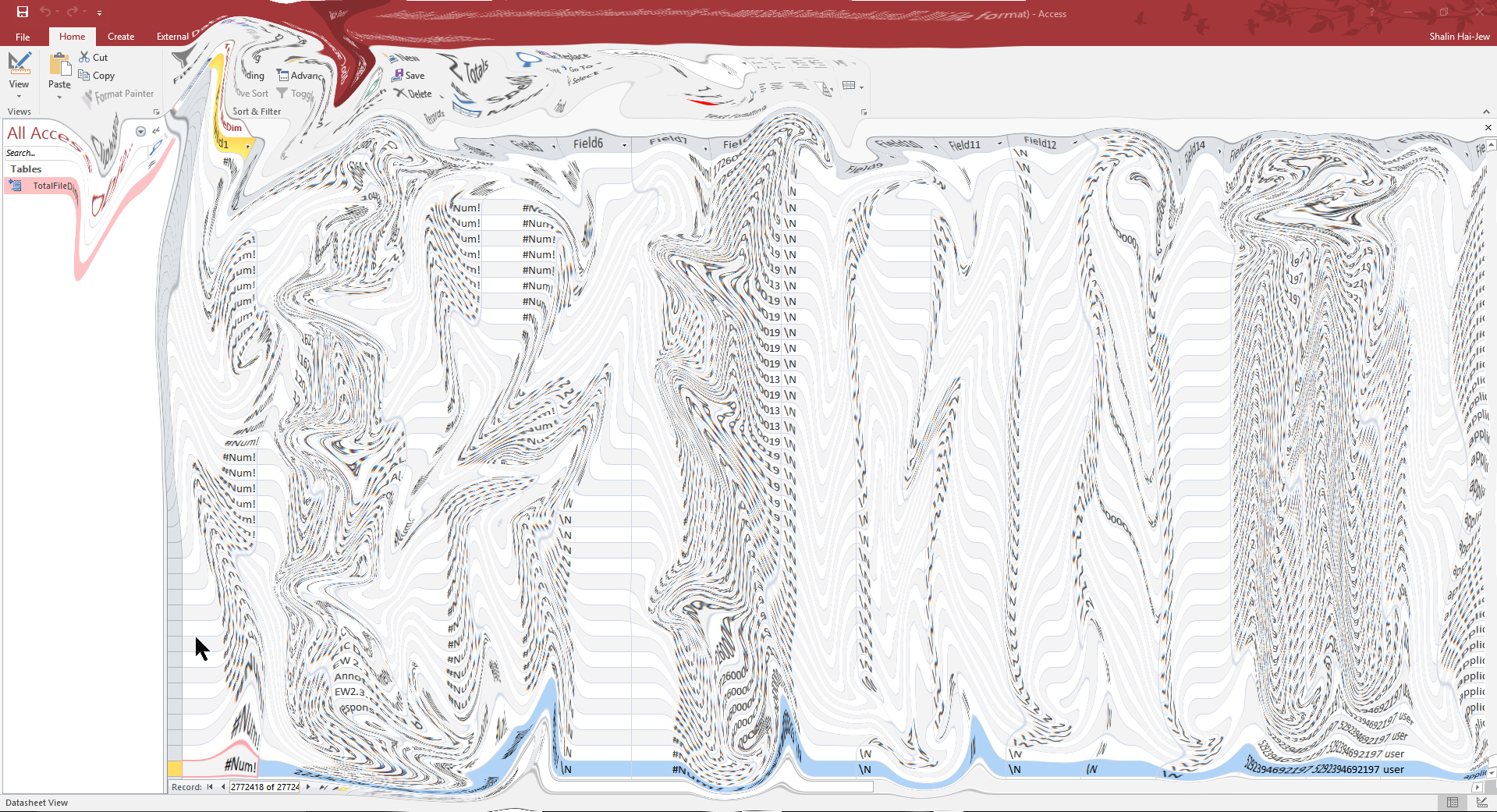
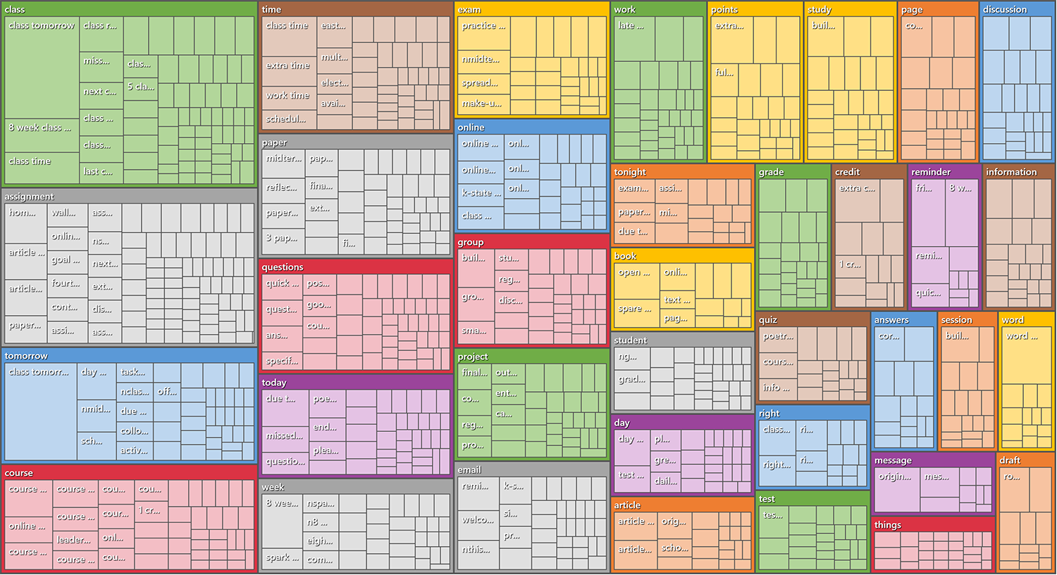
Figure 1: A Liquefied Screenshot of a Dataset in Microsoft Access
So what do we have here? As is typical with good practice, it helps to have intimacy with the data. This means knowledge of the front end of the learning management system (LMS) and its capabilities. This means understanding how faculty, staff, students, and community members use the LMS. This means understanding what data are captured and how...and how assertable are the data.
Possibilities in the Imagination
Before any dataset was explored, it was helpful to watch the related videos about the data capabilities of the LMS data portal. There was also a data dictionary shared in public about the contents. An initial brainstorm can be helpful, even long before one has access to the actual data. It is better to not let the data itself be a limiting factor because sometimes a well conceptualized question can lead to identification of data sources that one would not have thought of otherwise. Some early questions follow:
- What can be reported out at various levels: university, college, department, course, and individual?
- Is it possible to make observations about course design? Learner engagement (Discussions? Conversations)? Advising? Technology usage (such as external tools)?
- Uses of the LMS site for non-course applications?
- What sorts of manual-created courses exist, and how are these used? What percentage of the courses are these manual types of courses? ("Manual-created" courses are contrasted to auto-created courses.)
There were questions brainstormed about potential ways to identify learning trajectories (paths).
- How closely is it possible to map the data of a learner’s trajectory?
- Groups' learning trajectories?
- What are some attributes to use to identify various groups? Which attributes would be helpful? What sorts of group-specific questions may be asked?
- What may be understood about the learning going on in a particular course?
- A learning sequence?
- Are there ways to understand support for learners and support for learning from this data?
There might be practical applications for accreditation issues as well: Are there any accreditation applications for the LMS data? The resulting analytics?
The unit of analysis could go well beyond the institution and its sub-units. There could be cross-institutional learning methods, assuming that the respective institutions were willing and the data was share-able and the findings benefited everyone. Also, there could be potentially analysis of per-student analyses at a fine level of granularity.
Then, it was helpful to think about ways to approach the data. There could be descriptions about the institution of higher education’s uses of the LMS. There could be applications of time series data analysis, to understand trends, changes over time, and other time-based aspects of online learning, online teaching, online interactivity, and back-end online course development. Along with time, there may be analyses of space: Where are the respective learners from in a particular course of study, and why? (This type of student information is available elsewhere, but depending on the depth of information in an LMS, the locational information may be available.)
There could be inferential statistics, or the drawing of tentative conclusions based on statistical data. There could be predictive analytics, and even prescriptive analytics. Not only could classical statistical methods be applied, but newer analytical methods could be applied, such as linguistic analyses, network analysis, sentiment analysis, survival analysis, and various flavors of machine learning.
What’s There Really?
One of the first objectives of the data exploration was to enable the administrator to know what data was available on an LMS data portal and what the university could do with it. The data would be released by the company once a month to the university through the portal. (There is an additional pay option that would enable access to the data at more frequent intervals for more dynamic data capture.) The idea was that the exploration would start off slow, and it would be several weeks before initial reports would be due. What became clear early on was that the data came out in “flat files”, without the defined relationships between data variables, and without the columns of identifiers (in this case, lacking foreign keys and lacking meaningfully-labeled primary keys) that would enable granular question answering. The flat files were disconnected, without relational ties. So much power in data comes from the particular design of queries, across masses of data. User identifiers were represented as “bigint” (big integer) data according to the given data dictionary, but the identifiers themselves were not available, and even if they were, they did not compare to anything (and were effectively de-identified). [That is not to say that an insider could not re-identify some identities. For example, an analyst could use other data sources to verify identities even for individuals represented only by long integer strings.]
Extracting Meaning
There is the initial thrill of a whole bunch of data stuff, but that excitement turns quickly into a dogged focus to see what is knowable. The big data learning happens in bits.
The workflow may be described in nine steps:
- Conceptualizing Questions and Applications of the Data
- Review of the Dataset Information
- Data Download
- Data Extraction
- Data Processing and Analytics
- Validating / Invalidating the Findings
- Additional Data Analytics
- Write-up for Presentation
- Data and Informational Materials Archival
This recursive sequence may be seen in Figure 2 "Big Data Analytics in Small Tech Ecosystems: The Workflow". The descriptors of the datasets by the “creators” of the data is a good place to start. They may share information about how the data has been structured and how they conceptualize its use. The "data dictionary" is also an important place to start. It tells users how the variables are conceptualized and named. It is possible to look at the dictionary and see what is knowable within a variable (within a column), between variables (between columns), between groups (between grouped rows, based on attribute and outcome variables), and other factors. There is an innate built-in sense of information. In viewing columnar information with date data, it is possible to conceptualize capturing trends over time, comparisons between time elements, and other time-based factors. While much of the initial conceptualizations are for macro levels of data, it is possible to imagine more granular data as well, such as how individual programs and courses and teaching and learning trajectories may be explored and understood from the LMS data.
The download step is generally pretty straightforward, with the files coming off as .gz files, which are extracted using 7Zip. These extractions may be done en masse, with the respective extracted files in their respective folders. The files themselves have to be turned into text files with the addition of the .txt file extension. The data files are then ingested into a database program, like Access, in order to enable an N=all of the row data. While Excel 2016 can handle 1,048,576 million rows of data and 16,384 columns, that is insufficient. Rather, many of the flat files have 3 million rows of data. Once the files are in Access, it is possible to explore the data, select columns for extraction (through queries), and then exports are made in file formats that are readable in other analytical tools.
One has to be constantly vigilant to ensure that one is not losing data as one is moving data from one software tool to another. It is also important not to be somehow “gaining” data inadvertently. (Sometimes, one will substitute averages or other values for missing data through computational means, but that is a purposeful activity, not an accidental one.) To this end, it helps to put "breakpoints" (pauses) into the process during which analysts may check what is occurring with the data.
After that, one can use a variety of methods to query the data. In this work, only basic types of queries were run because these are flat files, without the full capabilities of relationships within the data tables. As part of most analytical processes, there are accepted methods to validate or invalidate the findings. The findings are ultimately written up for presentation and finalized. Finally, the raw data and processed informational materials are archived for possible future reference.
Figure 2: Big Data Analytics in Small Tech Ecosystems: The Workflow
While the sequence seems clean and logical, the work is anything but. The technologies on a laptop computer are designed for typical small data, not to handle datasets with millions of rows of data. As such, there will be limitations to what may be explored and how. Even getting the data lightly processed takes some wrangling to ensure that the machine is set up correctly.
Harnessing the “Small Data” Techno
So what were some of the surprises with dealing with "big data" in a "small techno" ecosystem? One example deals with the data lossiness mentioned earlier. While the original files consisted of millions of lines of records, the export from Access only enabled 65,000 or so records to be exported at a time because of clipboard limitations. Several days in, I realized that I had to expand my laptop’s clipboard to order to export as much of the data as possible from Microsoft Access.
- Right-click on the "Start" icon of the PC.
- Select “System”.
- Select the “Advanced system settings” from the left menu.
- In the pop-up window, go to the “Advanced” tab.
- In the “Performance” area, go to “Settings.”
- Go to the “Advanced” tab in the “Performance Options.”
- In the “Virtual memory” section, click “Change” and deselect “Automatically manage paging size for all drives.” Rather, select “Custom size.”
- The “Initial size” should be set to 2x the physical memory that the system has installed. For a computer with 16 GB (16,000 MB) of RAM, input 32000 MB.
- Then, the “Maximum size” should be set to 4x the RAM size (to 32,000 MB). [These settings were courtesy of "How to increase the size of the clipboard" by Allen Bethea at Techwalla.]
I also learned that I should not add more load to the export by exporting data with formatting included. Leave the formatting, and just capture the data! (When I first started reading about algorithms, I had done a private eye roll at how much effort computer scientists had taken to ensure that their algorithms ran as efficiently as possible. Now, I understand at least a little. The efficiencies matter particularly as machines are used to process big data in complex ways. Anything that is a resource hog will not be competitive, and it will not be used.) Also, if there are "minimum size options" when transcoding data, do it! Every bit of efficiency helps.
There is also the lesson that various software programs tend to take some inputs well and others not so much. One has to make sure that the various file types are agreeable in the respective software tools. For such sensitivities, even when one has read the documentation and used tools for years, one doesn’t know what will or will not work with data in an unwieldy size. Then, there is the interaction with the data.
Data Cleaning
It’s rare (impossible?) for data to come in clean, without garble or noise. This seems to be especially the case with big data from technology systems since how people interact with a technology system affects that data that is ingested. In general, “cleaning” or “pro-processing” deals with omitting nonsense information and handling empty cells. The idea is to make the data processable without introducing error and without losing real data. Data cleaning should be done in as non-destructive a way as possible. For example, if time data is being calculated, and there are some cells which do not contain date information, then through filtering, those cells should be identified and omitted from the date difference equation. The cleaning may be done during its own process or as an integrated and on-the-fly part of the data analytics.
Data Analytics
Once the information is available in a workable form, it is time to run the analytics. It is important to understand what is occurring when data are processed in respective software tools. Not all software tools are well documented. It’s not enough for inputs-outputs; analysts have to understand what goes on in-between to arrive at the outputs, or else the outputs themselves will not have sufficient value.
Structured data. Structured data refers to data in data tables, with cells labeled by both column and row headers. To categorize things of a type, one can select a column and filter the data in it and use colors to identify cells of a type. (The coloring in cells may be used for automated counts using some built-in Visual Basic code.) Quick word counts may be used to set up frequency counts. To calculate time differences, Excel has the DATEDIF function. Averages may be calculated with AVERAGE, AVERAGEIF, and AGGREGATE functions. The latter two functions are helpful to omit zeroes or skewing outlier noise from numerical sets. Some examples of noise are out-of-range dates in a date column.
Semi-structured and unstructured data. While there is plenty of structured data in the LMS data portal, there is also semi-structured and unstructured data, such as textual data. There are a number of both free and proprietary and commercial tools that enable the handling of unstructured data. In a qualitative software tool, it is possible to conduct data queries such as word frequency counts and text searches; it is also possible to autocode for theme extractions / topic modeling, sentiment analyses, and other types of machine learning. Another tool, a linguistic analysis tool, enables data outputs to Excel, which has a nice collection of data visualizations.
1. About Courses
In this LMS instance, 38,636 courses exist. Only a small percentage of these courses are publicly visible.
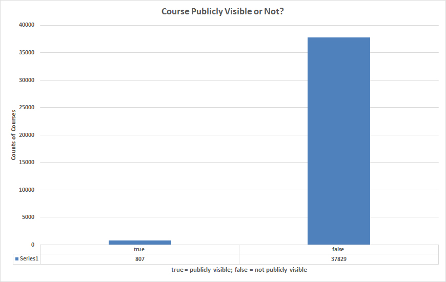
Figure 3: Course Publicly Visible or Not?
The current states of the courses are reflected in their "workflow status." In this case, these states may be as follows: available, claimed, completed, created, or deleted.
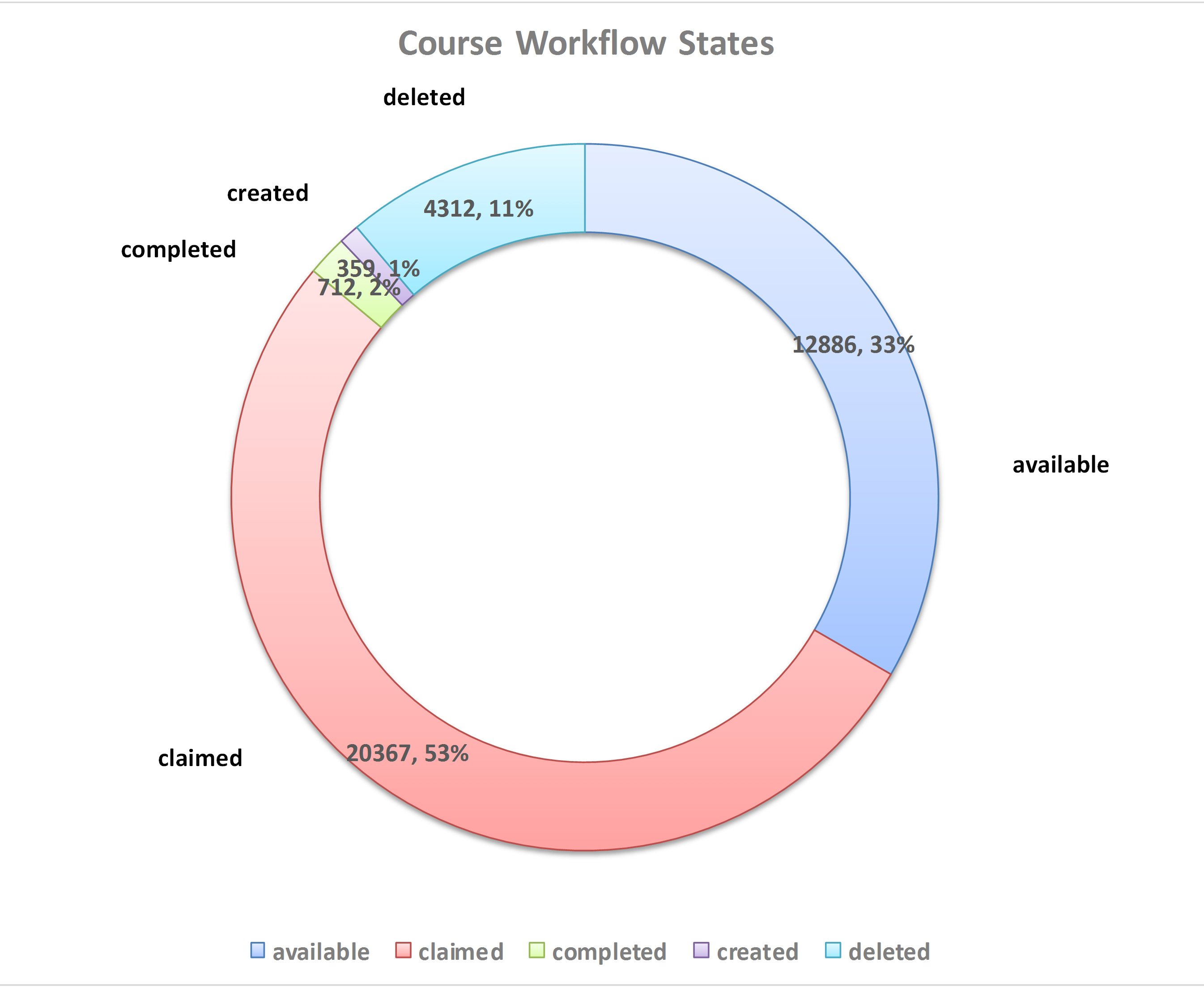
Figure 4: Course Workflow States
2. About Course Sections
The LMS data portal also offers insights about course sections. In this instance, there were 42,576 sections. Start and end dates may be placed on sections, and such dates were available only for 1,115 sections. For some of these, there were start dates but no end dates. For those with both start and end dates, the min-max range was 1 day up to 4,138 days (591 weeks, 11 years), with the oldest section started in 2002 (this may have been a glitch or typo). The length of time for a time-dated section was 182 days (26 weeks or about half a year). Most sections (97%) though did not have start and end dates set but allowed course availability settings and other methods to set availability for the sections.
In their "life cycle," they may be in either one of two states: "active" or "deleted."
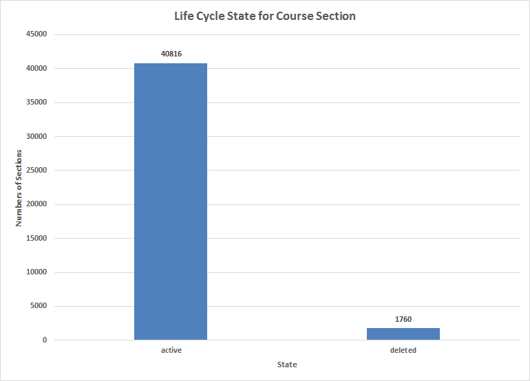
Figure 5: Life Cycle State for Course Sections
Those who build course sections may set specific start and end date limits to access the respective sections. In general, the default setting of non-defined carried the day (40,668), and there were almost equal amounts of restriction section access (1039) vs. non-restricted section access (869).
Figure 6: Date Restriction Accesses for Course Sections
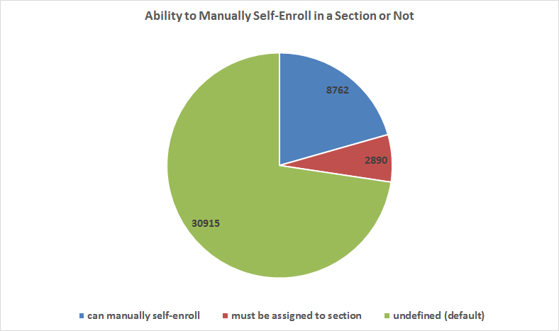
Another type of course section restriction involves the ability for learners to self-enroll in a particular section or not. For example, learners may self-select into a particular parallel learning sequence, based on an area of interest. Assigned sections may be determined by test results or "assigned" learning sequences.
Figure 7: Ability to Manually Self-Enroll in a (Course) Section or Not
3a. About Assignments
For the particular instance, it is possible to explore some macro-level features of the assignments.
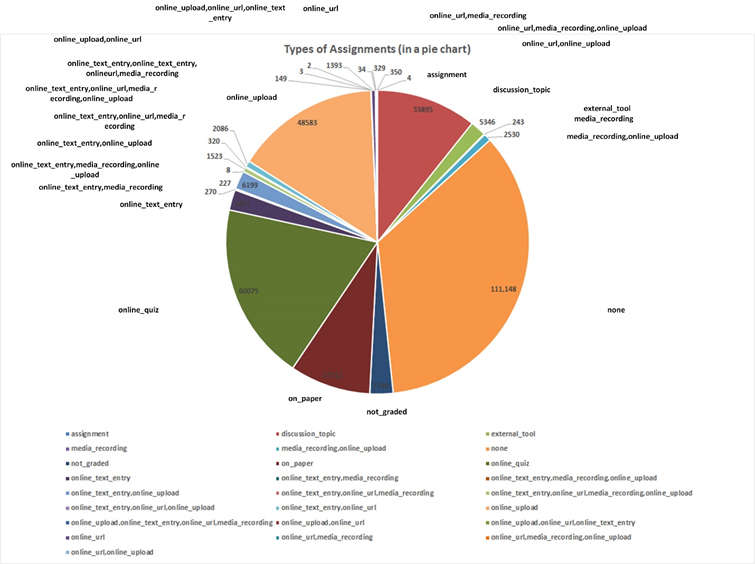
In Figure 8, "Types of Assignments on the LMS," there are some types of assignments found on the LMS.
Figure 8: Types of Assignments on the LMS
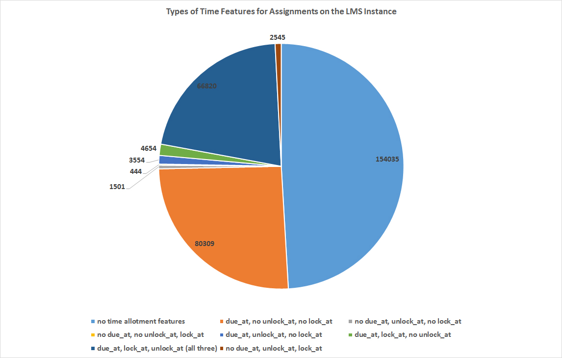
In Figure 9, assignments may be conceptualized based on the time features set on them. One observation of note is that half of assignments have no time features, and half do.
Figure 9: Types of Time Features for Assignments on the LMS Instance
Time features for assignment creation and deployment. There are some additional time features of assignments that may be extracted from the flat files. For example, the average length of time between when an assignment is unlocked as compared to when the assignment is due is 30 days. The minimum amount of time was 1 day, and the maximum was 900-some days. There were some non-sensical numbers based on assignments that were made in 2010 and 2011 that were uploaded into the system with those release days. Some of these outliers likely pulled the average higher. However, the 30 days may indicate assignments that require some level of focused work for students to build up to a work submittal, such as project-based projects (potentially). Also, most faculty will upload an assignment and update the assignments some 30-days out. That seems like good practice to review assignments and to continue to improve them. That said, many set up an assignment early in a term and then only update at the end of the term.
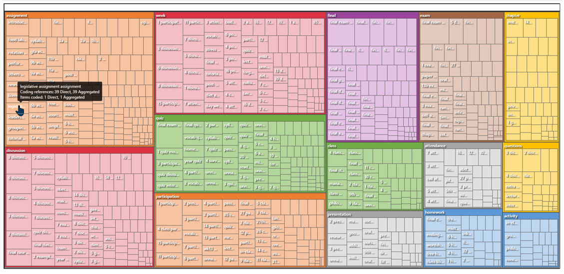
Exploring assignment titles. It is possible to use the listed assignment titles (text data) to see if there are common themes and other insights. "Topic modeling" enables the computational extraction of themes and subthemes, as may be seen in Figure 10.
Figure 10: Theme and Subtheme Extraction from Assignment Titles
Another approach involves the application of computational linguistics to some textual information from the LMS portal. The textual information here comes from assignment titles and the assignment descriptions.
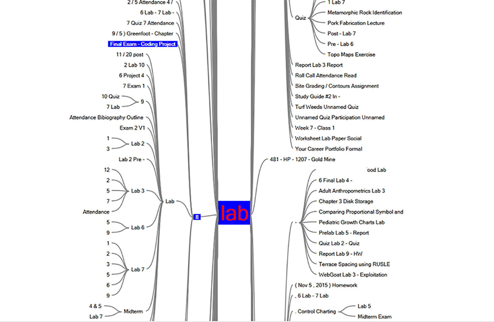
Target words in assignment titles. Using text analysis, data analysts may find key words of interest for further exploration. In Figure 12, there is a screenshot of an interactive word tree seeded with "lab." All assignment titles with "lab" are listed with lead-up words and lead-away words in the respective branches. (Part of this image was redacted to ensure that no personally identifiable information is inadvertently shared.)
Figure 12: Interactive "Lab" Assignment Word Tree for Gist
What is knowable about points for assignments? First, it’s important to separate out the various ways assignments are counted and evaluated. For example, 1,398 assignments are “not graded.” There are 2,031 assignments that are referred to as percentages (but with no clear base values). These prior listings were omitted. The rest are assignments which carry points, without other indicators about how much these affect the final grade. Some are point-bearing assignments which are pass-fail ones. These latter assignments were all evaluated to understand some average assignment values.
So there were 62,105 point-bearing assignments, including pass/fail, letter grades, and just points. Based on these, assignments on average are worth 29.75 points each in the K-State instance with 0s included. Without the 0s included, each point-bearing assignment is worth an average of 33.05 points. For the percentage assignments, the average of the percents were 69.15% with the 0s included and 73% without 0s included. The min-max range was 0 – 100%. The averages were calculated using Excel 2016—the average and averageif functions.
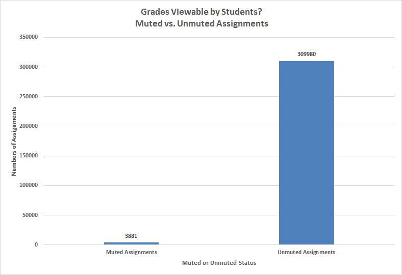
So just how transparent and revelatory were faculty to their respective learners? Did they "mute" or hide the assigned grades from students, or did they "unmute" and share the grades in a confidential way that was viewable by the student? On the whole, only 1% of the assignments were muted (grades were hidden from students on the LMS).
Figure 13: Grades Viewable by Students? Muted vs. Unmuted Assignments
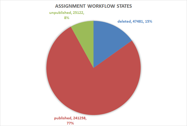
Assignments can be in a variety of states. The default state is "unpublished." Then, assignments may be "published" or "deleted". At this particular slice-in-time, the "workflow" states of the assignments were as follows (Figure 14):
Figure 14: Assignment Workflow States: Unpublished (default), Published, and Deleted
A "time-to-event" (survival) analysis was run on the CreatedAt and UpdatedAt data. All of the 313,861 assignments were updated, with a min-max range of 0 to 1014 days (approximately 2.8 years). The average amount of time between an assignment's creation and its update was 31.5 days (with a low standard error of .102). The median "survival time" of an assignment before it was updated was six days, with a lower bound of 5.9 and an upper bound of 6.09 in the 95% confidence interval. All assignments achieved event, which means all were revised or updated; in this analysis, no events were "censored" (0), and all assignments achieved "event" (1). At the 25th percentile, the assignment updates occurred within 43 days; at the 50th percentile, the assignment updates happened within 6 days; at the 75th percentile, the assignment updates happened very shortly after creation (within seconds). In other words, most assignment updates happened fairly quickly after creation. No assignments "survived" untouched by revision over time. (Assuming an update improved the assignment, this is a net positive.)
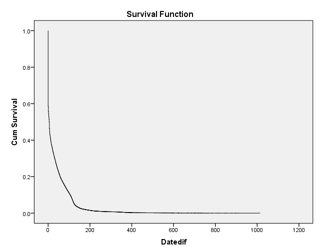
Figure 15: Survival Function of Assignments to Update Event
3b. About Submitted Assignments
Rubric use for grading? What about the use of rubrics for the grading of submitted assignments? There are 2,926,086 records of assignments in the history of this LMS instance. Of these, 2% (46,763) employed rubrics. (Often, assessment rubrics are used when colleges and departments have learning objectives that are defined at higher-than-course levels. The uses of rubrics may be seen as a pseudo-proxy for how far higher-level coordinated learner assessments have advanced in a particular organization using an LMS instance. In some cases, some faculty use rubrics to summarize what they are grading and to provide learners with a sense of what objectives they are trying to achieve with their learning and work.)
Excused submissions vs. regular submissions? Of 2,926,086 regular assignment submissions, only 816 were "excused_submissions." That's 0.000279% of all assignments were excused for the particular learner or learners.
Graded assignments? So of the 2,926,086 submitted assignments on the system, what percentage had received submitted grades? In this count, 66% of submitted assignments in this particular moment in time (October 2016) had received a grade (Figure 16).
Figure 16: Grade Submittal Counts for Completed Assignments
4. About Quizzes
There were 66,366 quizzes in this instance. Quizzes may be used summatively or formatively. They may be used for assessment as well as for learning. In Figure 17, the various quiz types may be seen.
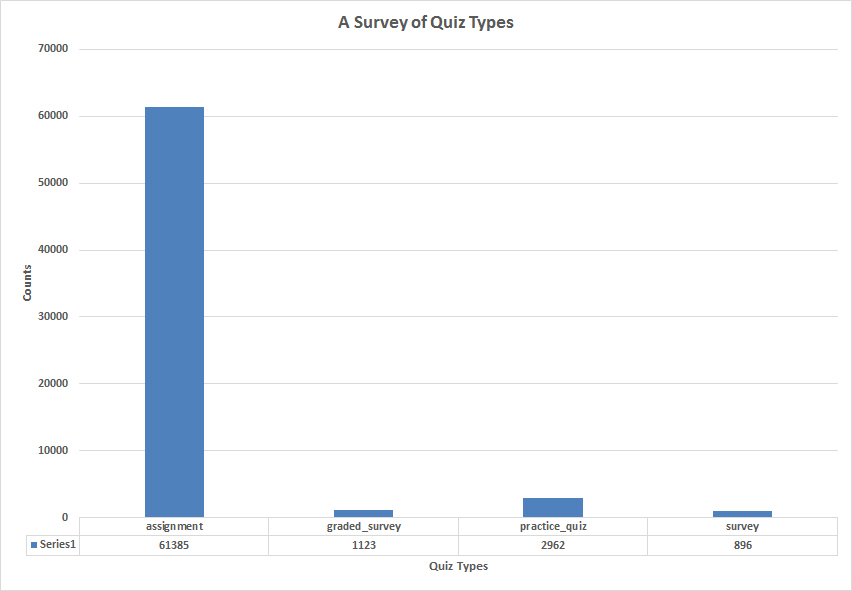
Figure 17: A Survey of Quiz Types
Within the various quizzes are various question types. In this instance, there were 924,391 questions, and the most popular question types were as follows, in descending order: multiple choice question, true-false question, essay question, multiple-answers question, short answer question, and others. More information follows in the visual.
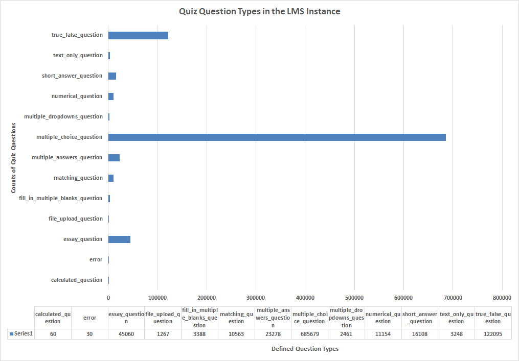
Figure 18: Quiz Question Types in the LMS Instance
There are also "workflow states" for quiz questions, such as whether they are published, deleted, or unpublished (default). Of the 924,391 quiz questions in the records, 195,702 were published, 28,966 deleted, and 699,723 unpublished.
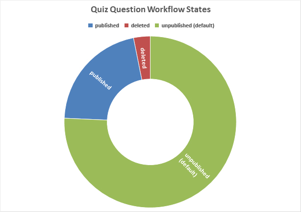
Figure 19: Quiz Question Workflow States
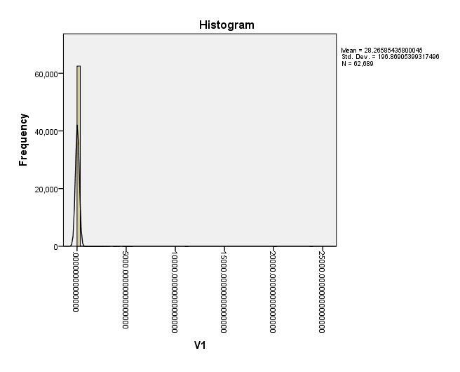
Figure 20 shows quiz point values, with a min-max range of 0 - 23,700 (yes, really). This set actually shows a number of quizzes with point ranges in the thousands. The average value of a quiz was 33 without 0s counted and 28 with zeroes averaged in.
Figure 20: An Inclusive Scatterplot of Quiz Point Values
Another way to view this data is as a histogram with a normal curve overlaid over it (Figure 21). This data visualization gives a sense of how far off "normal" some of the higher point values are for quizzes. V1 (Variable 1) here refers to the respective quiz point values.
Figure 21: Histogram of Quiz Point Values in LMS Instance (with normal curve overlay)
The time element is of interest as well. For example, the timestamp information includes when a quiz was created and when it was deleted (among others). It is possible to do a "time to event" ("survival") analysis of when quizzes actually are at most risk of being deleted. In this dataset, 22% of quizzes were deleted (14,769/66,366). The day range for the quiz deletions ranged from 0 - 813 days. A survival analysis showed that the estimated survival time of quizzes that were deleted were 23.6 days, with a lower bound of 22.7 and an upper bound of 24.4 in the 95% confidence interval; the standard error was .419. The median survival time--of the deleted quizzes--was a low 2 days, which means if a quiz is to be deleted, it usually happens fairly early. The dropoff in the curve below is steep but tapers off after about several months.
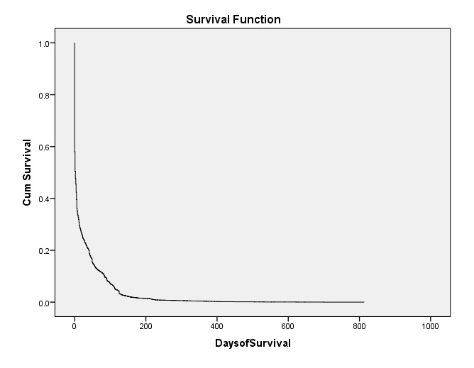
Figure 22: Survival Curve of Deleted Quizzes in the LMS Instance
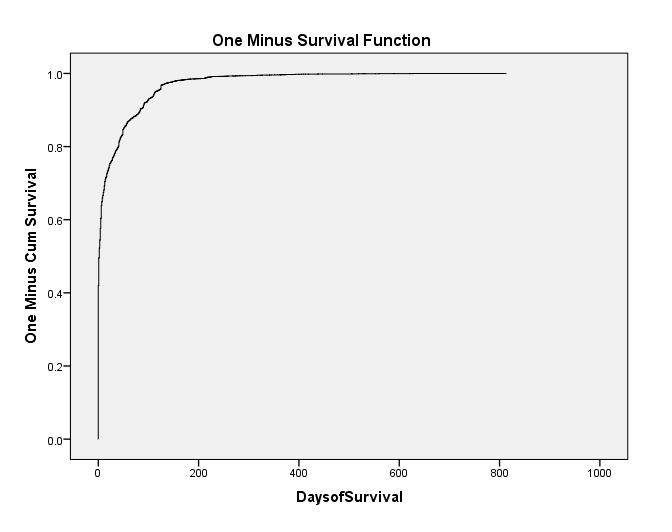
The data may be viewed a different way in Figure 23. This curve is a mirror of the above except that this shows risk. The risk of achieving event (lack of survival, in this case) is very high early on after a quiz has been created. The curve is steep and high early on but tapers off over time. The longer a quiz lasts, the less the likelihood it will be deleted, but the likelihood is never zero.
Figure 23: One Minus Survival Function Curve for Deleted Quizzes in LMS Instance
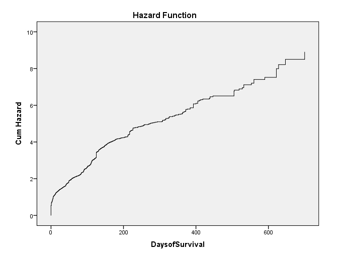
As noted earlier, quizzes once created tend to survive and not achieve "event" at least within the four years (2013 - October 2016) of the collected data. The hazard curve below shows a somewhat gradual rise in risk of deletion over time. This includes observations of "censoring" of the data, which means the quizzes that are started but which have not achieved "event" (deletion, in this case) by the time the observation has completed. Censored data are data that are "lost to observation" either because they survived beyond the period of the research observations or because of some other research-based factors (such as a faculty member leaving the institution of higher education and the quiz going dormant but not being deleted). Also, quizzes can have staying power, and theoretically and practically, they can last "forever." (Sadly, some faculty are using the same contents as they were some 15 years ago, without revision and without update.)
Figure 24: Hazard Curve of Deleted Quizzes in the LMS Instance
5. About Discussion Boards
Discussion boards offer a powerful way to set up asynchronous interactivity based around text, image-sharing, audio-sharing, video-sharing, and other activities.
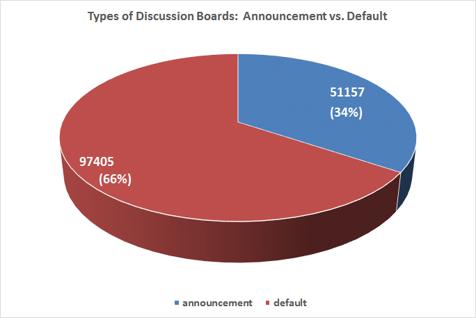
Figure 25 refers to some types of discussion boards, which can either be "announcements" or "default" ones.
Figure 25: Types of Discussion Boards: Announcement vs. Default
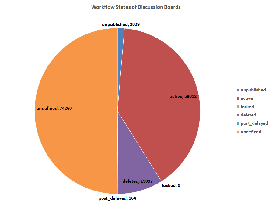
Figure 26 shows the various workflow states of the Discussion Boards. These states may be any of the following: "unpublished," "active," "locked," "deleted," "post_delayed," or null.
Figure 26: Workflow States of the Discussion Boards
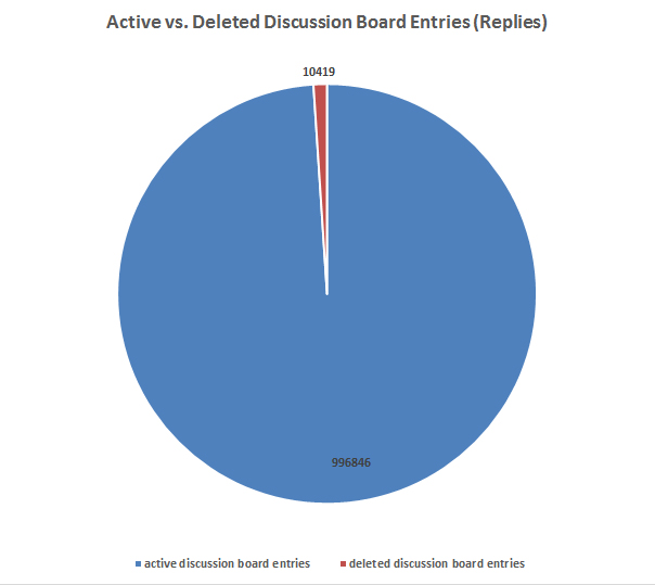
In terms of the entries or replies to discussion boards, a majority are active (vs. deleted). (It is possible that Discussion Boards are set up so that students cannot delete their messages.) This may be seen in Figure 27.
Figure 27: Active vs. Deleted Discussion Board Entries (Replies)
6. About Learner Submitted Files
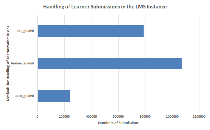
So how are learner-submitted files handled on the LMS? A majority of files uploaded by learners are human-graded (1,070,322). Some 787,398 were not graded. And 239,430 were auto-graded, in this particular LMS instance. (Figure 28)
Figure 28: Handling of Learner Submissions in the LMS Instance
Observed sentiments in submission comments (text format). So what sorts of comments are shared about these submissions? In this LMS instance, 872,427 comments were shared. When these text-based (vs. multimedia) comments were run through computational sentiment analysis, the sentiments were overwhelmingly positive (91.36 Tone percentile score in LIWC2015), and as "posemo" (positive emotion) score of 4.90 vs. a "negemo" (negative emotion) score of 0.87 (the latter two as percentages of text amounts coded to the respective emotions, with the other text considered non-emotional or neutral). A brief perusal of the comments shows some a lot of encouragement combined with directives and critiques. This same analysis, applied to 10% of the textual data, was tried in a different analytical tool, which failed to identify any sentiment at all.
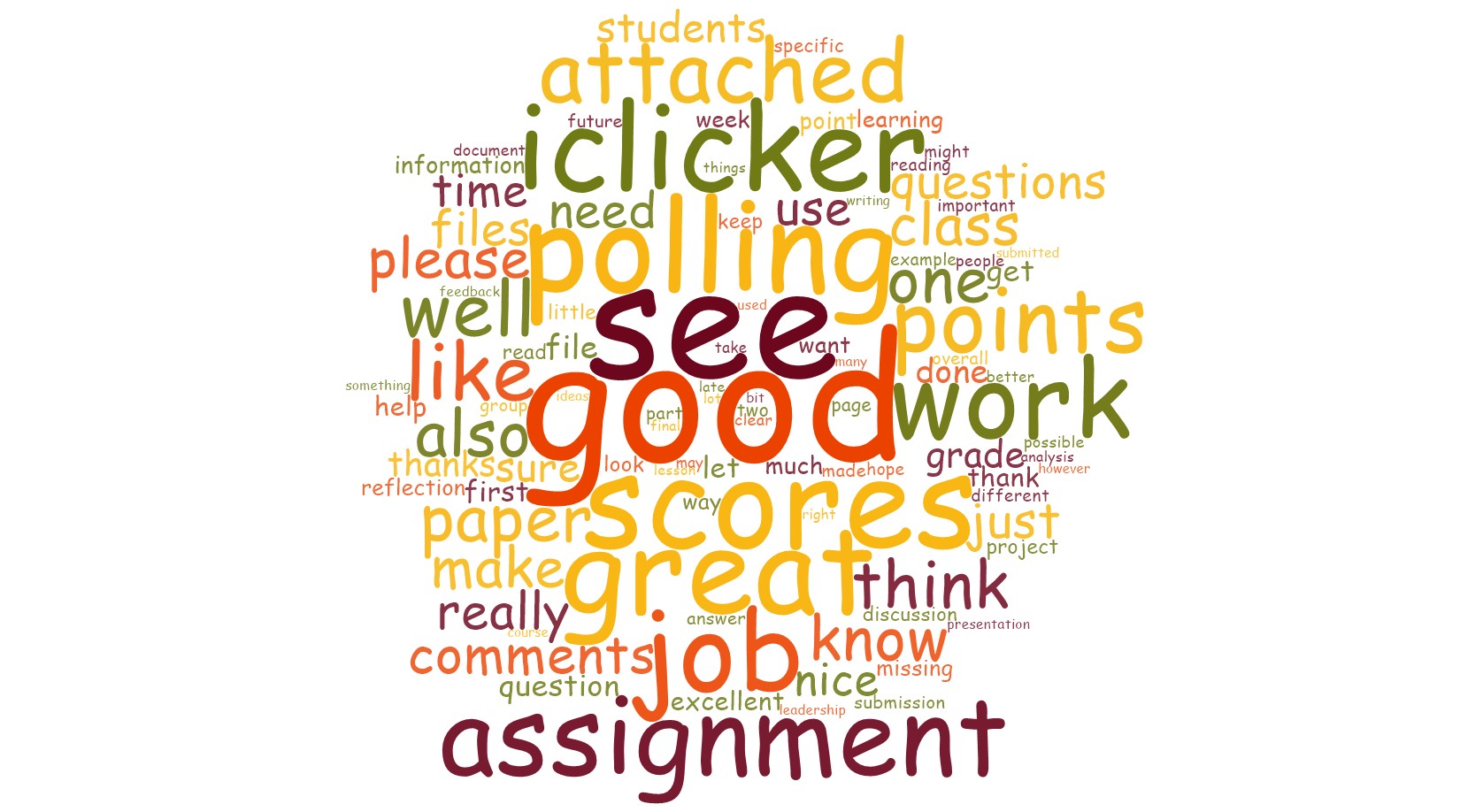
Figure 29: Some Common Words from Comments Made on Submissions
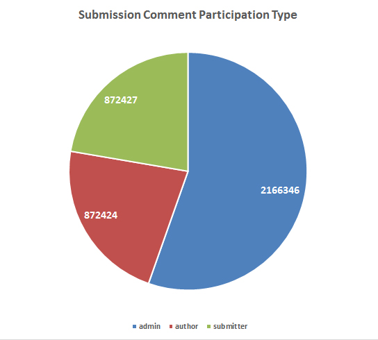
Also, it is possible to see who submitted comments linked to file submissions: admin, author, or submitter. In this particular system, there were 3,911,087 rows of data in this set. The close count between "author" (872,424) and "submitter" (872,427) suggests that those who submit work do so with accompanying commentary, and the "admin" (2,166,236) are the faculty commenting on the work. Submissions are not generally public to peer learners (unless public discussion boards are used for file submittal and commenting, but that data would not be seen in this particular flat file).
Figure 30: Submission Comment Participation Type
7. About Uploaded Files
Uploaded files are used to add course documents, images, slideshows, readings, and multimedia to an online course. These are files which may or may not be downloaded by learners, based on instructor settings in the LMS. (Simulated and virtual world experiences are usually added via inline frames or iFrames, not files...unless the simulations are simple agent-based modeling ones or other simple types.) In the history of this LMS instance, there has been a clear upward trajectory of file uploads. For 2016, the bar only shows file uploads and revisions through mid-October 2016.
Figure 31: Uploads and Revisions of Files to the LMS Instance by Year
In Figure 32, there are some types of uploaded files in the LMS.
Figure 32: Observed Uploaded File Types in the LMS
In Figure 33, "Word Cloud of File Contents," there is a word cloud of words, years, and numbers describing uploaded file contents.
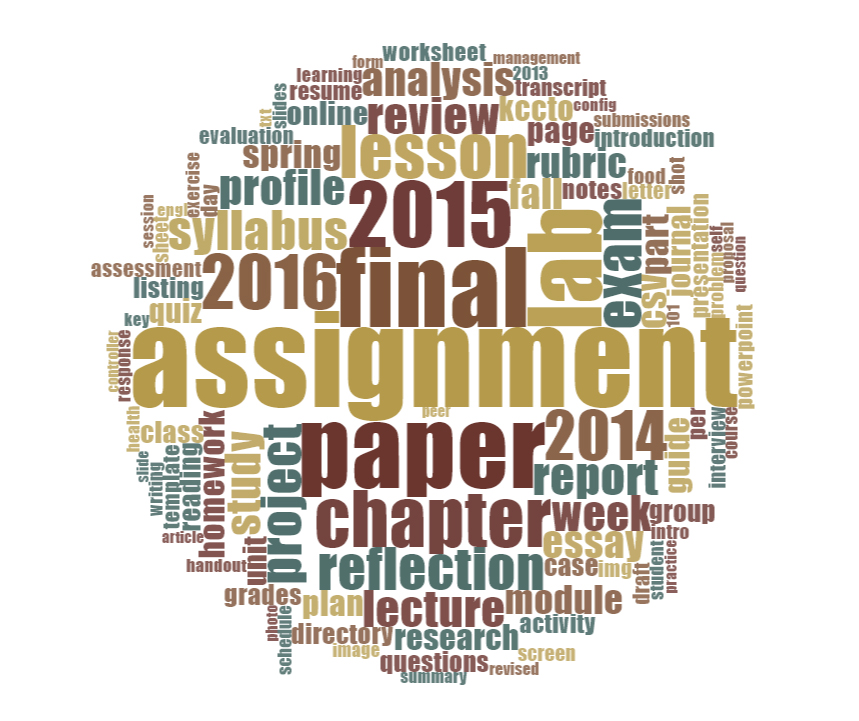
Figure 33: Word Cloud of File Contents
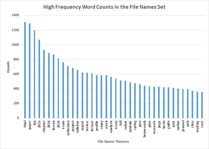
Another version of the same information follows in Figure 34.
Figure 34: High Frequency Word Counts in the File Names Set
Ideally, analysts should have access to the uploaded files themselves--in all the various multimedia formats--for analysis. In this context, only the related textual information may be analyzed, as proxy data. (If all files were made accessible to administrators, though, there would be even more privacy concerns than exist with the current available information. It is unclear how much expectation of privacy learners may have with their shared work in a password-protected course. That said, LMSes are also used for hiring, tenure and promotion, policy discussions, and other uses, so those uses should be considered as well. In higher education, the tendency is towards protection of information and abiding by all laws and policies.)
8. About the Wikis and Wiki Pages
On this LMS instance, there were 47,512 parent wikis and 111,774 pages. There are several ways to understand wiki pages. One is that the "wiki" reference is apparently in reference to some wiki technology understructure which enables pages to be versioned. There is a record of every iteration of a page, and it is possible to return to an earlier version of a wiki page. Such pages may be interconnected through linkage. They may be used in module sequences. They may be used as the home page of a course.
There are two "parent types" for wiki pages, such as whether they are at course level or group level. (Figure 35)
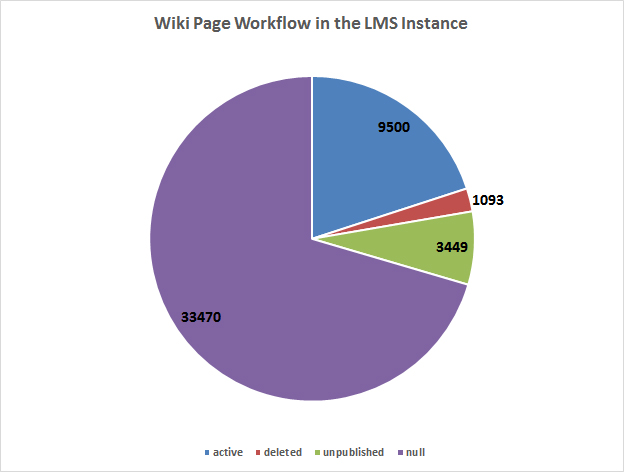
Another approach is to see what the various states of the wiki pages are. The wiki pages may be "active," "deleted," "unpublished," or "null." (Figure 36)
Figure 36: Wiki Page Workflow States
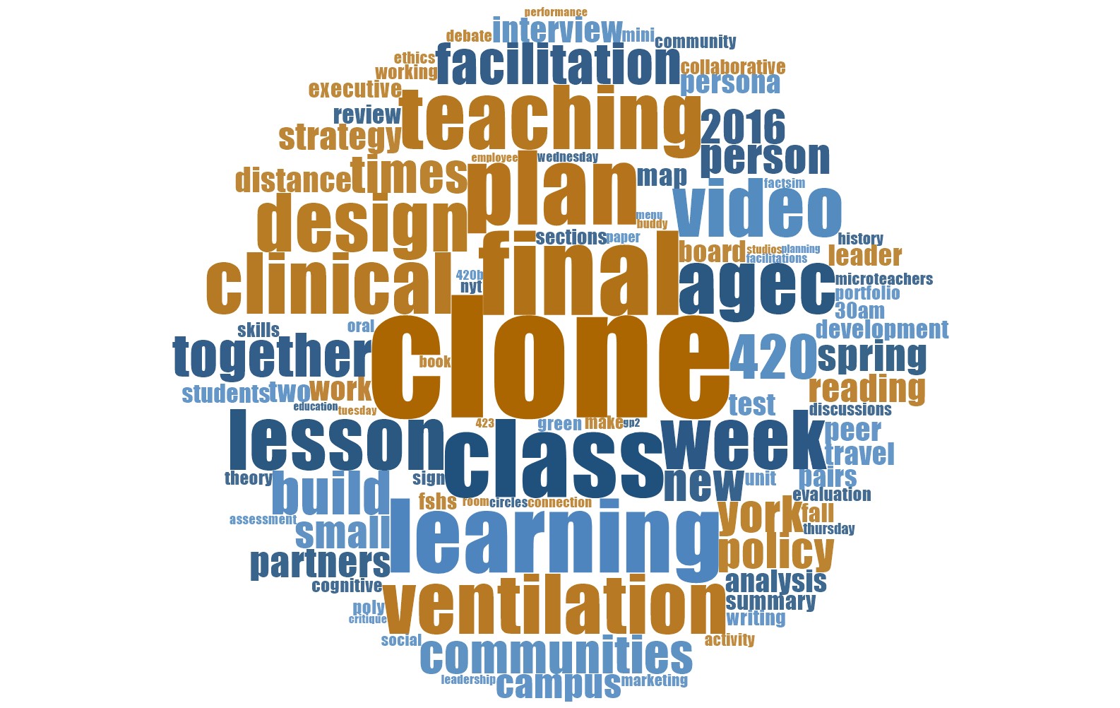
Also, it is possible to capture a sense of the words used in the wiki titles. (Figure 37)
Figure 37: Word Frequency Word Cloud from Wiki Page Titles
For Figure 37 (above), three words were added to the stopwords list: "wiki," "group," and "top". Omitting some of the more frequent terms which are not particularly informative enables those with clearer topical and semantic meaning to be represented in the word cloud.
9. About Enrollment Role Types
User roles in the system are set up as "role names" (for user views) linked to underlying "base role types" (for technological functionalities). A base role is comprised of varying levels of role-based access (with ideally "least privilege" for security). In this system, there are eight general roles (Table 2). One role was created in 2013, five roles in 2014, one in 2015, and one in 2016. In terms of role updates, only one was updated ("Grader" name with the "TAEnrollment" base role), 232 days after its initial creation in 2013. How different LMS instances name and instantiate roles, of course, can vary broadly.
| Role Name | Base Role Type |
|---|---|
| Librarian | TAEnrollment |
| StudentEnrollment | StudentEnrollment |
| TeacherEnrollment | TeacherEnrollment |
| TAEnrollment | TAEnrollment |
| DesignerEnrollment | DesignerEnrollment |
| ObserverEnrollment | ObserverEnrollment |
| Grader | TAEnrollment |
| GradeObserver | TAEnrollment |
Table 1: Role Names and Base Role Types
In terms of role workflow states, three were "active" (Librarian, Grader, and Grade Observer), and five were "built in" (StudentEnrollment, TeacherEnrollment, TAEnrollment, DesignerEnrollment, and ObserverEnrollment).
It is also possible to see the frequencies of enrollment roles (that users have) on the LMS instance (Figure 38). The teacher, student, TA (teaching assistant), and designer roles are staples in an LMS. The observer roles are for course visitors. The "student view" role enables a teacher, TA, or instructional designer to see what an actual student would see of the course, given the student role. The admin role does not seem to be captured in the flat file data from which this following data visualization was captured.
Figure 38: Frequencies of Enrollment Roles in the LMS Instance
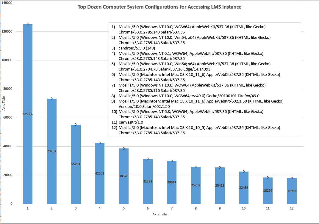
The various technological setups of the respective user systems--their operating systems, their web browsers, and their devices--may also be captured. In this recordset, there were 1,045,807 different touches to the system (including from robots and spiders). There were 1706 different unique configurations. The frequency range of these configurations was from 1 - 125,066 different frequencies of configurations. This information might be relevant for instructional designers building digital learning objects in an accessible way for a variety of devices and web browsers.
Figure 39: Top Dozen Computer System Configurations for Accessing LMS Instance
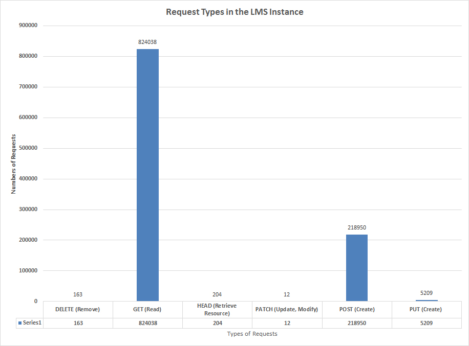
When people's systems access the LMS instance, what are their request types? Figure 40 shows "Request Types in the LMS Instance."
10. About Groups
Groups may also be explored. One approach involves taking the names of groups and running these through a word frequency count. Then, common terms that may be less informative are removed. In this case, all the following (including plural versions) were removed in the stopwords list: group, team, lab, discussion, presentation, assignment, project, section, class, work group (and workgroup), exam, study, student, homework, semester, and so on. The following then is the resulting word frequency word cloud.
A perusal of the names did identify various uses of the groups...for collaborative projects, presentations, research, writing, video-making, experiments, field trips, designs, test preparation, lab work, brochure development, song-writing, studio, and other work.
One aspect of users in groups is whether the users are added in as moderators. As it turns out, only a very small percent (0.4%) are. This may be seen in Figure 42.
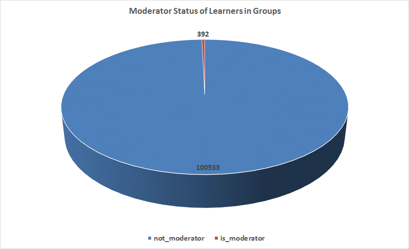
Figure 42: Moderator Status of Users in Groups
It is also possible to explore the learners' membership statuses in the group. In this LMS instance, a majority of the group invitations were accepted, and none were in the "invited" or "requested" states. This is a strong record, to have 100% acceptance of group invitations. Of the 100,925 individuals in groups, there were 22,483 group membership deletions (Figure 43).
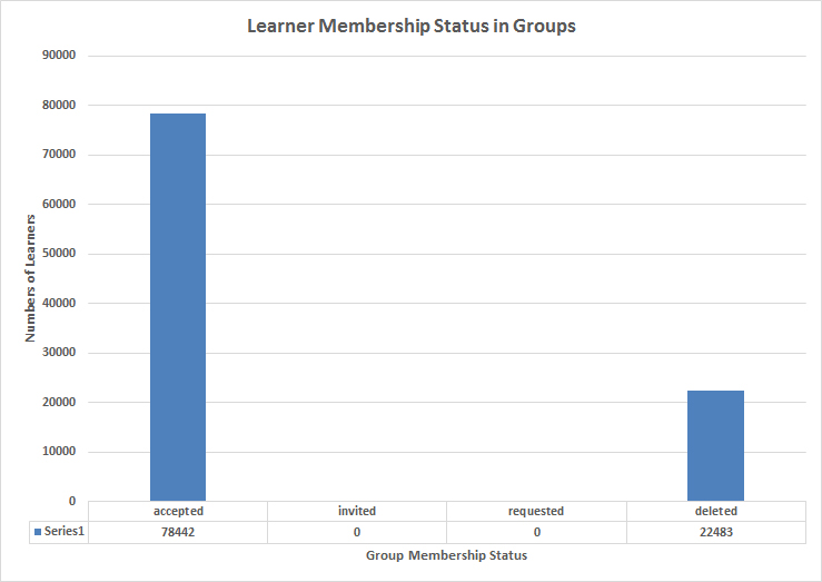
Figure 43: Learner Membership Status in Groups
11. About Users and Workflow States
There are various columns of data about users. In this instance, there were 100,323 individuals cumulatively mentioned during the lifespan of this instance (covering several years). One involves workflow states, which include the following (in alphabetical order): creation_pending, deleted, pre_registered, and registered.
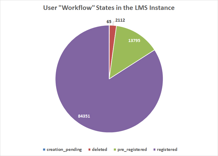
Figure 44: User "Workflow" States in the LMS Instance
Of these users, 35% (35,041/100,323) had a mentioned main time zone (which can be linked to a physical geography). (Table 2)
| Alaska | 3 | |
|---|---|---|
| Arizona | 7 | |
| Asuncion | 1 | |
| Auckland | 1 | |
| Baghdad | 1 | |
| Bangkok | 1 | |
| Beijing | 1 | |
| Bogota | 1 | |
| Brasilia | 2 | |
| Bucharest | 1 | |
| Central America | 1 | |
| Central Time (US & Canada) | 34765 | |
| Copenhagen | 1 | |
| Eastern Time (US & Canada) | 130 | |
| Harare | 1 | |
| Hawaii | 3 | |
| Indiana (East) | 2 | |
| Islamabad | 1 | |
| Jerusalem | 1 | |
| La Paz | 1 | |
| London | 1 | |
| Mid-Atlantic | 1 | |
| Moscow | 1 | |
| Mountain Time (US & Canada) | 59 | |
| Nairobi | 1 | |
| Pacific Time (US & Canada) | 46 | |
| Paris | 1 | |
| Rome | 3 | |
| Seoul | 2 | |
| Tokyo | 1 | |
Table 2: Main Time Zones of Users
It may be useful to understand when particular accounts were created. In this case, a majority of the accounts originated in 2014. Early accounts in 2013 were created as part of an apparent trial run.
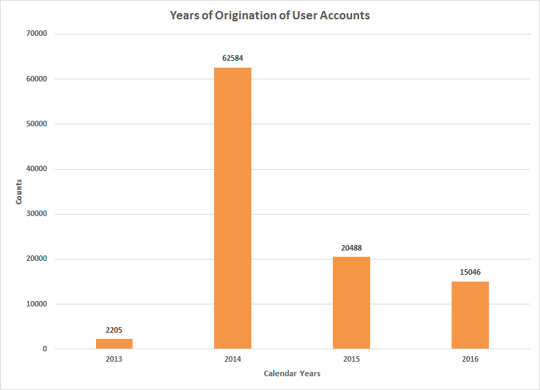
Figure 45: Years of Origination of User Accounts
Included in this listing were some faux student accounts.
Further released files (in May 2017) included some on "Pseudonyms." These are defined as "logins associated with users" in the data dictionary. This data table serves as a juncture between the LMS and the campus information systems. In this instance, 97% of the accounts were active, and 3% were deleted.
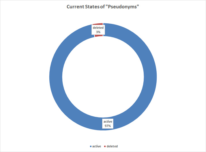
Figure 46: Current States of "Pseudonyms"
The following bar chart shows the years of created pseudonyms. The information only covers up to a few accounts in 2016.
Figure 47: Created Pseudonyms in the Canvas LMS Instance (by Year)
12. About Course Level Grades (based on Enrollments)
It is possible to evaluate both "computed_current_score" and "computed_final_score," both of which are reported out as percentages (including negative numbers). This data was captured in two related datasets, but there may have been some overlapping information because of the amount of garble in the resulting data (which was combined to run the analyses). What were some of the challenges with the datasets? First, there were 807,271 records (without indicators of overlap or how the overlap was handled in the original database). Of these, 334,246 had both related columns as null (so no scores). There were 55,498 with combinations of 0s and \N (null, also newline indicators) or both sides as 0s. Three hundred and eleven had no current scores but only completed scores. There were 417,496 column pairs with scores in both the "computed current score" column and the "computed final score" one. What was the difference between the initial grade and the final one? There seemed to be a 13% difference between the initial grade and the final one after five garble scores were removed. Without access to more data--who are the learners, which are the courses, when did the grades occur--and without more data cleaning, this section is a bit of a mess.
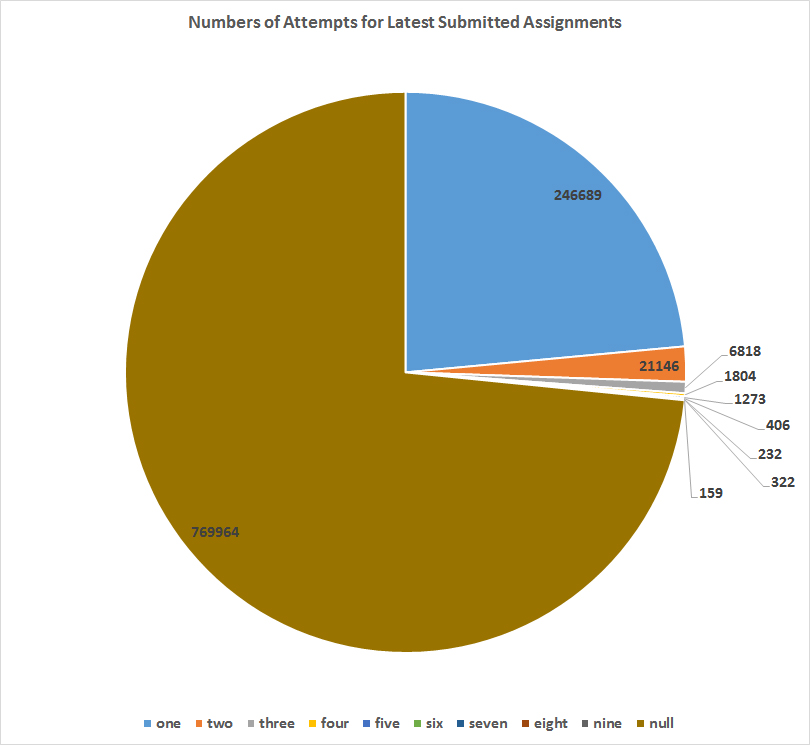
In terms of submitted assignments, approximately a fourth of recently submitted assignments enabled learners to engage in multiple attempts to achieve the work. Where this option was available, the numbers of tries ranged from 1 - 9, with a majority of learners submitting work once (246,689) and the next largest group submitting twice (21,146) and three times (6,818). Those who submitted work 4, 5,...9 times all did so in very relatively small numbers. (Figure 48)
Figure 48: Numbers of Attempts for Latest Submitted Assignments
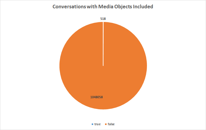
13. About Conversations (Emails)
"Conversations" are "emails" inside this particular LMS. In this system, by October 2016, some 1,520,199 conversations had been exchanged. Of these, only 1,048,058 records (69% of the full set) could be easily exported into Excel. (There was a "file sharing lock count exceeded" error message in MS Access, and the SQL server had a full set imported, but the author was not sufficiently confident to run analytics there yet.) What was found about conversations is that only 0.00049424745 of the exchanged messages had a media file attachment.
Figure 49: Conversations with Media Objects Included
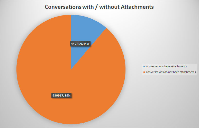
It is also possible to examine conversations with attachments. "Media objects" would include audio and video. Attachments may be text files, images, PowerPoint slideshows, and other such objects. According to Figure 50, extracted from the 69% set above, some 11% of shared conversations included attached files.
Figure 50: Conversations with / without Attachments
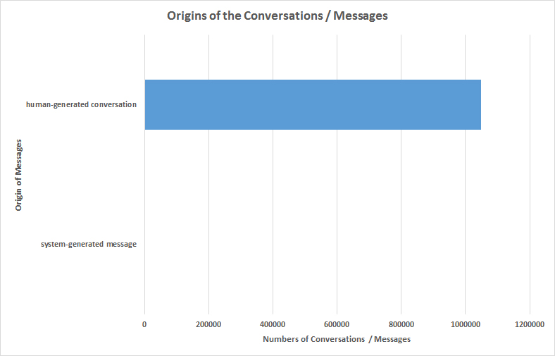
It is possible to see whether a conversation was system-generated (in an automated way) or whether it was human generated. Three were identified as system-generated, and 1,048,573 were human-generated. It's unclear why this shows so few system-generated messages, unless maybe this feature was run initially and then maybe disabled? (This is pure speculation.)
Figure 51: Origins of the Conversations / Messages
A set of 482,339 conversation messages was extracted, and two-thirds of these were analyzed for textual contents. A simple summary would suggest that most of the common conversations are about academic issues. It is possible to analyze the "long tail" of the word frequency counts to see rare "outlier" types of topics.
Figure 52: Conversation Messages Word Frequency Count
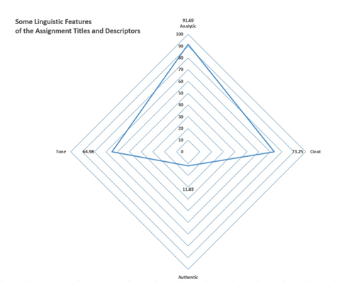
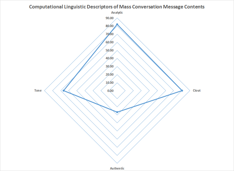
In the next textual analysis, all 482,339 conversation messages were analyzed. According to the computational tool used for the linguistic analysis, the texts were comprised of 60,509,894 words. In general, the email messaging showed high analytic features (82.33 percentile), high clout (80.21 percentile), low social warmth (Authentic score of 26.41), and a generally positive emotional tone (66.24). In general, some 70% of the words in this set were found in the linguistic analysis tool dictionary (normed against millions of words of various types of natural language expressions). There were 25.38 average words per sentence, which suggests fairly complex sentence structures. In the "posemo" (positive emotion) and "negemo" (negative emotion) measures, the first ranked 2.74, and the latter 0.60, so the tendency was for positive expressions. [In a different analytical tool, 112,215 of the messages were analyzed, and that software tool suggested that the text was mostly neutral, with no sentiment identified. A smaller set was later run with actual sentiment extracted. See Figure 55.] In terms of references to females (0.08) vs. males (0.11), males were referred to slightly more often. In terms of time references, the main focus seemed to be on the present ("focuspres" at 8.71), followed by focus on the future ("focusfuture" at 2.03) and then focus on the past ("focuspast" at 1.78).
Figure 53: Computational Linguistic Descriptors of Mass Conversation Message Contents
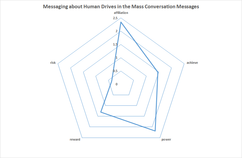
Another angle involved exploring the expressions of "human drives" in the exchanged messages, with the intuition that the communications may involve learner motivations. In this set, the main focuses were on the following, in descending order: affiliation (2.35), power (2.19), achievement (1.46), reward (1.3), and risk (0.37). The focus on affiliation and social identity seems reasonable, given the typical college age of learners. The "power" language may come from faculty speaking from positions of authority. The low level of focus on risk is intriguing here (maybe young learners are not thought to have developed the efficacy and confidence to take on uncontrolled risks?). Clearly, there is a role for theorizing and interpretation, even with computation-based analytics.
Figure 54: Messaging about Human Drives in the Mass Conversation Messages
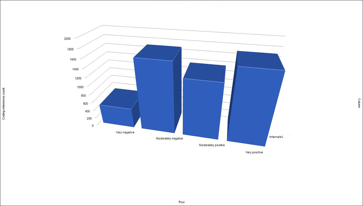
A smaller sample of the conversation messages were analyzed for sentiment. This set consisted of 72,377 messages. The automated observations of sentiment showed that there were two tendencies...either very positive or moderately negative (in terms of text categories). In this software tool, it is possible to explore which texts were categorized to which categories of sentiment (very negative, moderately negative, moderately positive, or very positive) in the comparisons between the target text and the built-in sentiment dictionary.
Figure 55: Sentiment Analysis of Sample of Conversation Messaging
With the smaller text sets, it was also possible to auto-extract some themes and to show these in a hierarchy chart. This sort of "topic modeling" enables closer extractions of themes instead of just a word frequency count.
Figure 56: Auto-Extracted Theme Based Hierarchy Chart of Conversation Messaging Sample (as a Treemap)
The same auto-extracted themes may be viewed as a pie chart, which captures the top-level themes.
Figure 57: Auto-Extracted Top-Level Theme Based Pie Chart from Conversation Messaging Sample
And, the same information may also be visualized in an interactive sunburst diagram.
Figure 58: Auto-Coded Theme-Based Hierarchy Chart of Topics and Subtopics from Conversation Messaging Sample (in a Sunburst diagram)
A "close read" perusal of some of the messages showed a lot of respectful language in approaching professors and learners, with polite language uses. Also, "help" was a common recurring theme.
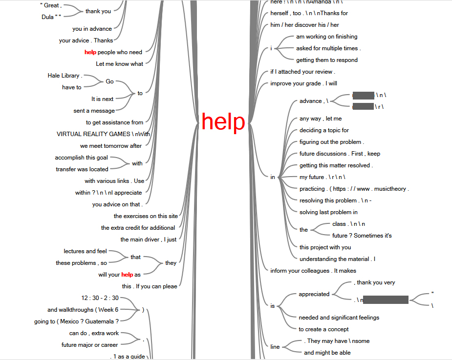
Figure 59: "Help" as a Common Theme in Conversations (Word Tree)
A sample of the text messages (121,727 words, 8,514 sentences) were run through an online utility for Document Readability. This found a Gunning Fog index of 10.88 (or almost 11 years of required formal education to understand the conversations with ease). The Coleman Liau index was 10.67, the Flesch Kincaid Grade level at 8.56, the Automated Readability Index or "ARI" at 8.56, and the SMOG reading level at 10.81. The total Flesch Reading Ease was 59.16 (with high readability at about 100). This online tool is Online-Utility.org and is made available by Mladen Adamovic.
14. About Third-Party External Tool Activations on the LMS Instance
Learning Tools Interoperability (LTI), a standard by the IMS Global Learning Consortium, enables a variety of tools to be integrated, such as with a learning management system. The next figure shows the numbers of external tool activations on the LMS instance from 2013 - 2016 (Figure 60).
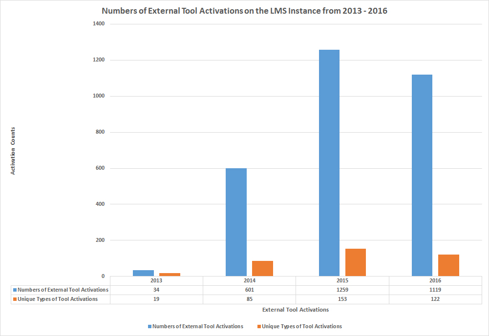
Figure 60: Numbers of External Tool Activations on the LMS Instance from 2013 - 2016
The next figure shows, in descending order, the types of specific third-party tools activated in this LMS instance, including: YouTube, TED Ed, Dropbox, Vimeo, Quizlet, MyOMLab, Khan Academy, Twitter, Flat World Knowledge, SlideShare, Yellowdig, MyLab and Mastering, SoftChalk Cloud, educreations, Funbrain, Code Embed, Wikipedia, USA Today, Mediasite, SchoolTube, Flickr Search, and others (Figure 61).
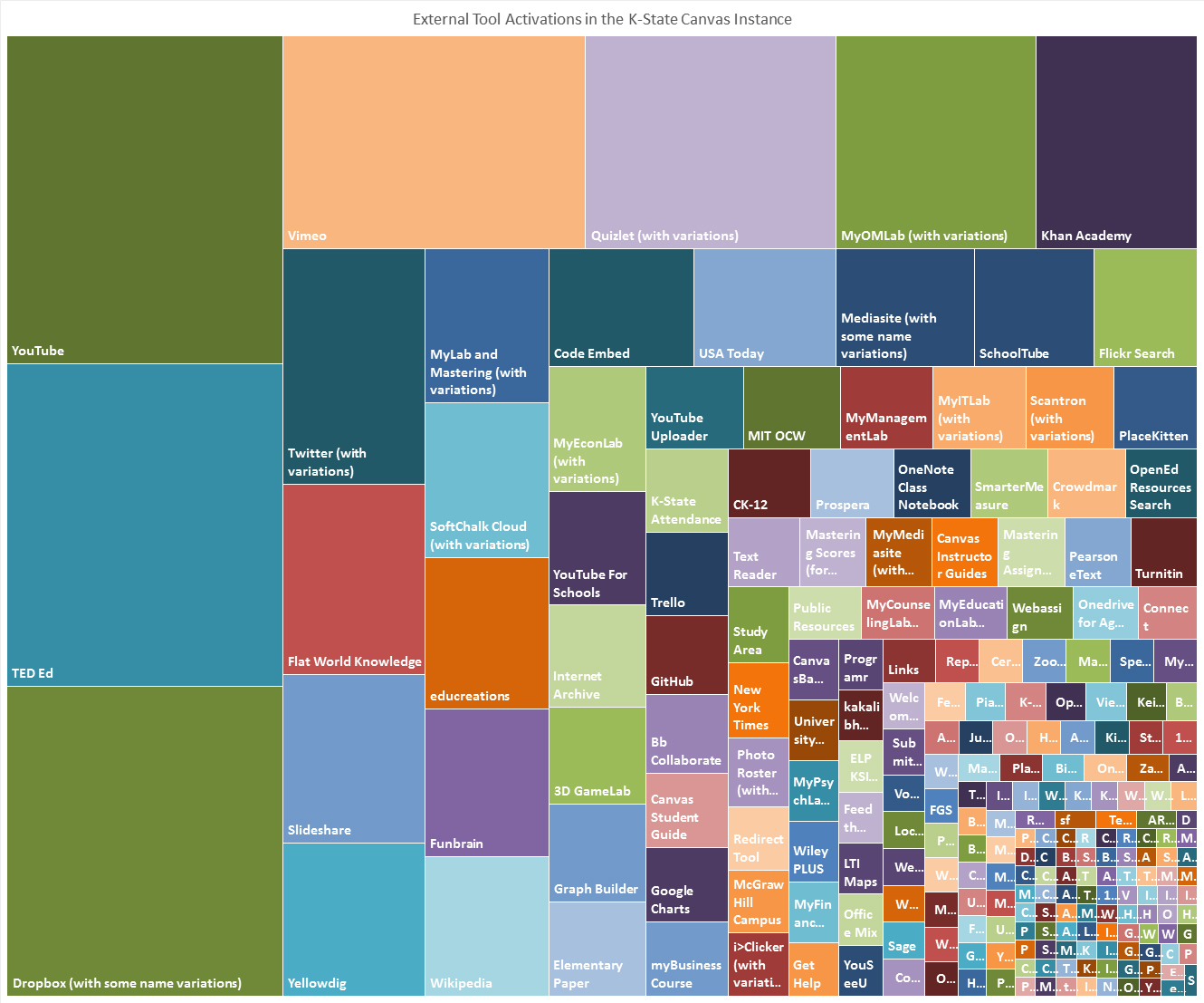
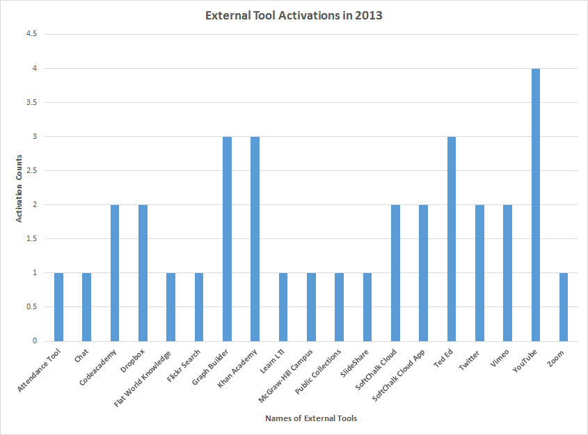
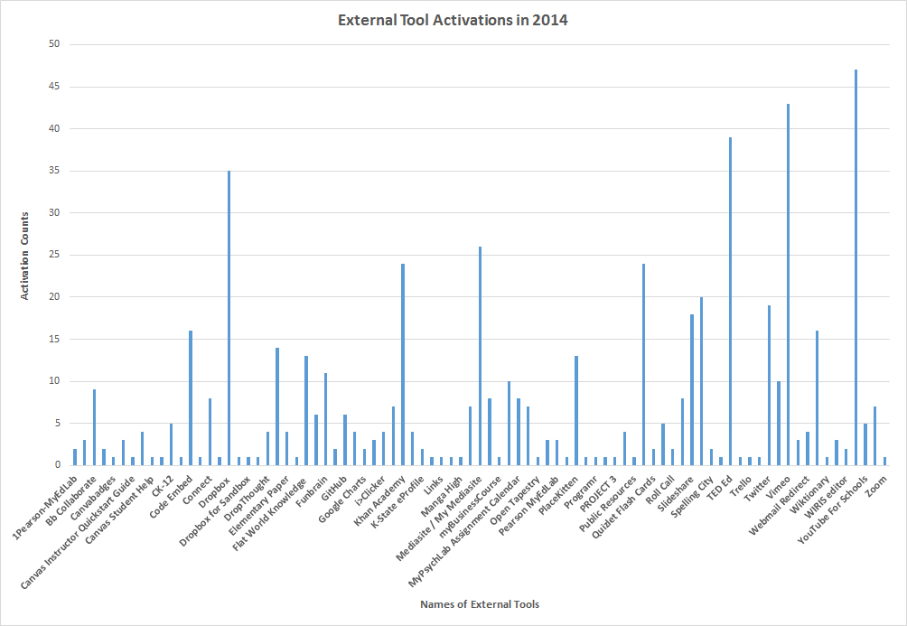
It is helpful to drill down into the respective activations for the years of the LMS instance. This may be seen in Figures 62 - 65.
Figure 62: External Tool Activations in 2013
Figure 63: External Tool Activations in 2014
Figure 64: External Tool Activations in 2015
Figure 65: External Tool Activations in 2016
Each of the earlier activations are assumed to be continuing, at least in a latent state. Activated third-party tools may be deleted, and that information may be elsewhere in the flat files.
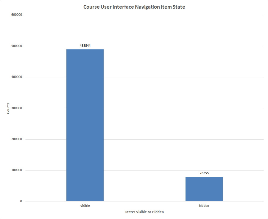
15. About Course User Interface (UI) Navigation Item States
Course user interface (UI) navigation items may refer to the left menu navigation within courses as well as other types of within-course navigation. In the left menu, these refer to buttons which enable access to various parts of the course: Discussions, Grades, Assignments, Pages, Files, Conferences, People, Attendance, and more customized elements like third-party video hosting tools and customized URLs and teacher evaluation tools. In this LMS instance, there were 567,099 such items, with 488,844 visible and 78,255 hidden. (In terms of UI item types, they are a limited number to maybe a few dozen, but each course has a number of such UI items.) This could suggest that the administrators over the system selected useful functions for the LMS. And / or these numbers could mean that the default selections are left visible whether or not all functionalities are used in a course.
Figure 66: Course User Interface Navigation Item States
Some Early Lessons Learned
Data visualizations. Data visualizations are critical elements in the analytics because they capture data patterns in ways that the human mind processes well. Data visualizations are part of the analytics first before they are finalized for data delivery to clients.
Sanity checking. A "sanity check" refers to a test of a computational result against reality to see how likely the outcome is to be true and "rational." It can be easy to immerse so much into data that one doesn't think to check for rationality until the process is several steps in and a lot of effort has been put into data visualizations and such--which turns out to be wasted effort. It helps to put in some natural pauses in processes to step back and evaluate the progress...and to check the sanity of the outputs. Data insights should be accurate to the underlying data and to the world. Is what is apparently happening what is actually happening? Has data somehow been lost or added along the way (accidentally)? Does the data capture the real world? It is important to "eyeball" stuff. Big data is eminently human readable, and it should be treated as such.
What are some examples of d'oh moments for me?
- Double counting. When running counts for particular data, don't mistake a count of the early text to accurately represent all the variety that that early text might suggest. For example, an automated count of "Mozilla/5.0 (Macintosh; Intel Mac OS X 10_9_5) AppleWebKit/601.7.8 (KHTML, like Gecko)" will also capture the following "Mozilla/5.0 (Macintosh; Intel Mac OS X 10_9_5) AppleWebKit/601.7.8 (KHTML, like Gecko) Version/9.1.3 Safari/537.86.7." To stop this from happening, one has to paint the cell of juncture when a filtered listing changes, so if a count returns "1974" instead of "11," one can see that in the Excel table and avoid a massive overcount. Automated counts do not apply in every situation.
- Typing incorrectly. Another example is when I type in numbers to record data. It is always important to watch closely while one types to avoid any mistaken typing.
- Ignoring error messages. Also, early on, I ignored error messages. I'd think, "There goes another same error message..." and not notice that a full N of all was not being exported. Error messages are there for a reason. They should be attended to.
- Blitzing through the work soup-to-nuts when I should have stopped at the soup. Early on, I would blitz through a process and come out with a lovely data visualization at the end without realizing that I'd not been sufficiently cautious in an earlier process. The speed of automation should mean slower human work and more efforts at checking work, so there is clarity and attentiveness at every step. What saves a person from this error is the willingness to go back and re-do work...and learn more along the way. Another way to slow down is to document the work at every step in precise detail, so one is forced to decelerate and pay attention.
- Going to Excel. Excel2016 is a great bridge tool to databases, but the affordances of databases (even Microsoft Access) are many... If the count is below the row limit on Excel 1.05 million rows of data, then Excel works wonderfully. However, if the number is higher, then it's critical to stay with Access to run the numbers and queries. The learning curve is actually fairly low for Access...at least in terms of transitioning from Excel. People say that "go to's" can be dangerous especially if they're unthinking go-to's. Indeed, this is one for me and a habit I intend to break.
- Too much trust in the official data dictionary. Also, initially, I put a lot of focus on the data dictionary to explain the data but realized that the data dictionary was not complete in some of its descriptions. (Or the LMS instance I am looking at has more features than was described in the data dictionary.) Some former variables have since been deprecated and are no longer available in the LMS data portal. It seems wise to look closely at the data and the data dictionary together to sort out what is actually in the data portal.
- Nuances in the data. Also, there are nuances to the data. For example, an assignment may be designed one way, but it may not be deployed. Or there may be assignment information for submitted assignments vs. those not submitted. When there are a lot of numbers flying around, it is important to be as specific and precise as possible.
- Losing multilingual understandings. With textual information, processed in UTF-8 charsets, the LMS data portal has the capability to portray hundreds of languages--to wit, any language expressible on the Web. That said, this textual data is not fully exploited because the analyses run on the text are based on English as the base language. (Other base languages may be set, but the outcomes report out in those languages.)
- Not understanding trade-offs with automation. There are a lot of benefits to using automation...like automatic calculations of basic descriptive statistics...but these should always be checked against the actual data. Also, there's a real benefit to "close reading" some of the data for more accurate and applied understandings.
- Not digging further. Sometimes, I will only go where the software takes me. I'll do a frequency count and not check for the "long tail." It makes sense to look at every possible datapoint for use. While "heuristics" may help in processes, they can be risky in that people may use them unthinkingly and miss other data opportunities. (This work--done over a couple weeks of free time--was done as "proof of concept" and was not about exploring the data for improving practices or data security analysis or something else. In other contexts, much more in-depth work would be done.)
Also, it helps to let a work "age" over time...and then to return to re-read to see if the data are clear...and the processes are correct... If possible, it helps to review decisions made from the data and ensure that those are proper as well. Of course, for all the openness to correct errors, it's important to front-load the human investment in getting it right the first time. But the diligence should continue.
For all the descriptions of this particular LMS instance, which is an externally (off-campus) hosted system, one is only the first step in…and this engages only the lightest of descriptive data. There is the unavoidable sense that the more interesting stuff will be in the granular details. Of course, it is easy enough to conceptualize questions, but operationalizing the data to capture the answers to those questions requires more data, more capabilities, and more sophistication. The “more data” would include identifier columns and foreign keys to the data portal data…and other data to mix with the LMS data portal information for fresh insights; the “more capabilities” would require access to a relational database (SQL-based), and the “more sophistication” would require more complex setups of queries, combinations of data, data cleaning, data processing, data visualizations, and analyses. The increasing complexity suggests that this is where the work may benefit from the addition of a team member or two for fresh insights.
Communicating with Campus Clients
Internal clients to an organization are the administrators. Those who do not have a background in data analysis may assume that the work is just obvious and easy, so it is important to define steps and to log time—so they understand that there are costs to the work—even if they cannot conceptualize the work. The defining of steps helps them understand why with N = all and empirical data that there are still only degrees of certitude. It is important to explain that data are noisy and that there are labeled cells with nonsense data. It is important to note the importance of checks and double-checks. It is important to clarify that data visualizations themselves both reveal and conceal simultaneously—because the form itself has its limitations.
How people read data visualizations also will affect how much data are shared through such mediums. Data visualizations are often “non-consumptive,” in the sense that clients do not explore the underlying data but only see what is conveyed on the surface. This means that those who process data have that much more of a responsibility to ensure that what they are communicating is accurate. They may have to slow users down in the consumption of the data visualization, so that they understand the underlying data. They also need to keep all raw files used in the data processing (and an accurate inventory of the raw data); they need to document their work; they need to make all their work available for others’ overview and consumption.
About “Big Data” Analysis and the Analyst
Analyzing big data on small tech is not generally advisable. One goes from "robbing Peter to pay Paul" in terms of finding space for data processing and for data at rest (Figure 65). Because of resource challenges, there are pressures to just process data without keeping intermediary copies of raw files... Of course, not saving the intermediary files means that data may be lost or mis-processed, without any records that may be reviewed and re-explored. One is constantly going to the Task Manager to see if background processes are actually running because of the slowness of some types of transcoding (like a million rows of data from a .xlsx file to a .pdf or a .docx to run in a software tool that does not ingest .xlsx well).
Figure 67: A Maxed-Out PC System
That said, the discoveries are interesting, both what is expected and what is surprising. One small surprise is that big data may be represented in all the traditional data visualizations: line graphs, bar charts, cluster diagrams, geographical maps, intensity matrices, dendrograms, treemaps, scatterplots, sunburst diagrams, doughnut graphs, survival graphs, and so on. The difference is only the (bigger) number attached to the various segments of the visualizations. The meaning of the numbers derive not only from the raw counts but the relational aspects of one number to another. Also, numbers may come into play in terms of expected values compared to observed values.
From this early experience, I can’t help but think that there are certain somewhat innate characteristics that align with “big data” analysis work. It helps to be curious and exploratory. There has to be a thrill to finding something out, even if that detail is just a small piece of a larger picture. There has to be meticulousness in handling data. There has to be an ability to handle abstractions because data can be elusive and complex. There has to be a dogged patience because the work is hard and sometimes mundane. As such, an analyst has not be dissuaded by the many hurdles--big and small--and be able to find solutions (Googling) that they can actualize with accuracy.
About LMS Data Portals
This was my first foray into a data portal of any kind. One surprise was that the data tend to be structured, clearly named, logical, human readable, and queryable. The human effort needed to find something interesting was minimal with common office software tools.
Without hearing much any LMS data portals, I can say that my confidence in the value of the data has been (re)affirmed. The data provide a mirror view of the LMS which is known from the front end and now also from the data perspective. The data provide a baseline understanding of the LMS system and something about its various stakeholders. The LMS data portal--through flat files alone--provides the following:
- insights into the collective uses of the system
- defined variables which may be combined into targeted queries (once the flat files are loaded and relinked in a database), and
- slices-in-time (the ability to explore particular phenomena with defined start- and end- times, such as terms)
in an empirical and data-driven way. The potentials are even higher with either local database hosting of the files or access to the online dynamic data for the particular instance. With this latter access, it would be fairly easily possible to do the following:
- profile individual users or groups of users and their touches in the system
- capture understandings of online course designs
- create insights about individual courses or clusters of courses
- analyze individuals / courses over time, and so on.
This is not an endeavor that a university is necessarily going to take on without having proper data security policies in place. This is also not something to take on without some funding or support. Concomitant to this public work has been in-house work building some of the forms and processes--if this effort should go forward, to access data portal information as part of institutional objectives.
It should be noted, too, that there is plenty of data observable from the user interface view of the software tool. Going one route should not close other routes.
It seemed useful to consider some of the limitations to the analytical methods used here. Besides the limitations of not running traditional queries in a larger database or with actual big data methods, there were some obvious limitations to the methods applied here. In every analytical approach, there are tradeoffs and strengths and weaknesses, which is why researchers use a range of analytical methods and write with all sorts of qualifiers.
Figure 68: Some Initial Limits re: LMS Data Portal Data
Next Steps...Ideally
For me, it does not make sense to process “big data” in “small tech” ecosystems. Systems that are not set up to handle particular "biggish data" challenges require too many work-arounds. (Imagine loading textual data into a software tool by highlighting and manually copying over pieces because the analytical tool is built to handle smaller pieces. This only happened once, but one painstaking time is once too many!) Data processing bogs down systems, and the wait times feel onerous. Also, there are too many opportunities for data loss.
Flat files leave too much possible insight untapped. To this end, it would be important to ensure that the files are reconstituted in a relational database, which is highly possible given free licensure for MS SQL Server 2016 Express (10 GB hard limit) and MS SQL Server Management Studio. This is not to say that these are the only options, but these offer a start, and the database queries do not seem too complicated. Eastern Michigan University has a free app called Canvas Data Viewer on GitHub that can download the flat files from the Canvas data portal and load them into a SQL server, or the whole of the "ETL" (extract, transform, load) process. That said, the move to SQL will require some programming (for customized queries) and some coding and involves non-trivial skills and requirements. And this is only involving "biggish" (sorta big) data. And, this will require going to Excel, too, for much of the analytics and the data visualizations.
The in-depth analyses will have to come from more sophisticated methods and tools like SAS (statistical analysis) and RapidMiner (machine learning). For example, a regression analysis may be run on two continuous variables like student participation during a term and grade outcomes. There may be analyses of linguistic features of student discussion board postings and grade outcomes. There may be machine learning of the differences in behaviors between "A" students and "C" students in a particular area of study. There can be long-term (longitudinal) trendline analyses of how courses evolve over time and maybe what features of these courses enhance learner performance. And so on.
Taking on big data analysis at an institution of higher education is not something that is done without high-level support and funding. This work displaces other work, and having this done in a non-systematic way will not result in positive application of the knowledge, and it will leave employees burned out. There are necessary technologies and skills that are required to make meaning from the respective datasets. It is important to build a bureaucratic structure (a very lean team) to enable the work so that when a research question arises, it can be answered accurately and expeditiously.
Some Final Notes
This work has evolved over several weeks in October 2016. At various junctures, I thought the work was provisionally "done," and then I'd realize that more was knowable in a "low hanging fruit" sort of way. It may seem extreme to revise a work over a hundred times, but Scalar is a platform that is flexible and promoting of "living" (evolving) works. This was held for publication for well over half a year to give the work time to settle and to enable the author to think a little more about this. In a recent work, she read: "Aggregate statistics, on the other hand, are the reverse: comprehensive but thin" (Christian & Griffiths, 2017, Algorithms to Live By: The Computer Science of Human Decisions, p. 191), and that sentence seems to describe this data portal data...at least in how the data was approached.
About Data Handling: The focus of this work was on summary data. Where there was personally identifiable information (PII)--such as in user data, in group names, in some file names, in some assignments--that data was not used. In many cases, some data were noisy and / or unintelligible in the context, so those were omitted from the respective frequency counts and data visualizations.
Disclaimer: This work is preliminary and exploratory. It is highly incomplete, even for just flat file exploration. It is meant to be descriptive and not prescriptive, nor advisory. Readers are asked to use their own best decision-making for solving similar issues, and they are expected to take responsibility for all their own risks.
Technologies Used: For this work, various technologies were used. They include the following: Access (database management system), 7Zip (file archival utility), Microsoft Excel (spreadsheet software), IBM SPSS (quantitative analysis), Notepad (text editor), NVivo 11 Plus (qualitative analysis tool), LIWC2015 (computational linguistics tool), Adobe Photoshop (image editing tool), Microsoft Visio (diagramming application), Word2016, Gadwin Printscreen (screen image capture tool), and others. The Online-Utility tool (April 2006 - present) was used to analyze text readability. Ideally, data processing (like transcoding) would be done on a backup machine, so that work does not bind up the main machine. However, any backup machines would benefit from having a full raft of tools, too, so some of the analytical and post-processing work may be done without moving between several machines.
This article is hosted on Scalar. The LMS data came from Canvas (by Instructure). More information on their data portal endeavors may be accessed here.
(An early version of this article is being shared on SlideShare. For legible data visualizations, please download the latest .pdf version from SlideShare, or email the author for a copy.)
All data extractions, data analyses, and data visualizations were achieved by the author.
Thanks!
Thanks to Scott Finkeldei, Interim Director of the Office of Mediated Education, Kansas State University, for extending permission to use the (partially masked) data for this article. I am also happy for this opportunity to explore this LMS data portal, which came about pretty serendipitously. Also, my intention early on was to only explore 2-3 flat files and to report out on those, but the datasets were more mesmerizing than I'd expected. And this is the result...several weeks (and lots of weekends and nights) later!
Thanks to Chris Ward (Instructure) for some ideas about the way forward beyond this initial exploration.
About the Author
Shalin Hai-Jew works as an instructional designer at Kansas State University. She is editing a book titled "Methods for Analyzing and Leveraging Online Learning Data" and has a call for chapter proposals through June 2017 and draft chapters due Aug. 30, 2017. She may be reached at shalin@k-state.edu.
So most of the data above was from October 2016. This article was held for release (by the author) until Summer 2017. As the author was perusing a recent extraction from the data portal, she noticed that there is a special file for learners no longer in the system. The file name is a little unfortunate as "dead accounts," but a word frequency look automatically grabs most of the first names because they tend to be more common than last names. From this, it is also clear that if a learner is no longer registered, they are not given access to the LMS. This data visualization is from late 2013 to early May 2017. Only one long number was put on the stopwords list for this visualization. Everything else was auto-generated without interference from the .xlsx file extracted from the .gz flat file.
Figure 67: Former Users of the Canvas LMS in this Instance
| Previous page on path | Issue Navigation, page 16 of 26 | Next page on path |
Discussion of "Wrangling Big Data in a Small Tech Ecosystem"
Add your voice to this discussion.
Checking your signed in status ...