Creating a Streamgraph in Microsoft Excel 2016
By Shalin Hai-Jew, Kansas State University
Streamgraphs were first popularized in February 23, 2008, with an image created by Lee Byron in The New York Times in a visualization titled “The Ebb and Flow of Movies: Box Office Receipts 1986 – 2008”. In Wikipedia, these 2D visualizations are described as “a type of stacked area graph which is displaced around a central axis, resulting in a flowing, organic shape” (“Streamgraph,” Mar. 24, 2016).
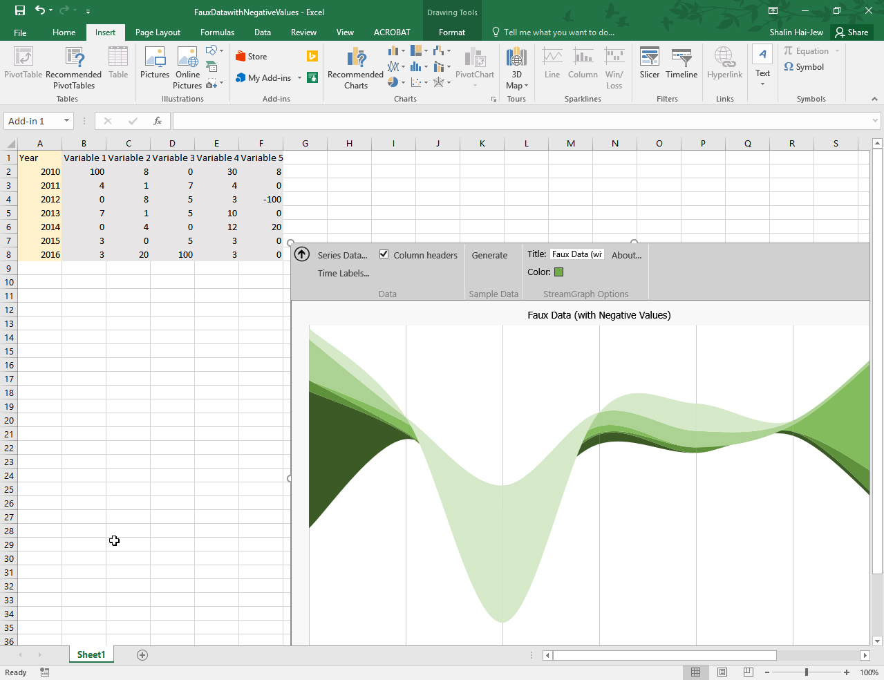
Figure 1: A Streamgraph Created with Faux Data Using the Microsoft Excel Streamgraph Add-in
Basically, a streamgraph contains data over time, with time represented on the x-axis and with related variables represented on the y-axis. Streamgraphs are read at the macro level as changes over time based on a particular target phenomenon (represented by the variables); they are read at the micro level in terms of individual variable changes over time and interaction effects between the individual variables over time. The directionality may change for various streamgraphs (with streaming in different directions). The sizes and colors and shapes of the respective streams may contain information as well as the data labels.
Most streamgraphs are non-interactive and non-dynamic (although some web-based ones may be interactive and dynamic).
A Free Microsoft Excel Add-in
In 2015, some developers at Microsoft Research created a free Microsoft Excel add-in (to both 2013 and 2016 versions of the software) that enables the easy creation of streamgraphs in Excel. The plug-in is accessible through the Microsoft Office Store.
This article introduces the add-in and provides some examples created both with synthetic data and real-world open-source data. Figure 1 (above) shows a streamgraph created with made-up data; the toolbar panel of the streamgraph is visible in this image.
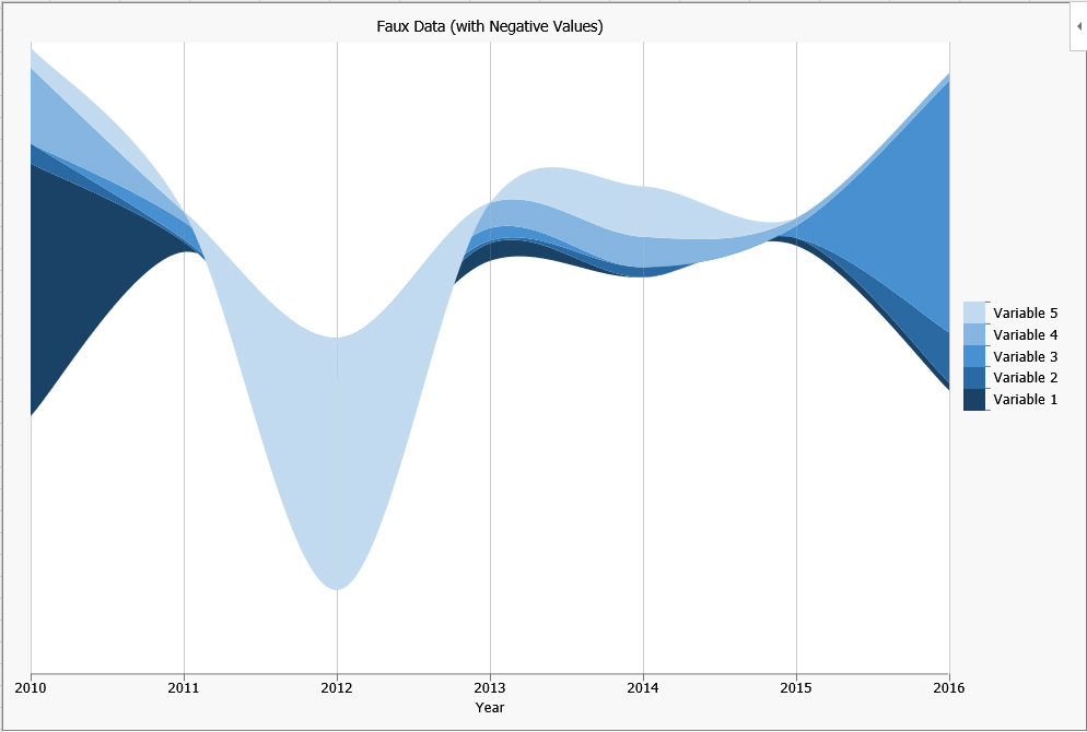
So riffing on the use of artificial data, it is also possible to use negative numbers to create dramatic dips as in Figure 2. In this latter visualization, the toolbar panel has been minimized.
Figure 2: Faux Data (with Negative Values)
Downloading and Installing the Steamgraph Add-in
This sequence assumes that the correct version of Excel (2013, 2016, or the online cloud-based one) is already installed. Go to this site.
Click the “Add” button. If authentication is needed, sign in with the proper email address or phone number. Identify whether you have a work-based account or a Microsoft account. Download the add-in. Double-click on it to install it to Excel.
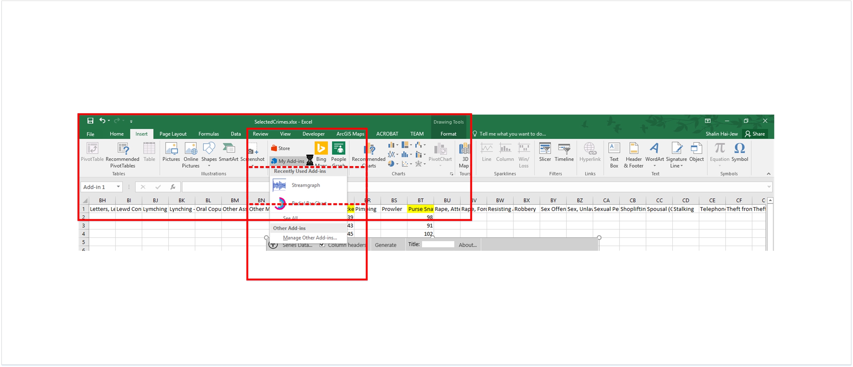
Open Excel. In the Ribbon, go to the Insert tab. In the Add-ins drop-down, select Streamgraph (Figure 3). [Notice that the Microsoft Store button is just above the Add-ins dropdown menu.]
Figure 3: Activating the Steamgraph Add-in in Excel 2016
The Streamgraph window will open. There are only a few choices from which to select.
- The Series data should include the column headers and cells of all the data.
- The Time labels should include the left column of the time span and the respective time spans.
- The Title is the label of the streamgraph.
- The Color option allows access to six color palettes based on the following core colors: light blue, orange, gray, yellow, dark blue, and green. The colors offer shading gradations around the core colors (not as an intensity indicator unless one puts in special data structuring).
Usually, it takes a little experimentation to see how these might work. In the following visualization, the “Series” data has a gray background, and the “Time” labels have a light orange background (Figure 4). The columns should be placed in an adjacent way to each other. Having any blank columns in between confuses the add-in. It is possible though to have a blank data column at either end to introduce white space in the streamgraph flow.
Figure 4: “Series” and “Time” Data Highlighted in the Data Table
The basic data structure is important to keep in mind. The years are listed in chronological order down the far left column. The variables are listed in the column headers. The numerical data (integers or percentages) are listed in the cells.
Streamgraphs with Real-world Data
So what does this look like with real-world data? As usual, it helps to use accurate data from trustworthy sources. If one uses one’s own data, one has to document thoroughly to explain how the data was acquired or created, how it was processed, and how it is presented. And as with proper treatment of data visualizations, it is a good idea to have text that leads up to and away from data visualizations to explain the contents of the visualization.
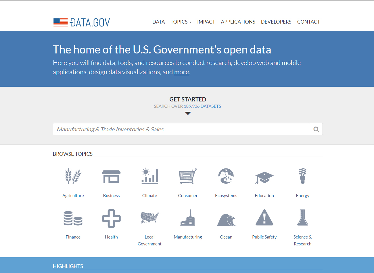
The U.S. government provides access to a lot of free data sets via its portal Data.gov (https://www.data.gov). (Figure 5)
Figure 5: Data.gov: “The home of the U.S. Government’s open data
Two datasets are used in this article. More about the datasaet and resulting streamgraphs follow.
Crime in the City of Angels: 2012 - 2015
For this article, a raw dataset of City of Los Angeles crime data was downloaded. This set, consisting of 935,259 records, is made available by data.lacity.org at http://catalog.data.gov/dataset/crimes-2012-2015.
The short text description that accompanied the dataset reads, in part: “This is the combined raw crime data for 2012 through 2015. Currently, crime data is refreshed on an annual basis. However, we are exploring automated methods and looking to increase this frequency.” The email address of the dataset’s “maintainer” is chelsea.ursaner@lacity.org.
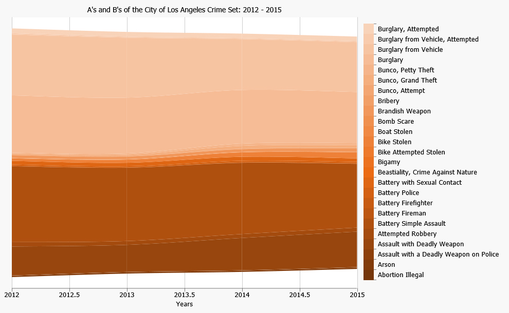
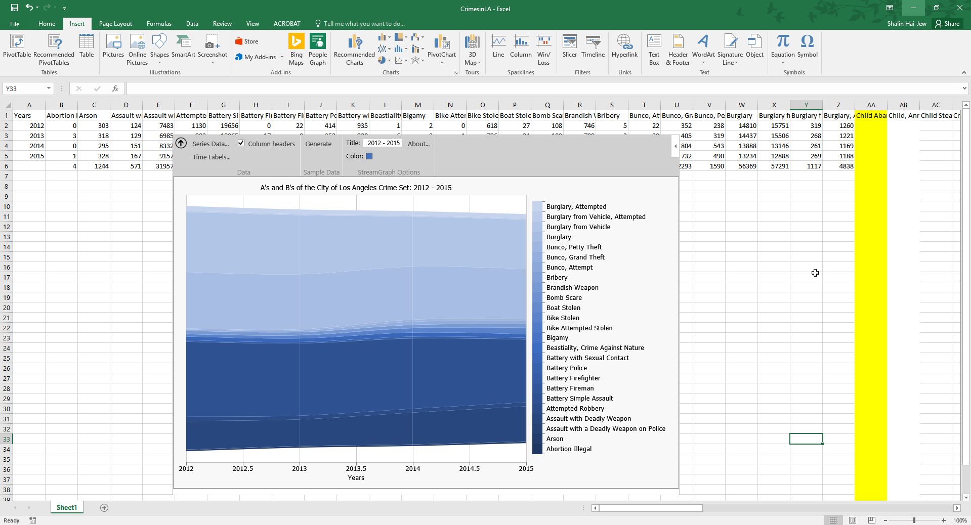
With a dataset this large, it helps to process and use parts of the data for a streamgraph. To these ends, the “A’s” and “B’s” of the crime set were processed (with misspellings included, such as “beastiality” instead of “bestiality). The processing included the identifying out of the respective formal crimes listed in a subset, filtering by year, and using those counts to populate a new workbook. The resulting streamgraphs may be seen in Figures 6 and 7.
Figure 6: A’s and B’s of the City of Los Angeles Crime Set: 2012 – 2015
Interestingly, the add-in adds in .5 years or half-years, enables a kind of smoothing between years.
Figure 7: The Back-end of the A’s and B’s of the City of Los Angeles Crime Set: 2012 – 2015
Another subset of the crime dataset involves a focus on “pickpocketing, purse snatching, and shoplifting,” which may be seen in Figure 8.
Figure 8: Pickpocketing, Purse Snatching, and Shoplifting in the City of Angels: 2012 – 2015
Smoking Habits in Kansas: 1995 – 2010
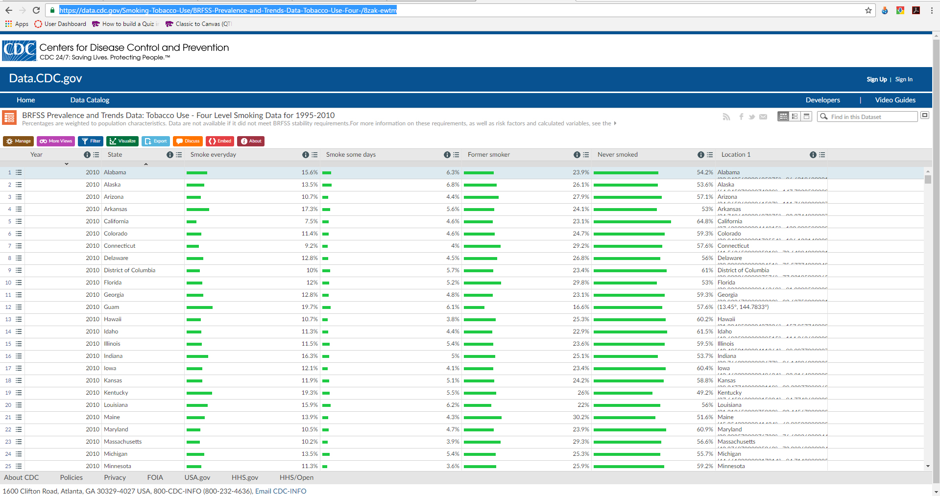
Another dataset used was from the U.S. Centers for Disease Control and Prevention. The Behavioral Risk Factor Surveillance System (BRFSS) shares its trend data through the Data.gov portal. The set used here is the following: BRFSS Prevalence and Trends Data: Tobacco Use – Four Level Smoking Data for 1995 – 2010.
The percentages of tobacco use are weighted to population characteristics to ensure that the statistics are comparable across the states. The data may be exported as .csv, .csv for Excel, JSON, RDF, RSS, and XML data (Figure 9).
Figure 9: BRFSS Prevalence and Trends Data: Tobacco Use – Four Level Smoking Data for 1995 – 2010
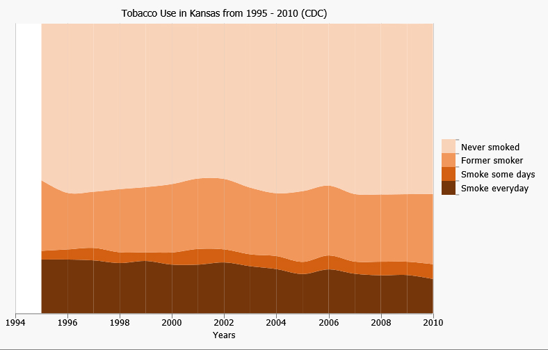
In this case, the streamgraph is created from the Kansas data from 1995 – 2010. The categories are Never smoked, Former smoker, Smoke some days, and Smoke every day (Figure 10).
Figure 10: Tobacco Use in Kansas from 1995 – 2010 (CDC)
When the data accounts for 100% of what is possible, there is no white space. Of course, it is possible to run only, say, part of the dataset, like “smoke everyday” and “smoke some days” to have a two-variable set with white space in the streamgraph. It is important to pare down data in order to have a coherent streamgraph. An overloaded streamgraph can lose informational coherence quickly (and result in jagged lines).
Sparser data, with some zeroes, will result in more dramatic views, such as with cross-over of some of the lines. Using negative cell values can also result in dramatic and swooping lines. Sometimes, running fewer years can also result in some eye-catching visuals.
About the Author
Shalin Hai-Jew works as an instructional designer at Kansas State University. She may be reached at shalin@k-state.edu.
She recently created a presentation titled "Creating Effective Data Visualizations for Online Learning" for the 4th Annual Big 12 Teaching & Learning Conference at Texas Tech University (June 2017). This topic may be of interest to those who create data visualizations.
| Previous page on path | Issue Navigation, page 15 of 26 | Next page on path |
Discussion of "Creating a Streamgraph in Microsoft Excel 2016"
Add your voice to this discussion.
Checking your signed in status ...