Google Correlate(TM): Exploring Big "Google Search" Data
By Shalin Hai-Jew, Kansas State University
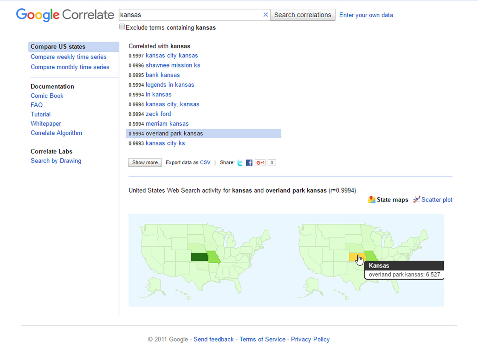
Figure 1: “Kansas” and “Overland Park Kansas” Query Correlation and U.S. By-State Mapping in Google Correlate
- Ever wonder which Google Search terms correlate with other query terms over time (based on billions of records)?
- Ever wonder if a time-series dataset that one has correlates with particular Google Searches over time?
- Ever consider how a particular search term time pattern instantiates in a particular country in the world? Or how correlations between search terms (over time) may vary between states in the U.S.?
- Ever want to draw a linegraph curve and dare Google to find search term frequencies over time that match that curve?
Google Correlate (https://www.google.com/trends/correlate) is an online application that enables users to access Google Search query data from 2003 to the present (with up to a week's lag). A core assumption of this tool is that people’s search queries occur in real-time and real-space, and these queries may be observed en masse as reflections of in-world events. Based on the time and space dimensions, the queries themselves may reveal different types of insights about people and their lived concerns. How search terms vary in frequency over time shows times of heightened interest for particular terms as well as times of lessened interest for particular terms. This data variability over time may provide insights about in-world phenomena as well as population interests.
To unpack what the multifaceted Google Correlate can do (at least at a beginner’s level), it is important to focus on different capabilities, one at a time.
A Simple Query Correlation
To start a simple query correlation, just write a query term in the “Search correlations” text box (anything representable in UTF-8, or any language representable on the Web and Internet). The search terms may be phrases, sentences, names, formulas, and so on. There is not a limit to a one-gram or unigram; in other words, there can be a number of alphanumeric terms in a particular order that may be explored. Make sure that the Country in the left dropdown menu is correct (or engage the dropdown if the default “United States” is not correct), and click the “Search correlations” button at the top.
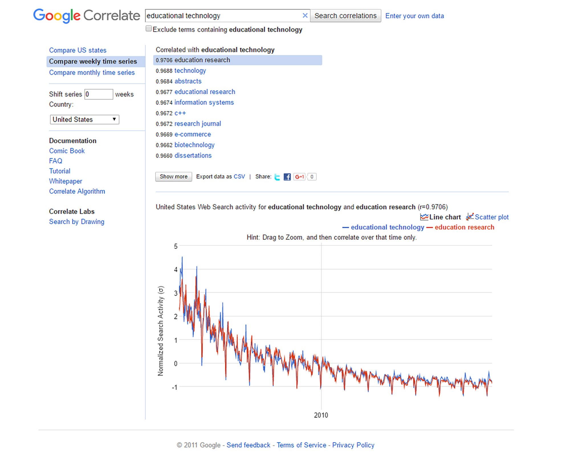
For this article, “educational technology” was used as the seeding term. In Figure 2, “Top 10 ‘educational technology’ Pairwise Correlations in the U.S. (Google Correlate),” the top 10 correlations may be seen. To the left are the correlations between the selected seeding search term and the phrase. A 0.9706 is a very high correlation, and that may be seen in the red and blue lines of the line graph below. In this case, the x-axis is time (2003 – present) in equal increments. The y-axis represents standard deviations away from the mean (whether higher or lower or right on the mean). The y-axis shows the normalized search activity so that the respective patterns over time may be legitimately compared. (Raw counts would show similar changes over time pattern-wise, but they would result in large gaps between the lines in the line graph depending on the volume of the two datasets being compared. Normalizing would show how far off the mean an aggregated query count is for a particular time period—either weekly or monthly—and this allows the y-axis to have a smaller range of possible values for clearer expressions of the correlations.) [Note: As a reminder, correlations are reflected as a number from -1 to +1. If r=0, there is no observable correlation between the two variables. If r = 1, there is a perfect positive correlation between the two variables. A correlation coefficient or r-score shows the statistical relationship between two variables. Sometimes, this coefficient is referred to as the “Pearson product-moment correlation coefficient” or “Pearson’s r.” Google Correlate only shows positive correlations, and they show the search terms with the highest correlation coefficients with the target seeding terms and then others in descending correlation order.] For more about “Standard_score,” please see the following article on Wikipedia.
In other words, when people search “educational technology” over time from 2003 to the present, “education research” has the closest data pattern over time in Google Search. The next most highly correlated pattern is “technology,” then “abstracts,” “educational research,” “information systems,” “c++,” “research journal,” “e-commerce,” “biotechnology,” and “dissertations.”
Figure 2: Top 10 “educational technology” Pairwise Correlations in the U.S. (Google Correlate)
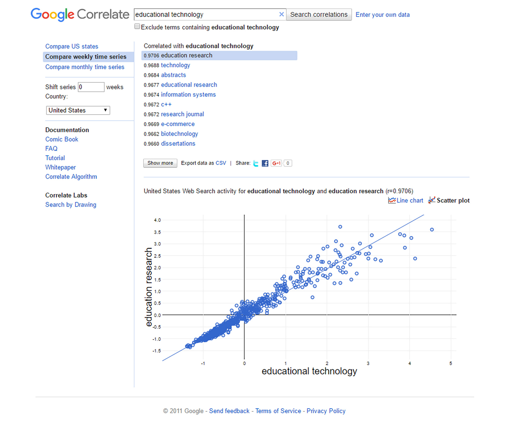
From the same data, it is possible to have Google Correlate draw a scatterplot. Note that the x-axis of the scatterplot represents “educational technology,” and the y-axis represents “education research.” The bottom left quadrant contains the less-than-average adjusted counts for the particular observed week. The mapping of the two sets of dots is to enable the visual analysis of whether the dots cluster and if it is possible to draw a line of best fit through the dots to see if there is an association between the variable represented on the x-axis and the one on the y-axis. The normalized data has the mean (μ for full population means, and x̅ for means of samples of populations) at zero for both sets. The placed dots show where the respective aggregate queries land (in terms of standard deviations from the mean) from the two sets. The diagonal line of best fit is drawn through the data to see if there may be a linear correlation between “educational technology” (on the x-axis) and “education research” on the y-axis. In Figure 3, the scatter plot shows a very high correlation, both in the r and the fit to the diagonal line.
Figure 3: “educational technology” and “education research” as a Scatter Plot (Google Correlate)
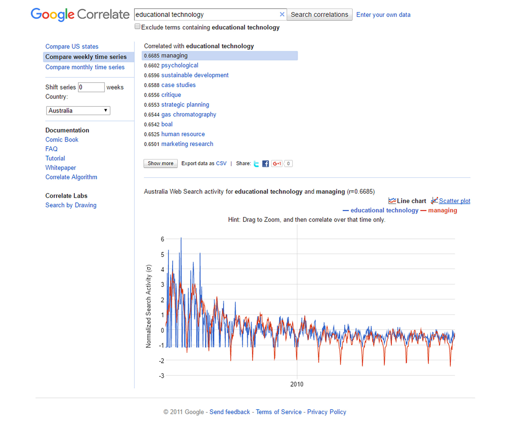
To showcase how this information may be intriguing, it is possible to run the same query at the same period (within the week, with weeks starting on Sunday at midnight Pacific Standard Time), albeit for a different country, like Australia. The results of this may be seen in Figures 4 and 5.
Figure 4: “educational technology” and “managing” Line Graph over Time for Australia (Google Correlate)
Figure 5: “educational technology” and “managing” Scatter Plot for Australia (Google Correlate)
The 50 countries for which Google Search data are available include (in alphabetical order) Argentina, Australia, Austria, Belgium, Brazil, Bulgaria, Canada, Chile, China, Colombia, Croatia, Czech Republic, Denmark, Egypt, Finland, France, Germany, Greece, Hungary, India, Indonesia, Ireland, Israel, Italy, Japan, Malaysia, Mexico, Morocco, Netherlands, New Zealand, Norway, Peru, Philippines, Poland, Portugal, Romania, Russian Federation, Saudi Arabia, Singapore, Spain, Sweden, Switzerland, Taiwan, Thailand, Turkey, Ukraine, United Kingdom, United States, Venezuela, and Viet Nam. (As a side note, when the countries feature was released in December 2011, Google also reduced the sample size for the U.S. time series "to match that of the other countries," with this change potentially causing "a noticeable increase in variance for queries with lower volumes" (Google Correlate FAQ, 2011).
Relations over Physical Space
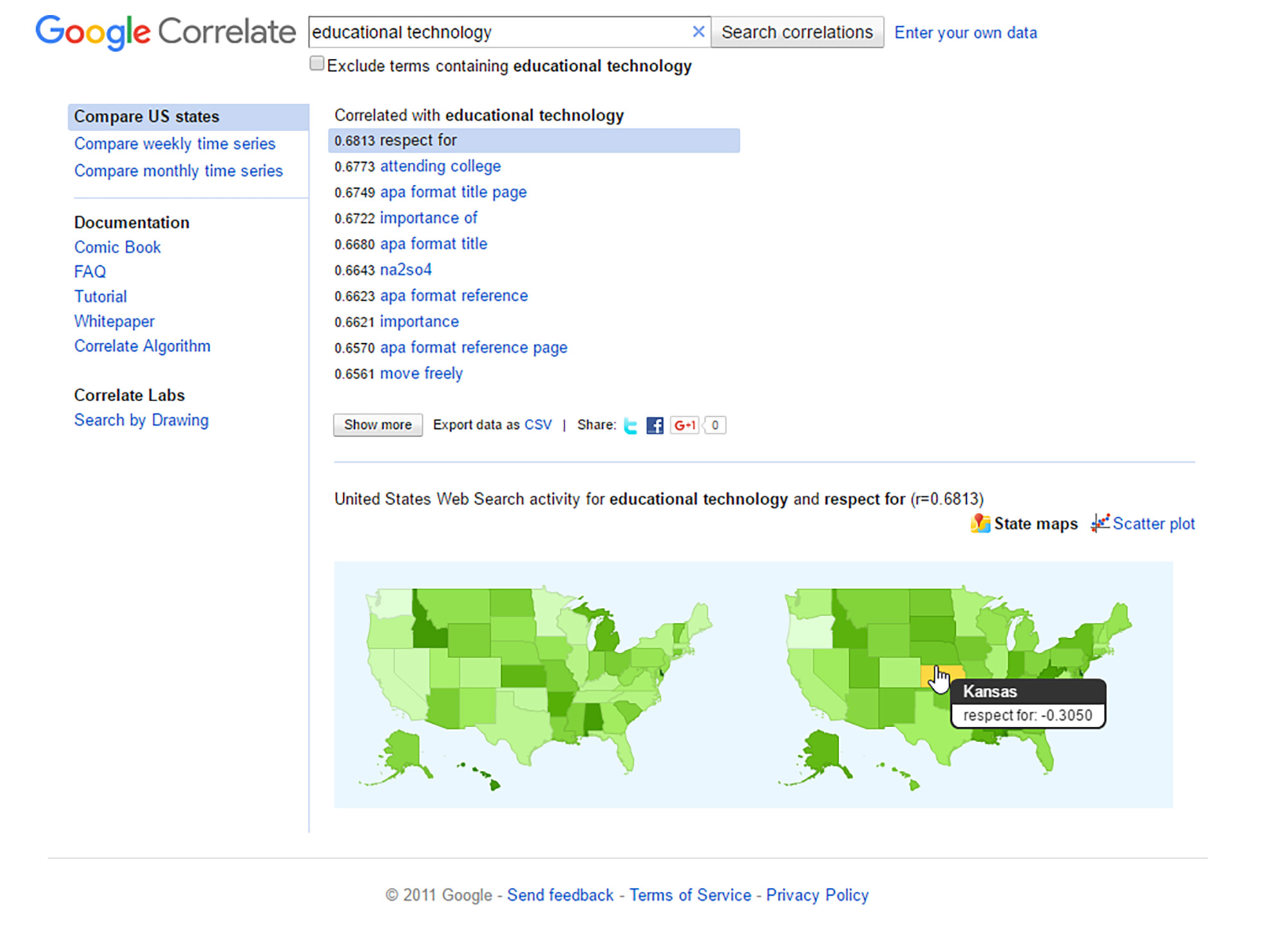
Beyond countries, it is possible to spatialize by states. For example, the “educational technology” seeding term may be used and applied to “Compare US states.” (To calculate the search score for a particular term per state, each target term is divided by the total number of searches from that state and normalized with the highest scoring state set at 100. This enables comparability across states / geographical areas.) The search volume by state is based on normalized data. The results may be seen in Figure 6.
Figure 6: “educational technology” and “respect for” Correlations across States in the U.S. (Google Correlate)
An expanded view version follows in Figure 7.
Figure 7: “educational technology” and “respect for” Correlations across States (Google Correlate) (Expanded View Version)
So in terms of “educational technology” correlations on Google Search, what would that look like within the U.S., and more particularly, in various states? Figure 7, “’educational technology’ and ‘respect for’ Correlations across States in the U.S. (Google Correlate) (Expanded View Version),” shows what this “Compare US states” feature enables. The r correlation scores are lower, and this actually does capture some less-than-average scores based on states (and choropleth-indicated regions, according to the interactive heat maps). For more on Choropleth Maps, please see the related article on Wikipedia.
These maps suggest that states boundaries, its peoples, its education, may inform searches and word associations. There are regionalisms as well—such as broader areas of reference—whether in casual conversation (“East Coast,” “West Coast,” “Upper Midwest,” “Central Plains,” etc.) or in more formal definitions. The idea is that physical proximity may have an influence.
Sharing Big Data from Social Queries
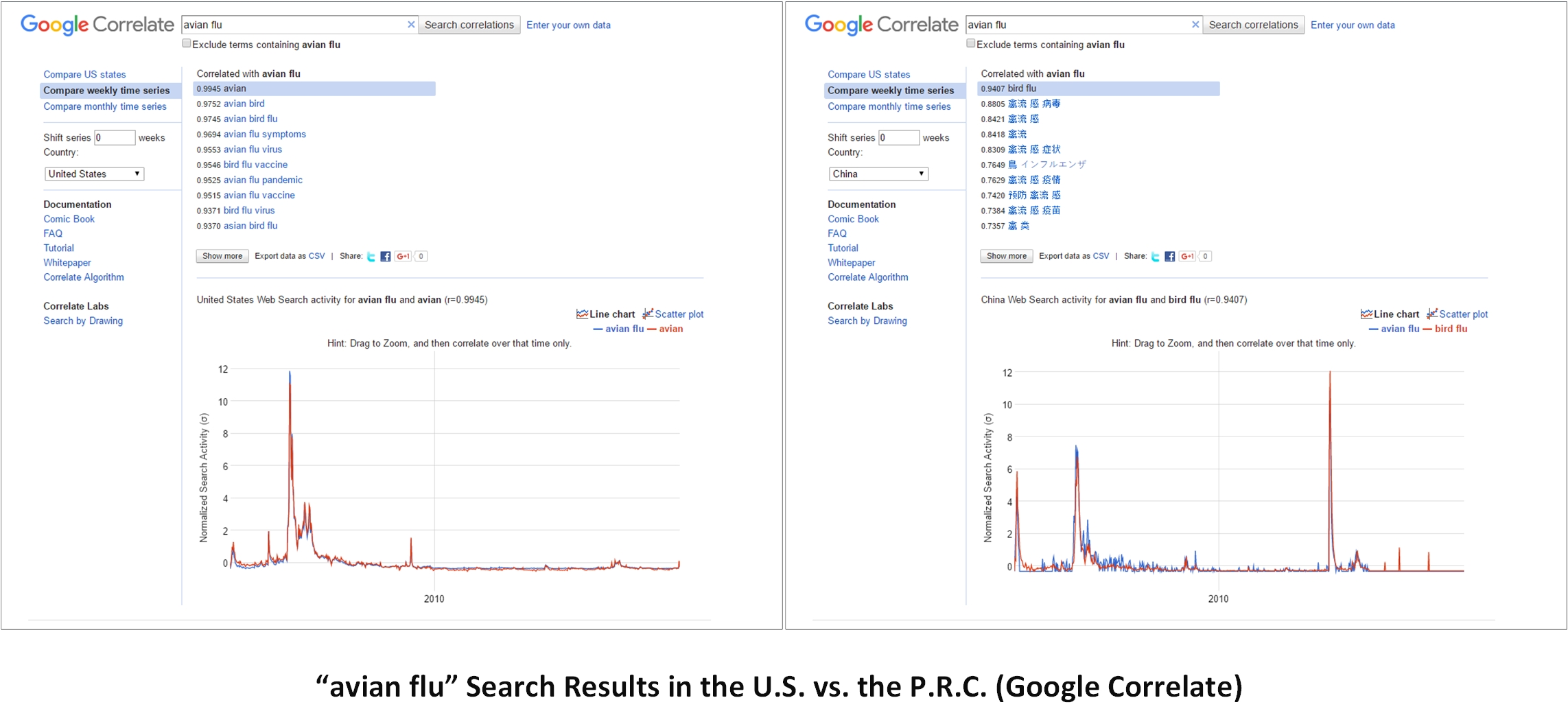
Remember the earlier comment that Google Correlate is a tool that may help map real-world phenomena across time and space, and it helps to keep that conceptualization in mind. One example which borrows directly from the Flu Trends work is a contemporaneous capture of “avian flu” line graphs from Google Correlate, with the U.S. data on the left and P.R.C. data on the right. Note that this works across languages. Note how the normalizing of the data on the x and y axes allows a visual comparison about periods of time when the issue of “avian flu” captured the public’s attention in both geographical spaces. (Figure 8)
Figure 8: “avian flu” Search Results in the U.S. vs. the P.R.C. (Google Correlate)
In recent years, various companies and organizations have worked to enable researchers and the general public to access “big data” for insights. In May 2011, Google Correlate was launched as a “generalization” of the Flu Trends tool, which connected Google Searches for particular flu-related query terms with the movement of flu infections across the country and which enabled some predictivity as to where flu infections were headed. The insight from the flu data was insightful in a number of ways, but one central insight was that macro-level query data may reveal underlying patterns of human activity and so could be used to model real-world phenomena. Another was the value of such "human sensor network" data for biosurveillance of human- and animal-borne diseases.
One general assumption of human nature is that people do not ask for data until they need it (reactive instead of proactive), so the temporality of web-based data queries may be informative. For example, a search for the term “presidential election” in the U.S. shows clear upticks in the lead-up to the elections and spikes right around the elections and then drop-offs back to low base rates of interest. Correlated search terms that co-relate over time may have some connections, such as conceptual relatedness (similarity) or practical relatedness (simultaneous need-to-know by large segments of the population). [I am not asserting that people are generally always reactive, but proactive searches will also occur--in anticipation of future needs for the data, but those are not sufficiently common to meet the high threshold of being in the top 10 or 20 most correlated search terms over time. Rather, such searches likely will not show up in top search frequencies because these are more serendipitous.]
Search by Drawing
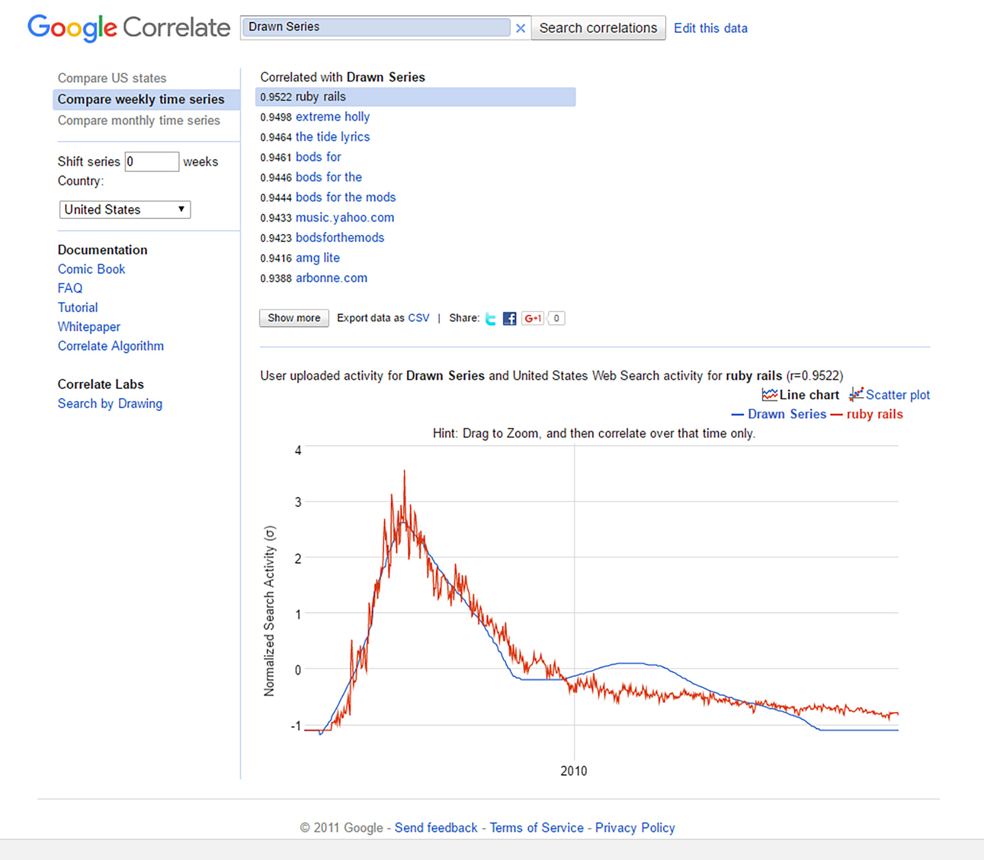
Another feature of Google Correlate is its “Search by Drawing” (by Correlate Labs). This enables a user to view a simple interface on which they can draw a curve. Once that curve is drawn, he or she can click the “Correlate!” button and find search terms that are closely associated with the main trajectories of the drawn curve. One simple curve resulted in a finding that “ruby rails” searches was the most closely associated with this drawn curve, which shows a spike at around 2006 and then a regression to the mean thereafter in a fairly gentle curve and then dropping below the mean (through the present) (Figure 9). Of course, very complex curves may result in no data found.
Figure 9: “Search by Drawing” Feature…Leads to “Ruby Rails” in the U.S. as the Top Correlate with the Drawn Curve (Google Correlate)
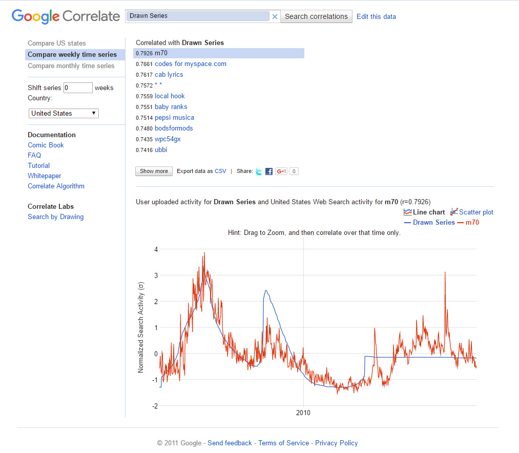
To provide a sense of how some other drawn curves may look and how closely the found data may fit, two additional figures are included.
Figure 10: Drawn Time Series Curve with a Serious Dip in 2015 (Google Correlate)
Figure 11: Drawn Time-Series Curve with Frequency Spikes in 2005 and 2008 (Google Correlate)
Some constraints and enablements to Google Correlate. There is a “Show More” under the top 10 most highly correlated search terms for the target term, which reveals the lesser-correlated terms (in descending order). Google Correlate does not show queries with correlation values of r < 0.6. Misspelled queries are omitted; in terms of frequency counts, most would not show up in a popular frequency count. (Note that lemmas are not treated as misspellings.) Pornographic queries are not enabled. Rare words also do not generally show up because of lower counts (not sure what the threshold for the raw counts is). For queries that correlate only over a small part of the time series, those are not included as well.
The makers of this tool have asked that users cite the source: "Data Source: Google Correlate (http://www.google.com/trends/correlate) ".
There seems to be a small glitch with the use of the period (.). Sometimes, words with a period on the end are treated as their own unique word, so “word” ≠ “word.” This may be because the period is important as decimal points and web addresses and so on. There does need to be something done, though, so that words that are followed by a period are not treated as a separate entity from the word by itself. This cannot really be addressed by the users of Google Correlate, even if they download the underlying data (of z-scores) from a query as a .csv file…because of the prior processing of the data before it reaches the user. If the user had access to the raw counts and the pre-normalized data, he / she could resolve this issue themselves. (Figure 12)
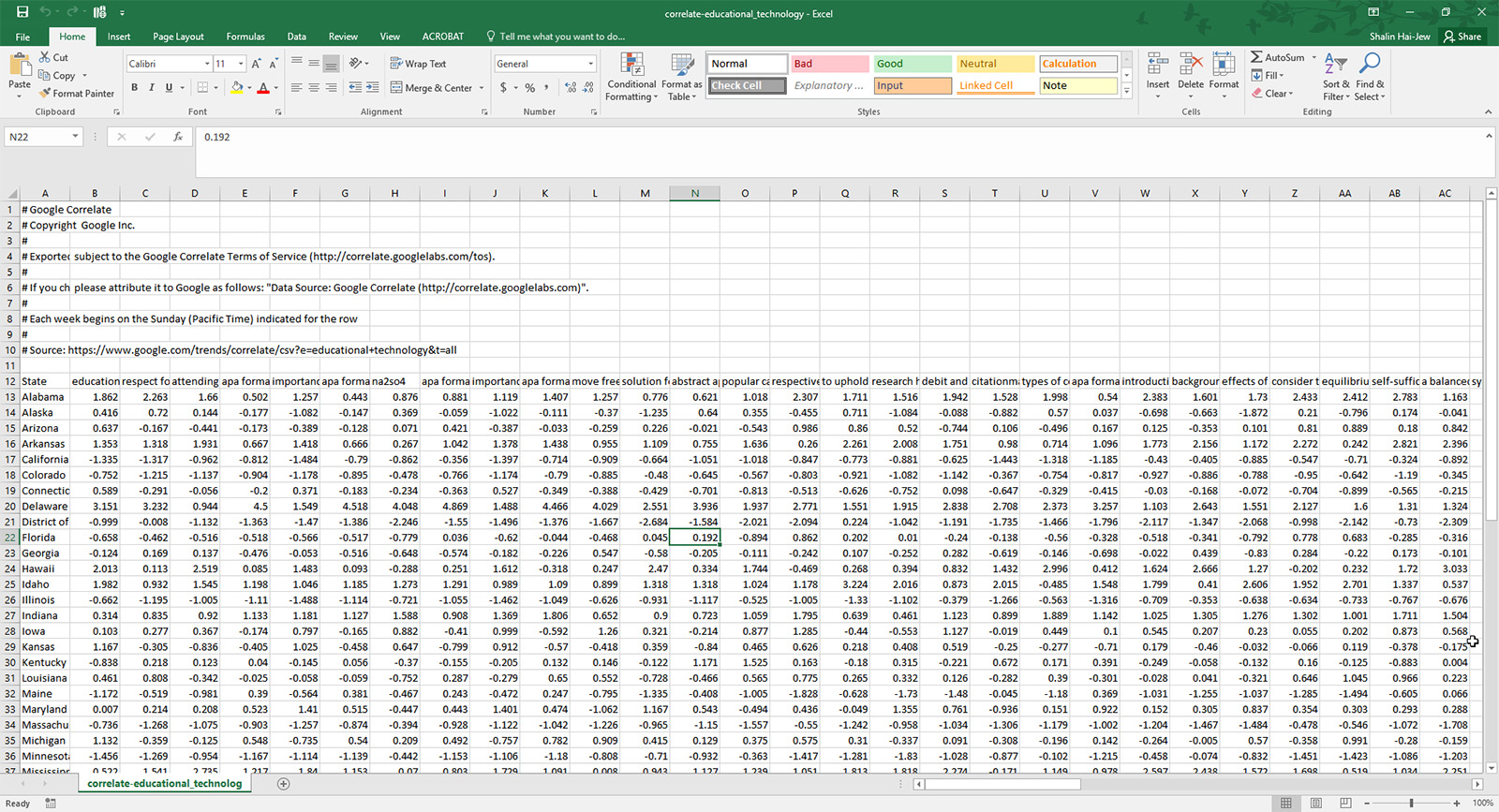
Figure 12: A Screenshot of a Downloaded .csv Dataset from Google Correlate
In terms of enablements, wildcard characters do work but require the use of the % (percent sign) to indicate the wildcard (not the * or asterisk).
Also, it is possible to click on the data visualization and to interact with it by zooming-in and zooming-out. Users can select different of the pairwise correlates to view different data visualizations. They can choose to see the line graphs or the scatter plots. They can take the initial query and plot that on the map of the U.S. states. They can run the query on different countries by going straight to the dropdown listing of countries (without having to input the initial seeding term in the text box).
Uploading Researcher Datasets for Trending Data Comparison
Users may upload their own time-series data in a pre-set format to compare their datasets’ time patterns against similar search terms’ time patterns on Google Search. [Note: The .csv file should be in the "CSV/MS-DOS" format... The data column should be rendered as text (not the date format, since Excel does not seem to enable the particular format listed for Google Correlate). The dates based on Sundays should be in their own column, and the next contiguous column should have the numerical value. This addendum was added thanks to a query by Tylor Hermanson in early March 2018.] The documentation reads:
When you upload a data set (a time series, for instance), Google Correlate will compute the Pearson Correlation Coefficient (r) between your time series and the frequency time series for every query in our database. Correlation coefficients range from r=-1.0 to r=+1.0. The queries that Google Correlate shows you are the ones with the highest correlation coefficient (i.e. closest to r=1.0). (Google Correlate Tutorial)
If there is interest in acquiring search term queries negatively correlated with a time-series dataset, then "just multiply your input data by -1 in your spreadsheet program before uploading it to Google Correlate" (Google Correlate Tutorial, 2011, p. 4). A negative correlation, in this context, means that these are the most common terms that decline in a Google Search when the seed search term frequency rises in a particular time span (or which rise when the search term frequency declines).
The uploaded datasets will not be used for anything other than to provide the Google Correlate service, according to their Terms of Service. The data offered is wholly de-identified and not re-identifiable. The IP (Internet protocol) address of users is collected for broad physical locational understandings.
Some Room for Nonsense
Of course, there may be a risk to over-stating this. There is room for befuddling results, even with high correlations between the seeding search term and some other terms.
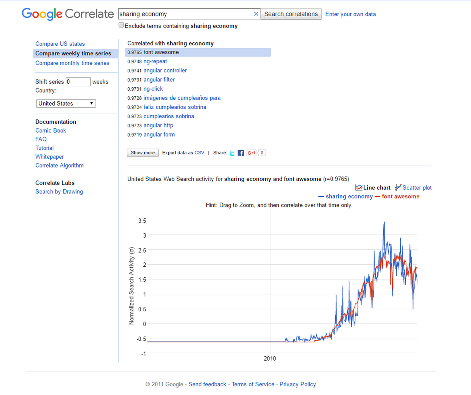
Figure 13: "sharing economy" on Google Correlate
While the above search does not seem to result in data that may tell a story, the same seeding term "sharing economy" applied to the U.S. does tell a story. Note the "stanford social" and the intensity of location in California, as a starting point for exploration.
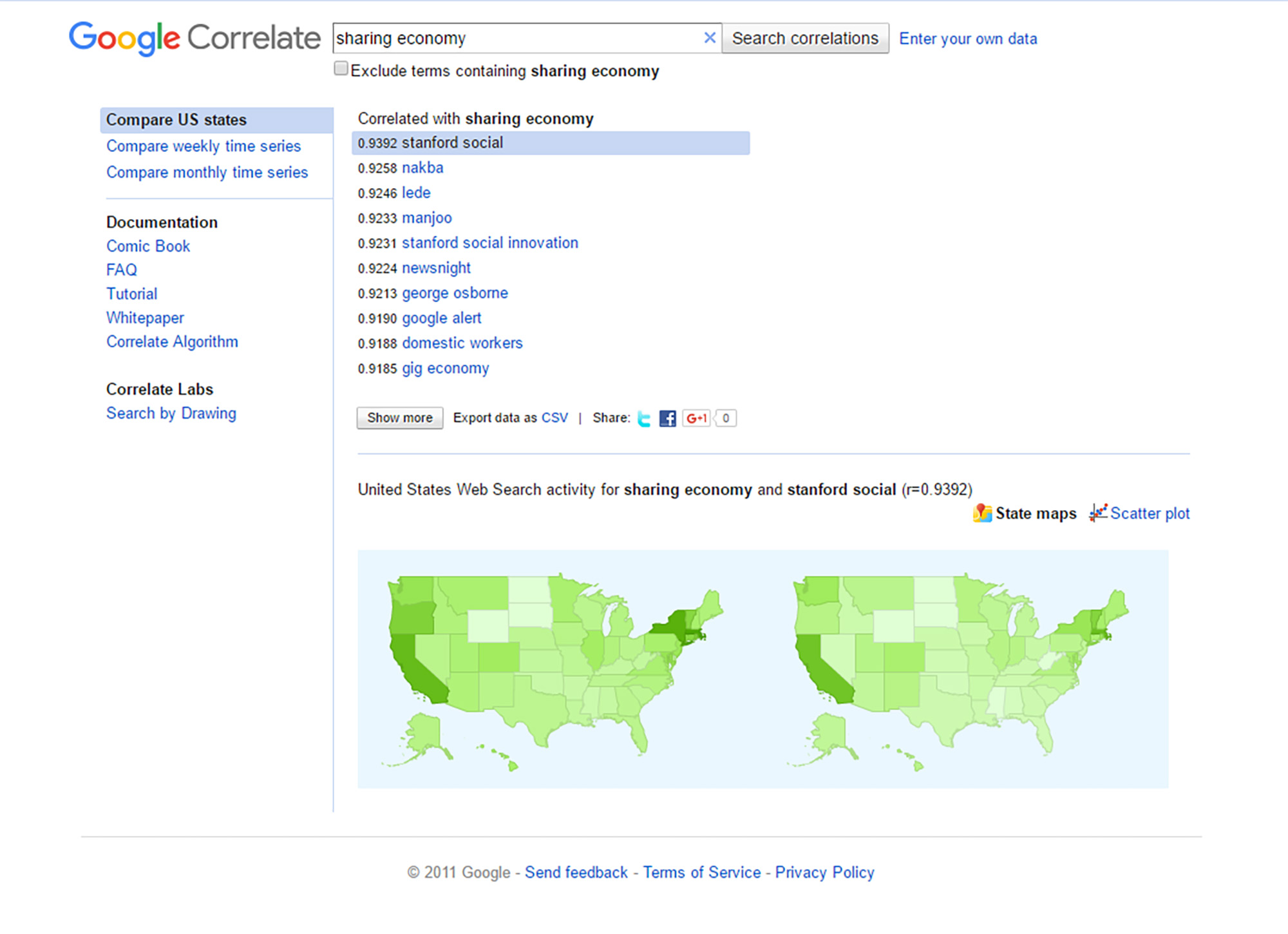
Figure 14: "sharing economy" and "stanford social" in Locational Comparison by State on Google Correlate
And this is not to say that nonsense is necessarily negative.
Conclusion
Google Correlate enables access to extracted insights from full sets (N = all) of empirical data, with potentials in data exploration, data comparison, data modeling (through machine learning), and others. This work summarizes some of the simpler features of Google Correlate. To review, using the data, it is possible to observe some data relationships based on large-scale search patterns through Google Search over time. From this data it is possible to interpret the patterns and hypothesize about why such associational relationships apparently exist. A common word-of-caution with big data: associations may appear to exist even when no real ones exist. Researchers should therefore be careful of spurious associations.
The available data is pretty remarkable. First, note that the data was not initially intended by the query-maker for public consumption in the way of social media microblogging messages or status updates or selfies; rather, these were queries for information (textual, image-based, map-based, video-based, and others) initially. Next, there is plenty of high-computational value-added, with the data showing co-search relationships between candidate search terms that hold with high correlation over the 14-year-period of data covered in Google Correlate. (The scope and breadth of what is available is simultaneously breathtaking and somehow expected.) As mentioned, this data may be comparative, applied across the 50 countries, including both developed and developing ones. As others have noted, the data is "available in near real time" and so may enable "nowcasting" (Stephens-Davidowitz & Varian, 2014, p. 1). (Many are trying to create models for indicator data that may accurately forecast in-world occurrences, with internet data as leading indicators.)
Do the Internet search terms co-move because of some sort of "common fate" (borrowed from Gestalt ideas) because of a shared underlying phenomenon? And if so, what is that phenomenon, and are there other datasets that may shed light on that in-world phenomenon (to triangulate data and to get closer to "ground truth")?
Still, big data does not supplant traditional data but rather may complement it. Researchers have noted some inaccurate predictions based on various uses of Google Correlate data. A web search engine like Google Search is constantly being updated and is subject to so-called "blue team" (in-house, non-adversarial-to-the-company, a "blue team" as opposed to the "red team") dynamics, with changes to search algorithms and results affecting how people use the search and the terms that they may use. Re-engineering such social systems affects not only the available data, but also the reproducibility of the research findings, and this may be challenging for science-based research (Lazer, Kennedy, King, & Vespignani, 2014). Google Searches are so blisteringly fast because the corporation conducts "up-front sorting," so it can deliver the searches in milliseconds (Christian & Griffiths, 2017, p. 72) even though the search results pull from "over a trillion distinct URLs" on the Web (p. 193). Daily, Google logs "3.5 billion searches per day and 1.2 trillion searches per year" ("Google Search Statistics," June 17, 2017). As such, it is important to stick with fundamentals in research and to qualify the use of big data given such observations. One research group has observed:
Search patterns are the result of thousands of decisions made by the company’s programmers in various subunits and by millions of consumers worldwide (Lazer, Kennedy, King, & Vespignani, 2014, p. 1207).
The point is well made that the search data used for Google Correlate is a result of interactions between people and technical systems, and there are many hidden inputs into this relationship. This is not empirical information from direct observations of the world...but observations of a data layer, which is built off of human creations.
No ideas yet on how Google Correlate may be used for research? There is already some academic literature out with the use of this tool for research. Also, those interested in the Nearest Neighbor Search in Google Correlate may access a paper by Google engineers at https://www.google.com/trends/correlate/nnsearch.pdf.
References
Christian, B. & Griffiths, T. (2017). Algorithms to Live By: The Computer Science of Human Decisions. New York: Henry Holt and Company. p. 72.
"Data Source: Google Correlate.” Google, Inc. Retrieved May 25, 2017, from http://www.google.com/trends/correlate).
Google Correlate FAQ. (2011). Google, Inc. Retrieved June 11, 2017, from https://www.google.com/trends/correlate/faq.
Google Correlate Tutorial. (2011). Google, Inc. Retrieved June 11, 2017, from https://www.google.com/trends/correlate/tutorial.
Google Search Statistics. (2017, June 17). Retrieved June 17, 2017, from http://www.internetlivestats.com/google-search-statistics/.
Lazer, D., R. Kennedy, G. King, and A. Vespignani. (2014). “The Parable of Google Flu: Traps in Big Data Analysis.” Science 343 (6176) (March 14): 1203–1205. Retrieved March 29, 2017, from http://nrs.harvard.edu/urn-3:HUL.InstRepos:12016836.
Mohebbi, M., Vanderkam, D., Kodysh, J., Schonberger, R., Hyunyoung, C., & Kumar, S. (2011, June 9). Google Correlate Whitepaper. Google. Retrieved May 25, 2017, from https://www.google.com/trends/correlate/whitepaper.pdf.
Stephens-Davidowitz, S. & Varian, H. (2014). A hands-on guide to Google data. Retrieved May 28, 2017, from http://people.ischool.berkeley.edu/~hal/Papers/2015/primer.pdf.
Select Resources
Some resources follow.
Google Correlate’s Terms of Service
Google Correlate Tutorial
Google Correlate FAQs
Nearest Neighbor Search in Google Correlate
Search by Drawing (in Google Correlate)
About the Author
Shalin Hai-Jew works as an instructional designer at Kansas State University. Her email is shalin@k-state.edu.
| Previous page on path | Issue Navigation, page 18 of 26 | Next page on path |
Discussion of "Google Correlate(TM): Exploring Big 'Google Search' Data"
Tylor Hermanson's Take on Google Correlate as an SEO Research Tool
Interested in Search Engine Optimization (SEO) and the use of Google Correlate from that angle? Tylor Hermanson recently wrote a piece on this, and his methods for using the data for awareness and decision-making is intriguing. Check his work out at https://www.searchenginejournal.com/google-correlate-research-tool/266341/.Posted on 30 August 2018, 10:47 pm by Shalin Hai-Jew | Permalink
Add your voice to this discussion.
Checking your signed in status ...