Creating a Simple PivotTable in Excel 2016
By Shalin Hai-Jew, Kansas State University
A “pivot table” describes a tool to help summarize and present data as interactive data visualizations. As such, larger datasets may be explored by people through pivot tables. The setup is very basic, but it enables the partial description of the available data in the dataset. Pivot tables also enable comparisons between data and some interrelationships between data. They help depict some macro-scale data patterns.
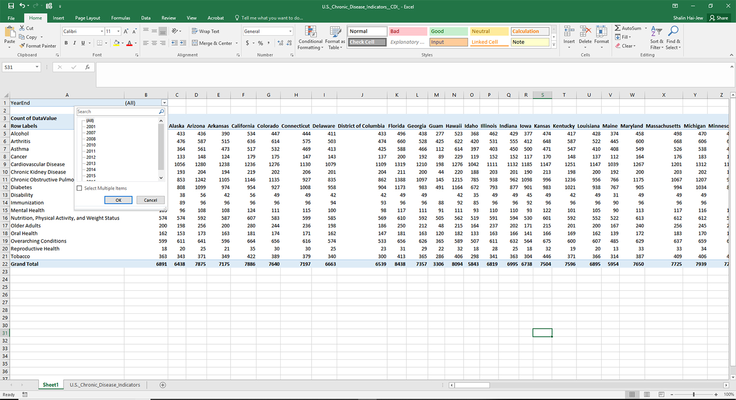
To see how this might work, the dataset “U.S. Chronic Disease Indicators (CDI)” was downloaded off of data.gov. This set is comprised of 519,718 rows of data related to population health from 2000 – 2016. The website description reads (verbatim):
CDC's Division of Population Health provides cross-cutting set of 124 indicators that were developed by consensus and that allows states and territories and large metropolitan areas to uniformly define, collect, and report chronic disease data that are important to public health practice and available for states, territories and large metropolitan areas. In addition to providing access to state-specific indicator data, the CDI web site serves as a gateway to additional information and data resources.
The dataset’s metadata was updated Aug. 20, 2018. The set itself is available in various formats (CSV, RDF, JSON, and XML). The set was released through an Open Database License (ODbL), requiring Attribution Share-Alike for Databases.
The data is set up in classic structured data format, with the respective variables in the column headers and the rows underneath as row data based on particular states and their health data scores across a range of health variables, described in the following summary topics: alcohol, arthritis, asthma, cancer, diabetes, mental health, chronic obstructive pulmonary disease, oral health, cardiovascular disease, immunization, chronic kidney disease, “nutrition, physical activity, and weight status,” older adults, tobacco, overarching conditions, reproductive health, and disability. The set looks like the following in Excel (Figure 1).
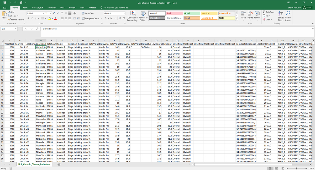
Figure 1. “U.S. Chronic Disease Indicators (CDI)” (2000 – 2016) in Excel
It makes sense to know one’s data, but given clear data labeling and a sample of the data, it is not that difficult to understand data at least superficially (which is somewhat dangerous). Optimally, data dictionaries would accompany datasets, so that the data may be accurately understood. (This article does not really make assertions about the specific data but is more about making PivotTables in Excel.) To make a pivot table, it is important to understand which data columns may be of interest. In perusing the data, it looks like “F” / Topic is a data label, “D” is a spelled-out state indicator, “K” is a “Data Value,” and “O” and “P” are the lower and higher ranges for the 95% confidence intervals. Basically, to create pivot tables, there need to be variables in the designated “rows” and “columns,” and there need to be values of some sort. These columns will work for our purposes, but it is important to note that the data table will be a part of the Excel spreadsheet, and even the unselected columns can be brought into play (as filters, as categories).
If the data need to be cleaned, this would be the time (after a pristine and unedited master dataset has been saved and set aside for potential later usage). If the data need to be unioned with other data, then that should be done now, too. Since this is being done in Excel, the top data row limit is a little over a million rows.
Setting up a Basic PivotTable in Excel
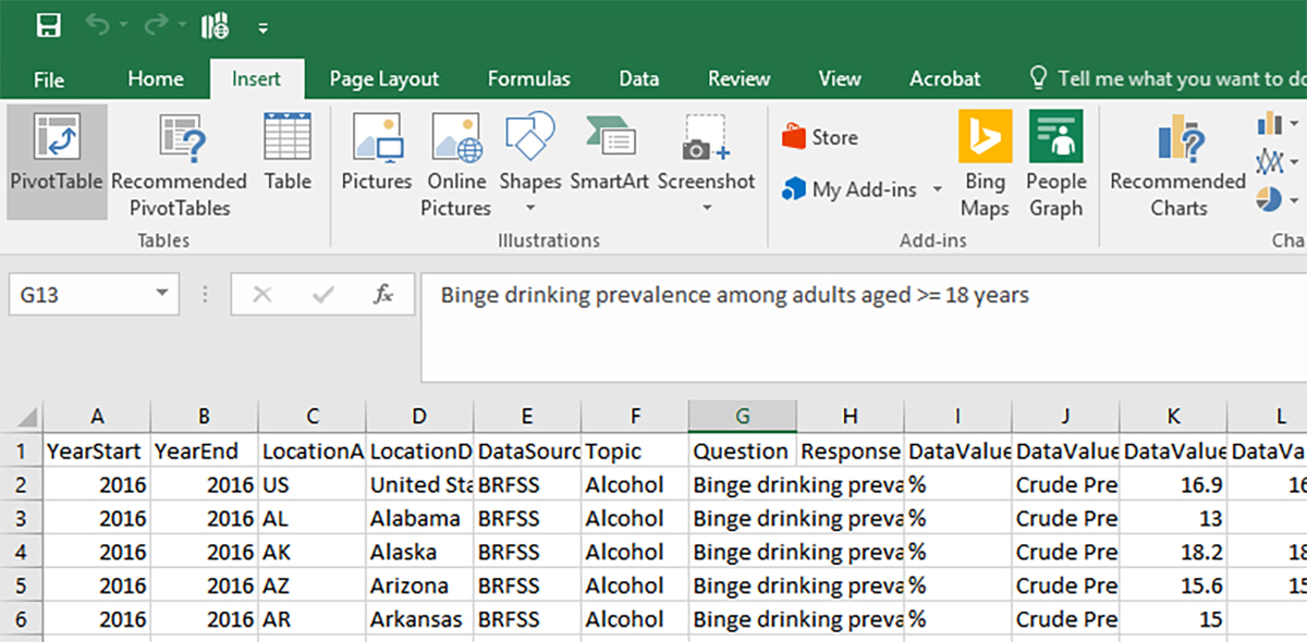
To get started, click in one of the cells in the table.
In the Insert tab, select “PivotTable.” (Figure 2)
Figure 2. Insert -> PivotTable
In this case, the pivot table is created in its own worksheet. In this case, the default settings for the entire table may be left as-is. Click OK. (Figure 3)
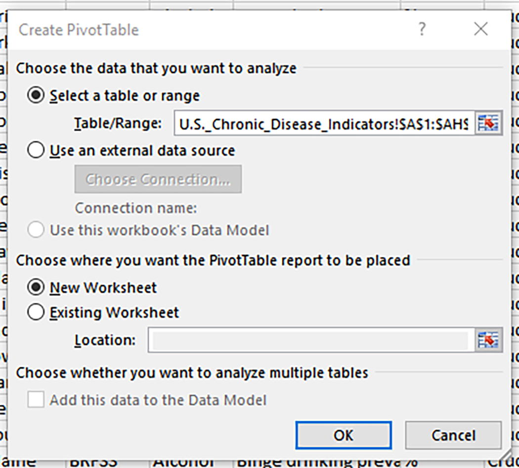
Figure 3. Create PivotTable
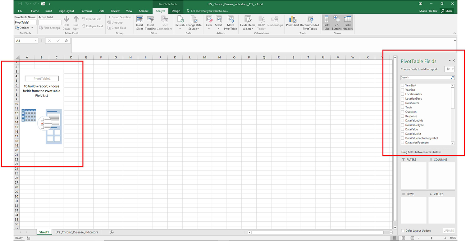
In the next view, users are asked to define the fields of interest. These may be selected at the top right and dropped into the four quadrants at the bottom right (FILTERS, COLUMNS, ROWS, VALUES)…or they may be selected with a checkmark, in which case, they are dropped into the ROWS quadrant below. Each of the PivotTable fields may be moved around the different quadrants or deleted out if they are not wanted. If there is a large amount of data at play, a user may check the “Defer Layout Update” to save on processing until everything is in the right place. (Figure 4)
Figure 4. PivotTable Field List
Choose fields from the PivotTable Field List. (Notice that the column labels of A, B, C, D, have been lost, but the order of the variables are the same as if the letter labels were still used…and my selections of the earlier variables can be acted on. The names of the variables are available in camelcase. Also, as one checks the respective fields, their sub-variables may be seen, which helps to disambiguate the data further.) (Figure 5)
Figure 5. Data Values Selected
Generally, the row and the column data may be interchangeable. Values data have to be numerical. Filters may be of various types.
As the fields are placed at the bottom right, the data view changes to reflect the interrelationships. (Figure 6)
(For those just trying out this PivotTable feature, it may help to use a simpler and more familiar dataset, so there can be a lot of experimentation.)
Figure 6. Dragging and Dropping Data Columns into Respective Areas
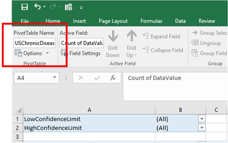
At the top left, type in an information-rich name for the PivotTable. In this case, it will be
“USChronicDiseaseIndicatorsbyTypeandRegion.” (Figure 7)
Directly below the name is the dropdown menu Options
Figure 7. Assigned PivotTable Name
While naming the pivot table, it may be a good idea to name the worksheet as well (at the bottom left)
“PivotTable1)
Defining Options for the PivotTable
In the Options dropdown from the top left, it is possible to open a multi-tabbed window that defines how the PivotTable presents, how it prints, its alt-text for accessibility purposes, and other behaviors. The tabs include the following: Layout & Format, Totals & Filters, Display, Printing, Data, and Alt Text. (Figure 8)
Figure 8. Defining PivotTable Options
There’s something to be said for a first go using all the defaults before starting to make changes, unless one is very familiar with what the various terms mean.
Click OK. The PivotTable exists. The dropdowns indicate ways to filter the data to explore. (Remember that the set used here has over half a million rows of data. Government data, no less.)
How a Pivot Table Works
The created visualization is already valuable because it presents the row data information in a data table. (Figure 9) The relative health (at least in terms of chronic diseases) of the respective populations of various states may be compared between the states and against cumulative U.S. statistics. Also, exploring by year, earlier years show that not all the states were collecting all the relevant data, so the “holes” in the data collection may also be seen. Users can use the scroll bars to navigate around the data table (across in this case).
Figure 9. A Resulting PivotTable with a Year Filter Dropdown
Certainly, the interactivity is a main feature of pivot tables, so one can explore the data by filtering.
In the dropdown next to Column Labels, let us select “Kansas.” (Figure 10)
Figure 10. Selecting Kansas in the Column Label Dropdown (in the PivotTable)
The next view shows Kansas data (Figure 11).
Figure 11. Kansas Data across a Range of Summary Indicators of Chronic Disease
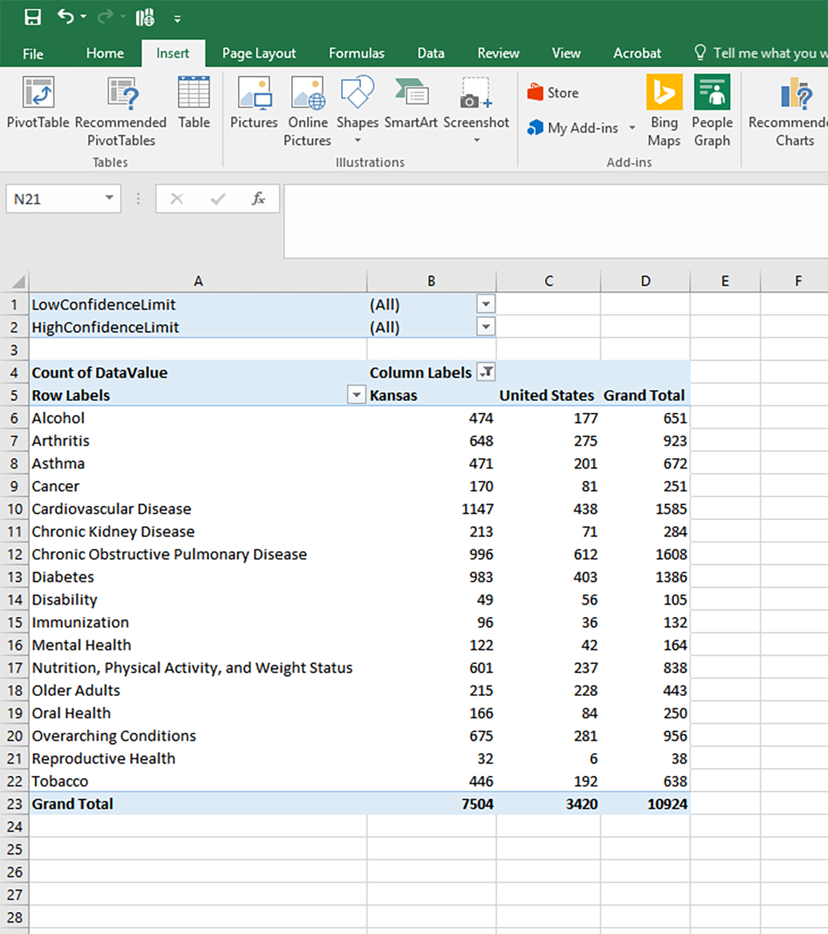
What about comparing Kansas data with that of the United States (from this dataset)? (Figure 12)
Figure 12. Kansas Health Data Compared against U.S. Data
Of course, it is possible to use the pivot table data (in any of its pivots) and turn that into data visualizations in Excel. An interactive vertical bar chart is created in Figure 13.
Figure 13. An Interactive Vertical Bar Chart Visualization
Copying Pivot Tables
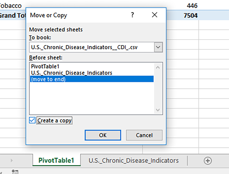
To make another PivotTable to compare Kansas health scores with those of its neighboring states and also the U.S., right click the PivotTable1 sheet and make a copy at the end. Click OK. (Figure 14)
Figure 14. Copying the PivotTable1
Based on the data, the other states’ data was added, and a spider chart was created. (Figure 15) (Side note: Copying a data visualization out into a different file will render it a flat and non-interactive visual file.)
Figure 15. A Sense of Chronic Disease Indicators for Kansas and Surrounding States
With some experimentation, it becomes easier to directly ask and answer questions using pivot tables.
Pivot tables are often used to showcase data in a summary way via dashboards.
Dashboards (with Slicers) in Excel
To create an interactive dashboard in Excel, click the plus button (or shift + F11) at the bottom left in the worksheet tab area. Rename the worksheet “Dashboard” (or something more creative).
Ctrl + A to highlight the target worksheet, and add a neutral non-distractive color to hide the respective cells.
Copy the data visualizations from the pivot charts into the space (the bar chart, the spider chart).
Go to the Insert tab, and select Slicer. Indicate the variable that you want users to be able to use to interact with the available data in the data visualizations. Such interactivity makes the data more understandable (in some cases) and more engaging and dynamic. (Figure 16)
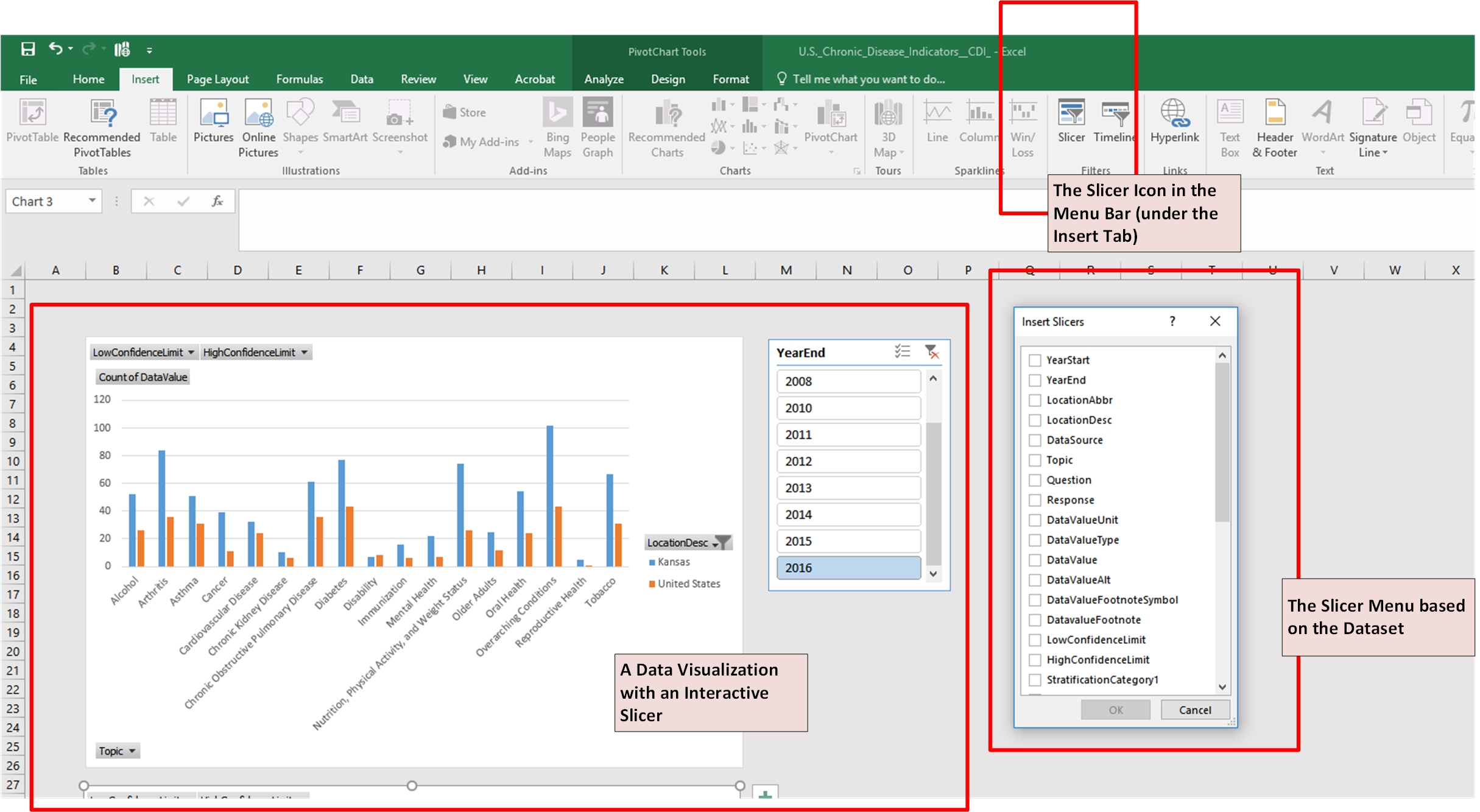
Figure 16. Creating a Dashboard from the PivotTables
In the dashboard, there can be a number of data visualizations and a number of Slicers. To make a Slicer applicable to all the data visualizations on the dashboard, right click the Slicer, and select Report Connections. Click all the respective Reports. (Figure 17)
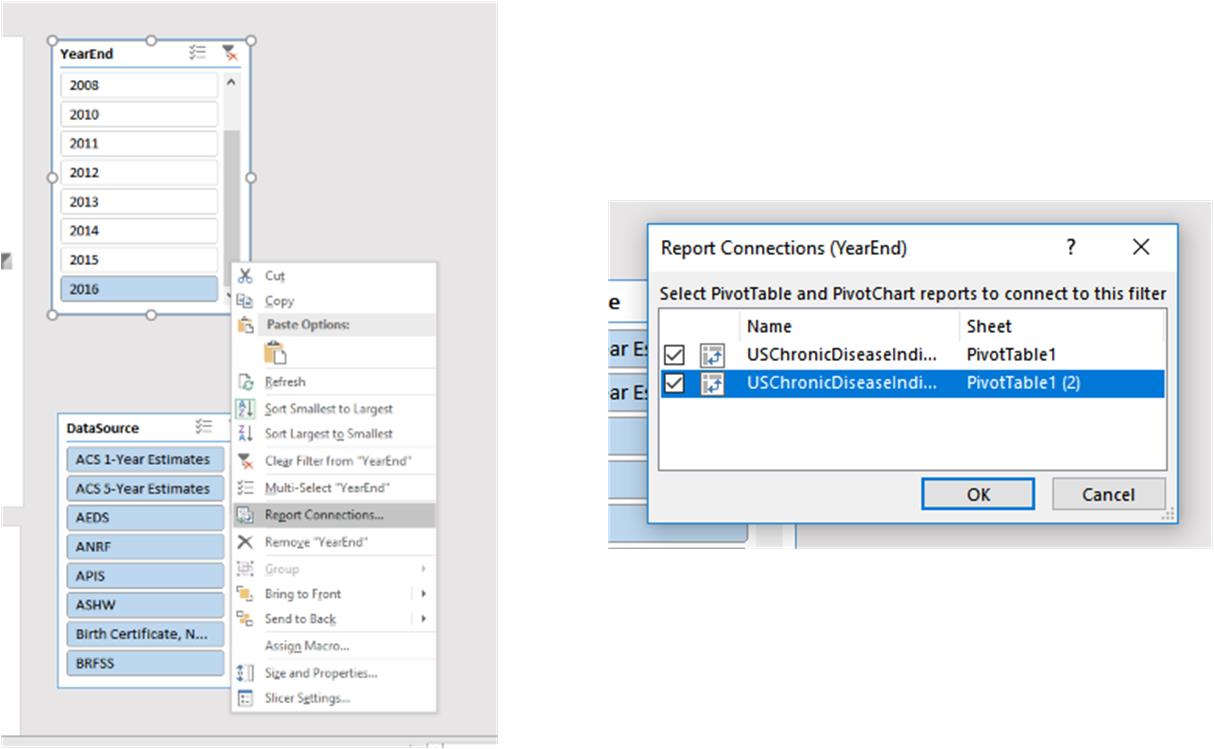
Figure 17. Report Connections (for the Data Visualizations on the Excel Dashboard)
These Slicers work best across the data visualizations if the variables are cross-cutting the respective data visualizations and if there is not a lot of empty cells (incomplete data).
Saving the File
To preserve the pivot tables for reuse, do not resave data as a .csv (comma separate values) file. Rather, save as a .xlsx file or as a typical Excel workbook. There are VBA (Visual Basic for Applications) code snippets that can be used to lock various pivot tables if a file is to be shared (and if locking is desired).
Others may want to share the dashboards online. In that case, a file may be saved into OneDrive…or a version may be output to present online (Save -> Share -> Present Online) for interactive Internet dashboards. (Figure 18)
Figure 18. Creating an “Online” Presentable Pivot Table and / or Dashboard with Slicers
Conclusion
This is a simple walk-through of how basic pivot tables work in Excel 2016 and some of its capabilities. This work focused mostly on function and very little on aesthetics.
About the Author
Shalin Hai-Jew works as an instructional designer at Kansas State University. Her email is shalin@k-state.edu.
| Previous page on path | Cover, page 13 of 22 | Next page on path |
Discussion of "Creating a Simple PivotTable in Excel 2016"
Add your voice to this discussion.
Checking your signed in status ...