Geographic Information Visualization by R
By Jiena G. McLellan, The Beef Cattle Institute, Kansas State University
Geographic Information Visualization, which can get us to our favorite restaurants, help us avoid busy traffic, and assist us in foreign countries, plays a huge role in the Information Era. By utilizing the powers of geographic information visualization, we can not only enjoy playing with the data, but also make better decisions with better insights.
In this article, I will introduce how to apply geographic information visualization in different fields. With the help of an R package “choroplethr” [Ari Lamstein and Brian P Johnson (2017). choroplethr: Simplify the Creation of Choropleth Maps in R. R package version 3.6.1.], we can generate the geographic heat map to visualize the data.
1) Unemployment rate in US from 1990 to 2013
Staggering from the impact of economic dynamics, natural disasters, and varying job markets in the US, the US unemployment rate fluctuated year by year. To have a better understanding of the distribution of the unemployment rate by different regions, it is vital to use a visualization tool to acquire an overview of the data.
This animation demonstrates the unemployment rate from 1990 to 2013 by county level. Data is from the US Bureau of Labor Statistics (BLS) Local Area Unemployment Statistics (LAUS) (webpage: http://www.bls.gov/lau/ ), which is available in “rUnemploymentDate” R package [Ari Lamstein (2017). rUnemploymentData: Data and Functions for USA State and County Unemployment Data.].
In this animation, we can not only visualize the distribution of unemployment rate by counties but also the progression of unemployment distribution year by year. In this way, we can dig through the data to have better insights. For example, as we have known, tourism is the prime support for Nevada’s economy, so the global financial crisis of 2007 to 2009 had a great negative effect on the unemployment rate in Nevada during that time.
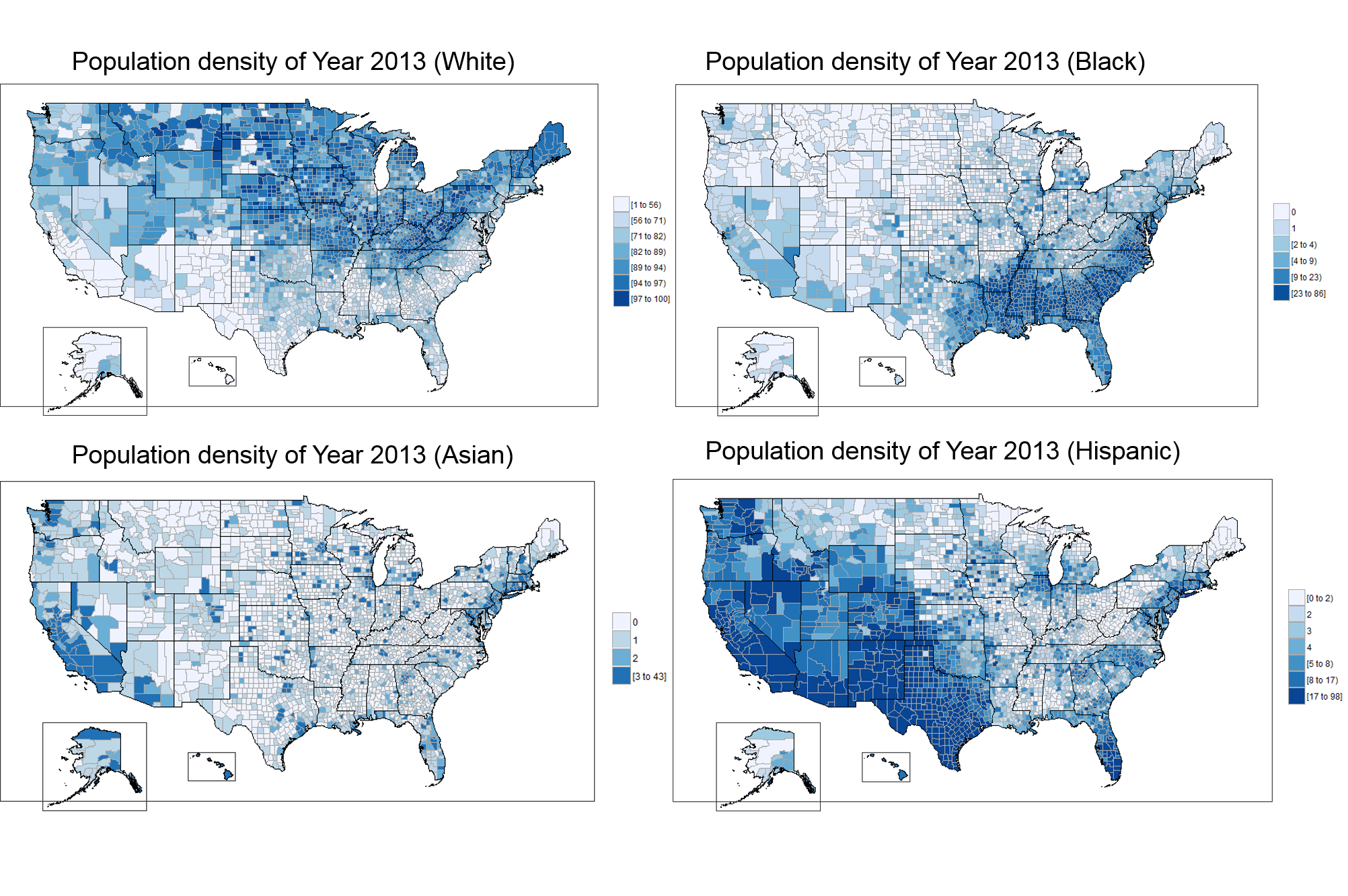
2). US Demographic visualization in 2013
As we known, demographic data is collected partially through the act of counting people. But it is also vital to have a better insight of the population density and the density by race. The US heat map visualization tool can help us to have a better overview of us demographic distribution.
The data comes from Year 2013 of the 5-year American Community Survey (ACS). It is not surprising that the West Coast and East coast have higher population densities than the Midwest area in the US. Aggregating the population by race, we can see the demographic by each race in the U.S. The last heat map is the income per capita in 2013.
Figure 1: Total Population of the U.S. in 2013
Figure 2: 2013 Population Percentage by Race
Figure 3: 2013 Per Capita Income
Data visualization techniques have been widely applied with different sorts of data. Due to the nature of geographic data, a heat map would be one of the best options to tell the story.
In summary, using the geographic visualization tool, we can have better insights from the data. Converting the census data or other geographic data to the heat map helps the general audience catch insights from data and visualize the data stories.
About the Author
Jiena G. McLellan is the project coordinator of the Beef Cattle Institute (K-State Vet Med). Originally from Guangdong Province in China, she came to K-State with a degree in bioengineering. She received her master’s degree in statistics from Kansas State University after she finished her Graduate Certificate in Public Health. She is interested in storytelling with big data by using various tools such as data visualization and applied statistics. Her expertise is in big data analytics, applied statistics and create interactive applications with automatic reporting system. She may be reached at jiena@vet.k-state.edu.
| Previous page on path | Cover, page 4 of 26 | Next page on path |
Discussion of "Geographic Information Visualization by R"
Author's Web Page
Jiena Gu McLellan has a new personal web page showcasing her professional and educational interests and achievements. This may be accessed at https://www.jienamclellan.com/.Posted on 11 September 2018, 2:24 pm by Shalin Hai-Jew | Permalink
PlayeR Website
Jiena McLellan also has a site that enables users to interact with R. This is a very user friendly website at https://appforiarteam.shinyapps.io/PlayR/.Posted on 11 September 2018, 2:34 pm by Shalin Hai-Jew | Permalink
Add your voice to this discussion.
Checking your signed in status ...