Textual Adaptation in The Nursery Alice, 1889
The Nursery Alice, besides the addition of Tenniel’s colored and enhanced imagery, is also extremely different from a textual standpoint. There are many varieties of type throughout this work: bolder and larger styles used for headings in the first few pages as well as chapter headings, italicized type used to emphasize certain information, all-caps types, and decorative font for the short poem “A Nursery Darling
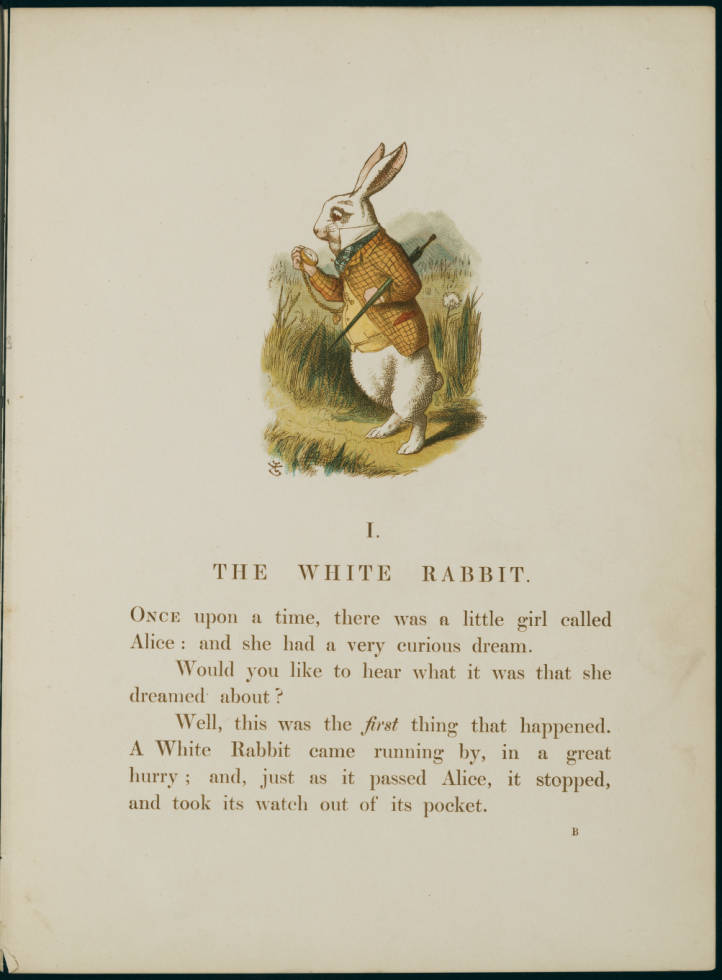
One of the main principles of visual design is contrast: in order to make a distinction between elements on a page, there should be a level of difference between them (Williams). The way elements are contrasted will depend on the audience. For instance, older readers will need a larger typeface so they can see it from far away, young adults are drawn to strong graphics that pop against a mobile screen, and young children to textual accompaniment that marry well with vivid imagery. Carroll’s emphasis on titles or chapter headings as well as the physical layout of the text itself, creates an eye-catching device. While examining the nursery version next to the original Alice, it becomes evident the Nursery version is also significantly distilled - some scholars even call the shortened text in this version “captions” (Goldthwaithe). Unlike the original, Carroll waited for Tenniel’s enlargements before writing the text for the nursery version. Because the images within the book (and those of the redesigned cover art by Gertrude S. Thomson), were tailored for pre-readers, the text would also have to be adjusted (Brown). The narrative was thus a direct consequence of the 20 images chosen for the book.
One of the main principles of visual design is contrast: in order to make a distinction between elements on a page, there should be a level of difference between them (Williams). The way elements are contrasted will depend on the audience. For instance, older readers will need a larger typeface so they can see it from far away, young adults are drawn to strong graphics that pop against a mobile screen, and young children to textual accompaniment that marry well with vivid imagery. Carroll’s emphasis on titles or chapter headings as well as the physical layout of the text itself, creates an eye-catching device. While examining the nursery version next to the original Alice, it becomes evident the Nursery version is also significantly distilled - some scholars even call the shortened text in this version “captions” (Goldthwaithe). Unlike the original, Carroll waited for Tenniel’s enlargements before writing the text for the nursery version. Because the images within the book (and those of the redesigned cover art by Gertrude S. Thomson), were tailored for pre-readers, the text would also have to be adjusted (Brown). The narrative was thus a direct consequence of the 20 images chosen for the book.
Not only is the text changed to make it more visually appealing, the book is shorter (the original Alice text is closer to 70 pages, while the Nursery version is merely 56), and the point of view shifts from Alice telling the story to Carroll telling Alice’s story. This narrative style invites a distinct dialogue between author and reader, as well as reader and listener. There is now a narrator “leading” the listener through a curious landscape, seemingly holding their hand. Carroll functions as the stand-in parent; his writing mimics the kind of show and tell, question and answer format many parents already employ when reading aloud. Carroll also pauses in the plot for small “teaching” moments, where he speaks directly to his imaginary young listeners. During the Caucus race scene, he addresses the audience with, “You don’t know? Well, you are an ignorant child! Now, be very attentive, and I’ll soon cure you of your ignorance!” This interjection does not exist in the original. Instead, Alice asks the Dodo to explain the race.
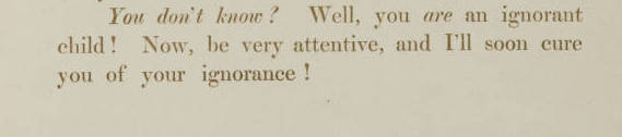
Carroll interjects and addresses readers during the Caucus race scene.

In the original version, Alice asks the Dodo the meaning of “Caucus Race”.
There is a playful, didactic tone to Carroll’s interjections. These “conversations” between reader and author occur throughout the text. Because there are so many instances where Carroll addresses his audience, children are invited into a more direct relationship with the author. Or at least, a more direct relationship with whoever is reading them the book. Even with an emphasis on communication between reader and listener within the nursery version, a similar style is built into the original Alice. The character of Alice is inquisitive, constantly curious, and unafraid to face the next obstacle. She challenges readers to consider what they would do if they found themselves in Wonderland. Carroll merely adapts this conversational, interjective tone to appeal to a younger audience, building in many personal asides and remarks and creating an interactive experience engaging enough for even those under five years of age.