A Detailed Look at Wealth Inequality
Now let’s turn from income to wealth. While income captures the money coming into a family or household an annual basis, wealth measures accumulated assets or “net worth.” This includes savings, home equity, and investments (and subtracts debts). Here the American pattern of inequality is starker still, although also less widely understood or appreciated.
Consider the latest data on patterns in global wealth, from Credit Suisse’s 2012 Global Wealth Report. Of the 166 countries included in the report, the United States is—unsurprisingly—one of the wealthiest, with a mean (average) wealth-per-adult of about $260,000—making it the 7th richest nation on that list.
But that is a pretty coarse measure; the mean simply divides national wealth by the national adult population. A more telling benchmark is median wealth—the point at which half adult American are worth more and half are worth less. On this metric, the United States (at only about $39,000) drops to 27th. Indeed the yawning gap between the mean and the median is pretty good measure of wealth inequality. If average wealth is $260,000, but half of all adults have a net worth of less than $39,000, a lot of wealth is being hoarded at the very top.
The graphic below plots all 166 countries. Mean or median wealth runs up the vertical axis, so that the richest countries are at the top of the graph. And the gini index of inequality (a measure that runs from 0 to 100, with 0 indicating perfect equality) runs across the horizontal axis, so that the most unequal countries are to the right. The US, the red dot, clear stakes out the upper right: rich and unequal. All of the countries richer (higher on the graph) are also more equal in their distribution; the few that are more unequal (those to the right of the US) are also much poorer.
The relative position of the US is clearer if we narrow our focus to a smaller universe of rich and democratic peers. Of these 166 countries, 29 have a mean adult wealth of $100,000 or more. In this company, the United States ranks 27th of 29 on median wealth, and dead last on the two inequality measures: the gini index, and the ratio between mean and median wealth.
The top 1 percent claim about a third of the nation’s wealth [see FIG below]. The top 5 percent claim over 60 percent. The top 10 percent claim over 70 percent. The top 20 percent claim over 80 percent. The next two percentiles—those falling between the richest 20 percent and poorest 40 percent—together claim a little more than 10 percent. Leaving the poorest 40 percent with a share of national wealth that is nearly imperceptible on the chart.
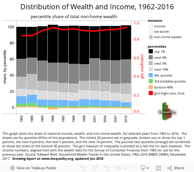
This inequality has been attenuated in recent years, since housing is (or was) the main source of wealth for middle-income American families. Between 2007 and 2010 alone [see FIG below], those in the broad middle class (between the 20th and 60th income percentiles) saw their family wealth slip almost 40 percent. The recession hit the wealthy hard, but they rebounded quickly: by 2011, the richest 5 percent were back were they were in 2003, while net worth for the median household had fallen by half over the same span.19
Sidebar: Blue Collar Mortgages
One of the simplest and starkest measures of growing inequality lies in the juxtaposition of blue collar earnings with costs of sustaining a middle-class standard of living. Wages for most Americans and incomes for most American families have slipped or stagnated for a generation. Core household costs (for education, for health care, for transportation) have, over the same span, continued to rise.
Housing is especially important in this respect, because it is both a household expense and, as an investment, a source of household or intergenerational wealth. The graphic below summarizes income or earnings, and housing costs, for a few key demographics . The green bars, rising sharply between 1970 and 1980 and then leveling off, show the monthly payment (assuming a loan at 90 percent of value on prevailing terms) on a median value home. The 1960-1980 spike in housing costs, in this sense, reflects both steadily rising home values, and high interests rates. The blue bars show monthly income or earnings. And the table in the lower left shows the share of monthly income or earnings (depending on the chosen demographic) needed to make those housing payments.
This distribution of wealth is starkly at odds with that of our international peers [see FIG below]. The share claimed by the top 1 percent in the US comes closer to the share claimed by the top 5 percent in most other settings. The share claimed by the top 5 percent in the US, exceeds that claimed by the top 10 percent in all other settings. And the share claimed by the top 10 percent in the US is—for most of our peers-- as close to the median as it is to the 10 percent.20
Consider the latest data on patterns in global wealth, from Credit Suisse’s 2012 Global Wealth Report. Of the 166 countries included in the report, the United States is—unsurprisingly—one of the wealthiest, with a mean (average) wealth-per-adult of about $260,000—making it the 7th richest nation on that list.
But that is a pretty coarse measure; the mean simply divides national wealth by the national adult population. A more telling benchmark is median wealth—the point at which half adult American are worth more and half are worth less. On this metric, the United States (at only about $39,000) drops to 27th. Indeed the yawning gap between the mean and the median is pretty good measure of wealth inequality. If average wealth is $260,000, but half of all adults have a net worth of less than $39,000, a lot of wealth is being hoarded at the very top.
The graphic below plots all 166 countries. Mean or median wealth runs up the vertical axis, so that the richest countries are at the top of the graph. And the gini index of inequality (a measure that runs from 0 to 100, with 0 indicating perfect equality) runs across the horizontal axis, so that the most unequal countries are to the right. The US, the red dot, clear stakes out the upper right: rich and unequal. All of the countries richer (higher on the graph) are also more equal in their distribution; the few that are more unequal (those to the right of the US) are also much poorer.
The relative position of the US is clearer if we narrow our focus to a smaller universe of rich and democratic peers. Of these 166 countries, 29 have a mean adult wealth of $100,000 or more. In this company, the United States ranks 27th of 29 on median wealth, and dead last on the two inequality measures: the gini index, and the ratio between mean and median wealth.
Back to Introduction
| Previous page on path | Mind the Gap, page 3 of 4 | Next page on path |

Discussion of "A Detailed Look at Wealth Inequality"
Add your voice to this discussion.
Checking your signed in status ...