When Words Emerge
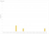
This visualization represents when words were used and how frequently organized by date. It was the most difficult because there were multiple variables at play. I initially wanted to have all the information in one chart but opted to visualize it differently for the sake of legibility. All the visualizations are bar graphs to facilitate clear lines and distinctions between days and word occurrences. Each one is a different color. Unlike the article frequency where there is uniformity in the thing that is measured, each word here is distinct and different from the others. The word is counted as its own rather than part of a vague set of referents. I used the dashboard function in Tableau to collage the different visuals together, and this collage allows each graph to maintain its standalone integrity to be able to see these words and their occurrences side-by-side to compare when each word was used and in how many articles. What is notable about this word mapping was the emergence of the term “boatpeople” as a way to refer to the Rohingya and others being trafficked into other parts of southeast Asia. It is as if the term “boatpeople” has become synonymous with the Rohingya in its consistent usage from May 14th to May 30th. This word’s appearance also lines up with a shift in the events surrounding the Rohingya. In the middle of May, the boat with Rohingya onboard were turned away by different countries, such as Thailand, and pushed back out to sea. This inability to land gave rise to the term “boatpeople” not only as those traveling by boat but those who were also bound to their boats because there was no other place to go.
This page has paths:
- The Power of Words Melissa M. Chan