Thanks for your patience during our recent outage at scalar.usc.edu. While Scalar content is loading normally now, saving is still slow, and Scalar's 'additional metadata' features have been disabled, which may interfere with features like timelines and maps that depend on metadata. This also means that saving a page or media item will remove its additional metadata. If this occurs, you can use the 'All versions' link at the bottom of the page to restore the earlier version. We are continuing to troubleshoot, and will provide further updates as needed. Note that this only affects Scalar projects at scalar.usc.edu, and not those hosted elsewhere.
The Book AsMain MenuA Repository of InformationA PerformanceA JourneyJessie CarterA Conceptual Playground for Choice(sagesolar, 2014, “The king of hearts”)A Medium for Universal LanguageA Phenomenal ReadingA Relationship Between Recto and VersoA Vision of the FutureA Repository of LanguageKate Aberman74d96e55dd29b74bef0e0a20c2d79e879fab26ccEmmie Banksd3c00922e17d33400599c8143d1d353f7d36ea7aJessie Cartera6f04f02805133baaf416ab9fcd9a4a2b857b080Deanna Fayed2f0ded76fb9215a15ea7a11b638a892a604843bfGabby Huberta3f266b029aa2bada1c10fd4a31317d37a1bec9dKatherine King6125a92332113f4973e618b8e428aac70a6ed790Carol Leea596a4440954bb8282b044cb431f3d2b8a9a8e75Sarah Richmanbeb66f0b62cd0c55d75ac46cfcf447f52ffe6aa8Matthew Winz5800f51dc1a62f1d2397973f41e4b16a521351b3whitney trettienf2bbb7126b60dc1bee07050dccbd9d30f12d7b2b
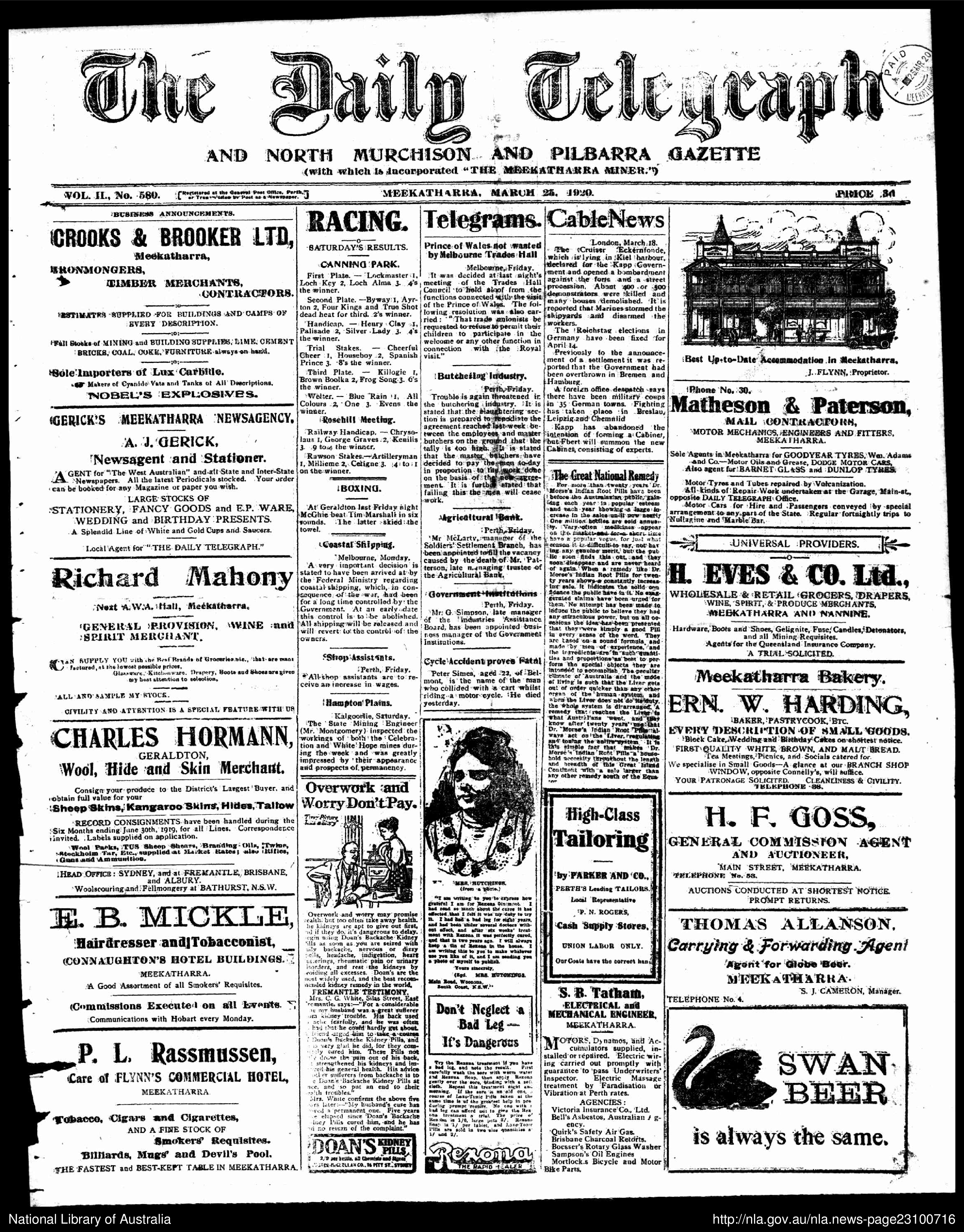
Newspaper Layout
12016-12-05T15:37:00-08:00Kate Aberman74d96e55dd29b74bef0e0a20c2d79e879fab26cc135563National Library of Australia, 1920, Wikimedia Commonsplain2016-12-08T20:23:25-08:00Kate Aberman74d96e55dd29b74bef0e0a20c2d79e879fab26cc
A path exploring the relationship between visual queues and the reader
by Kate Aberman
I appreciate you visiting this page , as I'M THRILLED TO SHARE THIS WITH YOU
Hopefully you understand my excitement from above – I aimed to put my voice in your head as you read that. Synesthesia may affect a small portion of the population, but almost all of us can be emotionally affected by visual queues found in our day-to-day lives. Let's call this emotional affectivity the phenomenal experience of reading – something beyond the literal.
If you strip down a text to its minimum - with one, black font in a singular column - the page feels barren. This brings to mind the newspaper column, but even the structured periodicals have variation to catch our attention. It’s possible that a purely barren form might bring us to tears (I may be overdramatic). But writers, artists, and readers alike seem to fight against a minimalist presentation, often to fully involve the reader and create a secondary understanding to any text. Even the existence of this website, scalar, is a prime example of the visual aspect of reading and understanding. We incorporate media and text paths to create a fluid, mobile structure catered to the reader’s curiosity and choice.
We are lucky to be able to read beyond words and because of this we can take multiple readings from one layout by considering new meanings from the emotional aspects of color, font, and shape. Varying each aspect of the visual path allows for differentiation. I can change mood by varying font and connect ideas with subtle similarities. One visual connection can contain different themes and keep them separate from another, yet still allow them to exist on the same page – manipulating the space beyond the physical relationship.
The following paths explore how artists like Stephan Mallarme, Johanna Drucker, Graham Rawle and Jonathan Lethem utilize shape, color, and font to play with the interaction of words beyond their next-door neighbors.