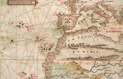
Composite Map
The next step was to visualize the data from the three aforementioned tables. The maps below, created with Carto DB, illustrate the unfolding of the legend over time. Taken together, these maps show how the once-European phenomenon of Prester John spread across the globe.
The composite map below visualizes the data from the three aforementioned tables, covering the years 1122-1700.
In addition to plotting over six centuries worth of information, this map depicts four layers:
- Author Origins (orange)
- Author Travels (red),
- Textual Origins (blue)
- Kingdom Locations (polygons, shaded light to dark according to the year ascribed to the Prester John sighting).
By clicking on the points on the map, the reader can learn more about that particular author, text, or Prester John sighting.
While this map illustrates something of the sheer volume of Prester John data available as well as the legend’s global reach, it does not tell much of a story in itself. In the following section, I will break this data down in a series of maps organized by what I will henceforth refer to as “eras” of the legend. I have designated five such eras. In the following section, I will use these maps to help tell the global story of Prester John. In this Version 1.0, I will focus particularly on the first two eras, though I will provide maps to help illustrate all five.