CHAPTER FIVE.
INCLUDE THE YELLOW HALLWAY PICTURE
Written By: Celeste Moore
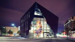
Just to touch down on the actual architecture of MOCA, that brings me to mention Museum Architecture written by Justin Henderson. I've talked about the building space as a whole, how the inside of this museum looks, and the amount of detail they've put into the available space they do have - but I never spoke about the construction of the building and how it ties together with the aesthetics. "The museum clearly exposes the constant tension between the specialized need of the institution, its unique requirements for exhibition, preservation, and education, and the desire of the architect for an aesthetic statement" (Henderson 7). The building itself is just as important because it's the first thing the visitors see before even walking in, already giving the museum a chance just by it's outward appearances. When I first arrived to Cleveland and I was able to pass by this building on the way, I was immediately drawn to this museum because of the steel, polished look. The open windows were inviting and it gave you a chance to peek in and catch a glimpse of what's actually inside. As shown above in this photo, you can already see the white stairs that's been mentioned many times in this book but a painting is decorating the outside of the steps, giving it a pop of color and something to catch the attentions of people who weren't planning on visiting. This museum always seems to draw attention with small things, keeping things fresh, and wanting to show off to anyone who hasn't gotten the chance to step inside. Which brings me to mention Blue Steel once more, the clear understanding that the article has for the structure and decisions towards the space of this museum. There's a specific quote from that I want to focus on for a moment before ending this chapter. "MOCA's interior walls, and occasional suspended ceilings, are white. The architect has, however, scrambled established notions of the 'white cube' gallery by unexpectedly-painting the overarching roof and enveloping outer walls a uniform dark blue. The structure, angled like the exterior, is exposed and painted to match the interstitial panels. On inauguration day, Moussavi noted that inside the white cube art floats, whereas with the dark ceiling at MOCA art appears grounded. Certainly these galleries are seldom neutral; the visitor experiences a sequence of spaces and volumes to provoke artist, curator and visitor alike. Beneath the open staircase, for instance, an enclosed exit stairway is painted a brilliant yellow and intended for sound installations such as that currently on show by Korean artist Haegue Yang" (Blue Steel. Architectural Review, no. 1389, Nov. 2012, pp. 30–39. EBSCOhost). To give the visitors an experience, to show how space is still the biggest part of MOCA. As a visitor myself, my eyes did wander and I was very curious on why or how the museum planned out not only the space but the interior that provides a soft but stern look. I may not be able to answer such a question but now that I know the museum truly cares about the structure and giving their visitors some sort of experience that involves space makes me happy as the author to know that the topic I've chosen has been able to be backed up successfully. And as mentioned in the quote, the yellow hallway that leads to the exit is another experience, even if the space gets smaller and smaller as you walk down the steps. It's something I haven't been able to experience in any other museum and the sound that's echoed throughout helps the space to be sort of enclosed and secure as you try to find your way around. You'll meet a lot of dead-ends but it's a fun experience that the museum created for some kind of enjoyment.