Inequality trends, indexed version
This version plots the same data, but indexes dissimilar measures (share of income, hourly wages, gini index) to a common scale. Choose either 1947 or 1979 as the index year. All measures are pegged at a value of 100 in the index year. Subsequent data points can be read as a percentage change over time. When the share of income going to the top one percent (the red line on the graph below), for example, is indexed to 1979, the 2012 value indicates a percentage increase since 1979--in this case about 117 percent.
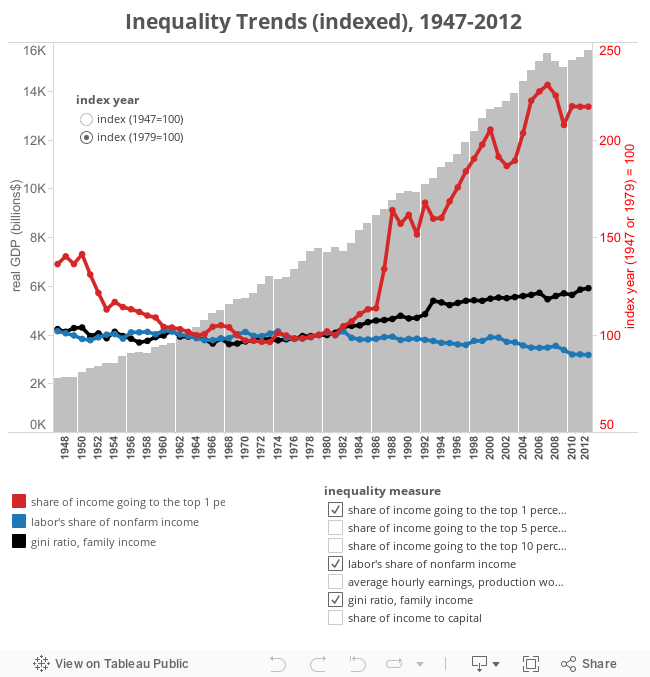
Sources: Share of income to top 1, 5, and 10 percent from World Top Incomes Database; labor and capital shares of income from the BLS, major productivity series; Gini ratio from Census Bureau via FRED series GINIALLRF; average hourly earnings from the BLS, current employment statistics, series CEU3000000008.
Sources: Share of income to top 1, 5, and 10 percent from World Top Incomes Database; labor and capital shares of income from the BLS, major productivity series; Gini ratio from Census Bureau via FRED series GINIALLRF; average hourly earnings from the BLS, current employment statistics, series CEU3000000008.

Discussion of "Inequality trends, indexed version"
Add your voice to this discussion.
Checking your signed in status ...