The Face Lift
By Suhaily Erkkila & Lindsey Parker
The book cover has often been one of the most important ways publishers capture and direct the reader’s attention. Think about the way that you browse a bookstore, physical or digital. More often than not, the cover is the first thing that catches your eye, it’s the first thing you see. It’s the difference between putting the book in your hand down and picking up another one that looks more interesting.
What IS a cover?
Think of a cover as a face. The face contains the majority of the features that identify any one person— if every single book in a bookstore was just plain white with simple black lettering, it would be physically impossible to tell one book from another. What’s more, a cover exists to catch our interest. A boring book cover is a book that doesn’t get read. Craig Mod, in his article Hack the Cover, has a lot of pertinent points about the digital book cover: where it’s been, what it’s doing, where it’s going.
“Here, the cover is a protector of the signatures and the binding. It allows the books to fly in and out of the stacks a thousand times, and still be usable. In the digital world, our books are protected by ubiquity. They are everywhere and nowhere. They multiply effortlessly and can fly continuously without damage or rot. They don't need covers like printed book need covers.”
On most points, I think we can all agree that the way we consume literature has changed, is changing, and will change. On the other hand, it is difficult to say that you browse through a digital space just looking at the metadata. How many people would choose a book solely on the year it was published, the current price, and how quickly you could have it shipped to your home, or download? That is not to say that metadata has no purpose in the digital world or in digital book covers. It does. Metadata is a useful tool for what could be described as an ‘extended cover’. It could include genres, intended age group, novel length, or even suggest books similar to the one you are currently looking at!
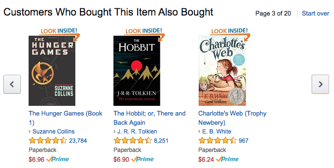
Figure 1 Amazon offers a new perspective on what makes a good book cover. Above are some examples of book covers online.
The point is, the cover is changing. It functions as it always has: catching the eye. It just needs a facelift! The striking visual cover of a digital book should be designed with six elements in mind.
- Strong focal point
- Contrast
- Balance
- Movement
- Rhythm
- Unity
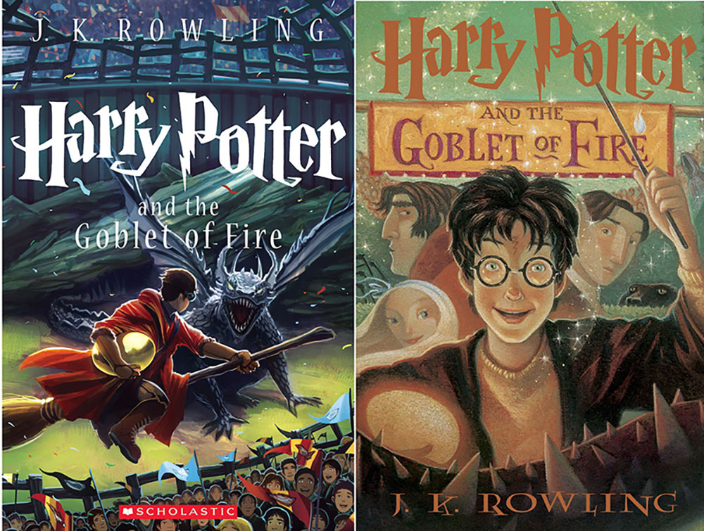
Designing a digital book cover will require a design to transfer well across different devices. One should have a good focal point to draw the eye. Contrast to help with legibility and readability. Balance keeps things from being overwhelming, while movement and rhythm keep the cover interesting. The most important principle is unity, because every principle must work to unify the cover. Pictured below are two different versions of the same book.
The book on the left has clarity, good detail, and color. It tells an exciting and interesting story. It is easily identifiable from the metaphorical shelf. The book on the right has a dull use of color and Harry is the only recognizable thing in the image. There isn’t much content about the story. This does address a new problem, when it comes to cover design: on some devices the only representation of a book is a small icon about the size of your thumb. How do you include all these principles in something so small?
New Digital Covers
Physical book covers haven’t really transitioned well into the digital age. When shopping for a book on Amazon, the cover is given little precedence over things like reviews, ratings, or other important data. Craig Mod, again in Hack the Cover, states that products like the Kindle remove the intimacy that a book cover can provide.
“We jump in and out of digital texts with little to no procession. In contrast, every time you set down a physical book, the cover is staring up at you. And every time you pick it back up, you have to go “through” the cover to get to the text. Do that five times and you'll never forget the title or author.”
Which further proves the point of intimacy between a reader and a book’s cover. We should work at rebuilding the reader's relationship with digital covers. New digital covers that use GIF animations, open up a whole new realm of possibilities. However, one can run into the same problems with animated book covers as with regular book covers; often less is more. A design that is too complicated can draw away from a focal point.
Below are examples of two different book covers, we believe one works and the other one does not. Harry Potter and the Sorcerer’s Stone works well because it seems simple and interesting. You still get the iconic lightning bolt, but the stone is the focal point. The neutral brown background helps the red of the stone stand out. The shine of the stone is subtle but captures the eye. The font is smaller than the font used on the physical book. It has also been relocated to the bottom of the cover. The Illustrator removed the author’s name because the information is already provided elsewhere.
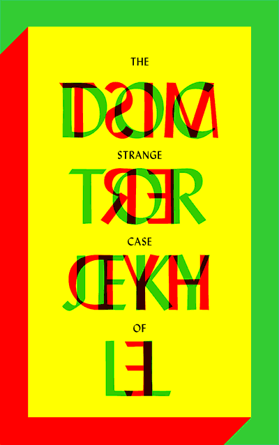
The cover for The Strange Case of Doctor Jekyll and Mister Hyde is one that has too much going on. While the cover embodies the main character’s life, it is not legible and very difficult to read. The colors are too saturated. The yellow colored background is very hard to look at. The green and red clash with the yellow and make the text hard to read.
The Web Cover
More and more book-related fads are popping up as the digital age progresses. Book trailers are becoming more and more popular, as are Twitter launches and Facebook campaigns. The fad that is perhaps becoming the most popular, is the web cover. A book's website functions like the cover of a physical book. Along with striking visuals, a website might include information about the author, book excerpts, reviews and blurbs, ratings, purchasing information, etc. With a web cover, a publisher is not having to battle the issue of physical space as in a physical design, or even an icon. The only issue with a web cover is keeping that recognizable consistency between every version of a given book. The main image or icon that identifies the book will move from a graphic for a website, to a Twitter Image, to a Facebook page, to a Youtube video, back and forth dozens of times. It has to be recognizable.
The Face of this Project
At the beginning we weren’t sure where this project was going to go, but as we continued to work on it an idea started to come to mind. The ultimate goal was to design an image that would transfer well between all mediums. It had to be something eye-catching, unique, but also not too complicated.