Telling Data Stories
By Shalin Hai-Jew, Kansas State University
IFrame 1*: Tableau Public Gallery
An exploration of Tableau Public’s online gallery shows a range of data visualizations, and some of these may be “data stories.” A “data story” is a narrative package containing data (facts and statistics, often not yet processed into information) depicted visually to convey a focused message. While “drama” has derogatory implications, in terms of data stories, the “drama” captures people's attention and makes data meaningful.
Data stories have been described as having certain patterns. Some just provide an overview of a context, such as a “by the numbers” point-of-view (“POV”) of an issue. This would be a “light” (lite) data view.
Some datasets provide early warning of impending occurrences unless mitigating actions are not taken. US Geological Survey hazard maps provide such examples, particularly the time-dependent earthquake probability maps and forecast (predictive analytics) data. Some data stories suggest humor (with an edge) and provide entertainment (think a U.S.-based map of the seven deadly sins). Some data stories surface hidden information. Other data stories highlight problems to be solved, such as a Zika virus distribution map from the U.S. Centers for Disease Control and Prevention.
As such, data stories should resonate “intellectually and emotionally with an audience” (Waisberg, March 2014). While data stories are often a “dynamic form of persuasion” in an educational and “conformational” sense, the creators of such data visualizations cannot censor the data (Stikeleather, 2013) or otherwise contravene professional ethics in data handling. Aesthetically, data stories are supposed to be simple and clear vs. ornate.
Still, all who create data visualizations have a limited palette and constrained technologies through which to share information. It helps to be aware of those who will be using the data, controlling against unintended or malicious usage, and understanding how the smaller data story may be understood against larger narratives in the social environment.
To package data in an engaging and exploratory way, “data designers” are to consider the knowledge (“correct and incorrect”) and the attitudes of their audience and meet the informational needs of data story consumers in five groups: novice, generalist, managerial, expert, and executive:
“Novice: first exposure to the subject, but doesn’t want oversimplificationGeneralist: aware of the topic, but looking for an overview understanding and major themesManagerial: in-depth, actionable understanding of intricacies and interrelationships with access to detailExpert: more exploration and discovery and less storytelling with great detailExecutive: only has time to glean the significance and conclusions of weighted probabilities.” (Stikeleather, 2013)
Origin of “Data Story”
This term “data story” may be derived from prior terms “data journalism” (2009) and “database journalism” (2006), but it is not currently clear where “data story” originated.
A perusal of the Google Books Ngram Viewer shows that the term “data story” has appeared in English language texts for years but sparked in 1903 – 1910 and then from 1955 on through 2000 (the end date of the particular corpus).
IFrame 2: “Data Story” in the Google Books Ngram Viewer
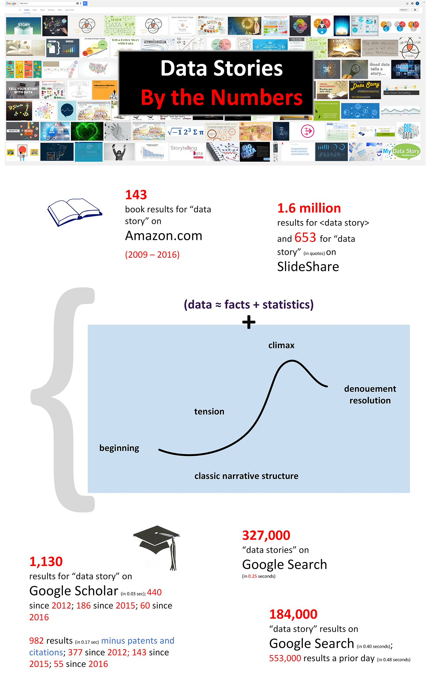
A Google Search results in 553,000 results for “data story” (in quotes). On SlideShare, there are 1.6 million results for <data story> and 653 for “data story” (in quotes). Data stories are available across a range of professional news sites, blogs, academic and other publisher sites, and other information providers.
It turns out that using a narrative structure to deliver data and using data to deliver a story are an effective strategy. Data implies rigor, empiricism, logic, and scientific-based skepticism. Story implies connection with the human reader.
Figure 1: Data Stories by the Numbers
Data Stories in Instructional Design
In the design of online learning, data stories are used now and again. Sometimes, they are used to show system dynamics in interactive simulations (such as in the life sciences). Sometimes, they are used to show patterns in time (such as in history and political science). Data stories may be used predictively, to show trends or social phenomena, and to suggest interventions. Data visualizations are harnessed to identify patterns in text corpora (in linguistics, in language studies, and other fields). Data stories are used to support data analytics methods, particularly those that are amenable to visual expression (like network analysis). Data stories appear across the curriculums to various ends.
Some of the most common underlying data visualization types in data stories used in academia include the following: geographical maps, tables, line charts, bar charts, timelines, cluster diagrams, and others. These data visualizations may be incorporated into web pages, virtual games, slideshows, and digital learning objects. Oftentimes, one package may contain a number of different types of data visualizations.
Ideally, data visualizations should be understandable even if the visualization were separated from its presentational context (Waisberg, March 2014). Ideally, based on the ideals of reproducible research, the underlying datasets should be downloadable and separable from the data visualization itself. That said, some data stores are so integrated that the parts may not be particularly separable. For example, some data stories are deeply hidden and encapsualted within a three-dimensional immersive virtual world, such as those that simulate various geographical regions and enable environmental sampling at various virtual “stations”.
Static visualizations are considered fairly old school now, and most contemporary data visualizations are dynamic and interactive. (The iframed examples included here contain a mix of static and dynamic data visualizations and data stories.)
General Steps to Creating Data Stories in Higher Education
In instructional design work, the work may come in piecemeal, with small requests for advisement or design or design-and-development. Sometimes, the work applies to a short course, which is equivalent to about an hour of study. The work may involve co-design and co-development of a whole course or course series along with course efficacy test development (usually funded by an external grant). No matter what the starting context, the instructional designer starts with the development requirements and starts the design, evolves the design based on feedback, prototypes digital learning objects, and then goes full bore for the development. If a data story is required, it is usually one element among many which require design and development. (Sometimes, the faculty members themselves will design this and just include it in the learning sequence.)
Defined objectives. There are some basic steps to the design and development of data stories. As with most digital learning objects, a designer begins with defined learning objectives, the learning contents (the data, the messaging), and then the general learner profiles.
Available digital (and digitizable) contents. From this start, he or she begins looking for contents for the data stories. In some cases, the contents may be open-source and widely publicly available imagery, video, research articles, public domain datasets, and so on. In other cases, the information is made available by other team members and are often protected.
Creation of locally developed contents. After the available information is assessed, it may be critical to create local contents through photography, videography, write-ups of original research, locally acquired data, and other resources. (Sometimes, synthetic data is used in a data story to demonstrate a point in learning. This helps the instructor and the instructional designer to avoid problems with revealing unpublished research data…or having to explain the noise in real-world data.)
Deciding on authoring tools and platforms. Another important step is deciding what authoring tools or other technologies are used to deliver the data story. The data story has to work across a range of computers, browsers, and devices, and the data story has to be interactive and accessible. In many cases, the structured data is used to inform computer programs on how to algorithmically lay out the data. In other cases, software tools may be used to hand-draw data in an illustrative way. Of course, machine-drawn data is labeled and annotated as well, so there is always some room for manual description. Also, to explain the data, there is often text, and sometimes, audio and video. It is said that people do not respond to huge numbers, but they do respond to people’s faces and their stories. People understand data on a human level—both personally and through others.
Storyboarding the sequence and look-and-feel. The next step is to create a “storyboard” of the sequence of the data story. Sometimes, there is no direct storyboarding, but the design happens on-the-fly in the authoring tools. There are strengths and weaknesses to both approaches. Storyboarding out everything is lower-cost than developing on the fly, but some of the technologies out there are so easy-to-use that the difference in development time is negligible, and there are ways to salvage the effort even if a particular prototype created in-tool is not directly used.
In-team critique (and beta-testing). The data is built into the data story, and the data story itself goes back out to the team for feedback and critique. The interactive functionality is tested on multiple browsers and mobile devices.
Rollout. The learning object is rolled out to the public for testing...and usage in a teaching and learning context. There can be additional assessments for the efficacy of the data story...and changes may be made.
In online instruction, data is at the core of the data story, and the story is the packaging around that data. The main plot of the story is data, and the plot trajectory is a data-driven one. In some data stories, the underlying data is not only explorable, but it is also downloadable for possible analysis through other tools.
Various Strategies for Data Stories
Different experts describe data stories in different ways, and they share ideas on how to improve the communications of information.
Video 1: “Exploring 7 Kinds of Data Stories” (with Ben Jones of Tableau)
Video 2: “Shaping Data Stories with Neuroscience” / “The Neuroscience of Storytelling” (with Rawi Nanakul of Tableau)
In the following video, a New York resident uses an open data portal with NYC data to find insights and improve his city. He finds that his "improv" background is a benefit in terms of telling data stories. His energy and humor are helpful, too!
Video 3: "Making Data Mean More through Storytelling" (Ben Wellington, in TEDxBroadway)
The following is a popular blog with plenty of data stories linked to timely news.
IFrame 3: Nate Silver’s FiveThirtyEight Blog
Finally, at a recent conference, the author was introduced to "Surfacing," a creative and engaging interactive story built on the Scalar platform (which this publication is built on). This work combines rich representations of data in narrative format, in text, in photographs and visuals, in video, in maps, in interactivity, and in cutting-edge technologies. This work, which showcases primary research, is thought-provoking and worth a look!
IFrame 4: "Surfacing"
* About IFrames on the Scalar Platform: An inline frame (iframe) serves as a link to a live site, with that site presented in a window. The sizes of iframes are constrained within the design of Scalar. If the page in the iframe is not showing accurately, you can click "Details" to refresh the site in the iframe. If you click "View Page," you will navigate to that page. This navigation does not open a new web browser tab, so you will have to click the back-arrow to return to the article. To refresh the whole article (which does not seem to affect the iframes), you may refresh the page in the browser.
References
Stikeleather, J. (2013, Apr. 24). "How to tell a story with data." Harvard Business Review. Retrieved July 20, 2016, from https://hbr.org/2013/04/how-to-tell-a-story-with-data/.
Waisberg, D. (2014, March). "Tell a meaningful story with data – Think with Google." Google, Inc. Retrieved July 20, 2016, from https://www.thinkwithgoogle.com/articles/tell-meaningful-stories-with-data.html.
Resources
"5 best practices for telling great stories with data and why it will make you a better analyst." (n.d.) Tableau Software. Retrieved July 27, 2016, from https://www.tableau.com/sites/default/files/whitepapers/whitepaper_best-practices_telling_great_stories.pdf.
Puri, R. (2016, July 21). How to create a media-worthy data story. Buzzstream. Retrieved July 27, 2016, from http://www.buzzstream.com/blog/how-to-create-a-media-worthy-data-story.html.
A History of Data Stories
The following shows "A Long Lineage for 'Data Story' Precursors (on Google Books Ngram Viewer)." This interactive graph is presented through the direct "Embed" feature in the Ngram Viewer, but the following does "lose" some information, such as the annual-based period links to related data in Google underneath the linegraph. The tradeoff is that more of the visualization shows directly without having to navigate to the site.
Figure 2: A Long Lineage for 'Data Story' Precursors (on Google Books Ngram Viewer)
About the Author
Shalin Hai-Jew works as an instructional designer at Kansas State University. Her email is shalin@ksu.edu.
| Previous page on path | Cover, page 9 of 26 | Next page on path |
Discussion of "Telling Data Stories"
Add your voice to this discussion.
Checking your signed in status ...