Drawing a 2D Informational Graphic with Microsoft Visio Standard 2016
By Shalin Hai-Jew, Kansas State University
Among technologies commonly found in an instructional design toolbox, a basic diagram-drawing tool is a necessity. In daily application, these tools may be useful for adding a textual layer to an image, a screenshot, a screengrab, or a map. In more extensive work, instructional designers (IDs) draw original 2D diagrams to describe models, show timelines, explain processes, and depict methods for decision-making.
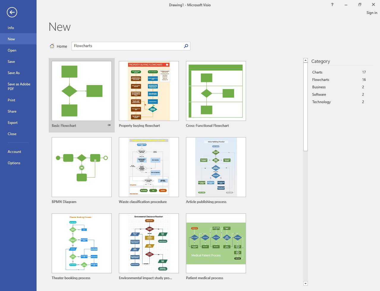
Figure 1: Flowchart Samples in Microsoft Visio Standard 2016
So why would an ID be drawing diagrams? First, most universities and colleges do not have a dedicated graphic designer for instructional design; rather, such talents are focused on the public relations and outreach parts of the organization. Second, while there are plentiful open-source and Creative Commons-licensed images, many of the images are widely used already, of unknown provenance, and also may not meet the direct needs of the learning design context. Third, many visualizations are not directly underpinned by data. Even though there are common layout algorithms to “draw” informational graphics directly from data, these do not apply to drawings based on concepts or hypotheticals or qualitative data.
Built-In Drawing in MS Office Suite Software Tools
While there are more illustration capabilities in Microsoft Word 2016, drawing features in Microsoft PowerPoint 2016, illustration and style features in Microsoft Excel 2016, many of the visuals are pre-packaged and look pre-packaged. Many visuals have pre-set numbers of spaces for text, and it may be difficult to re-edit the original visualization to add additional steps to a process or a model. The visualizations made in the prior software programs are built into the respective document or slideshow or spreadsheet, and it may take several steps to actually export a visualization. While the illustration and drawing features are welcome and can be highly useful, these features do not supplant the need for a diagramming tool.
In a stand-alone diagramming tool, like Microsoft Visio Standard 2016, while there are stencils with related shapes, there is a lot more flexibility in depicting various dynamics and relationships. In terms of stencil shapes, there are downloadable collections available for free; to use, just download the sets, unzip, and save the file to the MyShapes folder in the Documents folder.
Drawing with a Mouse
Using a mouse to draw does not provide the level of control that a trained stylus would. However, the developers of Microsoft Visio Standard 2016 have built in features to support accurate drawing.
A new Visio document may be started based on a number of data visualization conventions: software, flowcharts, business, floor plans, engineering, network, and schedules. The opening GUI even includes a direct search for online templates, to enable easy access to created templates used in certain industries.
Depending on the type of image being drawn, there are rich stencils (collections of related visual elements that fit a particular data visualization category or theme) with a variety of related shapes, arrows, and graph and math shapes. These shapes may be dragged into the drawing space, re-sized, moved around, and its features revised.
In the drawing space itself, there are various tools that enable easy drawing. These include a background grid, rulers (at the top and left sides of the drawing space), pull-down and pull-across guides (dragged from the horizontal and vertical rulers), and page breaks. Snap-to features help designers to align objects to a particular guide or guides. A designer may group objects along the top, bottom, sides, middles, and centers. He or she can distribute shapes across horizontal and vertical dimensions. He or she can also rotate objects by various degrees or manually.
For finer details, it is possible to zoom in to a particular part of the image for close-in attention. (It is hard to hide image defects when others can merely zoom in and check out a digital image at pixel level.)
Most mainline authoring tools have simple and intuitive graphical user interfaces (GUIs), which help disintermediate the work. Subject matter experts (SMEs), no matter what their fields, are often able to fire up a particular authoring tool and start using it right away. And if the initial interface somehow does not make sense initially, there are almost always dozens of videos on YouTube and slideshows on SlideShare that enable the use of that tool with a few tries.
Steps to Creating an Info Graphic
What are some basic steps to creating an info graphic in an instructional design context? Before any drawing happens, it is important to understand what the subject matter expert visualizes and what he or she (or they) wants it for.
- Data and Information: What information is being conveyed, and to whom?
- Angle on the Data: Is the data descriptive, prescriptive, proscriptive, or interpretive, or some mix of the prior?
- Data Source: Where does the core information come from?
- Ranges of Interpretation: How much interpretive range should viewers have in interpreting that informational graphic? (And how should the visualization be drawn to control for misunderstandings and to prevent them?)
- Self-Contained Meanings: If the image is stand-alone and separated from the learning context, how much informational value will that image have? Will it be sufficiently understood (and not misunderstood)?
- Aesthetics: Is there a desired aesthetic (and is that aesthetic defined in a project stylebook)?
- Instrumental Use(s) of the Imagery: What are the ways that the resulting imagery will be used (which goes to versioning and formatting)?
It is important to have a sufficient level of understanding early on to get started and to get the image maybe 70% of the way there, and then, the remaining nuances may be captured in the remaining time spent image-editing. In an educational environment, though, there is not a lot of room in any budget to re-do an image. Paper prototyping is preferred to actual full development work because the first is faster and lower-cost. A “just the facts” approach is preferred to something artful; if particular design aesthetics are applied, they should be of one kind and not multiple (which would create noise).
For complex instructional design projects, a project stylebook is defined to describe how various aspects of the project will be handled. Templates which embody the understood rules are created and used, in order to enforce a kind of consensus-built consistency
In terms of 2D informational graphics, the base pieces are built first, usually. Then, the text labels are applied. Relational details are emplaced. The overall look-and-feel is applied. After the initial image is drafted, then there are usually all sorts of updates and revisions—to the spacing of the objects, to the lines, to the text labels, and so on.
The act of drawing often illuminates parts missing from a model or diagram, so this process should be given sufficient time, to benefit the over-arching work.
Sometimes, if an image “satisfices,” that is sufficient. Informational graphics are often data summaries and therefore not comprehensively reflecting the underlying information. They are informed by conventions of common practice and emulation. They should not be derivative of others’ work, but if they are, that should be done with permission and source citation; there should also be enough modification that the resulting image is novel and contributory. That said, there are benefits to understanding some elemental features of two-dimensional figures.
Following Information Visualization Conventions
Essentially, an informational graphic is viewed from the left and across, from top to bottom, and from top left and down. This is not to say that informational graphics cannot be built to be read from bottom-up (or from right to left), but having different directionality works against collective trained habits (at least in the West). So what are so informational image conventions?
1. Drawing Human Attention: What draws human attention—size, color, foreground image, and other factors—is considered more important than lesser aspects of an informational graphic.
2. Visual Content: A two-dimensional data visualization is comprised of polygons (shapes), lines (including arrows), texts (alphanumeric and symbolic), and images, and such graphics are named with noun phrases.
3. Spatial Composition: The placement of objects is important, in terms of spatial relations, proximity, and other aspects. Objects may be nested within objects, which indicates subsetting of the smaller object inside the larger one.
4. Line Use: Lines show relationships and connectivity. They may be used to show sequences and directionality. Solid lines are considered impenetrable, and broken lines are considered porous (to varying degrees).
5. Text Labels: Text labels are important in illuminating the meanings behind an informational graphic. If there are steps to a sequence, numbering often enhances the understanding of steps and processes. Legends (usually involving text and graphics) may be needed to explain the data.
6. Consistent Units of Measure: Units of measure have to be clear and consistent. There is usually a tie between a measure and its visual representation (such as amount -> size).
7. Accessible Use of Color: If colors are used, there should be sufficient contrast for easy readability (black text on a white background works better than white text on a yellow background, for example). Applied color palettes in most mainline tools are designed based on sufficient contrast (for accessibility) and aesthetic pleasure (based on color theory and other understandings). Hot colors advance while cooler colors recede; colors also convey meaning by common practice and usage and so should be used purposively (not decoratively alone).
8. Pullouts for Closer Looks: If there are finer details that are critical points of focus, a pullout may be used to highlight a particular aspect of the diagram. Pull-outs enable a zoomed-in view.
9. Representations of Process: If there is an implied process, that is indicated by item placement, arrows, and text (including numbering). A linear process has one-directional arrows, and a recursive one has lines with two-arrows (on both ends).
10. Consistent Dimensionality: The x- and y- understandings of a two-dimensional visualization should not be broken by the inclusion of a 3D x, y and z object. The illusion of dimensionality should be maintained, so that viewers to not have to switch back and forth between those assumptions.
11. No Clip Art: Clip art is beyond passé, and if at all possible, unique hand-drawn imagery should be used. (However, if time is pressing, and there is copyright-free clip art for a very small representation on the image...)
12. No Defined Image Edges: Image edges are usually left without line borders, but low-font-size periods (.) may be emplaced at opposite corners of an image to push out the white space around an informational graphic.
13. Accuracy: Data visualizations should always be spell checked. Equations should be checked for accuracy. Name spellings and years should be checked for accuracy and alignment with representational conventions. Informational graphics should be carefully reviewed.
14. Controlled Amounts of Information: There are limits to the amount of data that may be borne in one informational graphic, and such images should be parsimonious where possible. (Complex information may have to be conveyed in multiple diagrams.)
15. Accessibility: Informational graphics need to be accessible, which means that the “alt text” that rides with the image should be sufficient with a sentence or two of summary.
16. Intellectual Property (IP) Status: If the informational graphics are copyrighted, licensed for limited public use, or released to the public domain, that should be indicated in the text linked to the informational graphic.
An informational graphic should be so clear that its main meaning is clear at a first glance, and a second, at most. It should be understandable as a stand-alone object, even when it is separated from its original context.
In terms of versioning, there are common standards for imagery type, color type, resolution, and size for Web use vs. print publication. For scalable imagery, vector graphics (like .svg, .pdf, .ai, and .eps) are preferred over raster (.jpg, .gif, .png, .tif, and others). Image compression may be lossless (without any decrement to the image data), or it may be lossy (with visual information disappearing). Images saved to .bmp and .gif and .png formats compress without loss; images saved to .jpg tend to be lossy. Generally speaking, common imagery for the Web include .jpg and .png, and for print publication, the preferred image type tends to be .tif. Image resolution for Web use is usually around 133 pixels per inch (ppi), and for general print publication is around 350 to 400 dots per inch (dpi). Color handling in Web imagery means that color output should be RGB (red, green, blue), and for print imagery should be CMYK (cyan, magenta, yellow, and black)--to represent the percentages of ink mixtures used to represent tens of thousands of colors on various papers.
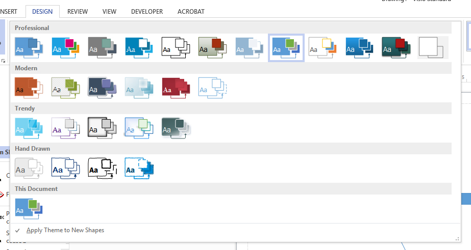
Figure 2: Some Design Color Palettes
In Microsoft Visio Standard 2016, there are various color palettes based on the following themes: professional, modern, trendy, hand drawn, and others. To the right of the pre-made palettes, there are options for customized color combinations, effects, and “embellishment” in the Variants section.
Users of Microsoft Visio can activate the Developer tab (File -> Options -> Customize Ribbon -> Select "Developer" Check Box under Main Tabs.
Figure 3: Activating the MS Visio Standard 2016 Dev Tab
They will enable a range of shape operations that are not available otherwise. To explore what these features enable, highlight multiple shape objects (polygons) and apply the various effects. The CTRL + Z to reverse the action works and enables cost-free experimentation. The Developer tab enables users to employ Visual Basic and other macros in the tool.
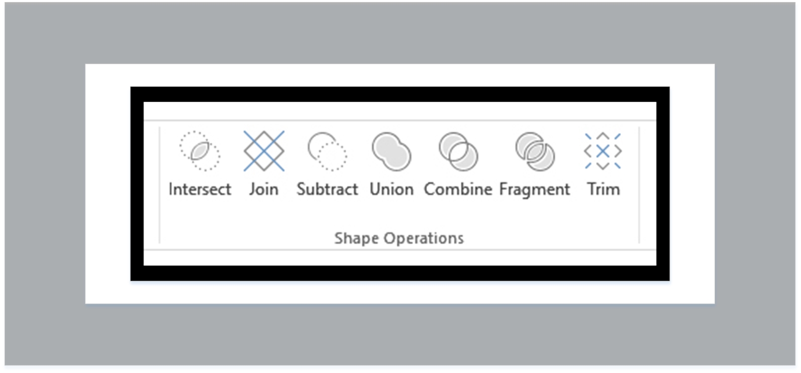
Figure 4: “Shape Operations” through Developer Tab in MS Visio Standard
If diagrams are used in a sequence, they should be designed as consistently as possible. They should be placed in sequences that make sense and do not break the flow of learning but enhance it.
Export File Formats
No matter what the various file versions which are output for various usages, it is important to keep a raw version of the original file as a .vsd (ViSio Drawing), which is a (scalable) vector graphics file format. The raw file is editable and may be re-versioned and output in other ways and other file formats. A compressed graphic image file from the .vsd enables very limited designer editing into the future, so the original file is important to maintain. A graphic image file can be re-versioned in Adobe Photoshop, Adobe Illustrator, or Adobe Fireworks, or some other image editing tool, to add visual effects, to crop, to color-edit, to resize, to change up the digital image file type, and to make other changes.
Microsoft Visio Standard 2016
The software program described here is available in both Standard and Professional versions, and it is also available as part of Office 365 as part of a subscription package. MS Visio Professional 2016 enables version control for team-development of visualizations, data linking, Information Rights Management features, additional professional diagrams based on industry standards (“Choose your Visio,” 2016).
Visio was started in 1992 by the Shapeware Corporation, which was acquired by Microsoft in 2000 (“Microsoft Visio,” July 22, 2016).
Conclusion
Instructional designers are not often pushed to explore software tool features unless they are required to by circumstances. It may be a positive thing to try to learn a new feature of a software tool with each usage to fully use a tool’s capabilities (and to have those capabilities at the ready for when a need arises). This short article introduces only some of the main capabilities of the tool and its use in a limited “use case.”
About the Author
Shalin Hai-Jew works as an instructional designer at Kansas State University. Her email is shalin@k-state.edu.
| Previous page on path | Issue Navigation, page 15 of 25 | Next page on path |
Discussion of "Drawing a 2D Informational Graphic with Microsoft Visio Standard 2016"
Add your voice to this discussion.
Checking your signed in status ...