Cluster Analyses and Related Data Visualizations in NVivo 11 Plus
By Shalin Hai-Jew, Kansas State University
One of the hot new(ish) approaches of computational data analytics in research involves the use of clustering as a form of pattern identification. Not only are there a number of new clustering algorithms, but there is also access to social media data that may be grouped meaningfully, and eye-catching and intuitive data visualizations of clusters.
At core, clustering is about grouping “like” or “similar” data. The dimension around which data is analyzed will vary depending on the research context, the data types, and the algorithms applied.
A Brief Historical Point about Clustering
Clustering originated as a research technique in 1932 by Harold Edson Driver and Alfred Louis Kroeber in their book “Quantitative Expression of Cultural Relationships” by the University of California Press. Back in the day, researchers would cluster data manually, with paper and pencil (which is also retro and cool). The “newness” referred to here has to do with the entry of computational data clustering as an augmentation or complement to other research methods today.
Applying Clustering in Research
The clustering may be an end point; for example, when clustering is used in data mining, researchers want to extract patterns from the grouped data and better understand what those groupings mean in a research context.
Clustering may be part of a research sequence through the use of "grouping variables". For example, researchers may cluster survey participants based on various attributes (like demographic features) and look for patterns among the respective groups in terms of responses. Groups may be clustered by their specific responses to a particular question, or by a particular outcome variable.
Depending on the approach, what a cluster is (how similar does a thing have to be to belong in one group vs. another) and how it is identified may vary. Do all objects have to be assigned to a cluster or not? Can an object just belong to one cluster (in an approach termed “strict partitioning”), or can it be coded to multiple clusters simultaneously (in an approach termed “overlapping clustering”)?
While cluster analysis is computerized, it is not supposed to be approached in an unthinking way: “Cluster analysis as such is not an automatic task, but an iterative process of knowledge discovery or interactive multi-objective optimization that involves trial and failure. It is often necessary to modify data pre-processing and model parameters until the result achieves the desired properties” (“Cluster analysis,” June 29, 2016).
Some Examples of Clustering in Research
Within relatively easy reach are a number of ways to apply clustering in research.
Online social networks are sometimes clustered based on formal and declared membership in particular groups of interest, like a mountain climbers group on a photo sharing site. In online social networks, there are also implicit clusters or groups of individuals with weak ties from replies, retweets, shares, likes, and commenting…often around issues of shared interest. These are not clusters with opt-in membership but those that form in an ad hoc way as people interact as a one-off or over a particular period in time. These online relationships, often begun and maintained online, are fleeting and ephemeral.
Clustering can be applied responses to surveys (with each question representing a data variable). Factor analyses and principal components analyses have long been applied to quantitative datasets and resulted in somewhat mysterious and unlabeled clusters, with some more amenable to sense-making than others. (What researchers usually get are groups of variables that co-vary and so are thought to represent a particular construct. Each of the clusters are relabeled by the researcher based on the variables in each cluster. There is a lower threshold beyond which the clusters may not be sufficiently relevant or coherent.)
Another sort of clustering surrounds themes that may be auto-extracted from a text, a text set, or text corpora. Here, clusters may be created based on observed linguistic features expressed as stylometry (quantitative metrics of style). Particular constructs may be extracted from the text as well such as clusters of time or emotion or other features.
In related tags networks, there are clusters of tags which co-occur with a seeding tag. The “similarity” in such clusters is based on co-occurrence. Whenever a particular tag is applied to a user-generated image (or digital contents), other tags are also often applied. This co-occurrence is a kind of similarity, a sharing of co-application to particular images above a certain threshold. As such, related tags inform on each other and provide a sense of semantic context. [A “Rainier” tag co-applied with “mountain” and “hike” is a different “Rainier” than one co-applied with “beer” and “cookout”. Semantic meanings are context sensitive, in a folk-created tags as in formal documents.]
In datasets in which location is a variable or feature, there is interest in regional or geographical clusters and what location (spatiality) may suggest about the data.
As might be suggested by some of the prior examples, cluster analysis may be used in an exploratory way—to see what patterns might be extant in the data. It may be used to form hypotheses which may then be tested in other ways or with additional data. Cluster analysis may be used to answer questions about the data. The cluster analysis method is not constrained to a particular objective.
What is Needed?
To conduct cluster analyses, there are several things needed. One is access to the right kind of data.
There are software tools with built-in cluster analysis capabilities. With some tools, users may set parameters for the clusters (such as the number of clusters that they may want to have extracted). The idea is that there is a number that results in just the right number of clusters to accurately represent the data without introducing noise.
But in many, these are “black box” operations with a few user inputs, the clustering, and then the outcomes—without more data. Unless the software company publicly documents what is going on under the hood, users will have to infer what is going on and interpret what they have. Optimally, they can run the same data using several different tools in order to observe differences.
There are general computer languages with cluster analysis capabilities and cluster analysis data visualizations, such as in R and Python. This approach not only requires some serious tech skills but also a deeper understanding of the algorithms applied to different data contexts. Clustering algorithms designed for particular models and certain assumptions of the underlying data cannot be applied haphazardly in a different context.
The easiest point of entry is to go with built software tools. The most intuitive way to access cluster analysis data is to start with visualizations and then work backward to the underlying numbers, the extracted clustered datasets, the underlying raw data, and then the mathematical methods.
"Machine Learning"
Broadly speaking, computational clustering methods may be understood as part of machine learning, which involves the extraction of meaningful patterns from data. "Unsupervised" machine learning involves the use of computational methods to extract patterns from data that is not prelabeled (or with later-extracted labels previously unknown to the researcher). [A more rigorous definition of unsupervised machine learning refers to the lack of hard coding of computers to extract insights from data but rather letting a computer program infer ways to extract patterns from data.] Clustering by k-means, principal components, factor analysis, word similarity, sentiment, and word frequency counts, are all generally types of unsupervised machine learning. The insights from such learning generally applies to data exploration and discovery.
"Supervised" machine learning involves the use of computational methods to extract patterns from data that were previously known (or partially known) to the researcher. In such approaches, there are human inputs ("labeled data") into the algorithm or program to tell the machine how to find the patterns. One example of this is "coding by existing pattern" in the following software tool.
Some Cluster Analyses in NVivo 11 Plus
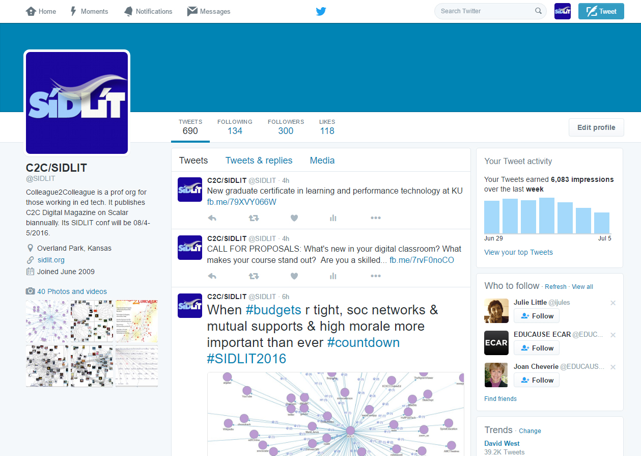
To see how this might work using NVivo 11 Plus, a qualitative research tool of the CAQDAS (Computer Assisted Qualitative Data AnalysiS) class, the data from the @SIDLIT account on Twitter was accessed, for a total capture of 683 records including retweets. At the time of the data capture, the account had 683 Tweets, 134 following, 300 followers, and 118 likes. From this data, various cluster analytics were applied. The size of the dataset was not sufficiently large for a text frequency cluster analysis (which would show word frequencies and their co-occurrence in proximity of usage through what appears to be a “sliding windows” text analysis approach). Word frequency clustering is often displayed as flat or non-hierarchical graphs. Figure 2 shows a screenshot of the Tweet landing page for the @SIDLIT account.
Figure 2: @SIDLIT Tweet List Page on the Twitter Microblogging Site
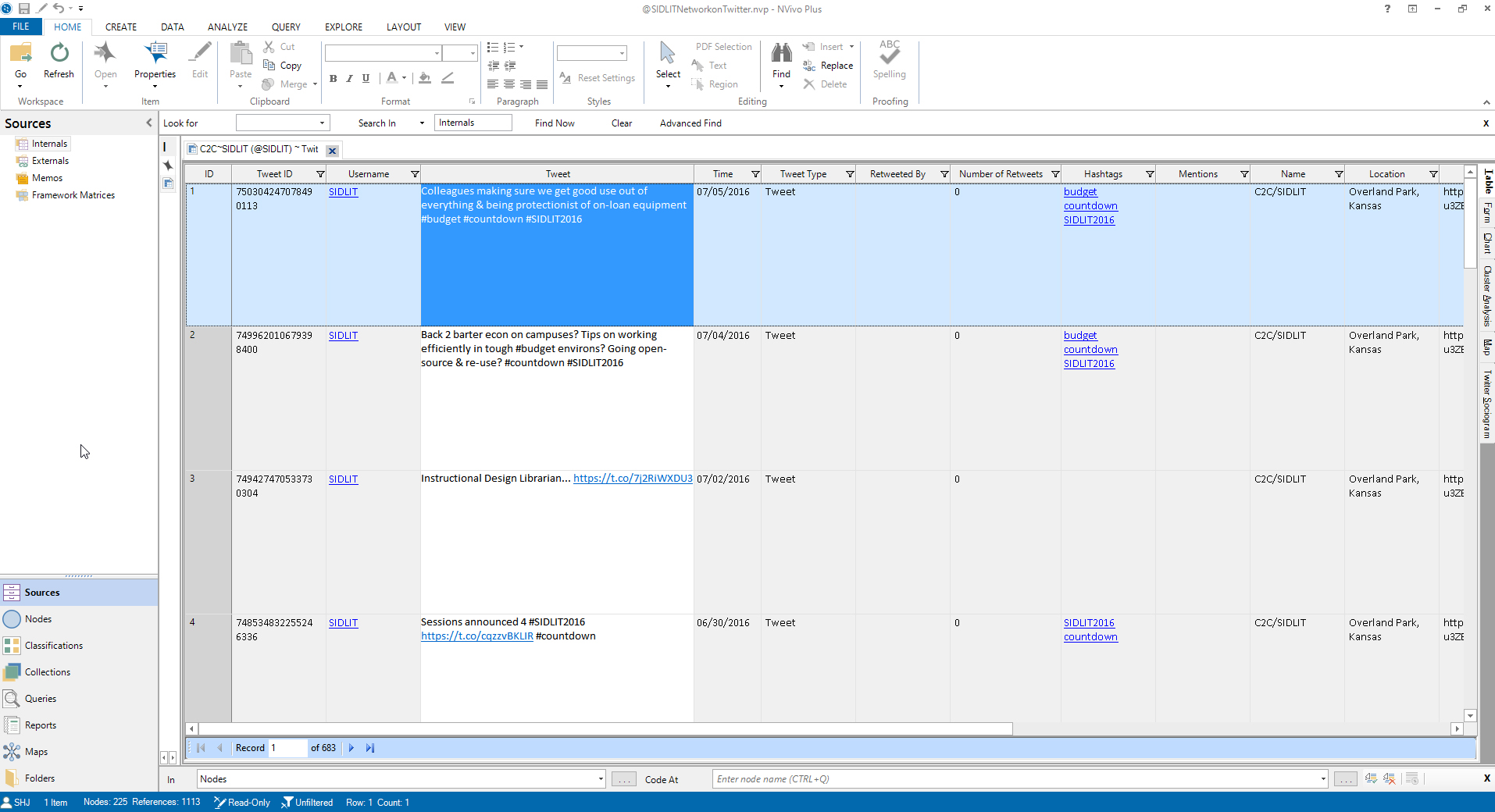
From the Twitter microblogging site’s data, the data from Twitter’s application programming interface (API) is ingested as a data table. Each column header indicates the type of data that is ingested. Each row is a record (Figure 3).
Figure 3: The Exportable Data Table of the Tweet Dataset in NVivo 11 Plus
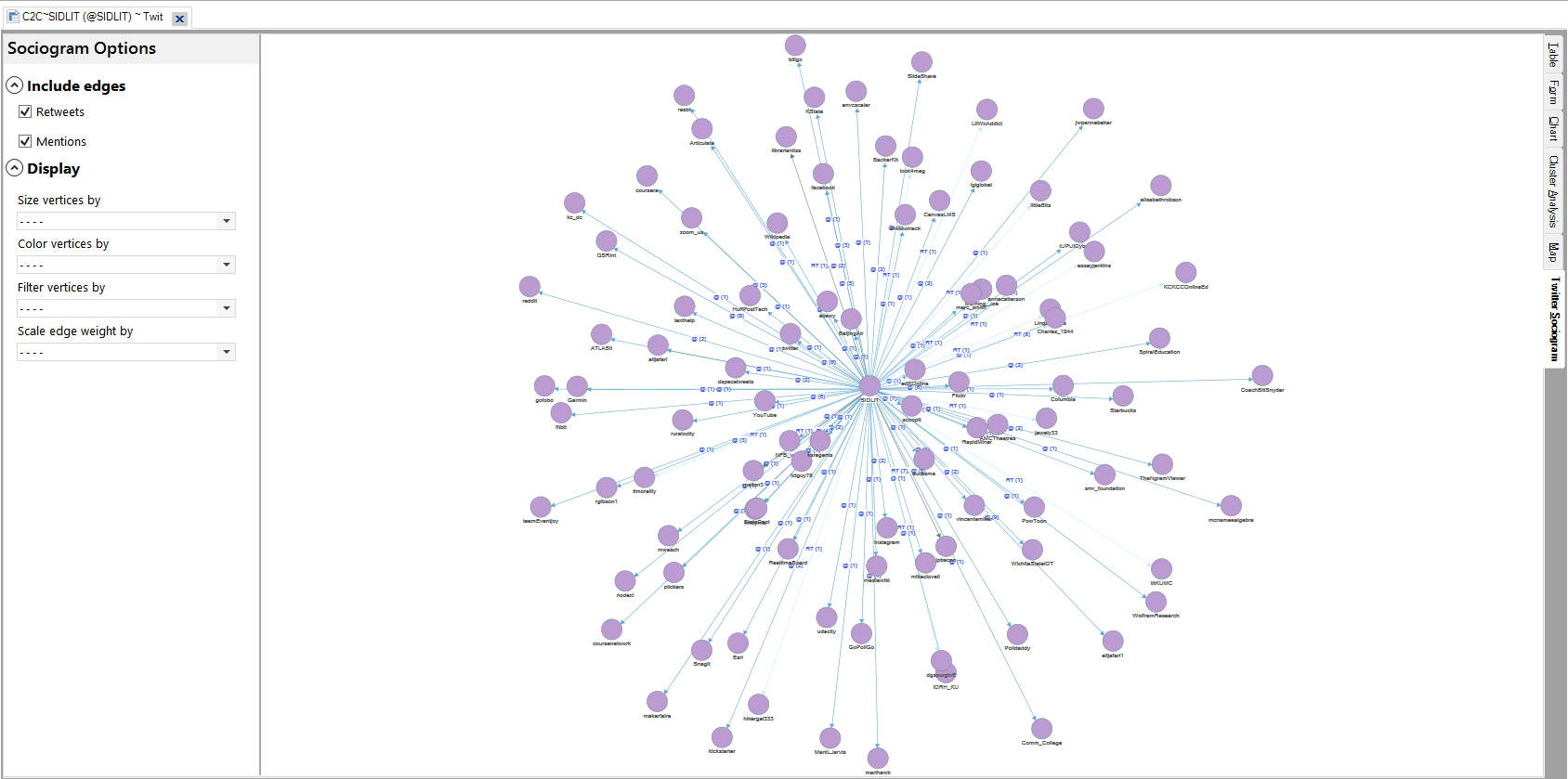
Sociograms (or sociographs) are common types of clustering visualizations. These involve nodes which represent egos (individuals, user accounts, and others) and links which represent relationships (formal ties, informal ties, and others). The node-link diagrams, sometimes referred to as vertex-edge diagrams, may be represented in two, three, or four dimensions. Two-dimensional diagrams are graphed on a two-dimensional plane; three-dimensional ones are graphed on the x, y and z axes; four-dimensional diagrams include time and are sometimes dynamic (and live).
In NVivo 11 Plus, there is built-in extraction of a sociogram. Figure 4 shows the extracted sociogram with @SIDLIT as the targeted node and the network as its ego neighborhood at one degree, with 225 nodes. The network seems to be an ad hoc mix of those @SIDLIT is following and also user accounts brought into the Tweetstream through @mentions during the particular period of the captured information. Remember, @SIDLIT is following 134 user named accounts on Twitter, and those are represented in the sociogram. The 300 followers are not being represented in the sociography because the arrows point out from the focal @SIDLIT node, and none point back in in this capture. (A more informative network graph would show bidirectional arrows to capture reciprocation. Digraphs or “directed graphs” may be necessarily limited by the software developers just to show out-degree as in this case…and not in-degree of the follower networks…in order to simplify the data visualization. When network graphs are too dense, they can be difficult to visualize. Even in this case, there are occluding nodes.) As such, the software captured a one-degree ego-neighborhood, which does not make for a grand cluster analysis. If the network were larger (say, at 1.5 degrees or 2 degrees), and a force-based layout algorithm were used, then the visuals would be much more stunning, and the clusters would show more clearly.
Figure 4: @SIDLIT Twitter Network Sociogram
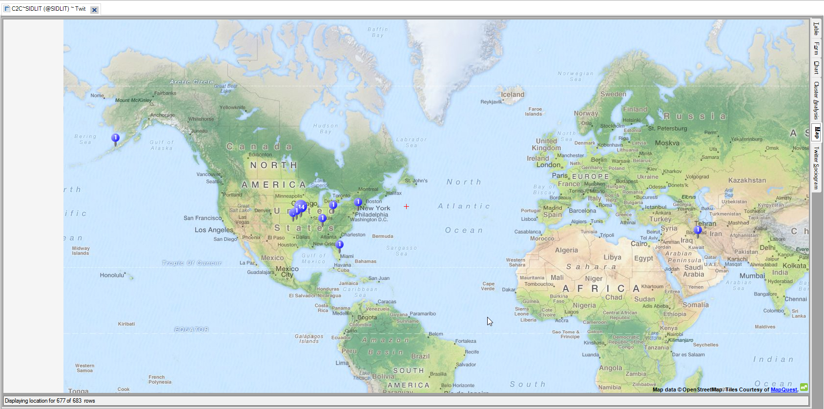
In Figure 5, there is a map of geolocational data from the @SIDLIT social network, with participants hailing from the U.S. and the Middle East. Geolocational data tends to be quite sparse on Twitter (with some published estimates at 1-2% of Tweets geotagged, and of these, many are human-input locations like “Mars,” which have no geolocational value). In this software tool, the geospatial mapping is not classically thought of as cluster analysis…but virtually every mapping tool has spatial analysis capability that treats spatiality (proximity and distance, regionalisms) as a variable.
Figure 5: Map for Geolocational Clusters and Spatial Patterning
In the next section are some more classic types of cluster analyses.
Clustering around Text Similarity of Tweetstreams
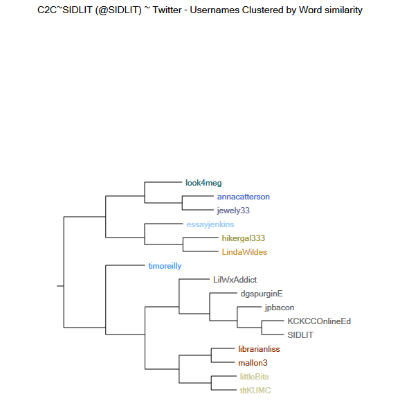
From the Twitter data set, it is possible to cluster user names based on the word similarity of their respective messaging. “Word similarity” may be defined on various language dimensions, especially since language has high dimensionality, but aspect of word similarity one may be literal semantic similarity (such as between synonyms). In Figure 6, the horizontal dendrogram shows user names of Twitter accounts that have been clustered by word similarity in the Tweetstream messaging. What this suggests is that the user accounts may have some shared interests in terms of messaging, and this may suggest some homophily (the clustering of individuals to others like themselves).
A dendrogram shows a hierarchical (vs. flat or non-hierarchical) clustering. These are interpreted from the leaves (the smallest connected units) to the branches and so on until the trunk is reached. So in the Figure 6 below, annacatterson and jewelry33 are one cluster, and higher up, they are connected to look4meg. This built-out hierarchy of clusters shows how the selected accounts merge with others at certain distances. This hierarchy does not capture all accounts but may show some of the more active accounts in terms of shared or relational messaging.
Figure 6: Horizontal Dendrogram of Usernames Clustered by Word Similarity in @SIDLIT Social Network on Twitter
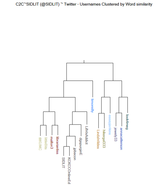
In Figure 7, dendrograms may also be represented vertically. In the “Cluster Analysis” article, the description describes a vertical dendrogram’s layout: “In a dendrogram, the y-axis marks the distance at which the clusters merge, while the objects are placed along the x-axis such that the clusters don’t mix” (“Cluster analysis,” June 29, 2016). On a horizontal dendrogram, the converse is true.
Figure 7: Vertical Dendrogram of Twitter Usernames Clustered by Word Similarity from @SIDLIT Social Network on Twitter
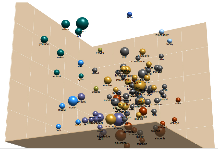
The same clustering information may be seen in Figure 8, a three-dimensional cluster diagram. Here, the location matters. The sizes and colors of the nodes also matter.
Figure 8: 3D Cluster Diagram of Twitter Usernames Clustered by Word Similarity from @SIDLIT Social Network
Those who would prefer the same data in two dimensions may refer to Figure 9.
Figure 9: 2D Cluster Diagram of Twitter Usernames Clustered by Word Similarity from @SIDLIT Social Network
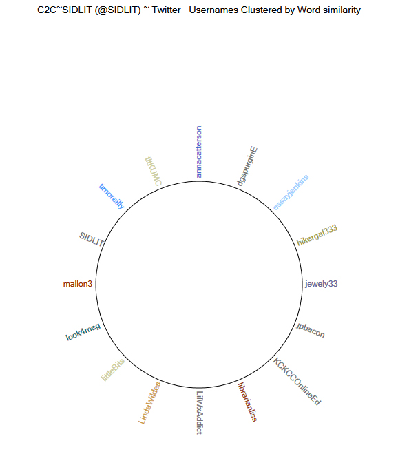
Also, the relational text similarity data may be graphed to a ring lattice graph (also known as a circle graph) (Figure 10).
Figure 10: Ring Lattice (Circle) Graph of Twitter Usernames Clustered by Word Similarity from @SIDLIT Social Network on Twitter
Clustering around Autocoded Themes
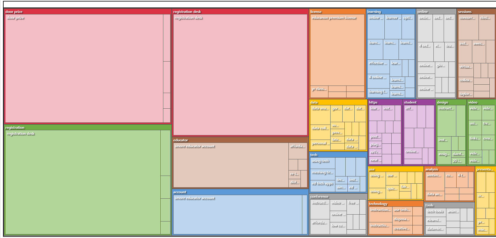
Another type of clustering enabled in NVivo 11 Plus involves the extraction of autocoded themes (computational topic modeling). Here, the “cluster” is based on a particular semantic term or concept (“theme”) and then related concepts (“sub-themes”). (Occasionally, non-semantic terms may be extracted as themes, but their informational value may be limited for that purpose. An "http" theme would be helpful in capturing all URLs shared though in a set with webpage references.) Autocoded themes and subthemes are also hierarchical because the main themes are at the top-level, and the sub-themes are at the secondary level. A treemap graph of these themes and subthemes may be seen in Figure 11.
Figure 11: Treemap Graph of Autocoded Theme and Subtheme Clusters from @SIDLIT Tweetstream
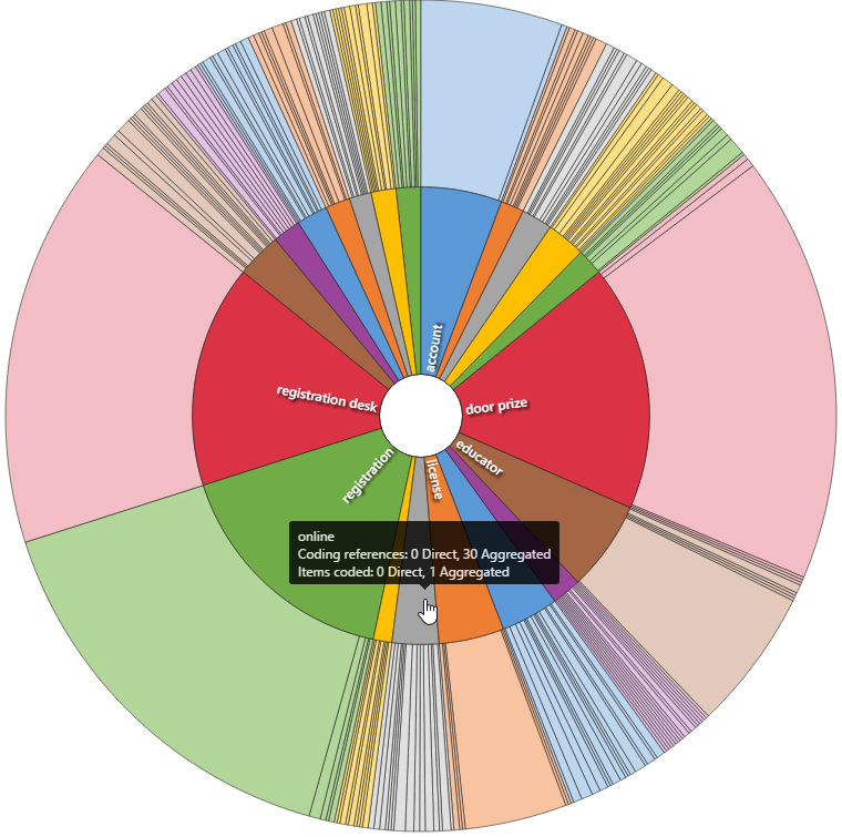
The same autocoded theme and subtheme clusters may be graphed to a sunburst (Figure 12).
Figure 12: Sunburst Hierarchical Graph of Autocoded Theme and Subtheme Clusters from @SIDLIT Tweetstream on Twitter
The treemap and sunburst visualizations show, in part, that clusterings do not have to look like bubbles (although many do). Also, these show that different levels of granularity may be expressed in cluster diagrams.
Underlying Datasets
To conclude, data visualizations are summarizations of the underlying data. Sometimes, people are too dazzled by the data visualizations to remember to explore the underlying data: the text sets, the data tables, the user Tweet messaging, and other elements. The above visualizations are all interactive within the software tool, and double-clicking on any of the visual features will bring up the underlying data.
About the Author
Shalin Hai-Jew works as an instructional designer at Kansas State University. Her email is shalin@k-state.edu.
| Previous page on path | Cover, page 15 of 26 | Next page on path |
Discussion of "Cluster Analyses and Related Data Visualizations in NVivo 11 Plus"
Add your voice to this discussion.
Checking your signed in status ...